What Font Does Cheetos Use?
The cheetos font is all about fun. Where some snack logos go sleek or aggressive, Cheetos leans hard into playful chaos, with lettering that looks like it might wiggle right off the bag. That mischievous energy is inseparable from Chester Cheetah, the brand’s cool, shades-wearing mascot. To see how playful type fits into the bigger branding picture, visit our famous brand fonts hub.
What font is the Cheetos logo?
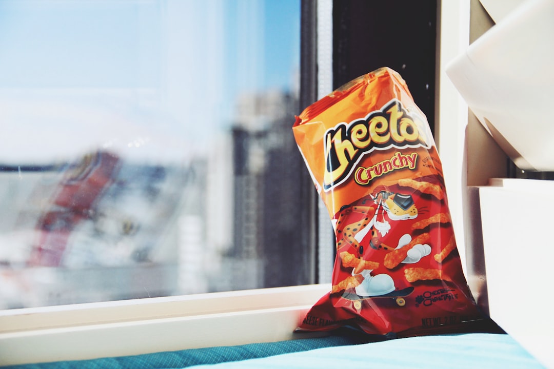
The Cheetos logo is custom lettering, not a stock typeface. The “CHEETOS” wordmark uses bold, rounded, slightly irregular letters with a bumpy, organic quality, as if each character has a little extra squish and bounce. The lettering often appears with a playful tilt or a hand-touched wobble that keeps it from feeling rigid or corporate. This irregularity is intentional: it makes the mark feel alive, fun and a little bit cheeky, which is exactly the personality Chester Cheetah projects. The result is a wordmark that reads as friendly, energetic and unmistakably aimed at fun-loving snackers. The bumpiness is doing storytelling work too: it hints at the puffy, uneven texture of the cheese puffs themselves, so the lettering almost looks edible. That kind of subtle product mimicry is a clever trick that ties the name directly to the sensory promise of the snack, making the logo feel like an extension of the food rather than a label slapped on top of it.
What is Cheetos’s brand typeface?
For flavor callouts, packaging copy and campaign text, Cheetos reportedly relies on rounded, friendly sans-serifs that keep the playful tone consistent. PepsiCo has not published an official public type spec, so the exact supporting font appears to vary by product line and region. What stays constant is the rounded, approachable feel: nothing sharp, nothing stiff. If you want to match the brand, choose chunky rounded sans-serifs and avoid anything thin or formal, because Cheetos lives in a world of bounce and bold color. The supporting type also has to share space with Chester Cheetah and a famously bright orange palette, so it tends to stay simple and rounded rather than competing for attention. In a design system this busy and energetic, the secondary font’s job is to be clear and friendly while letting the wordmark and the mascot do the heavy lifting on personality.
Free fonts that look like the Cheetos font
The wordmark itself is off-limits, but the chunky, playful mood is easy to capture with free fonts. Here is how the Cheetos system maps to open-license type.
| Use case | Cheetos uses | Free alternative |
|---|---|---|
| Logo / wordmark | Custom bumpy, playful lettering | Fredoka or Baloo (heavy) |
| Headlines | Chunky rounded display | Fredoka or Lilita One |
| Body / packaging | Rounded friendly sans | Nunito or Baloo 2 |
For more loud-snack neighbors and rounded options, see our breakdowns of the Doritos font and the best sans-serif fonts.
Why does Cheetos use this kind of type?
Cheetos sells fun, mess and personality, and its typography has to match. Bumpy, irregular lettering feels spontaneous and playful, signaling that this is a snack you enjoy without any pretense. The rounded, chunky forms read as approachable and kid-friendly while also appealing to adults who want a guilt-free moment of joy. Paired with Chester Cheetah’s wink-and-a-smile attitude, the wobbly wordmark turns a bag of cheese puffs into a little burst of personality. In a category where seriousness kills the vibe, looking fun is the entire point. The playful lettering also gives the brand enormous flexibility across formats and stunts. Cheetos has leaned into everything from museum pop-ups to limited-edition collaborations, and a wordmark with built-in personality travels easily into all of those contexts. A stiff, corporate logo would crack under that kind of creative stretching, but a bouncy, character-rich mark only gets more charming the further you push it, which is exactly why the design works so hard to look effortless.
Can I use the Cheetos font for my own project?
No. The Cheetos wordmark is trademarked custom artwork, and recreating it for your own products risks infringing PepsiCo’s rights even if your version is hand-built. The better path is to reach for a free chunky display font like Fredoka or Baloo and craft your own playful identity that nods to the energy without copying the brand. Read our font licensing guide before any commercial release so you stay on the right side of the line.
Frequently Asked Questions
Is there a downloadable Cheetos font?
No. The Cheetos wordmark is custom, trademarked lettering made specifically for the brand, so it is not available as a font file. Designers recreate its playful, bumpy feel with chunky rounded display fonts like Fredoka or a heavy Baloo, which capture the bounce without using the protected logo artwork.
What free font looks like Cheetos?
Fredoka and a heavy weight of Baloo are the closest free matches for the chunky, rounded, playful Cheetos character. Lilita One also works well for bold, fun headlines. These fonts share the thick strokes and friendly curves that give the Cheetos identity its energetic, kid-friendly personality.
Why does the Cheetos logo look so playful?
The irregular, bumpy lettering is designed to feel spontaneous and fun, matching Chester Cheetah’s mischievous personality. Rounded, chunky forms read as approachable and lighthearted, reinforcing the brand’s message that snacking should be joyful and unpretentious. The playful look is a deliberate strategy, not an accident of the design.
Who is Chester Cheetah and how does he affect the branding?
Chester Cheetah is the brand’s sunglasses-wearing mascot, and his cool, cheeky attitude defines the entire Cheetos identity. The playful, wobbly typography mirrors his personality, creating a unified character-driven brand. Together the mascot and lettering make Cheetos feel fun, animated and instantly recognizable across packaging and advertising worldwide.
What type style suits a fun, playful brand?
Chunky rounded display fonts work best for playful, energetic brands. Faces like Fredoka, Baloo and Lilita One deliver thick strokes and friendly curves that feel approachable and fun. Pair a bold display face for the name with a rounded sans like Nunito for supporting text to keep the lively tone readable and consistent.


