What Font Does American Airlines Use?
If you have ever studied a boarding pass or a tail fin and wondered about the american airlines font, you are looking at one of the most deliberately neutral type systems in commercial aviation. The carrier rebranded in 2013 with help from FutureBrand, replacing its long-running eagle-and-AA crest with the abstract “Flight Symbol,” and the typography was tuned to match that clean, confident reset. This guide breaks down the logo lettering, the marketing typeface, and the free fonts that get you closest. For more brand teardowns, see our famous brand fonts hub.
What font is the American Airlines logo?
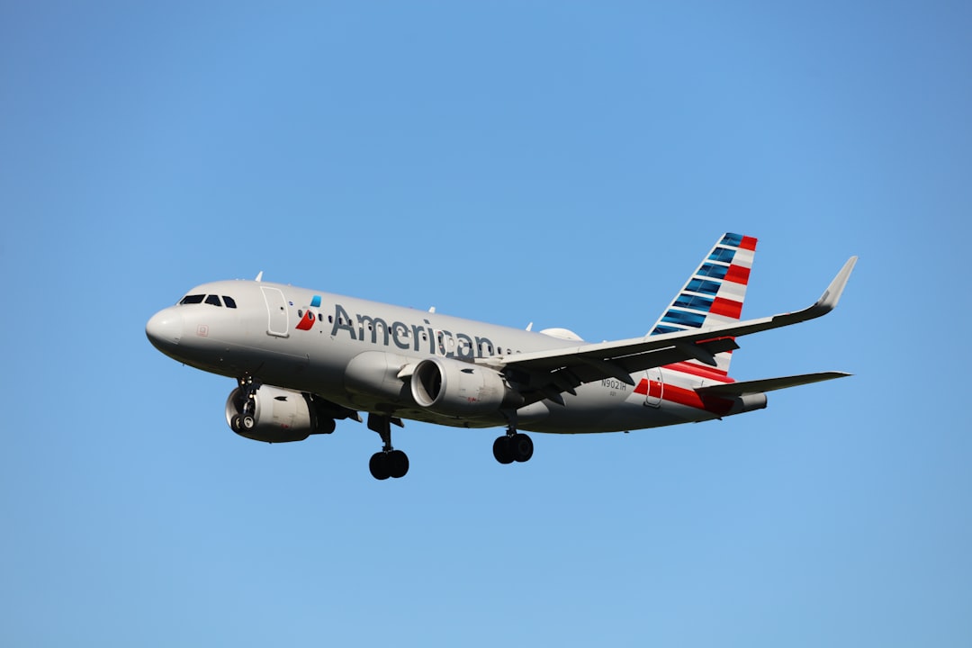
The “American Airlines” wordmark is best understood as custom lettering rather than a font you can download. Following the 2013 rebrand, the letterforms were drawn as a tailored grotesque: even stroke weight, open apertures, and a slightly condensed feel that reads cleanly at airport-sign distance. The “AA” sits inside the abstract red, white, and blue Flight Symbol, which suggests both an eagle and a tail fin. Because the wordmark is trademarked and optically refined, fonts off the shelf will only approximate it, never match it pixel for pixel.
What is American Airlines’s brand typeface?
Across signage, the website, and printed collateral, American Airlines appears to rely on a proprietary sans-serif sometimes described as “American Sans,” developed to give the airline a consistent voice everywhere from gate displays to its app. For much of its earlier corporate life, the carrier leaned heavily on Helvetica, the neutral grotesque that defined mid-century American transit branding. Treat any specific name as reported rather than confirmed; airlines guard their type licenses closely, and the practical takeaway is that the system favors a calm, legible grotesque over anything decorative.
Free fonts that look like the American Airlines font
You will not be able to license the exact custom face, but the grotesque category is well served by free options. The table below maps each role to a strong open-source substitute.
| Use case | American Airlines uses | Free alternative |
|---|---|---|
| Logo / wordmark | Custom grotesque lettering (Flight Symbol mark) | Inter (tightened tracking) |
| Headlines | Proprietary sans (“American Sans,” reported) | Arimo or Roboto |
| Body / UI | Neutral grotesque / Helvetica historically | Inter or Roboto |
Inter is the standout pick because it was engineered for screens, with a large x-height and tidy spacing that mirror American’s app and web feel. If you want the historical Helvetica vibe specifically, read our Helvetica guide for licensing-safe lookalikes.
Why does American Airlines use this kind of type?
Airlines sell trust, safety, and competence, and neutral grotesque type signals exactly those traits. There is nothing whimsical about American’s letterforms; they communicate engineering precision and reliability, which is precisely what a passenger wants to feel before stepping onto an aircraft. A neutral sans also performs across an enormous range of contexts: tiny seat-map labels, towering terminal signage, in-flight magazines, and a global app, often in multiple languages. By choosing a quiet, highly legible system, American keeps the focus on the bold Flight Symbol while letting the words simply do their job. The 2013 rebrand made this philosophy explicit. By retiring the ornate eagle crest in favour of an abstract, modern mark and pairing it with clean grotesque type, American repositioned itself as forward-looking and efficient. The typography is intentionally self-effacing: it never competes with the logo, never dates quickly, and never distracts from the operational information passengers actually need. That discipline is the whole point of a corporate type system at this scale.
Can I use the American Airlines font for my own project?
No. The wordmark and the Flight Symbol are registered trademarks, and even if you could obtain the custom typeface, using it to imply affiliation with the airline would invite legal trouble. The font itself may be licensed under terms that forbid redistribution. The safe and effective path is to recreate the spirit, a clean modern grotesque, using a free, openly licensed alternative such as Inter, Arimo, or Roboto. Before you ship anything commercial, skim our font licensing guide so you understand desktop, web, and embedding rights.
Frequently Asked Questions
What font does the American Airlines logo use?
The logo uses custom-drawn grotesque lettering created during the 2013 FutureBrand rebrand, paired with the abstract red, white, and blue Flight Symbol. It is bespoke artwork rather than a downloadable font, so any free substitute, such as Inter with tightened tracking, will only be a close visual approximation rather than an exact match.
Is the American Airlines font Helvetica?
Historically, American leaned heavily on Helvetica, the quintessential neutral grotesque of American transit design. After 2013, the airline appears to use a custom proprietary sans for most modern applications. So Helvetica is part of the heritage rather than the current primary face, though the two share a similar clean, no-nonsense character.
Can I download the American Airlines font for free?
No. The custom corporate typeface is not distributed publicly, and the wordmark is trademarked. For free, look-alike results, download Inter, Arimo, or Roboto from open-source font libraries. These grotesques capture the same calm, legible feel without any licensing or trademark exposure for your own design work.
What is the best free alternative to the American Airlines font?
Inter is the best all-around free alternative. Its large x-height, neutral grotesque shapes, and screen-first engineering closely echo American’s modern app and signage look. If you specifically want a Helvetica-style substitute, Arimo is metrically compatible and free, making it an easy drop-in for documents and the web.
What style of font is the American Airlines brand?
It is a neutral grotesque sans-serif: even strokes, open apertures, minimal personality, and maximum legibility. This style conveys reliability and engineering precision, which suits an airline’s need to project safety and competence. Explore similar options in our roundup of the best sans-serif fonts.