What Font Does British Airways Use?
British Airways has spent decades cultivating an air of premium, traditional Britishness, and the british airways font is central to that impression. Where budget carriers chase friendly and informal, BA reaches for refined serifs and the elegant Speedmarque, signalling heritage, reliability, and a touch of national pride. This guide examines the wordmark, the brand typeface, and the free fonts that get you close. For more brand-type breakdowns, explore our famous brand fonts hub.
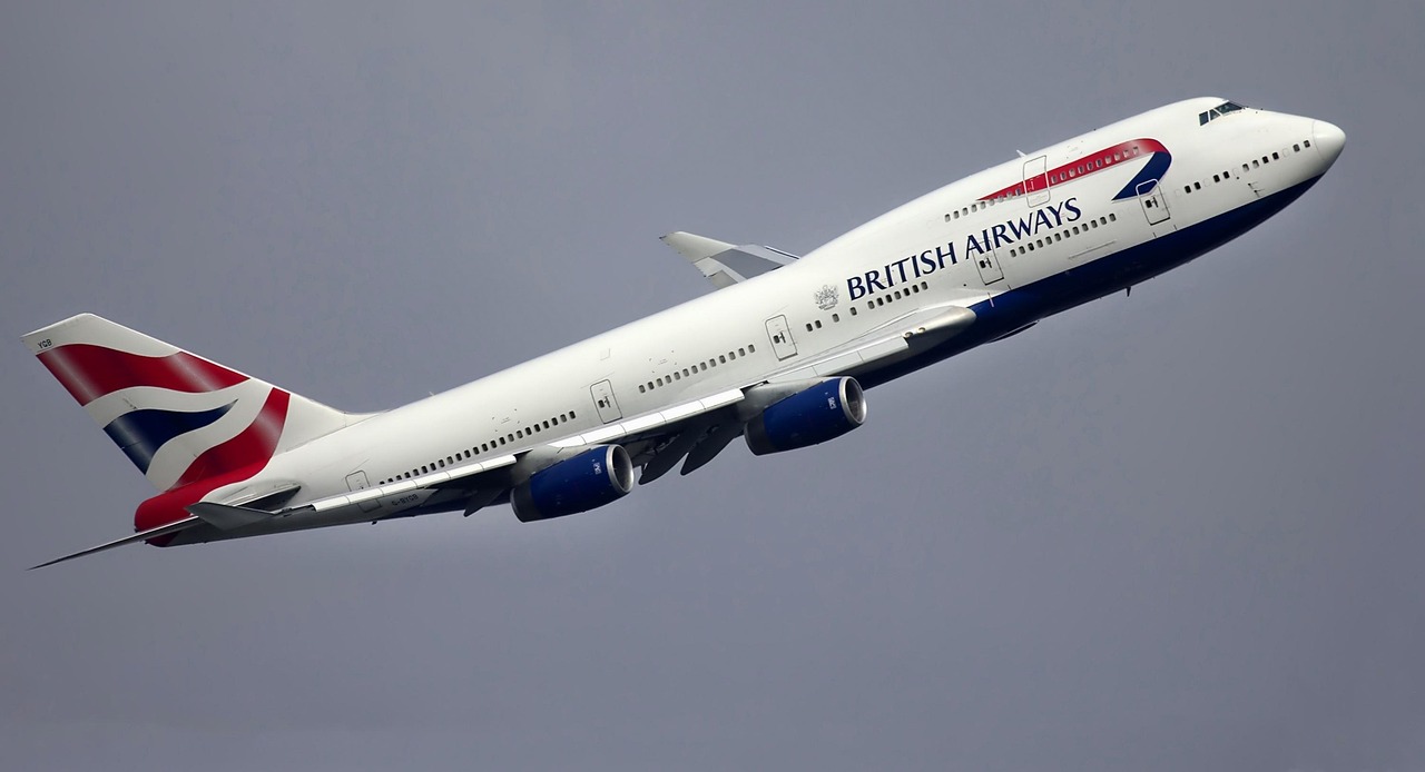
What font is the British Airways logo?
The “BRITISH AIRWAYS” wordmark is set in a refined serif, drawn or customised rather than pulled from a free library. The letterforms are upright, evenly weighted, and traditional, with crisp serifs that convey establishment and quality. Beside the words sits the famous Speedmarque, the flowing red and blue ribbon that evokes speed, flight, and the Union flag. Together they read as confident and premium. Because the lettering is bespoke and trademarked, you cannot download the exact face; any match will be an approximation.
What is British Airways’s brand typeface?
Across BA’s wider system, the brand is reported to use a custom serif, sometimes referenced under the name “Mylius,” for headlines and editorial moments, paired with a clean Helvetica-like sans-serif for body copy, signage, and interfaces. This serif-plus-sans pairing is classic premium-brand strategy: the serif delivers heritage and warmth, while the neutral sans keeps timetables, fares, and app screens legible. Treat the specific font name as reported rather than confirmed. The dependable takeaway is the combination, a dignified serif voice supported by a quiet grotesque workhorse.
Free fonts that look like the British Airways font
You can recreate BA’s premium, two-tier feel with free, openly licensed fonts. The table maps each role to a strong substitute.
| Use case | British Airways uses | Free alternative |
|---|---|---|
| Logo / wordmark | Custom refined serif (Speedmarque mark) | PT Serif or Lora (small caps, tight tracking) |
| Headlines | Custom serif (“Mylius,” reported) | Lora or Playfair Display |
| Body / UI | Helvetica-style neutral sans | Arimo or Inter |
PT Serif and Lora both bring the upright, dignified serif character the wordmark needs, while Arimo handles the neutral sans role for practical text. If you want a true Helvetica-style body font, our Helvetica guide lists licensing-safe lookalikes.
Why does British Airways use this kind of type?
BA positions itself as a flag carrier with prestige, comfort, and tradition, so its typography has to feel established rather than trendy. Serifs carry centuries of association with authority, books, newspapers, and institutions, and that gravitas reassures premium and business travellers paying for a sense of occasion. The neutral sans grounds the system in clarity for the moments that demand it. The Speedmarque adds dynamism so the brand does not feel stuffy. The overall effect is a measured balance: heritage and elegance up front, efficiency and legibility underneath. There is also a national dimension at work. As Britain’s flag carrier, BA leans on typography that feels distinctly British, the kind of refined, slightly formal lettering associated with established institutions and a long aviation heritage. That restraint is itself a luxury signal: where budget airlines compete on bright colours and bold sans-serifs, BA competes on poise, and its serif-led system communicates exactly that difference before a single word is read.
Can I use the British Airways font for my own project?
No. The BA wordmark, the Speedmarque, and any custom serif are trademarked and not licensed for public use. Reproducing them, especially in ways implying endorsement, would invite legal action. The right approach is to evoke the premium, traditional mood with free alternatives, a refined serif like PT Serif or Lora paired with a neutral sans such as Arimo, and then design your own distinct identity. Read our font licensing guide before any commercial release to confirm desktop and web rights.
Frequently Asked Questions
What font does the British Airways logo use?
The logo sets “BRITISH AIRWAYS” in a refined, custom serif beside the red-and-blue Speedmarque ribbon. It is bespoke, trademarked artwork rather than a downloadable typeface. Free serifs such as PT Serif or Lora, set in small caps with tight tracking, approximate the upright, dignified feel without matching the original lettering exactly.
Is the British Airways font a serif?
Yes, the wordmark and headline voice are serif, chosen to convey heritage, quality, and establishment. For body copy, signage, and app screens, BA pairs that serif with a clean Helvetica-style sans-serif for maximum legibility. This serif-plus-sans pairing is a classic premium-brand strategy used across luxury and flag-carrier identities.
Can I download the British Airways font for free?
No. The custom serif (sometimes referenced as “Mylius”) and the wordmark are not distributed publicly and are trademarked. For a free, similar look, combine PT Serif or Lora for serif elements with Arimo or Inter for sans-serif text. These open-source fonts recreate the premium feel without licensing or trademark concerns.
What is the best free alternative to the British Airways font?
For the serif wordmark and headlines, Lora or PT Serif are the closest free matches, delivering upright, refined letterforms. For body and interface text, Arimo offers a Helvetica-style neutral sans. Pairing a refined serif with a clean sans recreates BA’s heritage-plus-clarity balance for personal and commercial projects.
How does British Airways’ font compare to other airlines?
BA’s serif-led identity is notably more traditional and premium than most. By contrast, JetBlue uses a friendly lowercase sans, and many carriers favour neutral grotesques. BA’s serif signals heritage and prestige, while sans-led airlines aim for modern approachability. The choice always mirrors each brand’s positioning and target traveller.


