What Font Do the Lakers Use?
If you are searching for the exact lakers font, the honest answer is that the purple-and-gold mark is bespoke artwork, not a typeface you can install. Still, you can get remarkably close with the right free fonts. Below we break down the wordmark lettering, the jersey numerals, and practical substitutes. For more pro-sports breakdowns, see our famous brand fonts hub.
What font is the Lakers logo?
The familiar “Lakers” wordmark is a custom piece of lettering with a strong forward slant, connected energy, and tapered terminals that give it a script-leaning feel without being a true cursive. The forward lean suggests motion and speed, which fits a basketball identity. Because it was drawn as a logo, no off-the-shelf font matches it perfectly. The closest digital match in spirit is a bold, oblique display script or a heavy italic sans with rounded joins. Designers chasing the look usually start there and then manually adjust the slant angle and letter spacing.
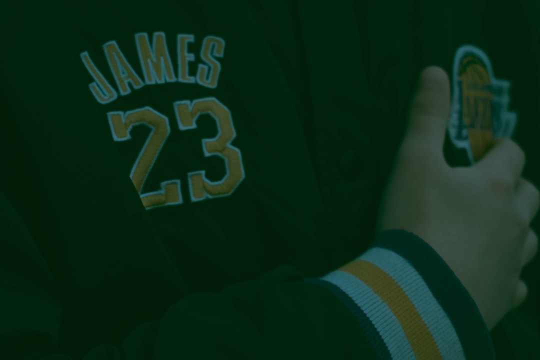
What font do the Lakers use on jerseys?
The jersey “LAKERS” lettering and the player numbers are reported to be a custom team set rather than a licensed retail font. The numerals read as a bold, slightly slanted block face with clean, confident strokes built for legibility from the upper deck. The nameplate on the back uses a coordinated block sans in all caps. As with most NBA franchises, these glyphs are proprietary, so any “match” is an approximation. A heavy block or athletic sans gets you visually close for fan projects.
It is worth separating the two looks the team wears. The home and association uniforms carry the gold-and-purple “Lakers” script across the chest, which leans on the same slanted display feel as the primary logo. The number font, by contrast, is more upright and structural, prioritizing the clarity a referee needs over the flourish a fan loves. When you recreate a jersey for a poster or a fan edit, keep that distinction in mind: matching the chest script and the back numbers usually means using two different free fonts rather than one, because the team itself treats them as separate jobs.
Free fonts that look like the Lakers font
You will not find the exact mark for free, but these substitutes capture the slanted, bold character of the brand for mockups and fan art.
| Use case | Lakers uses | Free alternative |
|---|---|---|
| Logo / wordmark | Custom slanted script-style lettering | A heavy oblique display script or bold italic sans |
| Jersey numbers | Custom bold block numerals | A chunky block sans such as a heavy-weight free athletic face |
| Nameplate / body | Custom block sans, all caps | A clean condensed sans like Oswald |
Why do the Lakers use this kind of type?
Sports typography solves two problems at once: instant brand recognition and legibility at distance. The Lakers’ slanted wordmark communicates speed and showmanship, fitting a franchise built on flashy, fast-break basketball. The jersey numbers prioritize stroke thickness and open counters so a referee, broadcaster, or fan can read them across a full arena. Tradition matters too. The mark has stayed largely consistent for decades, so any redesign risks diluting one of the most recognizable identities in sports. For the broader league context, see our guide to NBA fonts.
There is also a merchandising logic behind the consistency. Because the Lakers sell apparel worldwide, the lettering has to survive scaling from a stadium banner down to an embroidered cap or a phone case. Slanted display lettering with strong, simple shapes holds up across all of those sizes, while overly delicate or trendy type would break down when shrunk or stitched. That durability is part of why the brand has resisted the urge to chase modern type fads. The look you see now is essentially a refined version of a decades-old identity, and that continuity is itself a marketing asset that newer franchises cannot easily replicate.
Can I use the Lakers font for my own project?
The Lakers logo and wordmark are protected by trademark, and the custom lettering is owned by the franchise and the NBA. Even if you recreated the glyphs perfectly, using them commercially, or in a way that implies endorsement, would invite legal trouble. For personal practice or a one-off fan piece, a look-alike free font is fine, but for anything you sell or publish under a brand, pick a licensed typeface you have the rights to. Review our font licensing guide before you ship.
Frequently Asked Questions
Is the Lakers font a real downloadable typeface?
No. The Lakers wordmark is custom lettering created as a logo, not a retail font you can install. Several free fonts imitate its slanted, bold style closely enough for fan mockups, but none is the official mark. The team and the NBA own the artwork outright.
What font is closest to the Lakers wordmark?
A heavy oblique display script or a bold italic sans gets closest to the forward-leaning, energetic feel of the wordmark. You will likely need to tweak the slant angle and tighten letter spacing to match the original mark’s momentum and rhythm.
What font are the Lakers jersey numbers?
They appear to be a custom block numeral set built for the franchise, not a licensed font. The numerals are bold with a slight slant and open counters for distance legibility. A chunky free block sans is the practical stand-in for fan projects and mockups.
Are the Lakers colors part of the font identity?
Yes, in practice. The purple (Forum Blue) and gold pairing is so tied to the lettering that the two read as one identity. When recreating the look, getting the color right matters as much as the typeface, since fans recognize the palette instantly even before the letterforms.
Can I use a Lakers look-alike font commercially?
Only if the substitute font’s own license permits commercial use, and only if you avoid copying the protected logo or implying an official tie to the team. The font’s license and the team’s trademark are two separate issues, so check both before any commercial release.