What Font Does Tissot Use?
Tissot has stood for accessible Swiss watchmaking since 1853, and its restrained, confident logo reflects that “official timekeeper” precision. Searching for the exact tissot font? As with most heritage watch brands, the wordmark is custom lettering rather than a typeface you can buy — but its clean, tracked serif character is easy to approximate with free fonts. Below we cover the logo, the plus-sign detail, the broader brand type direction, and the best free alternatives. For more breakdowns like this, see our famous brand fonts hub.
What font is the Tissot logo?
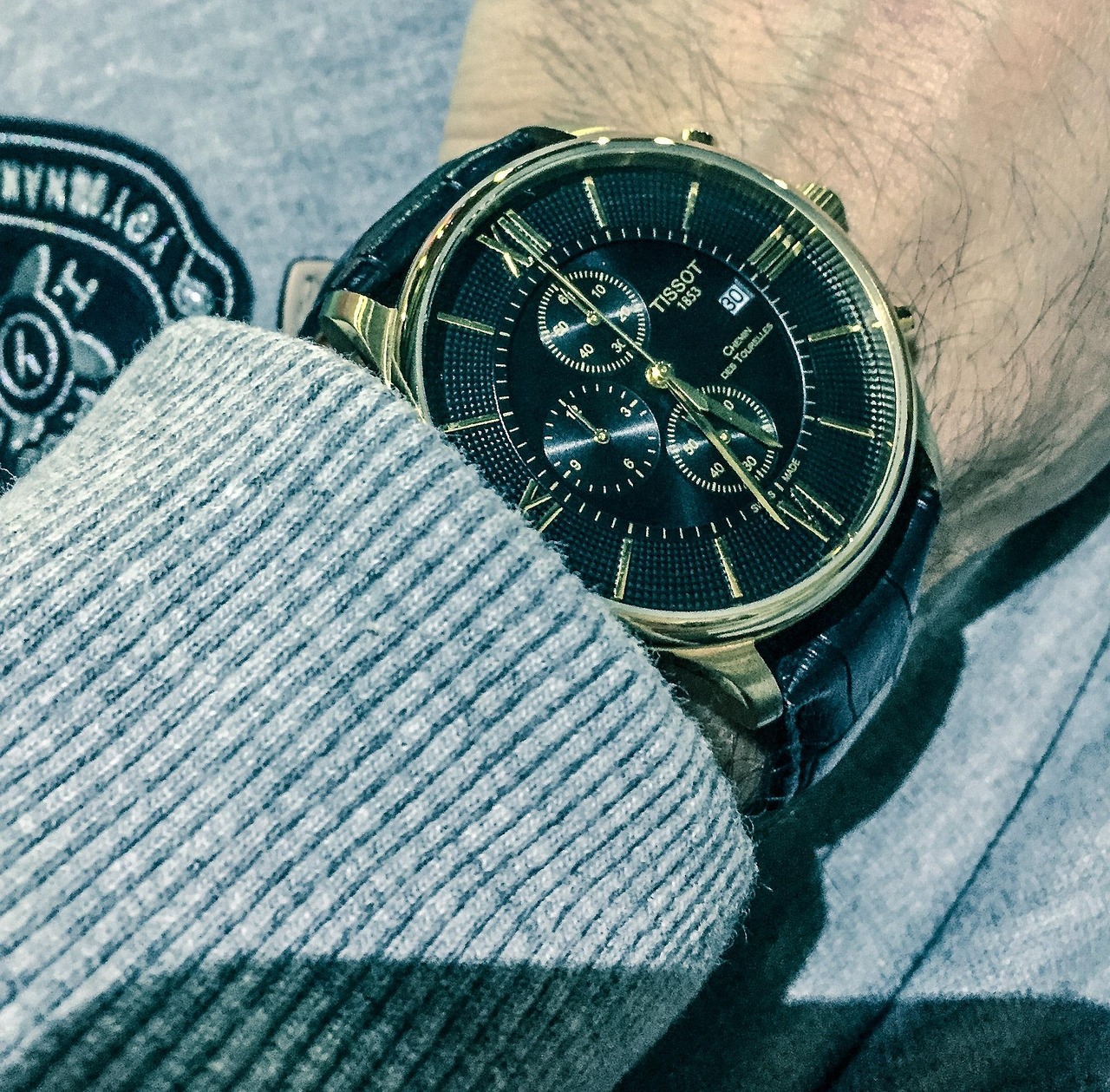
The Tissot logo is the brand name set in clean serif capitals with even, generous tracking, frequently accompanied by the small red-and-white plus sign that nods to the Swiss cross and the brand’s “+T” signature. The letterforms are upright and precise, with restrained serifs and balanced proportions that read as refined rather than ornate. It is custom wordmark lettering, not an off-the-shelf font, but it sits comfortably in the classic-serif tradition. The wide letter-spacing gives the mark an open, premium feel, while the plus accent adds a distinctive, ownable detail that ties the brand to Swiss heritage and reliability.
What is Tissot’s brand typeface?
Across its catalogs, website, and advertising, Tissot pairs its serif wordmark with clean, legible supporting type — often a neutral sans-serif for product specs and body copy, with serif or tracked-cap treatments reserved for headlines. The company has not released an official corporate font, so any single name should be read as an estimate rather than confirmed fact. The consistent direction is precision and clarity: nothing decorative gets in the way of legibility, which matters for a brand built on accuracy and “official timekeeper” partnerships. The serif-plus-sans pairing balances heritage with modern readability.
Free fonts that look like the Tissot font
You cannot legally reproduce the trademarked wordmark, but its clean, tracked serif look is straightforward to recreate with free, open-license fonts. The table maps each role to a downloadable option.
| Use case | Tissot uses | Free alternative |
|---|---|---|
| Logo / wordmark | Custom tracked serif caps | PT Serif or Cormorant SC |
| Headlines | Refined serif or tracked sans | PT Serif / Source Sans 3 |
| Body / dial | Clean neutral sans | Source Sans 3 or Inter |
PT Serif gives you the upright, refined serif character with the legibility Tissot favors; set it in caps with wide tracking to approach the wordmark feel. For specs and body copy, a neutral sans like Source Sans 3 mirrors the brand’s clean supporting type. Explore more refined serif options in our best serif fonts guide, and compare another Swiss watch identity in our Casio font breakdown.
Why does Tissot use this kind of type?
Tissot’s typography is tuned to communicate heritage and precision without slipping into stuffiness. A clean, tracked serif signals tradition and Swiss craftsmanship, while the wide spacing keeps the mark feeling open, modern, and premium rather than antique. The plus-sign accent reinforces the Swiss-cross association and gives the brand an instantly recognizable detail across its sporty and dress collections alike. By pairing the serif wordmark with neutral sans body type, Tissot keeps technical information crisp and trustworthy — essential for a company whose reputation rests on accurate timekeeping and value. The overall effect is approachable luxury: refined, reliable, and unpretentious.
Can I use the Tissot font for my own project?
No. The Tissot wordmark and its plus-sign device are registered trademarks, so reproducing them — even via a lookalike font — for your own branding can create legal exposure. You are free to adopt the style, though: choose a licensed serif like PT Serif, set it in caps with wide tracking, and build an original identity that feels precise and premium. Always verify commercial-use rights before downloading; our font licensing guide covers desktop, web, and embedding permissions. Because the look relies on common serif and sans families, you have plenty of safe, free options.
Frequently Asked Questions
What is the plus sign in the Tissot logo?
The small red-and-white plus sign accompanying the Tissot wordmark references the Swiss cross, signaling the brand’s “Swiss made” heritage and reliability. It functions as an ownable brand device alongside the lettering and appears consistently across Tissot’s product lines, packaging, and marketing materials.
What free font looks most like Tissot?
PT Serif is the closest free match for the clean, refined serif feel of the Tissot wordmark. Set it in capitals with generous letter-spacing to approximate the look. It is free on Google Fonts and licensed for commercial use, making it a safe foundation for a Tissot-inspired design.
Is the Tissot logo a serif or sans-serif?
The wordmark is a serif set in tracked capitals, giving it a heritage, precise character. Supporting text and product specifications, however, often use a clean neutral sans-serif for legibility. This serif-plus-sans pairing balances tradition with modern readability across Tissot’s catalogs and website.
Can I download the official Tissot font?
No. The wordmark is bespoke, trademarked lettering and is not sold as a typeface. Any file online claiming to be the official Tissot font is an unofficial recreation, and using it for commercial branding risks infringement. Use legitimate alternatives like PT Serif or Cormorant SC instead.
What font pairs well with a Tissot-style serif?
Pair a tracked serif like PT Serif for headlines with a neutral sans such as Source Sans 3 or Inter for body and specifications. This mirrors Tissot’s own approach, keeping headlines refined while technical text stays crisp and legible. Use wide tracking on the caps to maintain a premium, precise feel.


