What Font Does Panasonic Use?
If you have ever stared at a Panasonic television, a microwave, or a pair of earbuds and wondered about the typography, you are not alone. The panasonic font question comes up constantly because the brand’s lettering looks deceptively simple, yet it is hard to match exactly. Panasonic is one of the most recognizable names in consumer electronics, so its type choices are deliberate. Below we break down the logo wordmark, the broader brand typeface, and the free fonts that get you closest. For more brand breakdowns, see our famous brand fonts hub.
What font is the Panasonic logo?
The Panasonic logo is a custom wordmark rather than a font you can download. Rendered in the company’s signature blue, the letters use a clean, geometric-leaning sans-serif structure with even stroke weights and open, friendly counters. The letterforms have been refined over decades, with the current mark prioritizing legibility at small sizes and a calm, corporate confidence. Like most major electronics brands, the wordmark has been drawn and trademarked specifically for Panasonic, so the spacing, the slightly humanist terminals, and the proportions are bespoke. You will not find an exact downloadable file labeled “Panasonic,” and that is by design.
What is Panasonic’s brand typeface?
Beyond the logo, Panasonic is reported to use a proprietary type family commonly referred to as Panasonic Sans for headlines, packaging, and digital interfaces. From what is publicly visible, it reads as a modern humanist sans-serif: clean but warm, with generous spacing and a neutral tone that supports the brand’s “A Better Life, A Better World” positioning. We hedge here because Panasonic does not publish its full typographic system for outside use, and regional campaigns may vary. What stays consistent is the overall feel: approachable, modern, and unmistakably corporate without feeling cold.
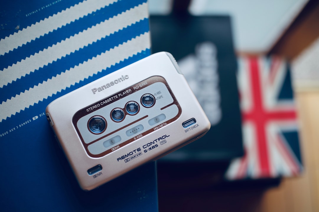
It is worth noting how the system holds together across very different contexts. The same humanist sans tone has to work on a remote control’s tiny printed labels, on a flat-screen TV’s on-screen menu, on glossy retail packaging, and across Panasonic’s business-to-business divisions in avionics and automotive. A proprietary family lets the brand fine-tune things off-the-shelf fonts cannot guarantee, such as multilingual coverage, consistent number shapes for spec sheets, and optical sizing that stays crisp at very small point sizes. That investment is why the lettering feels so unified even when you encounter it on wildly different products.
Free fonts that look like the Panasonic font
You cannot legally use the actual brand typeface, but you can recreate the same clean, modern sans-serif mood with high-quality free fonts. The table below maps common use cases to free alternatives that capture the spirit of the Panasonic look.
| Use case | Panasonic uses | Free alternative |
|---|---|---|
| Logo / wordmark | Custom blue wordmark | Inter (tightened, medium weight) |
| Headlines | Panasonic Sans (reported) | Source Sans 3 Semibold |
| Body / UI | Humanist corporate sans | Roboto or Inter Regular |
For more options in this category, our roundup of the best sans-serif fonts covers each of these in depth.
Why does Panasonic use this kind of type?
A clean humanist sans-serif is a strategic choice for a global electronics company. Panasonic sells everything from batteries to home appliances to broadcast equipment, often in dozens of languages, so the typeface has to be neutral, highly legible, and consistent across scripts and screen sizes. A modern sans communicates engineering precision and reliability while staying friendly enough for a kitchen appliance shelf. The blue color reinforces trust and calm. This is the same logic that drives many tech and appliance brands toward unfussy grotesques and humanist sans families rather than expressive display type.
There is also a heritage angle. Panasonic has unified several legacy sub-brands under a single name over the years, and a consistent, neutral typeface is one of the quiet tools that makes a sprawling portfolio feel like one company. When every product, manual, and ad shares the same calm letterforms, customers perceive coherence and dependability even without consciously noticing the type. That is the real job of corporate typography: to be invisible enough to disappear, yet consistent enough to build trust over decades.
Can I use the Panasonic font for my own project?
No. The Panasonic wordmark and any proprietary brand typeface are protected by trademark and licensing, so you should not reproduce the logo or pass off a lookalike as the official mark. For your own work, use one of the free alternatives above, which carry open licenses suitable for commercial projects. If you are unsure what you can and cannot do with a given typeface, read our font licensing guide before you ship anything client-facing.
Frequently Asked Questions
Is the Panasonic font free to download?
No. The Panasonic logo is custom lettering, and the brand typeface (reported as Panasonic Sans) is proprietary and not distributed publicly. To get a similar look for free, use Inter, Source Sans 3, or Roboto, all of which are open-licensed and free for commercial use.
What font is closest to the Panasonic logo?
Inter at a medium weight, with slightly tightened spacing, is the closest free match to the Panasonic wordmark’s clean, modern feel. Source Sans 3 is another strong option if you want a touch more warmth in the letterforms for headlines and packaging.
Is the Panasonic logo a serif or sans-serif?
It is a sans-serif. The wordmark uses clean, even strokes with no serifs, leaning toward a humanist or geometric sans structure. This gives it the calm, engineered, corporate look you see on Panasonic televisions, appliances, and packaging worldwide.
What color is the Panasonic font?
The Panasonic wordmark is rendered in a distinctive corporate blue. The blue reinforces trust and dependability, which suits a brand selling electronics and home appliances. On dark backgrounds or product surfaces, the mark may appear in white, but blue is the primary brand color.
Can I use Inter instead of the Panasonic font?
Yes. Inter is free and open-licensed for personal and commercial use, making it a safe substitute for the Panasonic look. Just avoid copying the actual Panasonic logo or implying official affiliation. Use Inter to evoke a similar clean, modern sans aesthetic in your own designs.


