What Font Does The Simpsons Use?
The springy, sky-and-clouds title sequence of America’s longest-running sitcom has one of the most copied wordmarks in television. If you came looking for the the simpsons font, the good news is that — unusually — there is a well-known free font that nails it. Below we cover the original lettering, the famous Akbar download, and how to build that Springfield bounce yourself. For more iconic wordmark breakdowns, see our famous brand fonts hub.
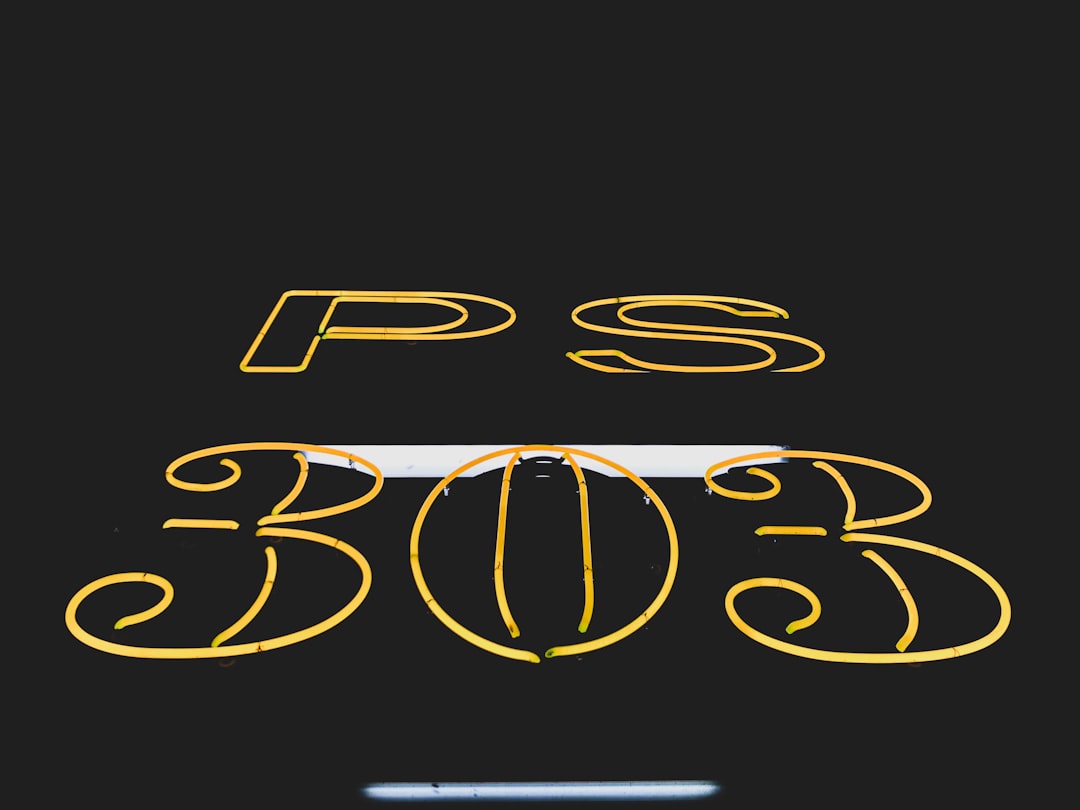
What font is The Simpsons logo?
The Simpsons logo is custom hand-lettering drawn for the show, not a commercial typeface. Its personality comes from cheerful imperfection: the letters bounce up and down along an uneven baseline, the strokes have a soft, rounded, cartoon weight, and the whole word “SIMPSONS” arcs and wobbles like something doodled rather than typeset. It is set in bright yellow with a red or black outline, matching the family’s skin tone and the show’s pop palette. The bouncy, off-kilter quality is the entire point — it telegraphs comedy, warmth, and a refusal to take itself seriously before a single joke lands. The lettering has barely changed since 1989, which is part of why it reads as instantly nostalgic: where most networks have rebranded their flagship comedies several times over, the Simpsons wordmark has stayed remarkably constant, becoming one of the most stable type marks in television history. That consistency turns the wobble itself into a logo — viewers recognize the shape of the bounce as much as the letters.
Is there a free Simpsons font?
Yes, and it is one of the most successful fan fonts ever made. Akbar, created by Nathan Scott Brown and frequently shared as “Simpsonfont,” is a free typeface built to imitate the show’s wobbly hand-drawn capitals. Type a word in Akbar, color it yellow, add a red outline, and you instantly get the Springfield look. It is the go-to choice for fan sites, party invitations, and parody graphics, and it has been freely available for personal use for decades. Because it is so closely tied to the show, treat it as fan-use rather than something to slap on commercial merchandise. To match the original most closely, set Akbar in all caps, give it a slight arch so the word curves like the title sequence, and add that signature red or black outline around the yellow fill — the outline is what sells the cartoon depth. A few variant Akbar files float around online with subtly different spacing, so if your first download feels off, try another version before assuming the font is wrong.
Free fonts that look like The Simpsons font
Akbar is the headline answer, but a couple of free pairings round out a full Simpsons-style layout for supporting and body text.
| Use case | The Simpsons uses | Free alternative |
|---|---|---|
| Logo / title | Custom bouncy hand-drawn cartoon caps | Akbar / “Simpsonfont” (free, the direct match) |
| Marketing / credits | Friendly rounded display | Chewy, Bangers, or Luckiest Guy (free, Google Fonts) |
| Body | Clean, approachable sans | Nunito or Quicksand (free) |
Want more playful display options in this vein? Our roundup of the best bubble fonts collects free rounded, cartoony faces that pair beautifully with Akbar.
Why does The Simpsons use this kind of type?
A wobbly, hand-drawn title does exactly what an animated comedy needs: it signals that nothing here is serious. The uneven baseline and soft, rounded strokes feel hand-made and inviting, echoing the show’s cartoon world and its everyman heart. Bright yellow ties the logo directly to the characters’ skin, making the brand instantly ownable. A crisp, mechanical font would have felt corporate and cold; the bounce keeps it warm, anarchic, and unmistakably cartoon. It is friendliness and irreverence baked into the letterforms.
Can I use The Simpsons font for my own project?
Akbar is free to download and fine for personal and fan projects, but the Simpsons name, the specific logo, and the characters are trademarked by Disney/20th Television. That means you should not use the lettering on merchandise, sell it, or imply official endorsement. Keep it to personal parody and fan art, and check Akbar’s individual terms before any commercial use. Our font licensing guide walks through the gap between a free font and a protected brand, and you can compare another animated wordmark in our SpongeBob font guide.
Frequently Asked Questions
What is the actual Simpsons font called?
The on-screen logo is custom hand-lettering with no official font name. The closest free download is Akbar by Nathan Scott Brown, widely shared as “Simpsonfont,” which recreates the title’s bouncy, wobbly cartoon capitals and is the typeface most people mean when they ask about the Simpsons font.
Where can I download the Simpsons font for free?
Akbar is freely available on most major free font sites under its own name or as “Simpsonfont.” Download it, set your text in yellow with a red outline, and you will reproduce the Springfield look. It is intended for personal and fan use, so avoid commercial merchandise.
What font goes with the Simpsons style?
For supporting text, pair Akbar with a friendly rounded display like Chewy, Bangers, or Luckiest Guy, and use a soft sans such as Nunito or Quicksand for body copy. These free faces keep the playful, cartoon energy without competing with the wobbly title.
Why is the Simpsons logo yellow?
The yellow matches the characters’ distinctive skin color, instantly linking the wordmark to the family and making the brand uniquely recognizable. Paired with a red or black outline, the bright yellow reads as cheerful and cartoonish, reinforcing the show’s comedic, anything-goes tone.
Is the Simpsons font hand-drawn?
Yes. The original logo is genuinely hand-lettered, which is why the letters bounce along an uneven baseline and have soft, irregular strokes. Akbar imitates that hand-drawn wobble in a usable digital font, but the source mark itself was drawn by hand for the show.


