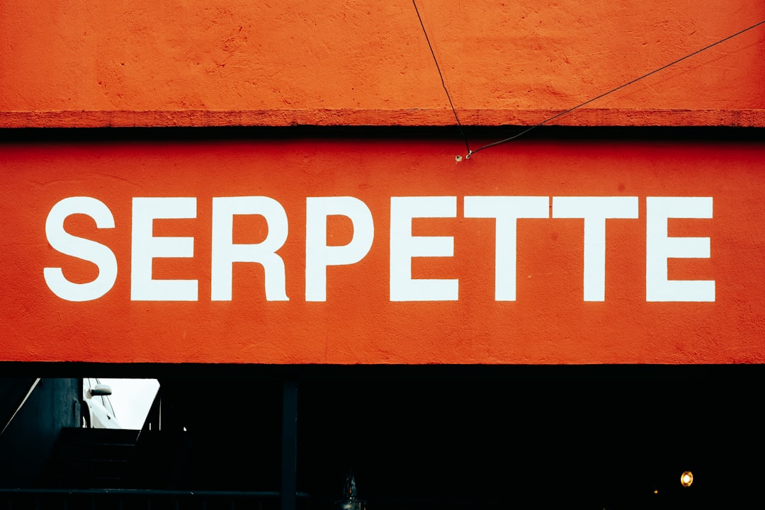
What Font Does Predator Use?
If you’re after the Predator font, you want that heavy, beaten-up title from the posters — thick letters with a gritty, military, jungle-warfare attitude. The honest answer is that the official mark is custom display lettering, so any “exact font” claim is an informed observation, not a confirmed spec. Below are the free fan recreation and the best heavy distressed alternatives to match the look.
The franchise is a great example of weight and texture signalling raw threat. For more on how studios build identity from custom lettering, see our hub on famous brand fonts and what the big logos use.
What font is the Predator logo?
The Predator logo is a custom heavy display — thick, blunt letterforms with a weathered, military-stencil character that fits the franchise’s jungle and combat setting. The official mark often carries a metallic or distressed finish and sometimes the creature’s tri-laser or mandible motif, all of which are artwork rather than parts of a font. Because the mark is bespoke and trademarked, a lookalike font matches the aggression without granting any right to the official logo. Treat the specifics as an informed observation, not a confirmed spec.
What typeface is used in the Predator franchise?
From the 1987 original through Predator 2, Predators, The Predator, and Prey, the title identity leans on heavy, distressed, military-flavored designs rather than one publicly sold family — each entry adjusts the weathering and finish while keeping that blunt, dangerous weight. Marketing, credits, and merchandise follow suit. So when people ask about “the Predator font,” they mean that heavy combat-edged wordmark, which is exactly what the free fan recreation imitates.
Free fonts that look like the Predator font
You can’t download the official mark, but a free fan font named “Predator” on DaFont recreates the heavy letterforms, and several legitimate distressed and stencil faces stand in well. Here’s a practical breakdown by use case.
| Use case | Predator uses | Free alternative |
|---|---|---|
| Logo / title wordmark | Custom heavy display | Fan Predator font (DaFont, personal use) |
| Military stencil headline | Blunt stencil display | Black Ops One or Stardos Stencil (Google Fonts) |
| Heavy distressed label | Weathered slab / grunge | Special Elite with a grunge texture (Google Fonts) |
Download only from reputable directories and read the bundled license. The fan font and the Google alternatives give you the heavy or stencil letterforms; you add the metallic finish, distress texture, and any laser or mandible motif yourself in your design tool.
Why does Predator use this kind of type?
Predator is a story about an elite hunter stalking soldiers through brutal terrain, and the typography has to telegraph raw physical threat the instant you see it. Heavy, blunt letterforms feel powerful and immovable — the visual equivalent of muscle and firepower — while a military stencil edge ties the title directly to the commandos and combat zones at the heart of the franchise. The weathered, distressed finish suggests survival, sweat, and damage, hinting that this is dangerous ground where things get torn apart. Building the mark from custom lettering let the studio tune that aggression and integrate the creature’s signature laser or mandible cues without diluting the weight. Those finishes and motifs are artwork, which is why fan recreations match the letter shapes but never quite capture the full poster — the menace lives in the texture and metallic styling you assemble in your design tool, not in the font alone. A heavy free stencil plus a grunge overlay gets you convincingly close.
How do I recreate the Predator title look?
The Predator look is about weight and damage, so start heavy and rough it up. Set your text in the fan “Predator” font or a blunt stencil like Black Ops One or Stardos Stencil, in all caps, with maximum boldness. Then build the combat finish:
- Apply a dark metallic or gunmetal gradient so the letters read like worn steel or military hardware.
- Overlay a grunge, scratch, or distress texture to add sweat, dirt, and battle damage to the surface.
- Keep the letterforms thick and stable — the weight is what communicates raw physical threat — and avoid anything thin or elegant.
- If you want the creature cue, add a subtle red tri-laser dot motif or a faint mandible silhouette as an accent, kept clearly your own.
For supporting text, a weathered typewriter face like Special Elite with a grunge overlay reinforces the field-report, military feel. Because the metallic finish and distress are effects rather than font features, a free heavy stencil plus these treatments gets you convincingly close to the franchise’s brutal title.
Can I use the Predator font for my own project?
You can use a heavy distressed or stencil font to capture the combat vibe, but keep two things separate. First, the fan “Predator” font is usually personal-use only — fine for fan art, not for anything you sell. Second, even a fully licensed stencil typeface gives you no right to the trademarked Predator logo or franchise branding, owned by 20th Century Studios / Disney. You can build a convincing heavy military title that feels like the films, as long as it stays distinct from the official mark and doesn’t imply affiliation. For commercial work, start with our font licensing guide.
Comparing sci-fi creature title styles? See the eroded geometric look in our Alien font guide and the wide spy-tech lettering in the Mission: Impossible font breakdown.
Frequently Asked Questions
What font does the Predator logo use?
The Predator logo uses a custom heavy display with a weathered, military-stencil character, not a public retail font. Treat any exact-font claim as an informed observation. A free fan font named “Predator” on DaFont recreates the look; the metallic finish, distress, and creature motifs are separate artwork.
Is there a free Predator font?
Yes — a fan-made font called “Predator” on DaFont imitates the heavy letterforms for free, typically under a personal-use license. For an alternative without a fan font, Black Ops One or Stardos Stencil on Google Fonts deliver the same blunt military-stencil look that you can finish with a grunge texture.
What font is used in the Prey movie?
Prey keeps the franchise’s heavy, distressed military identity, built from custom lettering rather than one sold typeface, so treat any exact-font claim as an informed observation. Each entry adjusts the weathering and finish while preserving the blunt, dangerous weight and combat-edged character of the original Predator title.
Can I use the Predator font commercially?
Generally no. The fan font is usually personal-use only, and even a licensed stencil lookalike grants no rights to the trademarked Predator logo or franchise branding. For anything you sell, use a clearly licensed font, keep your design distinct from the official mark, and avoid implying affiliation.


