Additive vs Subtractive Color: How Color Mixing Works
Every color you see in the world is produced by one of two fundamental systems: additive color or subtractive color. Understanding additive vs subtractive color is essential for anyone who works in design, photography, printing, or any visual medium. These two systems explain why your computer screen and your printed poster use completely different primary colors — and why colors that look perfect on screen can shift dramatically in print.
Additive color mixing works with light. It starts with darkness and adds colored light to create brighter colors, using red, green, and blue (RGB) as primaries. Subtractive color mixing works with pigment or ink. It starts with white light and removes wavelengths through absorption, using cyan, magenta, and yellow (CMY) as primaries. Both systems produce a full range of colors, but they do so through opposite physical processes.
What Is Additive Color?
Additive color is the system used by any device that emits light — screens, monitors, projectors, LED displays, and stage lighting. It is called “additive” because you create colors by adding different wavelengths of light together. The more light you add, the brighter and closer to white the result becomes.
The three primary colors of additive mixing are red, green, and blue — the familiar RGB model. When you combine these three at full intensity, you get white light. When none are present, you get black (the absence of light). The secondary colors in this system are:
- Red + Green = Yellow
- Red + Blue = Magenta
- Green + Blue = Cyan
This is why every pixel on your phone, laptop, or television is made up of tiny red, green, and blue sub-pixels. By varying the intensity of each sub-pixel, your screen can produce millions of distinct colors. A bright yellow on your screen is not produced by yellow light — it is produced by red and green sub-pixels firing at high intensity while the blue sub-pixel stays dark.
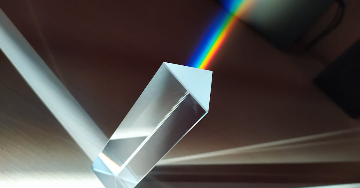
Additive color explains many everyday phenomena. White sunlight is the combination of all visible wavelengths. A rainbow splits that white light into its component colors. And the color wheel used in digital design is built on additive principles, with RGB at its core.
Where Additive Color Is Used
- Computer monitors and laptop screens
- Smartphones and tablets
- Television displays
- Digital projectors
- LED and stage lighting
- Video production and editing
- Web design and UI design
What Is Subtractive Color?
Subtractive color is the system used in printing, painting, and any medium that relies on pigments, inks, or dyes applied to a surface. It is called “subtractive” because pigments work by absorbing (subtracting) certain wavelengths of light and reflecting the rest back to your eyes. The more pigment you layer, the more light is absorbed, and the result moves toward darkness.
The three primary colors of subtractive mixing are cyan, magenta, and yellow — the CMY model. In theory, combining all three at full saturation should produce black. In practice, the result is a muddy dark brown, which is why the printing industry adds a dedicated black ink (K) to create the CMYK system. The secondary colors in subtractive mixing are:
- Cyan + Magenta = Blue
- Cyan + Yellow = Green
- Magenta + Yellow = Red
Notice something important: the secondary colors of subtractive mixing are the primary colors of additive mixing, and vice versa. This reciprocal relationship is fundamental to how both systems connect.
Where Subtractive Color Is Used
- Commercial printing (brochures, books, packaging)
- Home and office inkjet and laser printers
- Traditional painting (watercolor, oil, acrylic)
- Textile dyeing and fabric printing
- Photography (film development)
- Any medium involving physical pigments on a surface
Key Differences
Understanding the core differences between additive vs subtractive color mixing helps prevent costly design mistakes and ensures your work looks as intended across every medium.
Starting point. Additive color starts with black (no light) and adds light to create color. Subtractive color starts with white (full light reflecting off paper or canvas) and removes light through pigment absorption.
Primary colors. Additive primaries are red, green, and blue (RGB). Subtractive primaries are cyan, magenta, and yellow (CMY/CMYK).
Combining all primaries. In additive mixing, combining all primaries produces white. In subtractive mixing, combining all primaries produces black (or near-black).
Color gamut. RGB has a wider gamut than CMYK, meaning screens can display colors that printing physically cannot reproduce. This is why vibrant neon greens and electric blues often look duller in print — those colors fall outside the CMYK gamut.
Medium. Additive color is for screens and light-based media. Subtractive color is for print and pigment-based media. Choosing the right color mode for your project is a foundational graphic design principle.
How This Affects Design Work
The practical implications of additive color vs subtractive color hit every designer at some point — usually the first time a vibrant on-screen design looks flat and dull on a printed proof.
Designing for Screen
When designing for digital — websites, apps, social media, presentations — you work in RGB. Your design software should be set to RGB color mode, and you can take advantage of the full additive gamut. Bright, saturated colors that would be impossible to print can shine on screen. Understanding warm vs cool colors in the RGB space helps you create designs that feel dynamic on digital displays.
Designing for Print
When designing for print, you must work in CMYK or at minimum convert to CMYK before sending files to the printer. Colors that look electric on screen — particularly bright blues, vivid greens, and saturated oranges — will shift when converted. Professional designers learn to soft-proof their work, previewing how CMYK output will look before committing to a print run.
Some design projects span both mediums. A brand might need a logo that works on screen and in print. In these cases, you define color values in both systems: an RGB hex code for digital use and a CMYK breakdown (or Pantone match) for print. Strong brand identity systems always include specifications for both.
Understanding Color Behavior
Knowing whether you are working in additive or subtractive color also changes how you think about mixing and color harmony. On screen, adding colors moves toward white. In paint or ink, adding colors moves toward black. This affects every decision from choosing highlight tones to building complex complementary color palettes.
Frequently Asked Questions
Why are the primary colors different for light and paint?
Because light and pigment create color through opposite physical processes. Light works by emission (adding wavelengths together), so its primaries are red, green, and blue. Pigment works by absorption (removing wavelengths), so its primaries are cyan, magenta, and yellow. Each system’s primaries are the other system’s secondaries.
Can I use RGB colors for a print project?
You should not send RGB files directly to a commercial printer. RGB has a wider color gamut than CMYK, so some RGB colors cannot be accurately reproduced in print. Always convert your design to CMYK before printing, and review the soft proof to check for any unacceptable color shifts. For more detail on conversion, see our guide on CMYK vs RGB.
What happens when you mix all colors of light together?
When you combine red, green, and blue light at full intensity, you get white light. This is additive mixing in action — adding all visible wavelengths together produces the full spectrum, which the human eye perceives as white.
Why does CMYK use a separate black ink?
In theory, mixing cyan, magenta, and yellow at full strength should produce black. In practice, ink impurities and paper absorption mean the result is a muddy dark brown. Adding a dedicated black (K) ink produces true, deep blacks, saves colored ink, and improves text sharpness. The “K” stands for “key” — the key plate in traditional printing that carried the image detail.


