What Font Does Altered Carbon Use?
If you searched for the altered carbon font, you probably want to recreate that hard-edged, neon-soaked title card from Netflix’s adaptation of Richard K. Morgan’s cyberpunk novel. The short version: there is no retail typeface called “Altered Carbon.” The wordmark is bespoke lettering built for the show. Below we break down what the logo actually is, what the series likely uses on screen, and which free fonts get you closest without copying a trademark.
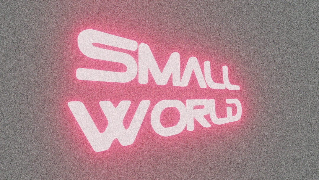
What font is the Altered Carbon logo?
The Altered Carbon logo is custom artwork. The wordmark is built from sharp, angular capitals with clean, precise strokes and a cold, technical edge, lettering engineered to sit comfortably under neon and behind rain. It feels machined and futuristic, with just enough hardness to read as cyberpunk rather than generic sci-fi.
That sharpness is the signature. The design leans into a dystopian, high-tech-low-life aesthetic: clipped terminals, tight geometry, and a surface that suits glowing, high-contrast treatments. It is the kind of mark that looks right glowing above a Bay City street, equal parts corporate and criminal.
Because the mark is hand-built, any claim that the logo “is” a specific commercial font is unreliable. Treat such claims as an informed observation, not a confirmed spec.
What typeface is used in the show?
On screen, Altered Carbon splits its type into two jobs. The title card uses the custom angular wordmark. The functional type, stack readouts, location cards, corporate branding, and interface text, leans on clean, technical sans-serifs so the layered, neon-drenched future reads as believable and legible.
Netflix has never published an official type spec sheet for the series, so the exact families used in titles and graphics are not publicly confirmed. What you can rely on practically is the contrast pattern: a sharp, cyberpunk wordmark for the brand, and plain technical grotesques and monospaced faces for the holographic interfaces and HUDs that fill the world.
Free fonts that look like the Altered Carbon font
You cannot download the official wordmark, but you can get a convincing tribute. The goal is sharp, angular, techno capitals you can light up with neon. A few good free starting points:
- Orbitron — a free Google Fonts geometric techno face with the futuristic, machined capitals that suit a cyberpunk title.
- Chakra Petch — a free squarish techno sans with the clipped, hard-edged character the wordmark leans on.
- Audiowide — a free display face with a sleek, chrome-and-circuit feel that takes a neon glow well.
Set your chosen face in capitals, add a tight cyan or magenta neon glow, and stage it against a dark, wet, high-contrast background to sell the dystopian mood.
| Use case | Altered Carbon uses | Free alternative |
|---|---|---|
| Main logo / title card | Custom sharp angular lettering | Orbitron or Audiowide + neon glow |
| Stack / tech labels | Technical squarish caps | Chakra Petch (Google Fonts) |
| Holo UI / readouts | Clean technical sans (unconfirmed) | Rajdhani or IBM Plex Mono |
| Body / subtitles | Neutral grotesque | Inter or Roboto (Google Fonts) |
For more neon and circuit-board display picks, our roundup of the best gaming fonts covers techno faces that suit cyberpunk titles and overlays.
Why does Altered Carbon use this kind of type?
Altered Carbon is pure cyberpunk: digitized consciousness, corporate immortality, neon over decay. The branding has to telegraph that high-tech, dystopian edge instantly. Sharp, angular, machined lettering communicates a cold future where bodies are hardware and identity is data, the perfect surface for glowing, high-contrast treatments.
The hard geometry also reads well at a glance in a busy, luminous environment, which matters for a show defined by its dense, neon cityscapes. Crisp, angular letterforms hold their shape even when they are glowing, doubled by reflections, or half-lost in rain, exactly the conditions the cinematography keeps putting the title under. This is a deliberate genre choice, and it is part of a long cyberpunk visual tradition that prizes high-contrast, machine-cut type over anything soft or humanist. For a different, more clinical flavor of near-future type, compare the minimalist restraint of the Devs font, where a quiet tech-thriller signals control rather than chaos.
Can I use the Altered Carbon font for my own project?
Here is the important split. The Altered Carbon wordmark, the specific logo lettering and the title itself, is owned by Netflix and the rights holders of the source novel. You cannot use it to brand a product, sell merchandise, or imply an official association. That is a trademark issue, separate from any font file.
The free look-alike fonts are a different matter. Faces like Orbitron, Chakra Petch, and Audiowide ship under open licenses (SIL Open Font License) that allow commercial use. So you can build an Altered Carbon-style neon title for fan art, a personal cyberpunk project, or a mood board using freely licensed type. What you cannot do is reproduce the actual wordmark and present it as your own brand.
When in doubt, separate the two questions: is the font file licensed for my use, and am I implying an official brand connection? For a deeper walkthrough of that distinction, see our font licensing guide. And if you want a more grounded, industrial sci-fi feel instead of neon, compare the The Expanse font.
Frequently Asked Questions
Is there an official Altered Carbon font I can download?
No. The Altered Carbon logo is custom-drawn lettering created for Netflix, not a released typeface. There is no official font file to download. The closest route is building your own with a sharp free techno face like Orbitron and adding a neon glow to match the cyberpunk treatment.
What font is closest to the Altered Carbon logo?
A sharp, angular techno display face gets closest. Free options like Orbitron or Audiowide give you the machined, futuristic capitals; add a tight neon glow and a dark, high-contrast background to approximate the cyberpunk look without copying the actual wordmark.
Can I use an Altered Carbon-style font commercially?
You can use freely licensed look-alike fonts commercially if their license allows it, such as OFL faces. You cannot use the actual Altered Carbon wordmark or title commercially, since those are protected by Netflix and the source rights holders. Always separate the font license from the trademark question.
What font does Altered Carbon use for its interfaces?
Netflix has not published the exact families, so any specific answer is unconfirmed. In practice the holographic UIs rely on clean, technical sans-serif and monospaced fonts for a high-tech feel. Free faces like Rajdhani or IBM Plex Mono reproduce that cyberpunk interface look for fan projects.


