What Font Does Antz Use?
If you searched for the antz font hoping to download it and recreate the title, you have probably found that nothing in your font menu lines up. The lettering on the poster was custom artwork built for one film, not a retail typeface. In this guide we explain what the wordmark really is, point you to the closest free heavy fonts you can download, and show how to use them legally. Treat this as an informed observation from a typographer’s view, not a confirmed studio spec sheet.
What font is the Antz logo?
The Antz wordmark is bold and chunky with a gritty-yet-fun attitude that suits a film mixing big-studio comedy with a slightly edgier, more grown-up tone. The letters carry heavy weight and a confident, graphic presence, often anchored by that stylized “Z” ending. No standard retail font ships exactly like this, the classic sign of a custom logo drawn specifically for the brand.
When fans ask which font was used, the honest answer is that a logo like this typically begins from a heavy bold display base and is then customized: weight pushed, edges shaped, spacing balanced for poster impact, and color applied for a punchy finish. So you can get close, but the identical wordmark is not downloadable. Any “Antz font” file online is a fan re-creation rather than the genuine artwork.
What typeface is used in the film?
Across the movie’s credits and supporting materials, text generally uses cleaner, more readable faces than the bold hero logo. That division is standard in animation: a strong custom wordmark carries the title, while a calmer, legible typeface handles credits, taglines, and body copy. The heavy hero treatment is built for impact, not for long passages of text.
To channel the film’s bold, slightly gritty energy rather than copy it exactly, work in two layers. For headlines, reach for a heavy bold display face with character. For supporting text, pair it with a clean sans-serif so the layout stays crisp. That mirrors how the studio reserved the dramatic treatment for the title alone.
Free fonts that look like the Antz font
The exact wordmark is not available for free, but several free or open display fonts capture the heavy, bold, gritty-yet-fun character. Choose the bold display base first, then refine edges and color for that punchy feel. Useful directions include:
- Anton or Archivo Black for tight, heavy, confident headline letters.
- Bungee when you want a blocky, graphic, poster-style weight.
- A clean grotesque sans for supporting text so the headline carries the impact.
| Use case | Antz uses | Free alternative |
|---|---|---|
| Main title / hero | Custom heavy bold lettering | Anton or Archivo Black |
| Graphic subhead | Custom display variant | Bungee |
| Body / captions | Clean companion sans | Inter or Work Sans |
| Gritty finish | Hand-applied texture and color | Add manually as artwork |
To approximate the look, set your word in a heavy bold font, keep the spacing confident, and add a subtle texture or shadow for a touch of grit. That layered approach matches the feel far better than any single download.
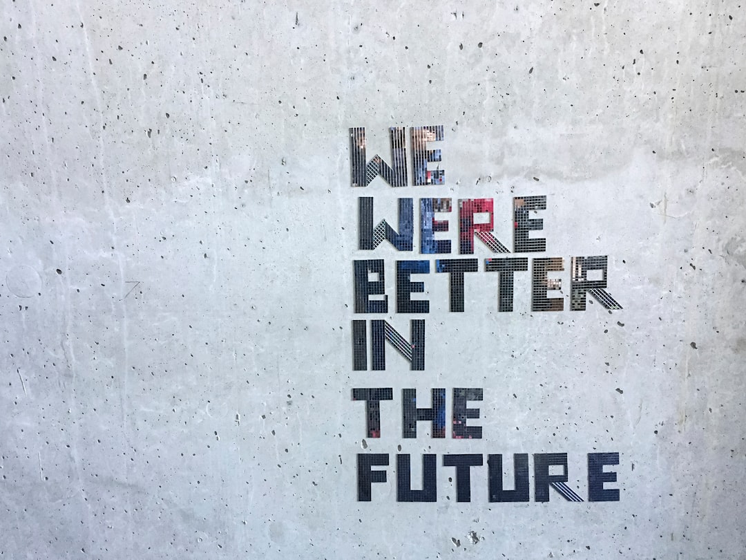
Pay attention to the final letter when you build a word ending in a strong character. In the original mark, the closing letter carries extra visual weight and personality, anchoring the wordmark and giving it a memorable silhouette. You can borrow that idea by letting the last letter of your own title run slightly bolder, taller, or more stylized than the rest, as long as the whole word still reads as a unit. A confident endpoint makes a logo feel finished. Just keep the grit restrained, because too much texture on heavy letters quickly turns into noise at smaller sizes.
Why does Antz use this kind of type?
A film that blends mainstream comedy with a more mature, slightly gritty sensibility needs a logo that signals both fun and edge. Heavy bold letters communicate confidence and energy, while small texture and color choices add the grit that hints at the film’s deeper themes. The weight also keeps the title legible when shrunk to a poster thumbnail or DVD spine.
Balancing boldness with a hint of edge is a deliberate branding move that sets tone before the trailer plays. To see how studios and brands engineer that kind of instant recognition through letterforms, our overview of famous brand fonts walks through the same principles across many well-known marks.
As one of the earliest fully computer-animated features, the film also arrived at a moment when studios were still defining how this new kind of movie should present itself. The logo had to feel modern and confident without leaning on the soft, cuddly cues of traditional family animation, since the story aimed a little older and a little edgier. A heavy, grounded wordmark answered that brief: serious enough to signal ambition, fun enough to stay inviting. That tension between bold and approachable is the takeaway for your own designs. Decide which way you want to lean, then let the weight, texture, and color of your letters carry that tone consistently from the first glance.
Can I use the Antz font for my own project?
The wordmark itself is protected. The Antz logo is tied to its studio and functions as a trademark, so you should avoid reproducing it for commercial work, merchandise, or anything implying official endorsement. That restriction applies to the specific branded artwork, not to bold display fonts in general.
Look-alike fonts are a different story. A free-for-personal-use display font is fine for fan art and study, while a properly licensed font is what you need for client work, products, or anything you sell. Always confirm the actual license, because “free to download” and “free for commercial use” are not the same. Our font licensing guide explains which permissions to check before you ship.
If this bold, characterful lettering appeals to you, you will likely enjoy our breakdowns of the stone-age The Croods font and the corporate-cute Boss Baby font, both built with comparable custom-logo techniques.
Frequently Asked Questions
Is the Antz font free to download?
No. The actual bold wordmark is custom artwork tied to the film’s brand and is not distributed as a typeface. Any file labeled “Antz font” online is a fan re-creation, so always verify its license before using it for anything beyond personal practice or study.
What font is closest to the Antz logo?
A heavy bold display font gets you closest. Try Anton or Archivo Black for tight, confident weight, or Bungee for a blocky graphic feel. Keep the spacing assured and add a subtle texture to capture the gritty-yet-fun character of the title.
Why does the logo feel gritty?
The grit comes from subtle texture and color applied over heavy letterforms as custom artwork, not from any single font. To recreate it, choose a heavy bold base font and add a light texture, shadow, or weathering yourself in your design tool for that edge.
Can I use an Antz look-alike font commercially?
Yes, provided the specific font’s license allows commercial use and you do not recreate the trademarked wordmark or imply official endorsement. Choose a font with clear commercial terms, keep your design original, and you can safely use it for client and product work.


