Aqua vs Turquoise: How to Tell Them Apart
The heart of aqua vs turquoise is which way each color leans and how bright it is. Aqua is a vivid, watery blue-green that is effectively identical to cyan on screen. Turquoise is a touch greener and more muted, carrying the mineral, slightly earthy quality of the gemstone it is named after.
What color is aqua?
Aqua is a light, bright blue-green named after water. In digital color, aqua and cyan share the same representative hex of #00FFFF (RGB 0, 255, 255), so on screen they are the same color. Aqua leans clearly toward blue and reads as fresh, clean, and almost luminous, evoking clear shallow water and tropical pools.
Because it is fully saturated and bright, aqua is energetic and best used as an accent or highlight rather than a large flat fill, where it can become overwhelming. It suits summer, beach, and aquatic themes, and digital interfaces that want a crisp, watery pop.
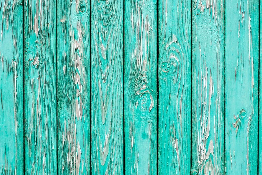
What color is turquoise?
Turquoise is a blue-green named after the opaque mineral, with a representative hex of #40E0D0. Compared with aqua, turquoise is slightly deeper, a little more muted, and leans noticeably more toward green. That mineral undertone gives it a richer, more organic, slightly vintage character.
Turquoise is more versatile than aqua for branding and product use because it is less glaring and more grounded. It carries strong associations with jewelry, the Southwest, and bohemian style, and it pairs well with warm earth tones, coral, and gold.
Aqua vs turquoise: side-by-side comparison
Both are blue-greens, and values vary by source, but these representative specs show the lean and brightness difference.
| Attribute | Aqua | Turquoise |
|---|---|---|
| Hex code | #00FFFF | #40E0D0 |
| RGB | 0, 255, 255 | 64, 224, 208 |
| CMYK (approx) | 100, 0, 0, 0 | 71, 0, 7, 12 |
| Undertone | Bright, leans blue | Muted, leans green |
| Hue family | Light blue-green (cyan) | Mineral blue-green |
| Best used for | Accents, aquatic and summer themes | Branding, jewelry, bohemian palettes |
| Mood / feel | Fresh, bright, watery | Earthy, rich, slightly vintage |
How do you tell aqua and turquoise apart?
Look at two things side by side. First, the direction of the lean: aqua tips toward blue, turquoise tips toward green. Second, brightness and gray content: aqua is luminous and fully saturated, while turquoise is slightly muted with a mineral, earthy quality. If a swatch looks like glowing pool water, it is aqua; if it looks like a polished stone, it is turquoise.
Because both names get used loosely in marketing, the hex code is the only fully reliable guide. To see how turquoise compares with its darker, bluer relative, read our guide to teal vs turquoise, and for the pure-versus-muted dimension of these colors, see cyan vs teal.
Why do aqua and turquoise get confused so often?
Aqua and turquoise both live in the blue-green band of the color wheel, and casual usage treats them as near-synonyms, which is where the confusion starts. Both evoke water, both are cool, and both read as refreshing, so people reach for either name interchangeably. The technical differences are real but narrow: aqua is fully saturated and leans blue, while turquoise is slightly muted and leans green. When colors share a hue family and a set of associations, the brain tends to collapse them into one mental category.
The naming conventions make it worse. “Aqua” comes from web color standards where it is locked to pure cyan, but in fashion and paint it is used loosely for almost any bright blue-green. “Turquoise” is named after a mineral that itself varies widely in color, from greenish to nearly blue, so even the reference object is inconsistent. The result is two words pointing at an overlapping cloud of colors. As with most close pairs, the only precise way to specify either is the hex value, not the label.
What do aqua and turquoise communicate in design?
Aqua communicates freshness, energy, and clarity. Its bright, watery quality reads as clean and lively, which makes it a natural fit for summer campaigns, aquatic and travel branding, fitness, and digital products that want a crisp, modern pop. It feels contemporary and a little energetic, but it rarely feels warm or grounded.
Turquoise communicates something richer and more grounded: creativity, healing, and a touch of bohemian or artisanal character. Its mineral heritage gives it strong ties to jewelry, the American Southwest, and handcrafted aesthetics, so it reads as more earthy and expressive than aqua. Turquoise also carries protective and calming symbolism in many cultures, which adds depth to its use in wellness and spiritual branding. Where aqua is bright and breezy, turquoise is warm-cool and characterful, which is why it tends to be the stronger choice for an identity that needs to feel distinctive rather than merely fresh.
When should you use aqua vs turquoise?
Choose aqua when you want brightness and a clean, watery, energetic feel: summer and beach branding, aquatic and wellness themes, and digital accents that need to pop. Keep it to highlights and smaller areas, since large aqua fills can strain the eye.
Choose turquoise when you want a richer, more grounded blue-green that works at scale: jewelry and fashion, bohemian and Southwestern palettes, and brands that want a distinctive but usable color. It plays especially well with warm accents like coral, terracotta, and gold. For the underlying warm-versus-cool decision, see warm vs cool colors, and compare these light blue-greens with soft true blues in powder blue vs baby blue.
Frequently Asked Questions
Is aqua the same as cyan?
On screen, yes. In web and digital color, aqua and cyan share the exact same hex value of #00FFFF, so they render identically. The names come from different traditions, aqua from water and cyan from printing, but as displayed colors they are interchangeable.
Is turquoise more blue or more green?
Turquoise leans slightly toward green, which is what distinguishes it from aqua and cyan. Its mineral undertone pushes it away from pure blue. The exact balance varies by brand, but compared with aqua, turquoise will almost always look the greener of the two.
What is the difference between turquoise and teal?
Turquoise is lighter, brighter, and leans green, while teal is darker, more muted, and leans blue. Think of turquoise as the vivid, mineral blue-green and teal as the deep, sophisticated one. They share a hue range but differ clearly in brightness and lean.
What colors pair well with turquoise?
Turquoise pairs beautifully with coral, terracotta, warm gold, cream, and brown. For contrast, combine it with its warm complement, a soft orange or rust. These earthy pairings play to its mineral, bohemian associations.
Can I use aqua as a main brand color?
It is risky at full saturation, because bright aqua can feel garish over large areas and strain the eyes. It works best as an accent. If you want a watery blue-green as a primary color, a slightly muted turquoise or teal is usually the more comfortable, scalable choice.


