Balance in Design: Symmetry and Beyond
Balance in design is the distribution of visual weight across a composition so it feels stable instead of lopsided. Every element on a page has weight — pull, gravity, presence — and balance is the art of arranging those pulls so the eye feels the layout is resolved. When balance is off, viewers sense it instantly, even if they can’t name what’s wrong.
Balance is one of the foundational principles of design, and it is less about literal symmetry than most people assume. This guide covers visual weight, the three types of balance, and how to pull off asymmetry — the most useful and most misunderstood form.
What is visual weight?
You can’t balance a composition until you understand visual weight — how much attention an element commands. Weight isn’t physical mass; it’s perceptual pull. Several factors increase it:
- Size. Larger elements weigh more.
- Color. Saturated, warm colors (reds, oranges) feel heavier than muted, cool ones.
- Value. Dark elements weigh more than light ones against a light background.
- Density and detail. A complex, textured element pulls harder than a plain one.
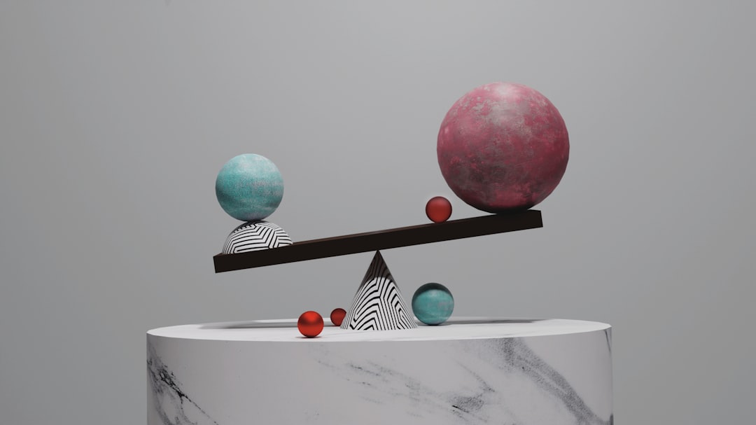
- Position. Elements far from the center exert more leverage, like weight on the end of a seesaw.
- Isolation. An element surrounded by space gains weight from the attention space confers.
Balance is the act of distributing these weights so no part of the page feels like it’s about to tip over. Think of the composition as a scale and your job as keeping it level — or deliberately, knowingly tilting it.
Symmetrical balance: formal and calm
Symmetrical balance mirrors visual weight across a central axis — usually vertical, sometimes horizontal. What’s on the left matches what’s on the right. It is the most immediately stable form of balance and reads as formal, orderly, traditional, and trustworthy.
You see it in wedding invitations, certificates, government seals, luxury logos, and classical architecture. The strength of symmetry is its instant sense of stability and authority; the risk is that it can feel static or predictable if used without contrast. A perfectly symmetrical layout is calm, but calm can tip into boring.
Asymmetrical balance: dynamic and modern
Asymmetrical balance distributes weight without mirroring — the two sides differ but still feel balanced. A large element on one side might be counterweighted by several small elements, a patch of bright color, or a generous block of empty space on the other. This is balance by negotiation rather than reflection.
Asymmetry is the dominant approach in modern editorial design, web layouts, and posters because it feels energetic, contemporary, and confident. It also creates room for clear emphasis — an off-center hero naturally commands attention in a way a centered one rarely does. The cost is difficulty: asymmetry requires a real feel for visual weight, because there’s no formula telling you the sides match.
A reliable mental model: imagine a fulcrum at the center of the page. A heavy element close to the fulcrum can be balanced by a much lighter element placed far from it, exactly like a physical lever. This is how a single large photo on the left balances a column of small text on the right.
Radial balance: weight around a center
Radial balance arranges elements around a central point, radiating outward like spokes on a wheel. Weight is distributed circularly rather than across an axis. It naturally draws the eye to the center, making it a strong choice when you want a single, unmistakable focal point.
Radial balance shows up in sunburst badges, circular infographics, mandalas, pie charts, camera-aperture logos, and flower-like compositions. It is less common in everyday layouts but unbeatable when the content genuinely orbits a single idea.
The three types compared
| Type | How weight sits | Feels like | Typical use |
|---|---|---|---|
| Symmetrical | Mirrored across an axis | Formal, stable, classic | Invitations, seals, luxury brands |
| Asymmetrical | Different but counterweighted | Dynamic, modern, energetic | Editorial, web, posters |
| Radial | Around a central point | Focused, harmonious | Badges, infographics, charts |
How to balance an asymmetrical layout
Asymmetry is where most designers struggle, so here is a working method.
- Place your heaviest element first. Usually the hero image or headline. Decide where it sits — often off-center.
- Assess the imbalance. The page will now feel heavier on one side. Name which side.
- Counterweight the light side. Add smaller elements, a color accent, or simply let white space build weight there. Remember: distance from center multiplies weight.
- Use white space as a counterweight. Empty space is not a void to be filled; a large, intentional gap can balance a heavy element beautifully.
- Squint and check. Blur your vision. If the page feels evenly weighted rather than tipping, you’re balanced.
Balance in motion: layouts that aren’t static
Balance isn’t only a property of fixed posters. On the web, layouts reflow across screen sizes, so a composition that balances beautifully on a desktop can tip over on a phone when columns stack vertically. Designing for balance therefore means thinking about how weight redistributes at every breakpoint — a side-by-side image and text block that balanced horizontally must still feel resolved when it becomes a vertical stack.
The same applies to scrolling. A long page is a sequence of viewports, and each one wants its own internal balance even as the whole reads as a unit. Practiced web designers treat each section as a small composition with its own weight distribution, then make sure the rhythm between sections feels even rather than front-loaded. Balance, in other words, is something you maintain over time and space, not just within a single frame.
Cultural and reading-direction factors
Visual weight is partly perceptual and partly learned. In left-to-right reading cultures, the eye enters at the top-left, which subtly loads that corner with attention — a reason many layouts place the heaviest element there and balance toward the lower-right. In right-to-left contexts the convention flips. None of this overrides the physics of size and color, but it nudges how a given arrangement feels balanced to a particular audience, and it’s worth keeping in mind for international work.
Balance and the other principles
Balance rarely works in isolation. It cooperates with contrast — a high-contrast element carries more weight and so changes the balance equation. It works with scale, since size is the most direct weight lever. And it depends on alignment to a grid, which gives you stable positions to distribute weight against. When a layout feels “off,” imbalance is one of the first suspects to check.
Common balance mistakes
- Top-heavy layouts. Cramming weight at the top leaves the bottom feeling empty and unfinished.
- Defaulting to dead-center symmetry. Centering everything is safe but often lifeless; asymmetry usually reads more current.
- Ignoring color weight. A small saturated element can outweigh a much larger muted one — easy to miss.
- Fearing empty space. Filling every corner to “balance” the page usually destroys balance instead.
Frequently Asked Questions
What is balance in design?
Balance in design is the distribution of visual weight across a composition so it feels stable and resolved rather than lopsided. Visual weight comes from size, color, value, and position. The three main types are symmetrical, asymmetrical, and radial balance, each producing a different mood.
What are the three types of balance in design?
The three types are symmetrical balance (weight mirrored across an axis, feeling formal and stable), asymmetrical balance (different sides counterweighted, feeling dynamic and modern), and radial balance (elements arranged around a central point). Each distributes visual weight differently and suits different design goals.
What is the difference between symmetrical and asymmetrical balance?
Symmetrical balance mirrors identical or near-identical weight on both sides of an axis, reading as formal and calm. Asymmetrical balance uses different elements on each side that still feel evenly weighted — for example, one large object balanced by several small ones. Asymmetry feels more energetic and contemporary.
How do you balance an asymmetrical design?
Place your heaviest element first, then counterweight the lighter side with smaller elements, a color accent, or intentional white space. Remember that distance from the center increases an element’s leverage, so a small item placed far out can balance a large central one. Squint to check the overall weight.


