Bauhaus Fonts: Typography from the Most Influential Design School
A school that lasted only fourteen years — from 1919 to 1933 — reshaped the entire trajectory of visual communication. The Bauhaus did not merely produce designers; it produced a philosophy of design that treated every creative decision as an argument about how people should live, work, and read. Nowhere is that philosophy more concentrated than in its approach to letterforms. Bauhaus fonts represent something rare in typographic history: typefaces born not from aesthetic preference alone, but from ideological conviction. Every eliminated serif, every geometrically constructed curve, every lowercase-only experiment was a deliberate rejection of the ornamental traditions that the school’s founders believed were holding design — and society — back.
The Bauhaus approach to typography was inseparable from its broader mission. Walter Gropius founded the school in Weimar with the goal of unifying art, craft, and technology, and the typographic experiments that emerged from its workshops reflected that ambition. Herbert Bayer, Josef Albers, and Laszlo Moholy-Nagy did not design typefaces to decorate pages. They designed them to communicate with maximum clarity and minimum waste. The result was a body of typographic work that anticipated sans-serif dominance by decades and laid the groundwork for everything from Swiss modernism to contemporary UI design.
Understanding Bauhaus typography means understanding why these letterforms look the way they do — the ideology behind the geometry, the social program embedded in the grid. This guide covers the school’s typographic principles, its key practitioners, the classic and contemporary typefaces that carry its legacy, and how to apply Bauhaus graphic design thinking to modern typographic work.
The Bauhaus Approach to Typography
Bauhaus typography was not a style arrived at by accident or market demand. It was a program — a conscious, articulated rejection of everything that had defined European type design for centuries. To understand the typefaces that emerged from the school, you must first understand what they were designed against.
The dominant mode of German typography in the early twentieth century was blackletter. Fraktur and its relatives had served as the default text faces for German-language printing since Gutenberg, and they carried heavy cultural and nationalistic associations. The Bauhaus founders saw blackletter as a symptom of a broader design problem: the persistence of ornament and historical reference in a world that demanded clarity. Their rallying cry, borrowed from architecture, was “form follows function.” Applied to typography, this meant that every element of a letterform should serve the purpose of legibility and communication. Anything that did not contribute to that purpose — decorative serifs, calligraphic flourish, stroke variation rooted in pen angle — was excess to be stripped away.
This conviction led to the concept of a “universal type,” a letterform so reduced to its geometric essentials that it would transcend national and cultural boundaries. The idea was utopian and, in retrospect, naive — writing systems are cultural artifacts, and stripping them of cultural context does not make them universal. But as a design provocation, the universal type concept was enormously productive. It pushed Bauhaus typographers to ask fundamental questions: What is the minimum visual information needed to distinguish one letter from another? Can a typeface be constructed entirely from geometric primitives — circles, squares, straight lines? What happens when you eliminate uppercase letters entirely?
Herbert Bayer’s Universal Alphabet, designed in 1925, was the most famous answer to these questions. Bayer proposed a single-case alphabet — lowercase only — constructed from circles, arcs, and straight lines of uniform weight. His reasoning was practical as much as aesthetic: two alphabets (uppercase and lowercase) required twice the type sorts, twice the learning, twice the visual complexity. A single geometric alphabet would be simpler to produce, simpler to learn, and simpler to read. The proposal was controversial even within the Bauhaus, and Bayer himself continued to use conventional capitalization in much of his work. But the Universal Alphabet became an icon of modernist typographic ambition, and its influence echoes through every geometric sans-serif designed since.
Jan Tschichold, though not a Bauhaus member, absorbed the school’s typographic philosophy and codified it in his 1928 manifesto Die neue Typographie (The New Typography). Tschichold’s rules were strict: sans-serif typefaces only, asymmetric layouts, photographs instead of illustrations, standardized paper sizes, and flush-left/ragged-right text setting. He later recanted many of these positions, calling them fascistic in their rigidity — a telling self-criticism that highlights the tension between Bauhaus idealism and practical design reality. But his work gave Bauhaus typographic thinking a systematic framework that spread far beyond the school’s walls, influencing the development of graphic design styles throughout the twentieth century.
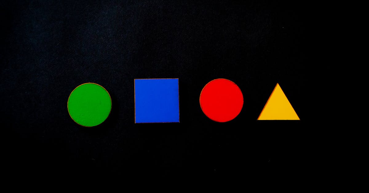
Geometric construction was not merely a technique at the Bauhaus — it was an ideology. The circle, the square, and the triangle were treated as fundamental forms with inherent meaning: the circle as fluid and infinite, the square as stable and rational, the triangle as dynamic and directional. Kandinsky taught entire courses on the psychological properties of these basic shapes. When Bauhaus typographers built their letterforms from these primitives, they were not simply choosing a convenient construction method. They were attempting to ground typography in what they believed were universal visual truths.
Key Bauhaus Typographers
The Bauhaus was a small school — rarely more than 150 students at a time — but its typographic output was driven by a handful of practitioners whose work defined the movement’s visual language. Each brought a distinct perspective to the shared project of rethinking how letters should look and function.
Herbert Bayer
Bayer studied at the Bauhaus from 1921 to 1925, then returned as head of the newly created printing and advertising workshop. His Universal typeface (1925) remains the single most recognized piece of Bauhaus typography. Built from geometric primitives with uniform stroke weight and no uppercase letters, it embodied the school’s commitment to rationalism and simplification. Beyond the Universal alphabet, Bayer was responsible for much of the Bauhaus’s own printed material — posters, stationery, catalogs — where he applied asymmetric layouts, sans-serif type, and bold use of photographic imagery. After emigrating to the United States in 1938, he continued to champion functionalist design in his work for Container Corporation of America and the Aspen Institute, spreading Bauhaus typographic principles into American corporate communication.
Josef Albers
Before he became famous for his “Homage to the Square” paintings and his foundational color theory text Interaction of Color, Albers was one of the Bauhaus’s most inventive typographic experimenters. His stencil letterforms, designed around 1926, took geometric reduction further than Bayer’s Universal by constructing an entire alphabet from a minimal set of geometric components — essentially a typographic kit of parts. Each letter was assembled from the same small inventory of shapes: quarter circles, half circles, straight bars, and right angles. The system was both a practical exercise in economy and a conceptual demonstration that the Latin alphabet could be radically simplified without losing legibility. Albers’s approach anticipated modular type design by decades.
Laszlo Moholy-Nagy
Moholy-Nagy’s contribution to Bauhaus typography was less about individual letterforms and more about the integration of type with image and space. His concept of “typophoto” — the fusion of typography and photography into a unified communicative medium — pushed Bauhaus print design beyond traditional page composition. Moholy-Nagy treated the printed page as a visual field where type, image, color, and white space all functioned as active elements. His layouts for Bauhaus publications were asymmetric, dynamic, and spatially adventurous, using scale shifts, diagonal text placement, and photographic overlays to create compositions that influenced magazine and poster design for generations. He later carried these ideas to the New Bauhaus in Chicago (now the Illinois Institute of Technology), ensuring their survival in American design education.
Joost Schmidt
Schmidt is perhaps the least known of the major Bauhaus typographers outside specialist circles, but his contribution was significant. He succeeded Bayer as head of the printing workshop in 1928 and was responsible for some of the Bauhaus’s most striking exhibition lettering and poster designs. Schmidt’s work was characterized by bold, architecturally scaled letterforms and a sophisticated use of spatial hierarchy. His poster for the 1923 Bauhaus exhibition in Weimar, with its rigidly geometric sans-serif type and constructivist-influenced layout, became one of the defining images of the school and one of the most celebrated famous graphic designers’ works of the era. Schmidt also developed a systematic approach to typographic education that emphasized measurable visual relationships over intuitive arrangement.
Classic Bauhaus-Inspired Fonts
The original Bauhaus typefaces were largely experimental — designed for specific applications within the school rather than distributed as commercial type families. The fonts we now think of as “Bauhaus” are interpretations, revivals, and extensions of those original experiments, some designed by Bauhaus associates and others by later typographers working in the same geometric tradition. These are the most significant bauhaus typeface options for professional design work.
Futura
Paul Renner designed Futura between 1924 and 1927, and while he was not a Bauhaus member, the typeface is so thoroughly aligned with Bauhaus principles that it has become the movement’s de facto representative in popular culture. Futura’s construction is rigorously geometric: the “O” is a near-perfect circle, the “A” is a sharp triangle, and stroke widths are optically (though not mathematically) uniform. Renner initially proposed more radical letterforms — with single-story “a” and “g” forms and other experimental characters — but the commercial release from the Bauer type foundry was moderated toward conventional readability. Futura remains one of the most widely used typefaces in the world, equally effective in headlines, body text, and branding. Its geometric clarity makes it the definitive geometric font.
ITC Bauhaus
Designed by Ed Benguiat and Victor Caruso in 1975, ITC Bauhaus is a direct interpretation of the Universal alphabet tradition, though it takes significant liberties with Bayer’s original forms. The typeface features rounded terminals, uniform stroke weight, and a playful geometric quality that owes as much to 1970s design sensibilities as to 1920s ideology. Available in five weights from Light to Heavy, ITC Bauhaus is most effective at display sizes for headlines, logos, and poster work. Its rounded, approachable character makes it popular for entertainment and lifestyle branding, though purists may find its warmth at odds with the austere rationalism of the original Bauhaus program.
Architype Bayer
Released by The Foundry in the 1990s as part of their Architype series, this typeface is the most faithful digital revival of Bayer’s 1925 Universal alphabet. It preserves the original’s lowercase-only construction, geometric primitives, and uniform stroke weight with minimal modification. Architype Bayer is primarily a historical and editorial typeface — useful for projects that specifically reference Bauhaus history, museum exhibitions, and design publications. Its strict adherence to Bayer’s original vision means it lacks the flexibility of more commercial geometric sans-serifs, but for authenticity, nothing else comes close.
Universal
Several digital interpretations of Bayer’s Universal concept exist under this name, varying in fidelity to the original drawings. The best versions maintain the single-case structure and geometric purity of Bayer’s 1925 design while adding enough refinement for contemporary use. Universal typefaces work well in design contexts where the Bauhaus reference is intentional and central — exhibition graphics, design school publications, and cultural branding. They are less practical for general-purpose typography due to the absence of uppercase forms and limited character sets.
Renner Antiqua
Paul Renner’s lesser-known serif companion to Futura, Renner Antiqua (also called Renner Serif in some digital versions), applies the same geometric construction principles to a serif framework. The result is a typeface that feels both classical and modernist — roman proportions built with Bauhaus precision. Renner Antiqua is a fascinating typographic hybrid and a useful reminder that Bauhaus-influenced design was not exclusively sans-serif. It works well in editorial contexts where geometric rigor needs the warmth and readability of seriffed forms, particularly in book design and long-form print layouts.
Dessau
Named after the German city where the Bauhaus relocated in 1925, Dessau is a contemporary geometric sans-serif that draws directly on the school’s typographic experiments. Its letterforms feature strict geometric construction with uniform stroke weight, circular bowls, and minimal stroke contrast. Dessau captures the Bauhaus spirit without the impracticality of some original experimental alphabets, offering a full character set with uppercase, lowercase, and standard punctuation. It is a solid choice for branding, editorial design, and any project that wants clear Bauhaus associations with professional-grade functionality.
Albers
Digital interpretations of Josef Albers’s stencil letterforms have appeared from several sources, with varying degrees of fidelity to his modular construction system. The best versions preserve the kit-of-parts logic that defined Albers’s approach — each letter visibly assembled from the same limited set of geometric components. These fonts work best in display applications where the constructive process is part of the visual message: poster design, exhibition graphics, and educational materials. Their modular character also makes them effective in motion graphics, where individual components can be animated into assembled letterforms.
Kabel
Rudolf Koch designed Kabel between 1927 and 1929 for the Klingspor foundry. Like Futura, Kabel belongs to the generation of geometric sans-serifs that emerged alongside (though not directly from) the Bauhaus. Koch’s approach was less dogmatic than Renner’s — Kabel features calligraphic details, angled terminals, and idiosyncratic letterforms that give it more personality than a purely geometric construction would allow. The lowercase “e” with its distinctive angled crossbar and the sharp, pointed apex of the “A” are particularly notable. Kabel is excellent for branding, editorial headlines, and packaging where you want geometric modernity with a touch of handmade warmth.
Free Bauhaus-Style Fonts
Not every project has the budget for premium type licenses. Fortunately, several high-quality bauhaus font free options are available through Google Fonts and open-source platforms. These typefaces capture the geometric spirit of Bauhaus typography without licensing costs, making them accessible for web projects, student work, and independent design.
Josefin Sans
Designed by Santiago Orozco, Josefin Sans is one of the closest free approximations of vintage Bauhaus geometric type. Its letterforms are built from geometric primitives with uniform stroke weight, and its tall x-height gives it a modern, open quality. The typeface is available in six weights from Thin to Bold, with matching italics, making it flexible enough for both display and short body text. Josefin Sans is available through Google Fonts and works particularly well in web design, where its clean geometry translates effectively to screen rendering. Its vintage character makes it a strong choice for branding projects that reference mid-century modernism.
Poiret One
Poiret One, designed by Denis Masharov, is an ultra-thin geometric display face that channels both Bauhaus minimalism and Art Deco elegance. Its uniformly light stroke weight and strictly geometric construction give it a delicate, architectural quality. The typeface works best at large sizes — its thin strokes require generous scale to maintain legibility. Poiret One is excellent for fashion branding, cultural event graphics, and editorial headlines where a refined, understated geometric aesthetic is appropriate. It is a single-weight font, so it requires pairing with a more flexible typeface for extended use.
Comfortaa
Johan Aakerlund’s Comfortaa is a rounded geometric sans-serif that shares DNA with ITC Bauhaus while offering a more contemporary, digitally native feel. Its perfectly rounded terminals and geometric construction give it a friendly, approachable quality that works well in tech branding, app interfaces, and lifestyle design. Available in three weights (Light, Regular, Bold), Comfortaa is versatile enough for headlines and short text blocks. Its rounded character softens the severity of strict geometric construction, making it a practical bauhaus style font for projects that need warmth alongside geometric discipline.
Quicksand
Designed by Andrew Paglinawan, Quicksand is a geometric display sans-serif with rounded terminals and a slightly condensed character width. Its construction is clearly rooted in the Bauhaus geometric tradition — circular bowls, uniform stroke weight, minimal stroke contrast — but its rounded details and open spacing give it a softer, more approachable personality. Quicksand is available in six weights from Light to Bold, making it one of the more flexible free geometric options. It performs well in web design, mobile interfaces, and branding contexts where geometric clarity needs to feel welcoming rather than clinical.
Didact Gothic
Didact Gothic, designed by Daniel Johnson, is a sans-serif typeface explicitly intended to resemble handwritten letters produced with a standard pen — but its geometric underpinning gives it clear Bauhaus sympathies. The typeface features simple, clean letterforms with minimal stroke variation and open counters that enhance readability at all sizes. Unlike many geometric display fonts, Didact Gothic is genuinely comfortable for body text, making it a practical choice for web content, educational materials, and long-form digital reading. Its utilitarian character aligns well with the Bauhaus emphasis on function over decoration.
Jura
Daniel Johnson’s Jura is a narrow sans-serif with geometric foundations and a distinctive angular quality. Its letterforms combine Bauhaus-derived geometric construction with a slightly condensed width that makes it space-efficient without feeling cramped. Available in four weights from Light to Bold, Jura works well for UI design, data-heavy layouts, and branding projects where a geometric font needs to fit more text into less horizontal space. Its angular personality gives it a more technical, engineering-influenced feel than rounder geometric options.
Bauhaus Typography Principles for Modern Design
The value of bauhaus typography for contemporary designers lies not just in the typefaces themselves but in the design principles that produced them. These principles remain directly applicable to modern branding, editorial, and interface design, often in ways that the original Bauhaus practitioners could not have anticipated.
Geometric construction — building letterforms and layouts from basic geometric shapes — is now standard practice in logo design, icon systems, and UI component libraries. When a contemporary designer constructs a wordmark from perfect circles and uniform-weight strokes, they are applying a method that Bayer and Albers codified a century ago. The Bauhaus insight was that geometric simplicity is not just aesthetically pleasing but functionally superior: geometric forms scale cleanly, reproduce reliably across media, and render crisply on screens of any resolution.
Reduction to essentials — the systematic elimination of every element that does not serve communication — is the foundational principle of modern minimalist design. Every “clean” website, every “simple” app interface, every brand identity that prides itself on whitespace owes a philosophical debt to the Bauhaus conviction that less visual noise means more effective communication. The dominance of sans-serif typefaces in digital interfaces is a direct descendant of Bauhaus typographic ideology.
Grid-based layouts were central to Bauhaus page design and remain the structural backbone of both print and digital layout systems. The CSS grid, the twelve-column layouts of Bootstrap and Foundation, the responsive breakpoint systems of modern web design — all trace their conceptual lineage to the Bauhaus commitment to systematic, mathematically determined page organization. Bauhaus designers did not invent the grid, but they made it an ideological commitment rather than a convenience.
Asymmetric balance replaced centered, symmetrical compositions in Bauhaus layouts. Rather than distributing visual weight equally around a central axis, Bauhaus designers used uneven distributions of type, image, and space to create dynamic tension. This approach is now so standard in web and editorial design that it hardly registers as a choice — but it was a radical departure from the centered title pages and symmetrical broadsheets that preceded it.
The sans-serif preference that the Bauhaus championed has become, in practice, the default of digital communication. The overwhelming majority of UI typefaces, app interfaces, and web body text is set in sans-serif faces. What was once a provocative aesthetic position — a rejection of tradition — has become the tradition itself. Understanding this historical context helps designers make more informed choices about when sans-serif type serves a project and when a serif alternative might actually be the more distinctive, attention-grabbing option.
Pairing Bauhaus Fonts
Bauhaus and Bauhaus-inspired typefaces are geometrically assertive, which makes font pairing both important and potentially treacherous. The geometric purity that gives these fonts their visual power also makes them unforgiving partners — they will clash with typefaces that operate on fundamentally different structural logic.
The most reliable pairing strategy is to combine a Bauhaus-style geometric sans-serif with a modern serif that shares its sense of precision. Futura pairs well with Freight Text, for example, because both typefaces are carefully proportioned and structurally disciplined, but the serif adds warmth and reading comfort that Futura alone cannot provide in long-form contexts. Similarly, Josefin Sans works alongside a refined serif like Lora for web projects that need both geometric headings and comfortable body text.
Pairing two geometric sans-serifs from the same tradition can work if there is sufficient contrast in weight, width, or scale. A bold weight of Futura for headlines with Quicksand Regular for body text, for instance, creates visual hierarchy while maintaining geometric cohesion. The key is to ensure that the two typefaces are different enough to establish clear roles — if they are too similar, the pairing will look like a mistake rather than a decision.
What to avoid is equally important. Ornamental typefaces — decorative scripts, blackletter, heavily detailed display faces — will fight with Bauhaus geometry at every turn. The entire point of Bauhaus typography was the rejection of ornamentation, so pairing a Bauhaus font with an ornate script creates a visual contradiction that confuses rather than enriches. Similarly, humanist sans-serifs with pronounced calligraphic influence (like Gill Sans or Optima) tend to clash with the mechanical purity of geometric Bauhaus forms. Their organic, handmade qualities sit uncomfortably alongside strict geometric construction. For more on navigating these distinctions, see our guide to popular fonts across categories.
Monospaced typefaces, on the other hand, can pair surprisingly well with Bauhaus-inspired fonts. The systematic, grid-based logic of monospaced type resonates with Bauhaus principles, and the contrast between proportional geometric headings and fixed-width body text can create a distinctive, technically inflected aesthetic suited to design, architecture, and technology contexts.
Bauhaus vs Art Deco Typography
Bauhaus and Art Deco were contemporaries — both movements flourished in the 1920s and 1930s — and their typographic outputs are frequently confused. Both favored geometric construction and clean lines. Both rejected the organic extravagance of Art Nouveau. But their motivations were fundamentally opposed, and understanding the difference between them is essential for making informed typographic choices.
The Bauhaus sought to eliminate decoration in service of function. Its typography was ideologically austere: sans-serif, uniform weight, single-case, grid-based. The goal was universal communication, stripped of class markers, national identity, and aesthetic indulgence. Bauhaus type was designed for factories, schools, and public institutions — for everyday life, not special occasions.
Art Deco fonts, by contrast, embraced decoration as a feature rather than a flaw. Art Deco typography was built for glamour: inline detailing, extreme stroke contrast, metallic finishes, symmetrical ornamentation. Where Bauhaus letterforms were engineered for mass communication, Art Deco letterforms were crafted for luxury. They appeared on ocean liner menus, Park Avenue lobby signs, and Hollywood movie titles. Art Deco graphic design celebrated precisely the visual excess that the Bauhaus condemned.
The structural difference is telling. Bauhaus geometric typefaces tend toward uniform stroke weight — every line in the letter is the same thickness, reflecting the democratic, anti-hierarchical ideology of the school. Art Deco geometric typefaces often feature dramatic thick-thin contrast, where heavy verticals meet hairline horizontals, creating a visual rhythm of power and elegance. Both start with geometric construction, but they arrive at opposite destinations: the Bauhaus at egalitarian simplicity, Art Deco at theatrical sophistication.
In practice, this distinction helps designers choose the right tool for the brief. A tech startup’s brand identity, a municipal wayfinding system, or a digital product interface calls for Bauhaus-derived geometry: clean, functional, unpretentious. A luxury hotel, a high-end spirits brand, or a fashion editorial calls for Art Deco: ornate, confident, deliberately extravagant. The geometric foundation is shared, but the intent — and the audience — could not be more different.
FAQ
What font is Bauhaus?
There is no single “Bauhaus font.” The term refers to a family of geometric sans-serif typefaces designed by or inspired by the Bauhaus school (1919-1933). The most historically significant is Herbert Bayer’s Universal Alphabet (1925), a lowercase-only geometric typeface. The most commercially recognized Bauhaus-style font is ITC Bauhaus, designed in 1975 by Ed Benguiat and Victor Caruso. Futura, while not designed by a Bauhaus member, is closely aligned with Bauhaus typographic principles and is often treated as the movement’s representative typeface.
Is Futura a Bauhaus font?
Futura was not designed at the Bauhaus, and its designer Paul Renner was not a member of the school. However, Futura was developed during the same period (1924-1927), shares the Bauhaus commitment to geometric construction and functionalist design, and emerged from the same intellectual climate of Weimar-era German modernism. It is accurate to call Futura a Bauhaus-era font and a Bauhaus-aligned font, but technically not a Bauhaus font. The distinction matters more to design historians than to practicing designers — in functional terms, Futura embodies Bauhaus typographic principles as fully as any typeface in existence.
What is the Bauhaus typographic style?
The Bauhaus typographic style is defined by geometric construction (letterforms built from circles, arcs, and straight lines), uniform stroke weight, sans-serif forms, asymmetric page layouts, grid-based composition, and a philosophical commitment to clarity over decoration. The school’s typographers advocated for lowercase-only alphabets, standardized type sizes, and the integration of typography with photography. These principles were codified in Jan Tschichold’s 1928 book Die neue Typographie and went on to influence Swiss modernism, International Typographic Style, and contemporary digital design.
Are there free Bauhaus fonts?
Yes. Several high-quality free typefaces capture the geometric spirit of Bauhaus typography. Josefin Sans, Quicksand, Comfortaa, Poiret One, and Didact Gothic are all available through Google Fonts at no cost. While these are contemporary interpretations rather than historical revivals, they share the geometric construction, uniform stroke weight, and functionalist clarity that define the Bauhaus typographic tradition. For more historically faithful options, some digital versions of Bayer’s Universal alphabet are available through open-source platforms.
How do I use Bauhaus fonts in modern design?
Apply Bauhaus typographic principles rather than simply selecting a Bauhaus-style typeface. Use geometric sans-serif fonts for headings and UI elements. Build layouts on a visible or implied grid. Embrace asymmetric balance and generous white space. Pair Bauhaus-inspired headlines with readable serif body text for long-form content. Stick to primary colors or a restrained neutral palette. Avoid ornamental flourishes, decorative borders, and script accents — these contradict the functionalist philosophy that gives Bauhaus typography its coherence and power.


