Beige Color Meaning and Symbolism
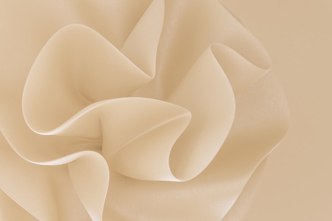
Beige is a warm, pale neutral that blends light brown with subtle yellow undertones, valued for its versatility and quiet, dependable character. The beige color meaning centers on neutrality, calm, and reliability, making it a foundational color in interiors, fashion, and branding. Its representative shade is approximately #F5F5DC , a soft, sandy off-white.
What does beige symbolize?
Beige symbolizes neutrality, simplicity, and dependable calm. As a warm neutral, it conveys balance and steadiness, providing a soothing, unobtrusive backdrop that lets other elements take center stage. Beige is closely linked to natural materials such as sand, linen, and unbleached fabric, giving it associations with comfort, authenticity, and understated warmth. It also represents reliability and practicality, since it pairs with nearly anything and rarely overwhelms. While beige can be seen as plain, its quiet versatility is precisely what makes it timeless and broadly appealing across design contexts.
The psychology of beige
Psychologically, beige feels calming, grounded, and reassuring. Its warm undertone makes spaces feel cozy and inviting, while its neutrality conveys stability and a sense of unhurried comfort. People often perceive beige as dependable, mature, and easygoing, a color that signals safety rather than excitement. Because it is restful and low-stimulation, beige is popular in environments designed for relaxation. On the downside, beige can read as boring, bland, or noncommittal when overused without contrast or texture. Balancing beige with accent colors and varied materials keeps it feeling warm and refined rather than dull. For more on neutral perception, see our guide to color psychology.
Beige symbolism across cultures
Beige and similar earthy neutrals have long been associated with nature, simplicity, and humility across cultures, owing to their links with natural fibers, sand, stone, and undyed cloth. In many design traditions, beige tones signal calm, minimalism, and refined restraint. The color is frequently connected to ideas of practicality and modesty, reflecting an understated rather than flashy sensibility. Because beige is so neutral, its cultural meanings are less fixed than those of bolder colors and depend heavily on context. Broadly, however, beige reads as warm, natural, and reassuring across many regions and styles.
Positive and negative associations of beige
| Positive | Negative |
|---|---|
| Calm, neutral, and versatile | Boring or bland when overused |
| Warm, natural, and reliable | Noncommittal or uninspiring |
| Timeless and easy to pair | Can feel dated or corporate |
Beige in branding and marketing
Brands use beige to convey warmth, reliability, and understated, natural sophistication. It is common in beauty, skincare, wellness, and minimalist lifestyle branding, where it signals gentleness, simplicity, and clean, organic quality. Fashion and home brands favor beige for its timeless, calming appeal and its ability to make products feel premium yet approachable. In packaging, beige and kraft-paper tones suggest sustainability, authenticity, and craftsmanship. Beige also works as a neutral foundation in web and editorial design, providing a soft, low-contrast background that keeps content readable and elegant. Its quiet versatility makes it a dependable choice for brands prioritizing calm and trust.
Colors that go well with beige
Beige pairs beautifully with terracotta (#E2725B) for a warm, earthy palette, and with sage green (#9CAF88) for a calm, natural feel. Navy (#000080) provides crisp contrast that makes beige look polished and classic, while soft white and ivory blend with beige for a layered, monochromatic neutral scheme. To explore high-contrast pairings further, see our complementary colors guide.
Shades and variations of beige
Beige spans many named variants. Classic beige (#F5F5DC) is a soft, warm off-white. “Tan” (#D2B48C) is a deeper, more brown beige. “Taupe” (#483C32) is a darker gray-brown neutral. “Sand” (#C2B280) leans yellow and earthy. “Khaki” (#C3B091) carries a muted greenish-brown tone. “Greige” (#BEB1A1) blends beige with gray for a modern, cooler neutral. These variations let designers tune beige from light and airy to deep and grounded across countless palettes.
Frequently Asked Questions
What does the color beige mean?
Beige means neutrality, calm, and reliability. As a warm pale neutral, it conveys simplicity, stability, and natural comfort. It is associated with sand, linen, and earthy materials, making it feel dependable, versatile, and timelessly understated.
What emotions does beige evoke?
Beige evokes calm, comfort, and reassurance. Its warm, neutral character feels grounded and easygoing, creating a soothing, low-stimulation mood. While restful and inviting, beige can also feel bland or uninspiring when used without contrast, texture, or accent colors.
What colors go with beige?
Beige pairs well with terracotta, sage green, navy, white, and ivory. Earthy warm tones build natural palettes, navy adds crisp contrast, and soft neutrals layer with beige for a calm, monochromatic, and elegantly understated overall look.
Is beige warm or cool?
Beige is generally a warm color. Its yellow and brown undertones place it on the warm side of neutral, giving it a cozy, natural feel. Some variants like greige lean cooler by blending in gray, but classic beige reads as warm.
What is the difference between beige and tan?
Beige is a lighter, paler neutral with subtle yellow undertones, while tan is a deeper, more pronounced light brown. Tan reads as warmer and more earthy, whereas beige is softer and reads closer to an off-white background neutral.


