What Font Does The Blair Witch Project Use?
The film that convinced a generation it might be real did it partly through type, so it is no wonder people search for the blair witch project font. The look is deliberately un-designed: rough title lettering, the now-iconic stick-figure symbol, and clattering typewriter credits that feel like recovered evidence. Like nearly every horror title, the branding is custom artwork rather than a single downloadable font — but the most recognizable piece of it, the typewriter credit style, is trivially easy to match with free type. Below we separate the trademarked branding from free fonts you can legally use, and explain why crude type was the whole point.
If you came hoping for one exact file, adjust the expectation: there is no official “Blair Witch” typeface for sale, and the title lettering was hand-made for the campaign. What is reproducible — and what most people actually want — is the recovered-evidence mood: typewriter credits, rough headlines, and a deliberately low-fi finish. The rest of this guide shows you how to assemble that mood from free, well-licensed parts.
What font is the The Blair Witch Project logo font?
The 1999 marketing used custom, rough-hewn lettering rather than a polished retail typeface. The title treatment reads as raw and hand-made — uneven, weathered, almost field-notes crude — paired with the stick-figure (the “Blair Witch” symbol) that became the campaign’s signature mark. Because the branding was built for the film’s found-footage conceit, treat any specific font name attached to it online as an informed observation, not a confirmed spec.
What we can state confidently is the intent: this is anti-design horror typography. Everything looks improvised and authentic, as though assembled from a missing student’s documentary footage rather than a studio art department. That crudeness is the craft. The campaign leaned into the illusion so hard that early audiences genuinely wondered whether the footage was real — and the type, deliberately stripped of polish, was a quiet but essential part of that deception.
For your own work, that means the goal is not elegance but believability. The most reproducible and recognizable element is the typewriter-style credits, which read like recovered case files. Pair that with a rough, hand-made headline and you have the two halves of the identity — one clinical, one raw — that together sell the found-footage premise.
What typeface is used in the film?
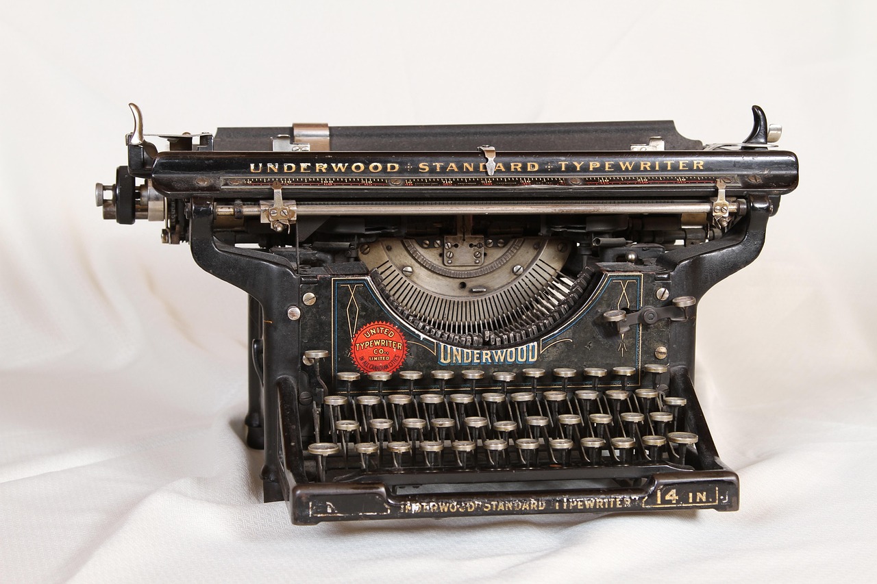
On-screen and across the famous “missing persons” marketing, the credits and informational text lean on typewriter-style monospaced lettering — the look of police reports, case files, and recovered notes. That typewriter aesthetic is the most reproducible part of the identity and the one most people actually want.
There is no single flamboyant in-film display font; the horror is carried by shaky camcorder footage, darkness, and sound. Because the branding mixed bespoke rough lettering with generic typewriter setting, the faithful way to recreate it is to combine a free typewriter font with a rough hand display for headlines.
Free fonts that look like the The Blair Witch Project font
You cannot download the trademarked branding, but free typewriter and rough display fonts capture the found-footage feel. The table maps each design job to a free, well-licensed substitute.
| Use case | The Blair Witch Project uses | Free alternative |
|---|---|---|
| Credits / case-file text | Typewriter-style monospace | Special Elite (Google Fonts) |
| Clean monospaced alternative | Even typewriter setting | Cutive Mono or Courier Prime |
| Rough title / headline | Raw, hand-made lettering | Rubik Distressed |
| Handwritten field notes | Uneven handwritten feel | Caveat or Shadows Into Light |
These free families let you echo the recovered-footage mood without touching the protected branding. For more rough, period-authentic typewriter and analog faces, our roundup of vintage fonts is a strong starting point.
Why does The Blair Witch Project use this kind of type?
The entire campaign was built to feel real — found footage from filmmakers who never came back. Polished design would have shattered that illusion, so the type had to look improvised and documentary. The choice does real storytelling work:
- Authenticity — typewriter and rough lettering read as case files and field notes, not entertainment.
- Anti-glamour — the crudeness signals “this actually happened,” heightening dread through realism.
- Memorability — the stick-figure symbol plus raw type created an instantly recognizable, low-budget identity.
It sits at the opposite end of the spectrum from ornate horror branding like the Hellraiser font, yet it shares the cold minimalism of the The Ring font — both withhold polish to make dread feel real rather than staged.
The campaign’s typography also did something marketers rarely manage: it became a template. After 1999, countless found-footage horror films borrowed the same toolkit — typewriter credits, distressed titles, “based on real events” framing — because audiences had learned to read that crude type as a signal of authenticity. When you reach for a typewriter font today, you are tapping into a visual language that this film, more than any other, made into shorthand for “this really happened.” Use it deliberately and it does a lot of storytelling for you.
Can I use the The Blair Witch Project font for my own project?
You can freely use look-alike fonts like Special Elite, Courier Prime, or Rubik Distressed for personal or commercial work, since those carry their own open licenses. What you cannot do is reproduce the exact branding — the title treatment, the stick-figure symbol, the name, and key art are protected and must not be used in a way that implies an official connection.
Practical guidance: combine a free typewriter font with a rough display, add your own grain or handwritten notes, and avoid copying the precise logo or stick-figure mark. Confirm each font’s terms before any commercial release. Our font licensing guide explains desktop, web, and embedding rights clearly.
Frequently Asked Questions
Is The Blair Witch Project font free to download?
The exact branding is not a free font, but the typewriter look is easy to match. Free Google Fonts such as Special Elite, Cutive Mono, and Courier Prime capture the case-file feel, and Rubik Distressed handles rough headlines — all licensed for personal and commercial use.
What typewriter font does Blair Witch use?
The credits use a typewriter-style monospace look rather than one publicly named face. Special Elite is the closest free match, with a worn, uneven typewriter character. Courier Prime offers a cleaner alternative. Treat both as informed look-alikes, not exact reproductions.
What font is closest to the Blair Witch title?
For the typewriter credits, Special Elite is the strongest free match. For the rough, hand-made title lettering, a distressed display like Rubik Distressed works well. Combine the two to recreate the found-footage identity.
Can I use the Blair Witch font commercially?
You can use free typewriter and distressed look-alikes commercially under their own licenses, but you cannot use the actual trademarked title, stick-figure symbol, or key art in a way that suggests an official tie to the film. Always check each font’s license and review our font licensing guide first.


