Bodoni Font Pairings That Work
Bodoni is the classic high-contrast Didone serif drawn by Giambattista Bodoni in the 1790s, and great Bodoni font pairings rely on one timeless move: set its refined, hairline-thin headline against a calm, geometric sans body. That tension between an ornate serif title and a minimal sans column is the visual language of fashion and luxury branding, which is exactly where Bodoni earns its keep.
Is Bodoni a heading or body font?
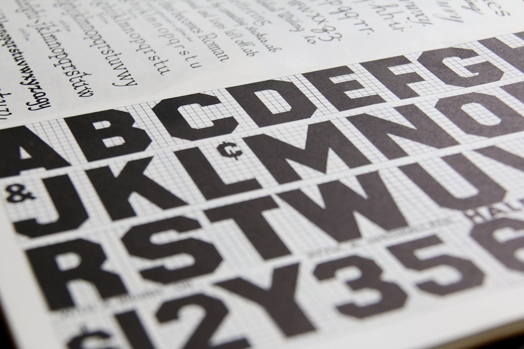
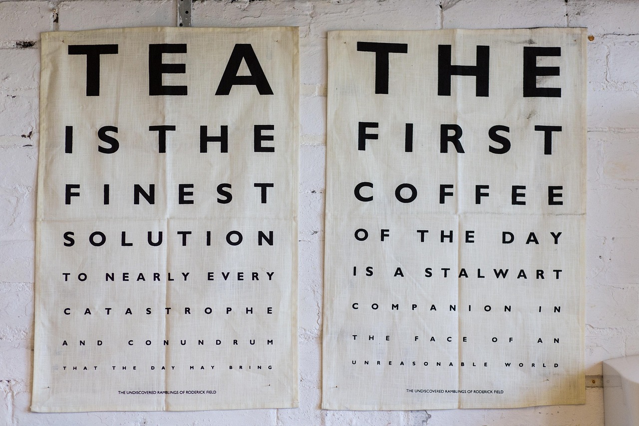
Bodoni is a display and headline face. Its dramatic contrast between thin hairlines and thick stems is exquisite at large sizes but punishing in body copy, where the hairlines thin out and shimmer. Use Bodoni for hero headlines, logos, magazine mastheads, and elegant initials, then let a clean sans carry the reading. Many digital cuts exist, but the free Libre Bodoni on Google Fonts is a reliable, web-ready choice optimized for screen rendering. If you are deciding between an ornate serif lead and a sans lead, our serif vs sans-serif guide is worth a look.
Best fonts to pair with Bodoni
Each partner below is a quiet, low-contrast sans that lets Bodoni’s elegance dominate.
| Pairing | Use as | Why it works |
|---|---|---|
| Bodoni + Futura | Heading + Body | The definitive luxury pairing; geometric purity offsets Bodoni’s ornate contrast. |
| Bodoni + Montserrat | Heading + Body | A free, web-friendly geometric sans that echoes the Futura look for modern brands. |
| Bodoni + Lato | Heading + Body | Lato’s warmth keeps long editorial body inviting beneath the formal headline. |
| Bodoni + Inter | Heading + Body | A neutral UI sans that disappears under the headline and stays crisp on screen. |
| Libre Bodoni + Helvetica | Heading + Body | Classic neutrality; the grotesque body grounds Bodoni’s high-fashion contrast. |
Bodoni + Futura (the classic combination)
This is the pairing luxury houses have used for decades. Bodoni’s high-contrast Didone strokes and Futura’s pure geometric circles and triangles seem like opposites, but together they create a balanced, timeless elegance — the ornate against the minimal. Set Bodoni large for the headline, often in elegant title case or letter-spaced caps, and use Futura for body, labels, and navigation. The combination reads as expensive, confident, and editorial, which is why it anchors so many fashion logos and beauty campaigns. If Futura is unavailable, a geometric substitute like Montserrat reproduces most of the effect.
Bodoni + Montserrat (the free, web-ready route)
For a no-cost stack you can ship immediately, pair Libre Bodoni with Montserrat — both free on Google Fonts. Montserrat’s geometric proportions stand in convincingly for Futura, giving you that same clean, modern counterweight to Bodoni’s drama without any licensing concerns. Use Libre Bodoni for headlines and oversized numerals, Montserrat in letter-spaced uppercase for category labels, and Montserrat Regular for body. This is the practical choice for boutique e-commerce, lookbooks, and portfolio sites that want luxury polish on a Google Fonts budget. Montserrat regularly features among the best Google Fonts for exactly this reason.
Bodoni + Lato (for long-form editorial)
When the layout includes real article text, Lato is a warmer body than a strict geometric sans. Its semi-rounded forms and open counters stay comfortable across hundreds of words while Bodoni anchors the masthead and section openers. The contrast between a formal Didone headline and an approachable humanist body softens the overall tone, making it ideal for lifestyle magazines and wellness brands that want elegance without coldness. Set Bodoni for the title and Lato Regular for the columns, with Lato Bold for subheads.
How to pair fonts with Bodoni yourself
Keep Bodoni in the headline and choose a clean, low-contrast sans body — Futura, Montserrat, Lato, Inter, and Helvetica all work. Never pair Bodoni with a second high-contrast serif; two ornate faces compete and the page loses its focal point. Give the headline generous white space and set it large enough (40px and up) that the hairlines render crisply; on the web, prefer Libre Bodoni, which is hinted for screens. Hold to two families plus weights, and create a strong size jump so the elegant serif clearly leads. Test combinations at real sizes in our font pairing generator before you commit.
Frequently Asked Questions
What font pairs best with Bodoni?
Futura is the best-known and most effective partner because its pure geometric forms create a striking, balanced contrast with Bodoni’s ornate Didone strokes — the classic luxury combination. For a free, web-ready alternative, Montserrat reproduces much of the same geometric counterweight. In every case, a clean sans-serif body lets Bodoni’s headline elegance lead.
Is Bodoni good for body text?
No. Bodoni is a high-contrast Didone whose thin hairlines weaken and shimmer at small sizes, making sustained reading uncomfortable and straining legibility. It is designed for large headlines, logos, and display use. Always pair Bodoni with a separate low-contrast sans-serif such as Futura or Montserrat to handle paragraphs, captions, and interface text.
Can you pair Bodoni with itself?
Only within a headline system, not for a full page. You can combine a heavier Bodoni cut for the main title with a lighter cut for subheads, but Bodoni cannot supply readable body text. For complete layouts, always bring in a clean sans-serif body so the page stays legible while Bodoni provides the elegant display moments.
Is Bodoni free?
The original Bodoni and many premium digital revivals are commercial fonts, but Libre Bodoni is a free, open-source cut available through Google Fonts under the SIL Open Font License. It covers personal and commercial use, web embedding, and self-hosting, and it is optimized for screen rendering — making it the recommended free option for web projects.
Which Bodoni version should I use on the web?
Use Libre Bodoni for web projects. Many older Bodoni digitizations have hairlines so thin they disappear or flicker at typical screen sizes, but Libre Bodoni was specifically reworked with slightly sturdier strokes and screen hinting for reliable rendering. It is also free under the Open Font License, so you can self-host it without licensing complications.