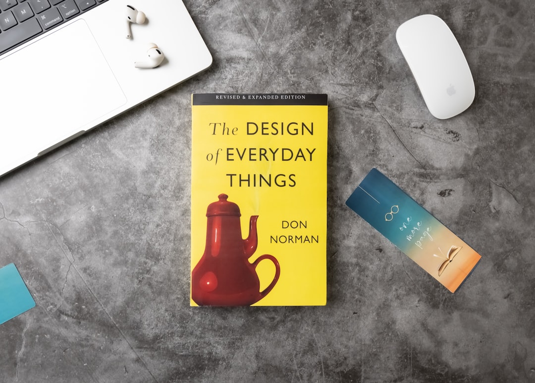
Book Cover Design Principles That Work
A book cover has one job that overrides all others: to make the right reader pick the book up. In a bookshop it competes spine-out on a crowded shelf; online it competes as a postage-stamp thumbnail among hundreds of others. Strong book cover design principles are built around those two viewing conditions, which is why genre signalling and title legibility at tiny sizes matter more than intricate artwork. A beautiful cover that fails to communicate its genre, or whose title turns to mush at thumbnail size, has not done its commercial job.
The key principles of book cover design
Here are the seven principles that make a cover work both on the shelf and on screen.
| Principle | Why it matters |
|---|---|
| Genre conventions | Visual cues tell browsing readers instantly what kind of book this is. |
| Title legibility | The title must read clearly even as a small online thumbnail. |
| Strong focal image | One central image or concept anchors the cover and draws the eye. |
| Mood-matched typography | Typeface choice sets tone and reinforces the genre. |
| Hierarchy of elements | Title, author, and tagline need a clear order of prominence. |
| Spine & back layout | The spine sells on the shelf; the back closes the sale. |
| Trim & bleed setup | Correct print specs keep artwork crisp and edges clean. |
1. Genre conventions — signal the category fast
Readers browse by genre, and covers that ignore conventions confuse them. A thriller leans on dark palettes and bold condensed type; a romance favours warm tones and softer scripts; literary fiction often uses restrained typography and conceptual imagery. These are not clichés to avoid — they are a shorthand that tells the right reader “this is for you.” Study the bestsellers in your category, then aim to fit the shelf while standing out within it, not to break the shelf entirely.
2. Title legibility — survive the thumbnail
More books are now discovered as small online thumbnails than on physical shelves, so the title must stay sharp at a fraction of full size. Test it: shrink the cover to roughly 100 pixels wide and check whether the title is still readable. Thin scripts, low-contrast colours, and ornate detail collapse at that scale. Bold, high-contrast lettering with clear spacing wins, which is where a grasp of the typography terms glossary pays off.
3. Strong focal image — give the eye one anchor
The most arresting covers commit to a single visual idea — a striking object, a figure, a symbol, a typographic treatment — rather than a busy collage. One strong focal point creates instant impact and reads cleanly at any size. A clear visual hierarchy built around that focal element guides the eye from image to title to author without competition.
4. Mood-matched typography — let the type set the tone
Typography on a cover does emotional work before anyone reads a word. A horror novel in a delicate serif feels wrong; a tender memoir in a jagged display face feels off. Choose typefaces whose personality matches the book’s tone, and limit yourself to one or two so the cover stays coherent. The right type makes the genre and mood legible even when the imagery is abstract.
5. Hierarchy of elements — order title, author, tagline
Decide what dominates. For a debut author, the title usually leads; for an established name, the author’s name may be the biggest element on the cover because it sells the book. A tagline or series line sits below both. Establish this order through size, weight, and placement so the eye absorbs the cover’s information in the intended sequence rather than fighting through equal-sized competing text.
6. Spine & back layout — design the whole jacket
The cover is only the front. On a shelf, the spine is often all a browser sees, so it needs the title and author set legibly with the same genre cues as the front. The back cover or flaps carry the blurb, a short hook, reviews, and the barcode — laid out with clear hierarchy and breathing room so a browser who flips the book over is sold, not overwhelmed. Treat front, spine, and back as one continuous design.
7. Trim & bleed setup — get the print right
A cover that looks great on screen can fail in print without correct specs. Build the artwork to the exact trim size with full bleed on all outer edges, calculate the spine width from the page count and paper stock, and keep titles and key imagery inside safe margins so trimming never clips them. Supply images at 300 dpi and design in CMYK so colours print as intended.
Common book cover design mistakes to avoid
- Ignoring genre conventions, so browsing readers cannot tell what kind of book it is.
- Setting the title in thin or low-contrast type that becomes unreadable at thumbnail size.
- Crowding the cover with multiple images and competing elements instead of one focal idea.
- Designing only the front and neglecting the spine and back, which do real selling work.
Frequently Asked Questions
What are the most important book cover design principles?
The most important principles are signalling the genre clearly, keeping the title legible at thumbnail size, and anchoring the cover with one strong focal image. Mood-matched typography, a clear hierarchy of title and author, and a properly designed spine and back complete the set. A cover succeeds when it makes the right reader stop and pick the book up.
What size should a book cover be?
It depends on the trim size of the book — common formats include 5×8 in, 5.5×8.5 in, and 6×9 in for paperbacks. The full cover file for print spans back, spine, and front, with the spine width calculated from the page count and paper stock. Always add bleed on the outer edges and confirm the exact dimensions with your printer or platform.
How do I make a book title readable as a thumbnail?
Use bold, high-contrast lettering, keep the title short on each line, and avoid thin scripts or ornate detail that breaks up at small sizes. Test by shrinking the cover to about 100 pixels wide; if the title is still clear, it will work in online stores. Prioritise legibility over decorative flourish whenever the two conflict.
Should a book cover follow genre conventions?
Yes, mostly. Genre conventions act as a visual shorthand that tells browsing readers what they are looking at, so a cover that fits its category attracts the right audience. The goal is to stand out within the genre’s conventions through a fresh focal image or typographic twist, not to abandon them and confuse potential readers.
What resolution and colour mode do book covers need?
For print, use images at 300 dpi at final size and design in CMYK so colours reproduce accurately, with full bleed on outer edges. For the ebook thumbnail, export an RGB version sized to your platform’s spec. Keep the title and key art inside safe margins so nothing important is lost to trimming.


