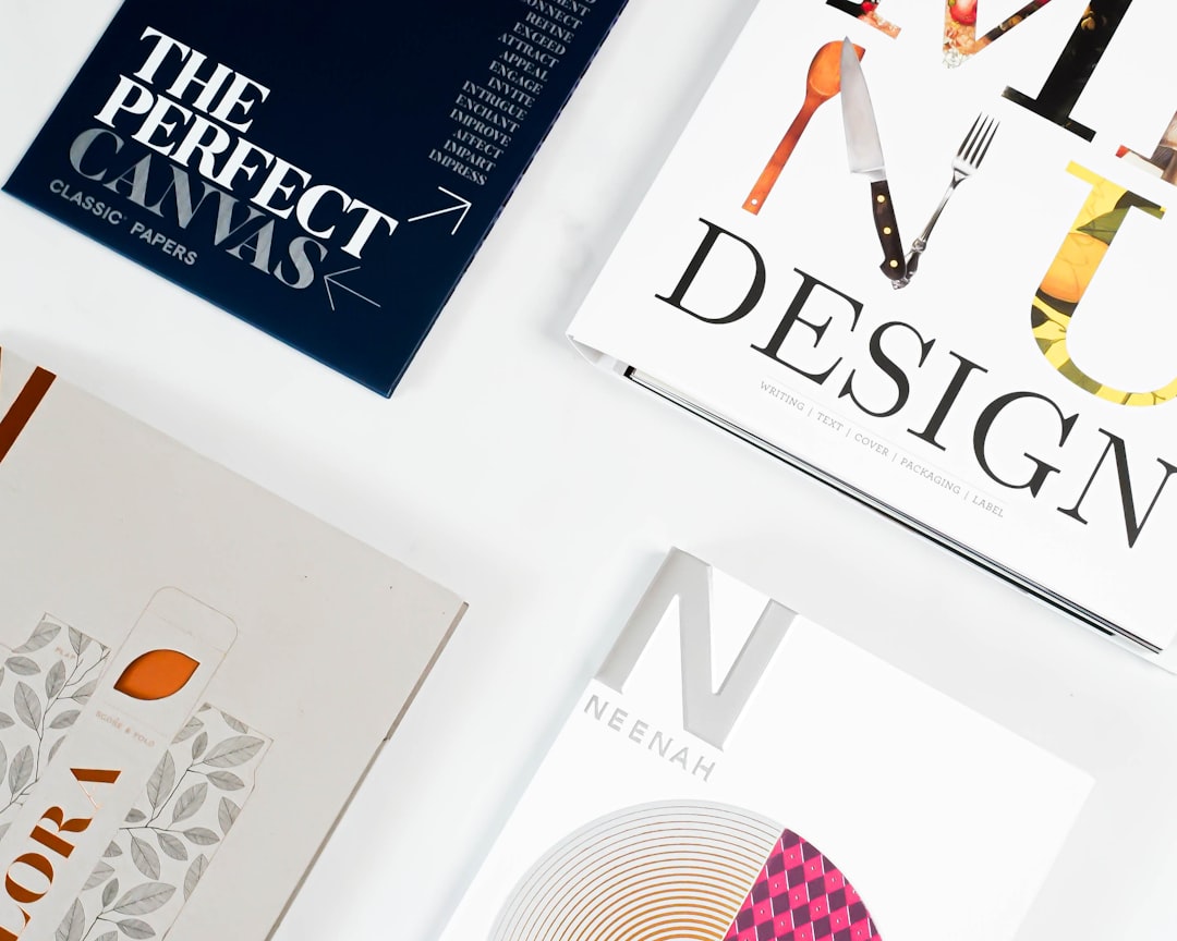
Brochure Design Principles That Work
A brochure has to do something most marketing pieces never face: it folds. That single fact changes everything, because the reader does not see your layout all at once — they reveal it panel by panel, in an order you can either control or ignore. Strong brochure design principles exist to manage that reveal, so the cover earns a second look, each fold delivers the right information at the right moment, and the final panel tells the reader exactly what to do next. A brochure that ignores its own folds reads like a flattened poster cut into confusing rectangles.
The key principles of brochure design
Before the panel-by-panel breakdown, here are the seven principles that separate a brochure people keep from one that goes straight in the bin.
| Principle | Why it matters |
|---|---|
| Fold logic | The fold type dictates how content is revealed and how much fits on each panel. |
| Panel flow | Readers open panels in sequence; information must unfold in a logical order. |
| Cover hook | The front panel decides whether the brochure gets opened at all. |
| Consistent grid | A shared grid across panels keeps margins, columns, and alignment unified. |
| Typography & legibility | Body copy must stay readable in tight panel widths and small print sizes. |
| Image quality & bleed | High-resolution images with proper bleed prevent white slivers at fold edges. |
| Clear call to action | One unmistakable next step turns interest into contact. |
1. Fold logic — design for the format, not against it
Bi-fold, tri-fold, and gate-fold brochures each behave differently, and your content should drive the choice. A tri-fold suits a three-part story or a service-features-contact structure, while a bi-fold gives you larger spreads for image-led pieces and a gate-fold builds a dramatic reveal toward a centre panel. Map your content to panels before you design a single element, because retrofitting a tri-fold story into a bi-fold leaves you with awkward gaps or cramped columns.
2. Panel flow — sequence the reveal
On a tri-fold, the inside-right panel is hidden until the reader fully opens the piece, so it is the wrong place for your opening message and the right place for a payoff or call to action. Plan the journey: cover hooks, the first fold introduces, the full open delivers detail, and the back panel closes. Following a deliberate visual hierarchy within and across panels keeps the eye moving in the order you intend rather than wandering.
3. Cover hook — earn the open
The front panel competes with everything else on the table, so it needs one strong idea, not a summary of the whole brochure. A bold benefit-led headline, a single striking image, and breathing room beat a crowded front that tries to say everything. Treat the cover like a flyer: if it cannot be understood in three seconds, it will not be opened, which is why many teams cross-reference solid flyer design principles when building the front panel.
4. Consistent grid — unify every panel
Because panels are designed in separate columns, it is easy for each one to drift into its own margins, type sizes, and alignment. A shared underlying grid fixes this: consistent outer margins, a repeating column structure, and aligned baselines make the brochure feel like one designed object rather than three leaflets taped together. Keep heading styles, bullet treatments, and spacing identical across panels for a professional, trustworthy result.
5. Typography & legibility — respect the narrow column
Panel widths are tight, so body type that is too large creates ragged, hard-to-read lines while type that is too small strains the eye. Aim for comfortable line lengths, generous leading, and a clear contrast between headings and body copy. Limit yourself to two typefaces and lean on weight and size for hierarchy; if you need to brush up on terminology, the typography terms glossary is a useful reference.
6. Image quality & bleed — prepare for print
Brochures are usually printed, and print is unforgiving. Use images at 300 dpi so they stay crisp, and extend any background colour or photo that touches a panel edge into the bleed area so trimming never reveals a white sliver. Keep critical text and logos inside the safe margin, well away from fold lines, so nothing important lands in a crease.
7. Clear call to action — close with one next step
A brochure that informs but never asks for action wastes its final panel. Decide on the single most valuable response — a phone call, a website visit, a booking, a QR scan — and make it the most prominent element on the closing panel. One clear CTA beats five competing ones, and pairing it with contact details and a short reason to act now removes friction.
Common brochure design mistakes to avoid
- Designing a flat layout first, then folding it — so headlines land mid-crease and panel order makes no sense.
- Cramming every panel full of text with no white space, leaving the reader nowhere to rest.
- Using low-resolution images or forgetting bleed, producing pixelated photos and white edges after trimming.
- Burying or omitting the call to action, so an engaged reader has no obvious next step.
Frequently Asked Questions
What are the most important brochure design principles?
The most important principles are fold logic, panel flow, and a strong cover hook. Together they ensure the brochure gets opened, reveals information in the right order, and respects the physical format. Supporting these with a consistent grid, legible typography, print-ready images, and one clear call to action turns a folded sheet into an effective marketing tool.
What is the best fold and size for a brochure?
A US letter (8.5×11 in) or A4 sheet folded into a tri-fold is the most common, versatile choice and fits standard envelopes and racks. Choose a bi-fold for image-heavy, magazine-style pieces and a gate-fold when you want a dramatic central reveal. Let your content structure decide the fold rather than defaulting to a tri-fold every time.
How much text should a brochure contain?
Less than most people expect. Each panel should carry one idea supported by a short paragraph or a few bullets, with ample white space around it. Lead with benefits and scannable subheads, and move dense detail to a single deeper-information panel so the reader is never confronted with a wall of text.
How do I make a brochure look professional?
Hold a consistent grid and type system across every panel, use high-resolution images with proper bleed, and limit your palette and typefaces. Professionalism comes from restraint and consistency: aligned margins, repeated styles, and clear hierarchy signal care, while mismatched panels and crowded layouts signal the opposite.
What resolution and bleed do brochures need for print?
Use raster images at 300 dpi and set up at least a 3 mm (about 0.125 in) bleed on every outer edge, extending background colours and photos into that area. Keep essential text and logos within a safe margin away from trim and fold lines so nothing critical is cut off or creased during finishing.


