Business Card Design Principles That Work
A business card has about three seconds to make an impression before it lands in a pocket or a drawer. Strong business card design principles keep that tiny canvas readable, professional, and easy to act on. Cards fail when they cram in too much, use type so small it disappears, or ignore print requirements and arrive with text trimmed off the edge. They succeed when every element earns its place and the most important information reads instantly.
The key principles of business card design
These seven principles cover the decisions that matter most, from physical dimensions to the finish you specify at the printer.
| Principle | Why it matters |
|---|---|
| Use the standard size | 3.5 x 2 in (85 x 55 mm) fits wallets, holders and printers without surprises. |
| Set bleed and a safe zone | Prevents key text and edges from being trimmed off during cutting. |
| Build a contact hierarchy | Guides the eye to name, role and contact details in the right order. |
| Keep type legible | Roughly 8pt minimum keeps phone numbers and emails readable. |
| Don’t overcrowd | White space signals quality and makes the card easy to scan. |
| Give the logo presence | Reinforces brand recognition and anchors the layout. |
| Use both sides wisely | Splits content so neither face feels cramped. |
1. Use the standard size — design for real-world dimensions
Most regions expect a card around 3.5 x 2 inches (85 x 55 mm), and that consistency is a feature, not a limitation. Standard cards slot into wallets, card holders, and Rolodex-style files, and every commercial printer supports the format. Designing off-size invites awkward storage and higher costs. If you want to stand out, do it through finish, stock weight, or a rounded corner rather than an unusual footprint that won’t fit where people keep cards.
2. Set bleed and a safe zone — get the print setup right
Anything that runs to the edge needs a bleed of about 3 mm (0.125 in) beyond the trim line so cutting never leaves a thin white sliver. Equally important is the safe zone: keep all text and logos at least 3-4 mm inside the trim, because mechanical cutting drifts slightly. Set your document to CMYK, not RGB, and supply 300 DPI artwork. These details separate a card that looks crisp from one that arrives with a clipped phone number.
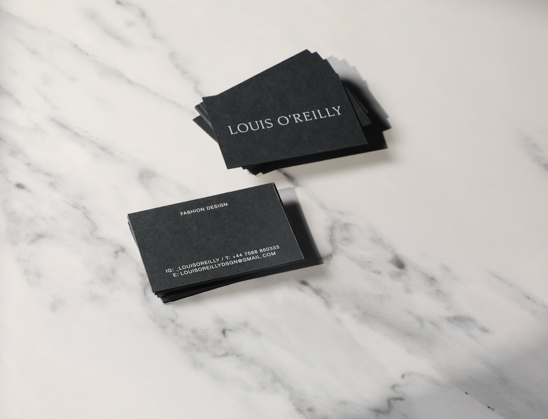
3. Build a contact hierarchy — lead the eye in order
A reader should absorb your card in a predictable sequence: who you are, what you do, then how to reach you. Make the name the largest text element, set the title or role slightly smaller, and let phone, email, and website form a tidy, equal-weight cluster. Strong visual hierarchy means the viewer never has to hunt. Drop details most people don’t need, like a fax line or a long physical address, unless they’re genuinely relevant to your work.
4. Keep type legible — respect the minimum size
The most common card mistake is type that’s too small to read comfortably. Keep body details at roughly 8pt and above, and confirm the chosen typeface holds up at that scale. Avoid ultra-thin weights and tight letter spacing, which both collapse in small print. If your brand uses a delicate display face, reserve it for the name and pair it with a sturdier, highly readable face for contact details. Reviewing core typography terms helps you pick weights and spacing that survive printing.
5. Don’t overcrowd — let white space do its job
Empty space is not wasted space. Margins and gaps around your content make the card feel considered and premium, and they give the eye places to rest between elements. Resist the urge to fill every corner with taglines, social handles, and QR codes. Pick the few things that matter, group them logically, and trust the negative space to carry the rest of the composition.
6. Give the logo presence — anchor the brand
Your logo is usually the strongest brand signal on the card, so give it a clear, uncrowded position rather than shrinking it into a corner. It should be recognizable at small scale and reproduce cleanly in the chosen colors. If the logo is the hero, let the name play a supporting role; if the name leads, keep the logo as a confident secondary mark. Either way, one element should clearly dominate so the layout has a focal point.
7. Use both sides and choose a finish
Two sides let you separate concerns: brand and logo on the front, contact details on the back, or vice versa. This prevents either face from feeling packed. The finish then sets the tactile tone. Matte feels understated and is easy to write on; gloss makes colors pop; spot UV or foil adds a tactile highlight to a logo or name. Heavier stock (around 350 gsm and up) communicates substance the moment someone holds it.
Common business card design mistakes to avoid
- Placing text or logos too close to the edge, so cutting trims them off.
- Cramming every phone number, handle, and tagline onto one side.
- Using type below 8pt or ultra-thin weights that vanish in print.
- Exporting in RGB at low resolution, producing dull or pixelated results.
Frequently Asked Questions
What are the most important business card design principles?
The essentials are using the standard 3.5 x 2 inch size, setting a clear contact hierarchy with the name leading, keeping type legible at roughly 8pt and up, avoiding clutter through white space, and preparing files correctly with bleed and a safe zone. Together these keep a card readable, professional, and print-ready.
What is the standard business card size?
In North America the standard is 3.5 x 2 inches; much of Europe uses 85 x 55 mm, which is nearly identical. Add about 3 mm of bleed on every side for printing, and keep all text at least 3-4 mm inside the trim line so nothing important is cut off.
What is the minimum readable type size for a business card?
Aim for roughly 8pt as a floor for contact details, and confirm legibility by printing a test at actual size. Thin or condensed fonts may need a point or two more. The name can be considerably larger to lead the hierarchy, while details stay small but comfortably readable.
Should a business card be printed on one side or two?
Two sides usually work better because they let you separate brand elements from contact details, keeping each face uncrowded. A single-sided card is fine for minimal designs, but if you feel the urge to shrink type to fit everything, that is a sign to move some content to the back.
What finish should I choose for a business card?
Matte suits understated, professional brands and is easy to write on; gloss boosts color vibrancy; spot UV or foil adds a tactile accent to a logo or name. Pair your finish with a heavier stock, around 350 gsm or more, so the card feels substantial. For broader guidance, see our overview of core design principles.


