What Font Does Catan Use?
Searching for the catan font usually means you want the famous rugged adventurous wordmark from the hugely popular settlement and trading board game, once called The Settlers of Catan, not a generic serif or everyday type. The honest answer is that the logo is custom artwork, not a single released typeface. The lettering is rugged and characterful, with hand-hewn letterforms that feel adventurous and earthy, matching the game’s theme of building settlements on a wild, resource-rich island. Below we break down what the lettering actually is, why it suits the brand’s frontier tone, and which free fonts get you closest legally.
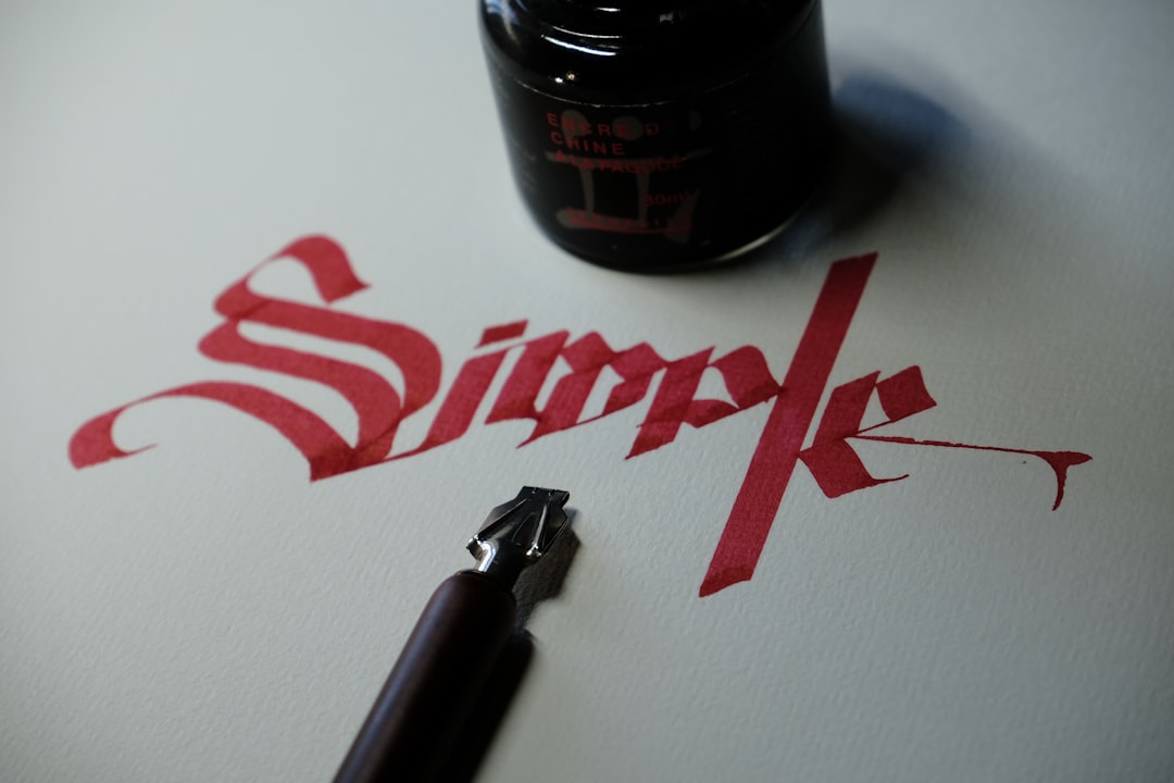
What font is the Catan logo?
The Catan logo is best understood as a custom, rugged adventurous lettering treatment rather than a single installed font. The letters are sturdy, characterful, and slightly weathered, drawn with the kind of hand-hewn quality you would expect from a game about taming an untamed island. That rugged, adventurous character is the whole identity: the wordmark looks crafted and earthy rather than slick, often with carved or organic edges that echo timber and stone. As with most thematic game logos, the characters were drawn, weighted, and spaced by hand so the rugged balance falls exactly where the designers wanted it.
Because long-running brands commission lettering artists for their identity, treat the precise construction as an informed observation, not a confirmed spec. The current logo is a recognisable rugged treatment rather than a stock face. The look is reminiscent of weathered slab serifs and carved, frontier-style display fonts rather than any one downloadable file. If it were a stock typeface, fans would have named it years ago, so treat the construction as bespoke rugged lettering built specifically for the game.
What typeface does Catan use in its branding?
Across the box, board, cards, expansions, and decades of merchandise, Catan keeps a custom rugged adventurous wordmark while pairing it with cleaner, more legible faces for resource cards, numbers, and rules. The logo gets the hand-hewn treatment; functional text such as card titles, dice numbers, and instructions is usually set in a quieter serif or sans so it stays readable. This split between a characterful display logo and neutral supporting type is standard across thematic board-game branding.
So if your goal is to mirror the whole identity, you need two decisions: one rugged, adventurous display for the headline with carved letters, and one calm, well-spaced face for the cards and paragraphs. Setting body copy in the textured display style is the most common mistake people make when chasing this frontier aesthetic.
Free fonts that look like the Catan font
No free font will be an exact match, but several capture the rugged, adventurous spirit well enough for a poster, a card mockup, or a fan project. Bold names below are alternatives you can search for and license accordingly.
| Use case | Catan uses | Free alternative |
|---|---|---|
| Main title / poster | Custom rugged adventurous logo | Rye or Alfa Slab One |
| Subtitle / card titles | Carved classical serif | Cinzel or Playfair Display |
| Body / credits | Clean readable sans | Inter or Work Sans |
Rye is a strong starting point for the title because its rugged, slab-serif, frontier character shares the logo’s hand-hewn, adventurous feel; scale it large and tune the spacing to match. Alfa Slab One gives a heavier, sturdier feel if you want extra weight, and Cinzel adds a carved, classical character that suits the settlement mood when set in earthy tones of timber brown, ochre, and deep green.
For the most authentic effect, set the title in Catan’s signature earthy palette of warm browns, ochre, and forest green with confident spacing so the letters feel rugged and crafted. The rugged character is what makes the logo read as “Catan,” so the colour and texture matter as much as the font. Crisp, perfectly even tracking can flatten the hand-hewn feel, so work large, keep the spacing organic, and let the letters feel carved. A single download will always fall short until you add that frontier palette yourself. For another game breakdown, see our Risk font guide.
Why does Catan use this kind of type?
The lettering is doing real branding work. Catan is positioned as an immersive game of exploring, settling, and trading on a wild island, so its logo needs to feel rugged, earthy, and adventurous rather than slick or minimal. Hand-hewn, weathered letterforms read as crafted and immersive, exactly the mood the brand wants on a shelf of strategy games. A clean modern sans alone would feel wrong here, and a playful script would undersell the adventure. The custom treatment balances ruggedness and legibility, making the game instantly recognisable across its many expansions.
The choice also primes players emotionally. Rugged, carved letters feel earthy and adventurous, which suits a game whose whole appeal is building a foothold on untamed land. That frontier tone is hard to achieve with a stock font, because a generic serif reads as ordinary rather than immersive. A bespoke treatment lets the designers pitch the feel precisely, somewhere between a pioneer’s map and a fantasy adventure, which is exactly the register a settlement game wants.
Can I use the Catan font for my own project?
You can recreate the style, but you cannot use the actual logo. The Catan name and wordmark are trademarked branding owned by its publishers, so copying them for merchandise, a business, or anything implying affiliation is off-limits. Using a free rugged look-alike for a personal, fan, or unrelated creative project is fine as long as you respect each font’s individual license. Our font licensing guide explains personal-versus-commercial use, and our famous brand fonts hub collects more logo type breakdowns. If you are exploring other games, our Jenga font guide covers a bold stacked-block wordmark.
Frequently Asked Questions
Is the Catan font free to download?
No. The Catan logo is custom artwork, not a released font, so there is no official file to download. Any “Catan font” you find is a fan recreation or look-alike. For the style, use free fonts like Rye or Cinzel, set them in an earthy palette, and check each license before commercial use.
What font is most similar to the Catan logo?
Rye is among the closest free matches for the rugged, hand-hewn letterforms, with Alfa Slab One a heavier alternative and Cinzel a more carved, classical option. None is identical, since the logo is hand-styled and relies on its texture and earthy colours, but with the right palette and organic spacing they get convincingly close for fan projects.
Did the company design the logo itself?
Long-running brands typically commission lettering artists and brand designers for their identity, and the rugged adventurous styling is consistent with that practice. Treat the precise authorship as an informed observation rather than a confirmed credit, but it is clearly custom work rather than a stock font, given how specifically the hand-hewn letterforms suit the settlement theme.
Can I use a Catan-style font commercially?
You can use a free look-alike font commercially if its license permits, but you cannot reproduce the trademarked Catan wordmark on products you sell. Set your own text in a free rugged serif font instead of copying the official logo, and verify both the font license and trademark rules first. Imitating an adventurous mood is fine; reproducing the exact logo is not.


