Character Design Basics for Beginners
Strong character design is built on a handful of fundamentals that have nothing to do with how well you can render. A memorable character starts with a clear silhouette, a deliberate shape language, and consistent proportions, draftsmanship comes later. This guide walks beginners through those fundamentals so you can design characters that read instantly, stay on-model across poses, and actually communicate personality, whether for a brand mascot, an illustration series, or a personal project.
Character work is one of the most valuable styles in the illustration toolkit because it gives a brand a recurring, recognizable presence. For where it sits among the other approaches, line art, isometric, 3D, see our pillar on illustration styles every designer should know. Here we focus on the craft of the character itself.
Start With the Silhouette
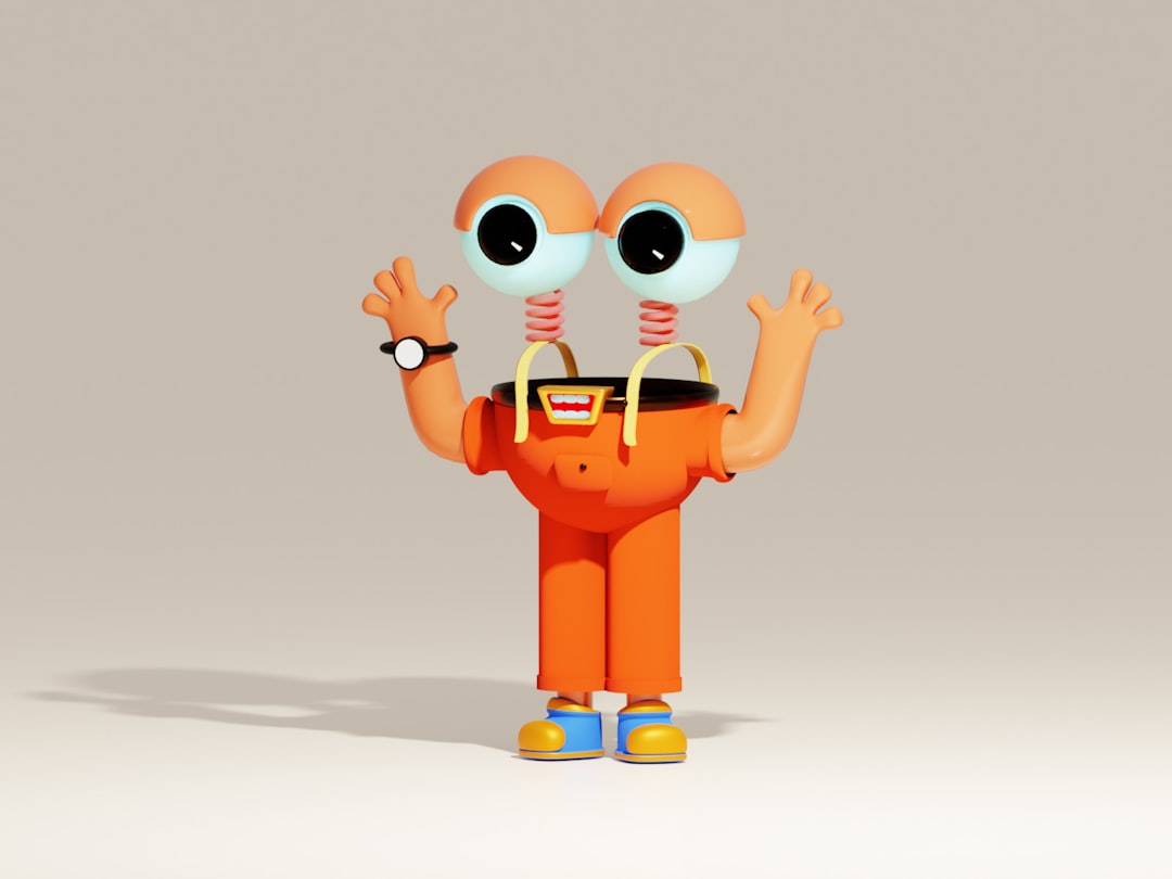
The single best test of a character design is the silhouette test: fill your character with solid black and ask whether it is still recognizable and readable. Iconic characters, think of any beloved cartoon, pass this instantly because their shapes are distinct in outline alone. If your character is only identifiable by its surface details (color, face, costume markings), the underlying design is weak.
Design the silhouette first, before any detail. Exaggerate distinctive features, an oversized hat, a particular posture, a unique body shape, so the outline alone carries identity. A strong silhouette is what lets a character read at thumbnail size and from across a room, and it is the foundation everything else sits on.
Use Shape Language Deliberately
Audiences read meaning into basic shapes, and great character design weaponizes that:
- Circles and curves feel friendly, soft, approachable, and youthful, used for heroes, children, and likable mascots.
- Squares and rectangles feel stable, strong, dependable, and sometimes stubborn, used for reliable, grounded characters.
- Triangles and sharp angles feel dynamic, dangerous, or energetic, used for villains, speed, and tension.
Choose a dominant shape that matches your character’s personality and build the whole design around it, a round, bouncy mascot or an angular, aggressive one. This shape language communicates personality before the viewer registers a single detail, and it is one of the most reliable tools in the discipline. Consistency in shape is also what keeps a brand mascot feeling like itself across applications, the same instinct behind good icon design, where a coherent shape system holds a whole set together.
Get Proportions and Ratios Right
Proportion drives the entire feel of a character, and the key variable is the head-to-body ratio. Larger heads and bigger eyes read as younger, cuter, and more approachable, which is why mascots and children’s characters use exaggerated heads (sometimes a 1:1 head-to-body ratio). More realistic, adult proportions (a smaller head, longer body) read as mature and serious.
Decide your proportions intentionally based on the personality and audience, then lock them in. Inconsistent proportions are the fastest way to make a character look “off” between drawings. Establish the ratios early and treat them as a rule for every subsequent pose.
Design Expressive Faces
The face carries emotion, and for most characters, simpler is more expressive. Big, clear eyes and a readable mouth communicate feeling far better than anatomically detailed faces, which is why so many beloved characters have minimal, almost abstract features. Focus on the eyes and brows; together they convey the majority of emotional information.
A practical exercise: draw your character expressing four core emotions, happy, sad, angry, surprised, using only changes to the eyes, brows, and mouth. If those read clearly, your facial system works. If they all look similar, simplify and exaggerate until each emotion is unmistakable.
Build a Consistent Color Palette
Color reinforces personality and aids recognition. Most strong characters use a tight, intentional palette, a dominant color, one or two secondary colors, and an accent, rather than a chaotic mix. The dominant color often carries meaning (warm tones for friendly characters, cool or dark tones for cold or villainous ones).
Lock the exact colors into a small palette and reuse them everywhere, because color becomes part of the character’s identity. A character recognized by its signature color is a character working as a brand asset, which is the whole point of a mascot.
Stay On-Model Across Poses
The real test of a character design is whether it survives being drawn many times. “On-model” means the character looks consistent across every pose, angle, and expression, same proportions, same shapes, same key features. This is where amateur character work falls apart: the character looks great in the hero pose and then drifts in every variation.
Professionals create a character model sheet, a reference showing the character from front, side, and three-quarter views, plus a range of expressions and poses, to lock down the design. Build one before you commit to a character, and use it as the source of truth. The model sheet is what makes a character reusable across a campaign rather than a one-off drawing.
Add Personality Through Details
Once the fundamentals are solid, details give the character life: a signature accessory, a recurring gesture, a distinctive texture or marking. These specifics make a character feel like an individual rather than a generic figure. The key is restraint, one or two memorable details outperform a cluttered design, and they should reinforce the personality the silhouette and shape language already established, not fight it.
Think about the story the character tells at a glance. Every choice, the slouch, the squint, the worn-out boots, should add to a coherent personality. When silhouette, shape, proportion, expression, color, and detail all point in the same direction, you have a character that communicates instantly and stays memorable, which is exactly what a brand or illustration series needs.
Frequently Asked Questions
What are the basics of character design?
The core basics are silhouette (a recognizable outline), shape language (using circles, squares, and triangles to signal personality), proportion (head-to-body ratio that sets age and tone), expression (clear, readable faces), and staying on-model across poses. Strong drawing skill helps, but these fundamentals matter far more for a memorable character.
Do I need to be good at drawing to design characters?
Not at the start. Character design rests on silhouette, shape language, and proportion, decisions that depend more on intentional design thinking than rendering skill. Many appealing characters use simple, clean shapes. Drawing ability helps you execute, but a well-conceived simple character beats a beautifully rendered but poorly designed one.
What is the silhouette test in character design?
The silhouette test fills a character with solid black to check whether it is still recognizable from its outline alone. Strong characters pass because their shapes are distinct without surface details. If a character is only identifiable by color or face markings, its underlying design is weak and needs a more distinctive silhouette.
What is a character model sheet?
A character model sheet is a reference document showing a character from multiple angles, front, side, three-quarter, along with a range of expressions and poses. It locks down proportions, shapes, and key features so the character stays consistent (on-model) across every drawing, making it reusable across a campaign or series.
How does shape language affect character design?
Shape language uses basic forms to signal personality before the viewer notices details. Circles and curves read as friendly and approachable, squares as stable and dependable, and triangles or sharp angles as dynamic or dangerous. Choosing a dominant shape that matches the character’s personality makes the design communicate instantly.


