Charcoal vs Black: What’s the Difference?
At first glance, charcoal and black may look interchangeable — they are both dark, serious, and versatile. But experienced designers know the gap between them is significant. Black (#000000) is the complete absence of light, the darkest value possible on any screen or page. Charcoal (~#36454F) is a very dark gray with subtle blue or warm undertones that soften its appearance. The charcoal vs black color distinction matters for readability, mood, and visual comfort in every medium from web interfaces to printed packaging.
In this comparison we explore the black vs charcoal debate in detail — covering hex codes, psychological associations, and actionable guidance on when to swap pure black for its warmer cousin. For more on dark and neutral shades, see our neutral color palette guide.
Black: The Absolute Dark
Black is the zero point of the light spectrum. In digital design its hex code is #000000, meaning all red, green, and blue channels are set to zero. In print, achieving a true black often requires a rich black mix (adding cyan, magenta, and yellow to 100% key) because 100% K alone can look washed out on press.
Characteristics of Black
Pure black is absolute and uncompromising. It provides the highest possible contrast against white, making it a go-to for body text in editorial design and for bold graphic statements. However, that same extreme contrast can feel harsh on screens, especially in dark-mode interfaces where large areas of #000000 against bright text cause eye strain.
Black carries powerful psychological weight: authority, elegance, formality, and mystery. Luxury fashion houses, tech companies, and editorial brands rely on black to project sophistication. Yet its starkness can also feel cold or impersonal if used without relief.
When Black Works Best
Black excels in high-contrast graphic design — think bold typography, dramatic photography, and minimalist logos. It is indispensable for foundational design principles like establishing visual hierarchy, because nothing draws the eye faster than a black element on a light field.
Charcoal: The Warm Dark Gray
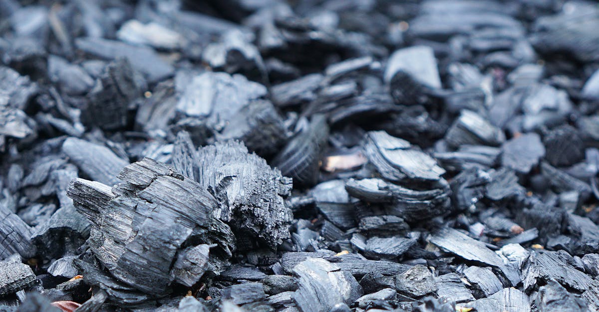
Charcoal is named after the dark residue left by burned wood — a material that is almost black but retains visible texture and warmth. The color hovers in the very dark gray range, typically between #36454F and #333333, and often carries a faint blue, green, or brown undertone depending on the specific formulation.
Characteristics of Charcoal
Because charcoal is not absolute zero, it introduces a sliver of lightness that the human eye perceives as depth and warmth. Placed beside true black, charcoal appears noticeably softer — almost velvety. This subtlety makes it far more forgiving in large-area applications like website backgrounds, card components, and dark-mode themes.
Charcoal also pairs more naturally with other colors. Where pure black can overpower pastels or muted tones, charcoal sits alongside them without dominating. Designers working with earth tone palettes or pastel palettes often prefer charcoal for text and borders because it harmonizes rather than clashes.
Common Charcoal Hex Codes
- #36454F — classic charcoal with a cool blue undertone
- #333333 — a popular web-safe dark gray used as a body-text alternative to black
- #3B3B3B — a neutral charcoal without a strong color cast
- #2E2E2E — a deeper charcoal that stays just short of black
Key Differences
Here is how charcoal and black compare across the dimensions that matter most to designers:
- Lightness: Black has zero lightness; charcoal has a small but perceptible amount of lightness (roughly 15–25% in the HSL model).
- Undertone: Black has no undertone — it is the absence of color. Charcoal typically carries a subtle blue, green, or brown cast.
- Contrast: Black creates maximum contrast against white (21:1 ratio). Charcoal produces slightly less contrast, which can be easier on the eyes for extended reading.
- Mood: Black feels absolute, dramatic, and formal. Charcoal feels sophisticated, approachable, and modern.
- Versatility: Charcoal blends more seamlessly into multi-color palettes; black tends to dominate.
Understanding grey vs gray naming conventions can also help you navigate the spectrum of dark neutrals when specifying colors for international teams.
Hex Codes and Design Use
Below are side-by-side values for quick reference:
- Black (#000000): RGB 0, 0, 0 | CMYK 0, 0, 0, 100 (or rich black: 60, 40, 40, 100)
- Charcoal (#36454F): RGB 54, 69, 79 | CMYK 32, 13, 0, 69
In UI design, many style systems — including Material Design and Apple’s Human Interface Guidelines — default to off-black or charcoal values for text rather than pure #000000. The rationale is simple: reducing maximum contrast lowers visual fatigue without sacrificing readability. A body-text color of #333333 on a #FFFFFF background still meets WCAG AAA standards while feeling noticeably gentler.
For print, charcoal offers a practical advantage: it is easier to achieve consistent results on press. Rich black requires careful ink management to avoid smearing, while a charcoal mix uses less total ink coverage and dries faster.
When to Use Charcoal Instead of Black
Not every situation calls for a swap — sometimes only true black will do. Here is a decision framework:
Use Charcoal When
- Designing dark-mode interfaces or backgrounds where users will spend extended time reading.
- Building palettes with soft, muted, or warm colors that black would overpower.
- Creating editorial layouts where readability and visual comfort are priorities.
- Printing large solid areas where ink coverage needs to be controlled.
- Seeking a modern, approachable brand voice rather than a stark, formal one.
Use Black When
- Maximum contrast is required for accessibility — small text on complex backgrounds.
- The design concept is deliberately dramatic, bold, or high-fashion.
- Printing fine text at small sizes, where lighter dark grays may appear washed out.
- The brand identity is built around the authority and absolutism of pure black.
FAQ
Is charcoal just dark gray?
Charcoal is a specific type of dark gray that typically carries a subtle cool or warm undertone. While all charcoal shades are dark grays, not all dark grays are charcoal — some lack the characteristic depth and slight color cast that define the charcoal family.
Why do designers avoid pure black for body text?
Pure black (#000000) on a pure white (#FFFFFF) background creates a 21:1 contrast ratio, which is technically perfect but can cause a harsh vibrating effect, especially on backlit screens. Slightly reducing that contrast with charcoal or off-black values (#222222 to #333333) eases eye strain while still exceeding WCAG accessibility thresholds.
Can charcoal and black be used together?
Yes, combining charcoal and black adds depth to dark-themed designs. Use true black sparingly — for borders, icons, or emphasis — while charcoal handles larger surfaces like backgrounds and card fills. The contrast between the two creates a layered, three-dimensional feel.
What colors pair well with charcoal?
Charcoal is exceptionally versatile. It pairs elegantly with warm whites, golds, dusty roses, sage greens, and slate blues. For a complete palette-building approach, explore our neutral color palette guide, which covers dark neutral pairings in depth.


