What Font Does Chevrolet Use?
If you have ever stared at a tailgate and wondered which typeface spells out the badge, the short answer is that the chevrolet font is bespoke. Automakers almost never publish the exact files behind their logos, so what follows separates the trademarked wordmark from the everyday type Chevrolet uses in ads and dealer materials. For more brand breakdowns, see our famous brand fonts hub.
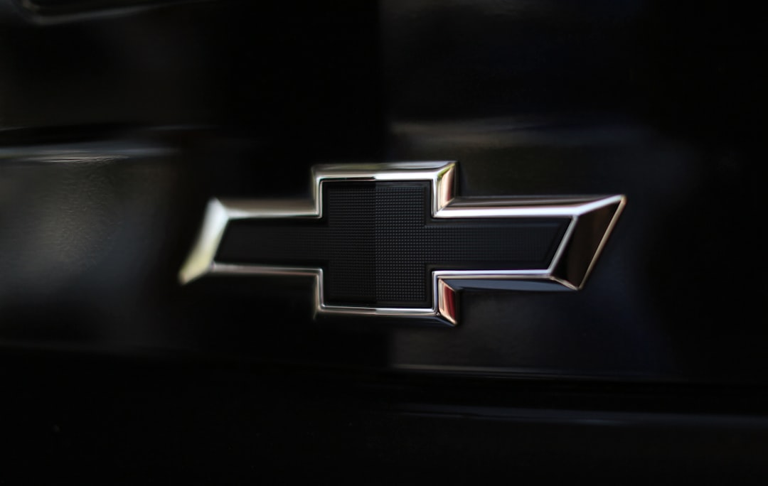
What font is the Chevrolet logo?
The visual heart of the Chevrolet identity is the gold “bowtie” emblem, but the lettering that accompanies it is its own design exercise. The “CHEVROLET” wordmark is set in wide, uppercase letters with generous tracking and squared-off, even-weight strokes. It is best described as custom lettering rather than a licensed font: the proportions are tuned so the word sits cleanly under or beside the bowtie at any size, from a grille badge to a stadium banner. The letterforms feel sturdy and upright, with little contrast between thick and thin, which gives them a dependable, hard-wearing character that matches the truck-and-everyman positioning of the brand.
What is Chevrolet’s brand typeface?
Beyond the badge, Chevrolet’s marketing has been reported to rely on robust American-style sans-serifs for headlines and supporting copy. Over the years this has appeared as confident grotesque and geometric faces that echo the wordmark’s wide, no-nonsense stance. Chevrolet has not, as far as public records show, released a single named “Chevrolet Sans” the way some rivals license a bespoke corporate family, so any specific font name attached to the brand should be treated as a close match or an educated guess rather than confirmed fact. What is consistent is the *style*: heavy weights, open counters, and a plain-spoken tone that prioritizes legibility on signage and screens.
Free fonts that look like the Chevrolet font
You cannot legally lift the trademarked wordmark, but you can recreate its spirit with open-source faces. The table below pairs each use case with a practical free substitute that captures the bold, wide, American-sans feel.
| Use case | Chevrolet uses | Free alternative |
|---|---|---|
| Logo / wordmark | Custom wide letter-spaced caps | Saira (Bold, expanded), tracked out |
| Headlines | Strong American grotesque sans | Archivo Black or Montserrat Bold |
| Body / UI | Clean neutral sans | Archivo or Inter |
For a deeper menu of options, browse our roundup of the best sans-serif fonts and test a few weights before committing.
Why does Chevrolet use this kind of type?
Type choice is brand strategy. Chevrolet sells dependability, value, and a broad slice of American life, from work trucks to family crossovers. Wide, bold sans-serif lettering communicates exactly that: it is solid, unpretentious, and instantly readable from a moving vehicle or a highway billboard. The squared, even strokes feel engineered rather than decorative, reinforcing the impression of something built to last. There is also a practical reason: badges get stamped, embossed, and reproduced at tiny sizes on screens and at enormous sizes on dealership signage, so the letterforms must hold up across that entire range without losing clarity.
Can I use the Chevrolet font for my own project?
The Chevrolet wordmark and bowtie are protected trademarks owned by General Motors, so you cannot use them to brand your own product, merchandise, or business. Even if you found a downloadable file claiming to be the logo font, reproducing the mark could create legal exposure. The safe path is to use a free, openly licensed alternative such as Archivo or Saira to evoke a similar look without copying anyone’s identity. Before publishing, confirm the license covers your use, whether that is web, print, or embedding, by reviewing our font licensing guide.
Frequently Asked Questions
Is the Chevrolet logo a real downloadable font?
No. The “CHEVROLET” wordmark is custom lettering created for the brand, not a retail font you can buy or download. Any file online labeled “Chevrolet font” is an unofficial recreation. To get a similar effect legally, use a bold, wide sans-serif such as Archivo Black or Saira and adjust the letter spacing to taste.
What font is closest to the Chevrolet wordmark?
For the wide, bold, all-caps wordmark, Saira in an expanded bold weight or Archivo Black both come close once you increase the tracking. Montserrat Bold is another accessible option. None will match perfectly, since the original is hand-tuned, but they reproduce the upright, even-stroke American-sans character convincingly.
Does Chevrolet have an official brand typeface?
Chevrolet has not publicly released a single named corporate typeface in the way some automakers do. Its marketing has been reported to use strong American-style sans-serifs, but specific names should be treated as close matches rather than confirmed brand fonts. The identity is defined more by the bowtie and the custom wordmark than by a downloadable family.
What color is the Chevrolet bowtie and lettering?
The modern bowtie is gold with a silver outline, and the wordmark typically appears in a matching dark or metallic tone depending on the placement. On dark backgrounds the lettering often flips to white or silver. The exact specifications are part of General Motors’ internal brand guidelines and are not published for public use.
Can I use Archivo or Saira commercially?
Yes. Both Archivo and Saira are released under the SIL Open Font License, which permits commercial use in print, web, apps, and products at no cost. You should still keep a copy of the license file and avoid selling the fonts themselves. For any client work, our font licensing guide explains how to document permissions properly.


