What Font Does Code Vein Use?
If you searched for the code vein font, you likely saw that clean, sharp-edged wordmark and want to recreate it for a banner, an avatar, or a fan project. The honest answer: the Code Vein logo is custom lettering, shaped for Bandai Namco to match the game’s slick anime-vampire aesthetic. It is not a font you can download. Below we break down the logo, the in-game UI type, and the free fonts that get you closest, plus how to license everything cleanly so your design holds up commercially.
It helps to set expectations up front: there is no single “Code Vein font” file, and that is true for almost every major game wordmark. Studios commission bespoke lettering precisely so their title cannot be copied with a free download. What you can do — and what this guide focuses on — is reverse-engineer the style into reusable, properly licensed parts you control.
What font is the Code Vein logo?
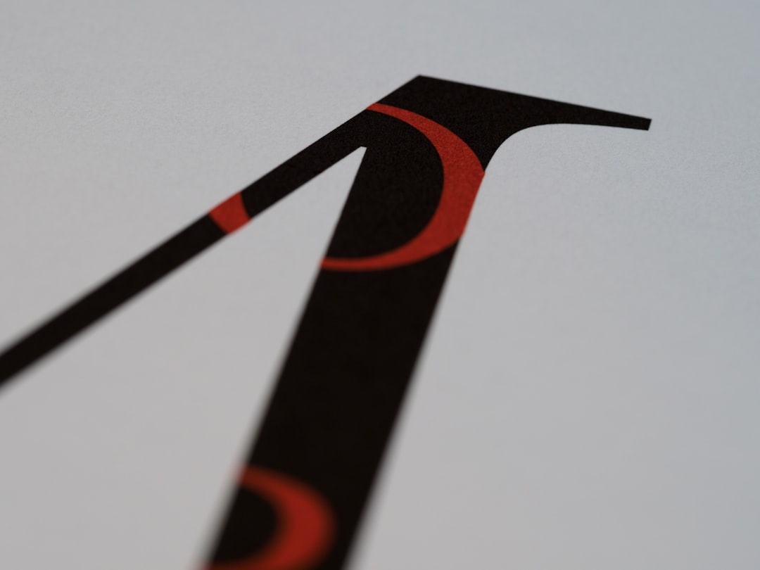
The Code Vein wordmark is a piece of custom display lettering, not a stock typeface. The letterforms are clean, geometric, and slightly sharpened — modern sans construction with angular cuts and tight spacing that give it a cool, stylish edge. It feels precise and a little futuristic, matching the game’s anime presentation rather than the grungy dread of many soulslikes.
Because it was tailored for the brand, no legitimate downloadable file named “Code Vein” exists. Sites claiming to offer “the Code Vein font” are serving generic sharp sans or modern display faces that resemble the logo. Treat any exact-match claim as an informed observation, not a confirmed spec — Bandai Namco has not published the wordmark’s construction.
What typeface does Code Vein use in-game (UI/menus)?
The stylized logo and the in-game interface are different jobs. Menus, item descriptions, skill trees, and subtitles use clean, highly legible type so the game’s soulslike systems stay readable. The angular logo styling stays with the title and key art — the UI prioritizes clarity across the game’s many stat-heavy screens.
The shipped UI typeface is not officially documented and varies by localization language, since Code Vein ships in Japanese, English, and more. For Latin text it reads as a clean modern sans chosen for legibility. If you are recreating a Code Vein look, follow the same split: sharp modern display for the headline, calm and readable type for everything else.
Free fonts that look like the Code Vein font
You cannot license the real wordmark, but free fonts capture the sleek, sharp feel well. Aim for clean geometric or angular display for titles, then a readable companion for body. Reliable free choices:
- Orbitron — a geometric, futuristic display with the cool, sci-fi edge that suits Code Vein key art.
- Rajdhani — a sharp, slightly condensed sans with angular cuts, great for headers and UI-style text.
- Exo 2 — a modern technical sans that scales cleanly from titles to body copy.
- Teko — a tall, condensed display for bold, stylish subheads.
| Use case | Code Vein uses | Free alternative |
|---|---|---|
| Logo / title | Custom sharp modern lettering | Orbitron or Rajdhani |
| Headings / key art | Angular display treatment | Teko |
| Body / menu text | Clean localized sans | Exo 2 |
| Stylish accent | Sharp geometric cuts | Rajdhani |
For more display options that suit action and anime-styled games, browse our roundup of the best gaming fonts, which covers sharp modern, brush, and heavy serif styles together.
Why does Code Vein use this kind of type?
Type sets the genre signal. Code Vein is often called the “anime Dark Souls” — a stylish, character-driven soulslike about Revenants and blood-drinking survivors in a post-apocalyptic world. Sharp, modern lettering signals that polished anime aesthetic and futuristic edge, distinguishing it from the grimy gothic look of its inspirations. A blackletter or brush logo would clash with the sleek, stylized presentation the developers chose.
This is the usual pattern: the headline font sets the visual identity, while the readable UI font keeps the game playable. For a contrast in mood, compare how a punishing samurai action game leans on brush lettering in our Nioh font breakdown — a very different flavor of dark-action branding.
What makes the Code Vein wordmark interesting is restraint. Anime-styled games often over-decorate their logos with glows, gradients, and ornamental swashes. Code Vein goes the other way: clean geometry, controlled angular cuts, and confident spacing. That minimalism reads as cool and premium, and it lets the elaborate character art and blood-red key visuals carry the emotional weight. The logo plays a supporting role, framing the cast rather than competing with it.
If you are chasing this look, precision is everything. Sharp display type is unforgiving — uneven spacing, inconsistent stroke angles, or a single soft corner will undercut the whole effect. Work on a grid, keep your angles consistent across every letter, and consider a subtle metallic or single-color treatment rather than busy gradients. The goal is a wordmark that feels engineered, like the title was milled out of metal, which is exactly the tone a stylish sci-fi-tinged soulslike wants.
Can I use the Code Vein font for my own project?
The actual wordmark belongs to Bandai Namco and is protected as part of the game’s branding. You cannot legally use it for commercial work, merchandise, or anything implying official endorsement. Personal, non-commercial fan art is low-risk, but the logo remains their intellectual property.
The safe route is to recreate the style with properly licensed fonts. Orbitron, Rajdhani, Exo 2, and Teko are all free for commercial use under open licenses — but confirm each before you ship. Our font licensing guide explains desktop, web, and embedding rights clearly. Build your wordmark from a licensed sharp display face plus your own tweaks and the result is yours to use freely.
Frequently Asked Questions
Is the Code Vein logo a real downloadable font?
No. The Code Vein wordmark is custom lettering created for the game, not a released typeface. Downloads claiming to be the official font are look-alikes. To approximate the style legally, use a free sharp display face like Orbitron or Rajdhani for your titles.
What font is closest to the Code Vein logo for free?
For the sleek, futuristic edge, Orbitron is a strong free pick. If you want a sharper, more condensed feel, Rajdhani works well. Pair either with Exo 2 for body text to keep the clean, modern anime-styled look consistent across your design.
What style is the Code Vein typeface?
It is a sharp, modern display style — clean geometric construction with angular cuts and tight spacing. The look matches the game’s stylish anime-vampire presentation, giving it a cool, futuristic edge that sets it apart from the grungy gothic branding of many other soulslikes.
Can I use Code Vein style fonts commercially?
You cannot use the actual logo commercially without permission from Bandai Namco. You can use free look-alike fonts like Orbitron and Exo 2 commercially under their open licenses. Always verify each font’s terms before shipping a paid product, and review our font licensing guide first.


