What Font Does Coldplay Use?
If you searched “Coldplay font” expecting one tidy answer, here’s the honest truth up front: Coldplay is one of the most typographically restless bands in pop, and the “Coldplay font” you have in mind almost certainly depends on which album you grew up with. Below we break the wordmark down era by era, explain why the band keeps reinventing it, and list the closest free alternatives for each look.
What font is the Coldplay logo?
Coldplay doesn’t maintain a single fixed logo the way some bands do. Instead, each album campaign gets its own custom wordmark and visual system, usually designed by the British studio The Sniffer Dog (Mark Tappin and Simon Gofton), who have shaped the band’s art for years.
That means there is no one “Coldplay font” sitting in a foundry catalogue. The lettering you remember — whether it’s the painterly script of A Rush of Blood to the Head or the neon graffiti of Mylo Xyloto — is bespoke artwork made for that release. Fan recreations of individual era logos circulate on DaFont and FontMeme, but they’re approximations of one specific campaign, not an evergreen band font. Treat any single “Coldplay font” as an informed observation tied to an era, not a confirmed, official spec.
What fonts does Coldplay use on album covers?
The fun of Coldplay typography is how radically it shifts. Here’s a tour of the major eras:
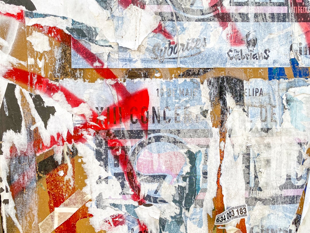
- Parachutes (2000) and A Rush of Blood to the Head (2002): understated, hand-touched serif and script lettering — quiet and introspective.
- X&Y (2005): a custom blocky “Baudot code” grid system spelling the title in coloured squares — more symbol than font.
- Viva la Vida (2008): the title scrawled across Delacroix’s Liberty Leading the People in rough white brushstrokes.
- Mylo Xyloto (2011): explosive spray-paint graffiti lettering, all colour and street energy.
- A Head Full of Dreams (2016): bright, geometric, flower-of-life motifs with clean modern type.
- Music of the Spheres (2021): an entirely custom planetary-symbol alphabet — each track represented by its own glyph rather than Latin letters.
Across these, the through-line is reinvention, not a typeface. The Music of the Spheres symbol set in particular is a constructed alphabet, closer to a private language than a font you could type with. For more brand-logo case studies built the same custom way, see our famous brand fonts guide.
Free fonts that look like the Coldplay font
Because the answer changes by era, the best free alternative depends on which Coldplay you want to evoke. Here’s a practical mapping:
| Use case | Coldplay uses | Free alternative |
|---|---|---|
| Clean modern era (Spheres / Dreams) | Custom geometric sans | Montserrat (Google Fonts) |
| Graffiti era (Mylo Xyloto) | Spray-paint display | Permanent Marker (Google Fonts) |
| Painterly title (Viva la Vida) | Rough brush script | Caveat Brush (Google Fonts) |
| Soft early-era serif | Hand-touched serif | Lora (Google Fonts) |
Montserrat is your safest all-rounder for a contemporary, polished Coldplay feel — geometric, friendly and free under the SIL Open Font License. For the rowdier Mylo Xyloto aesthetic, Permanent Marker mimics the hand-sprayed energy, and Caveat Brush captures the loose, defiant brushstrokes of the Viva la Vida title.
A practical tip when recreating a Coldplay era: the typeface is only half the work. The band’s identity leans heavily on colour and texture — spray-paint splatter for Mylo Xyloto, classical oil-painting backdrops for Viva la Vida, neon gradients for A Head Full of Dreams. If you pair Montserrat with the wrong palette, it won’t read as Coldplay at all. Match the colour world first, then let the font sit inside it. That layered approach is exactly how the band’s designers make relatively simple lettering feel so distinctive.
Why does Coldplay use this kind of type?
The constant reinvention is strategic. Coldplay’s whole brand is about reinventing the live experience and the album as an event — each record is a “world” with its own colour palette, stage design and visual identity. Locking into one permanent logo would undercut that. Fresh typography signals a fresh chapter, and fans associate each font with a specific era of their own lives.
It also reflects the music. Quiet, introspective albums got restrained serif and script lettering; the maximalist, technicolour records got loud graffiti and geometric systems. The type is a mood ring for the album’s sound, which is exactly why “what font does Coldplay use” has no single answer.
Can I use the Coldplay font for my own project?
Every Coldplay era wordmark is custom artwork owned by the band and its design partners, and the band name is protected as a trademark. You can’t legally lift a Coldplay logo — or a close copy of it — onto merchandise, a poster or a brand identity that implies affiliation. The downloadable “Coldplay” fan fonts don’t change that: reproducing the band’s actual styled name commercially can infringe trademark even if the font file is free.
What’s fine is using a neutral, commercially licensed font like Montserrat or Caveat Brush to capture a similar vibe for your own, clearly distinct project. Just confirm each font’s terms first — our font licensing guide explains desktop versus web versus embedding rights. If you like band-logo deep dives, our Queen font breakdown and Gorillaz font guide are good next reads.
Frequently Asked Questions
Is there one official Coldplay font?
No. Coldplay commissions a new custom wordmark for nearly every album, so there’s no single official typeface. The lettering you remember belongs to one specific era — like Mylo Xyloto or Music of the Spheres — rather than a permanent band font you can license.
What font is used on Music of the Spheres?
Music of the Spheres uses a fully custom alphabet of planetary symbols — each song is assigned its own glyph instead of Latin letters. It’s a constructed pictographic system, not a downloadable typeface, designed specifically for that album’s space concept.
What free font is closest to the Coldplay logo?
It depends on the era. For the modern, clean Coldplay look, Montserrat is the closest free match. For the graffiti Mylo Xyloto era, try Permanent Marker; for painterly title text, Caveat Brush works well — all free on Google Fonts.
Why does Coldplay change its logo every album?
Each Coldplay album is built as a self-contained “world” with its own colours, staging and identity. Refreshing the typography signals a new chapter and keeps the brand feeling current. The font also mirrors each record’s mood — restrained for quiet albums, loud and colourful for maximalist ones.


