Colors That Go With Copper
Copper is a warm metallic orange-brown, which gives it the glow of a warm color and the richness of a neutral. The best colors that go with copper include teal, navy, cream, charcoal, forest green, and blush. Below are exact hex codes, ready palettes, and notes on using copper in branding and interiors.
What colors go with copper?
Copper (around #B87333) is warm and earthy, so it loves cool partners for contrast and deep neutrals for grounding. As an orange-leaning metallic, its complement falls in the blue-green range. The strongest partners are:
- Teal (#008080) — a blue-green that sits near copper’s complement for a striking, balanced contrast.
- Navy (#1B2A4A) — a deep cool blue that makes copper’s glow pop while staying sophisticated.
- Cream (#F5EFE6) — a warm off-white that keeps copper soft, elegant, and organic.
- Charcoal (#36454F) — a deep anchor that gives copper schemes contrast and modern structure.
- Forest green (#228B22) — a rich deep green that pairs with copper for a natural, autumnal feel.
- Blush pink (#F4C9C2) — a soft warm tint that makes copper read romantic and modern.
Best color combinations for copper
Copper is a warm, glowing metallic, so it wants cool partners to balance its heat. Teal sits roughly opposite copper’s orange on the color wheel, making it a natural complementary color that creates the boldest contrast. Navy and charcoal are deep cool neutrals that ground copper, while cream and blush keep things warm and soft. Because copper is often confused with its cousin metal, it helps to compare copper vs bronze before choosing accents. Copper’s glow also flatters jewel tones — see how it works alongside the partners in our colors that go with emerald guide.
Copper + teal + cream (bold modern)
The highest-impact pairing. Teal and copper are near-complements, so together they feel vivid and contemporary, with cream softening the contrast.
Copper + navy + charcoal (refined industrial)
A deep, masculine-leaning scheme. Navy and charcoal let copper act as the single warm metallic accent — ideal for branding, packaging, and lighting.
Copper + forest green + cream (warm botanical)
An autumnal, natural palette. Forest green grounds copper in earthiness, while cream keeps it from feeling heavy — great for interiors and seasonal design.
Copper color palettes (with hex codes)
| Pairing color | Hex | Why it works / mood |
|---|---|---|
| Teal | #008080 | Near-complement; bold and modern |
| Navy | #1B2A4A | Deep cool anchor; sophisticated contrast |
| Cream | #F5EFE6 | Warm off-white; soft and elegant |
| Charcoal | #36454F | Deep neutral; modern structure |
| Forest green | #228B22 | Rich deep green; natural and autumnal |
| Blush pink | #F4C9C2 | Soft warm tint; romantic and modern |
| Ivory | #FFFFF0 | Bright creamy neutral; clean lift |
Three ready palettes to copy:
- Bold modern: Copper #B87333 · Teal #008080 · Cream #F5EFE6 · Charcoal #36454F
- Refined industrial: Copper #B87333 · Navy #1B2A4A · Charcoal #36454F · Ivory #FFFFF0
- Warm botanical: Copper #B87333 · Forest green #228B22 · Cream #F5EFE6 · Blush #F4C9C2
How to build a balanced copper palette
Because copper is a saturated metallic, it works best as an accent rather than a dominant field. A reliable structure is roughly 60% neutrals (cream, charcoal, navy), 30% a supporting color (teal or forest green), and 10% copper as the metallic highlight. That keeps copper feeling like a finishing touch rather than a wall of orange.
Watch copper’s undertone before pairing. A true copper (near #B87333) leans warm orange-brown; some “copper” finishes tip toward rose-gold (pinker) or bronze (browner and more muted). Pinker coppers love blush and navy; browner coppers sit better with forest green, charcoal, and cream. If you’re unsure which you have, compare it directly against a warm brown to gauge how much orange is in the mix.
For digital and brand work, confirm contrast. Copper is a mid-tone, so copper text on cream or white frequently fails accessibility ratios — reserve copper for large display type, icons, rules, and decorative accents, and use charcoal or navy for body copy.
One detail that separates a polished copper scheme from a muddy one is committing to a single warm metal. Copper, brass, gold, and bronze all read as “warm metallic” at a glance, so mixing them in equal amounts blurs the very texture that makes copper special. Pick copper as the lead, then let your remaining warmth come from non-metallic tones — terracotta, cream, blush — rather than a competing finish. On the cool side, decide early whether your palette leans teal-and-bold or navy-and-refined, because that choice sets the entire mood and tells you how much neutral space the copper needs to glow. As a rule, the darker and cooler the backdrop, the more a small amount of copper reads as a deliberate, premium highlight — which is why copper hardware against a deep teal or charcoal cabinet looks so intentional compared with copper scattered across an already-warm room.
Colors to avoid with copper
Copper is rich but a few pairings undercut it:
- Bright, saturated orange — too close in hue and far louder, making copper look muddy rather than metallic.
- Cool pastel purple or lavender — fights copper’s warm earthiness and can look chalky beside it.
- Other competing warm metallics — mixing copper, gold, and bronze in equal amounts muddies the scheme; pick one as the lead metal.
Using copper in branding vs interiors
In branding, copper signals warmth, craft, quality, and a handmade or artisanal feel, which is why it appears in coffee, spirits, and premium maker brands. Pair it with navy or charcoal for legibility, and use teal or blush as a single accent. Building a system? Our guide on how to choose brand colors explains anchoring around a warm metallic like copper.
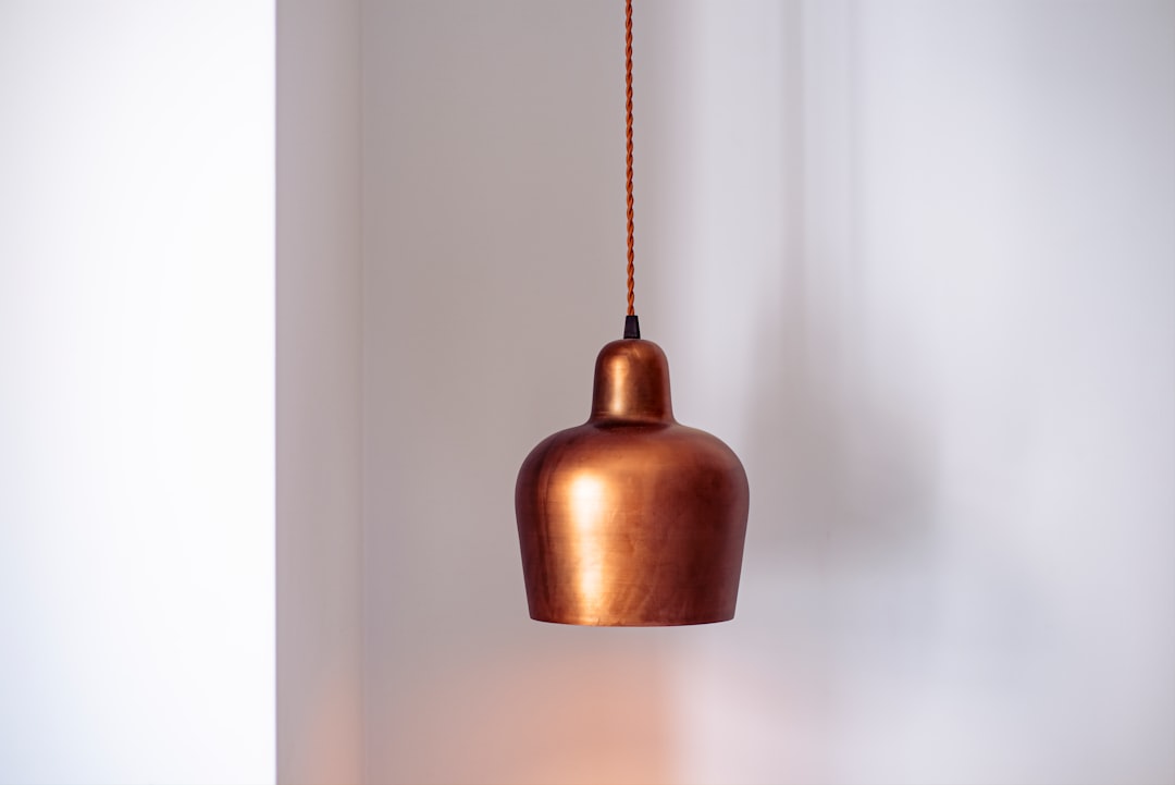
In interiors, copper is a popular finish for lighting, hardware, and accents because it adds glow without overwhelming a room. Layer it against teal or forest-green walls, cream upholstery, and warm wood; charcoal grounds it for a modern, industrial feel. For a flexible base to build around copper, see our neutral color palette guide.
Frequently Asked Questions
What is the best color to pair with copper?
Teal (#008080) is the best all-around partner for copper because it sits near copper’s complement, creating a vivid, modern contrast. For a more grounded look, navy (#1B2A4A) and charcoal (#36454F) cool and anchor copper’s warmth, while cream keeps the palette soft.
Does copper go with navy?
Yes, beautifully. Navy (#1B2A4A) is a deep cool blue that makes copper’s warm glow stand out while staying refined, which is why copper-and-navy is a favorite for branding, packaging, and interiors. Add cream or ivory to lighten the pairing.
What green goes with copper?
Forest green (#228B22) is the standout green for copper, giving a rich, autumnal, natural palette. Teal works too as a near-complement for a bolder, cooler contrast. Both let copper act as the warm metallic accent against a deeper green base.
Is copper a warm or cool color?
Copper is a warm color because it’s an orange-brown metallic. That warmth is why it pairs so effectively with cool tones like teal and navy, which provide the contrast that makes copper’s glow stand out in both branding and interiors.


