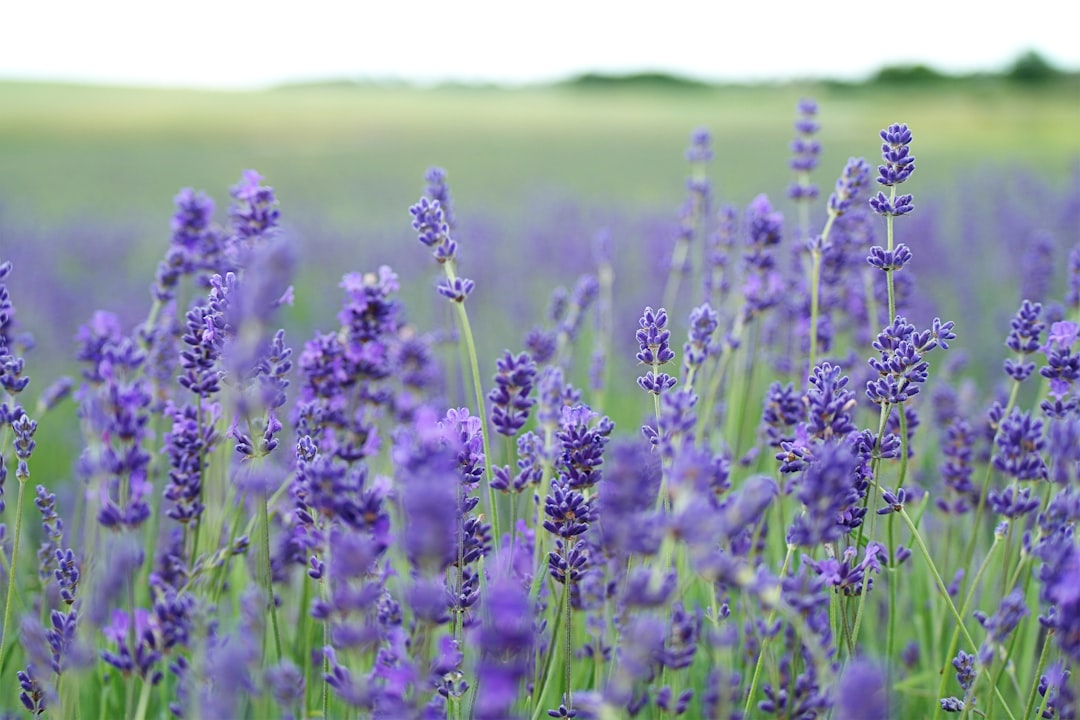
Colors That Go With Lavender
Lavender is a soft, light purple with cool, slightly gray undertones — calming, elegant, and a little nostalgic. The best colors that go with lavender are muted greens like sage, clean neutrals such as gray and white, and gentle warm contrasts like soft yellow and dusty rose. Below are exact hex codes, ready palettes, and notes on using lavender in branding, web design, and interiors.
What colors go with lavender?
Lavender (around #B57EDC) is a pale violet — cool, low in saturation, and easily overpowered. Because it’s so soft, it pairs best with quiet neutrals and gentle contrasts. The strongest matches are:
- Sage green (#9CAF88) — a muted green that contrasts lavender gently for a calm, botanical pairing.
- Gray (#8A8D91) — a quiet neutral that lets lavender stay the soft focal point and reads modern.
- White (#FFFFFF) — clean space that keeps lavender feeling fresh and airy.
- Soft yellow (#F2D98D) — a warm pastel near lavender’s complement, for a cheerful, spring-like contrast.
- Navy (#1B2A4A) — a deep cool blue that grounds lavender and adds welcome structure.
- Dusty rose (#C8A2A2) — a muted warm pink that pairs with lavender for a soft, romantic palette.
Best color combinations for lavender
Lavender is a cool violet, so warm yellows sit near its complement and give it the brightest, most cheerful contrast — see complementary colors for why. Sage and dusty rose are softer, analogous-leaning partners, while gray, white, and navy supply structure. Lavender and lilac are very close, so if you’re choosing between them, see lilac vs lavender — the distinction affects which pairings read best.
Lavender + sage + white (calm botanical)
The most soothing pairing. Sage and lavender are both muted, so together with white they feel fresh, natural, and serene.
Lavender + soft yellow + gray (cheerful pastel)
A near-complementary lift. Yellow brightens lavender while gray keeps the contrast gentle — great for stationery and spring branding.
Lavender + navy + dusty rose (soft and grounded)
Navy anchors lavender’s lightness and dusty rose ties in warmth — a refined scheme for beauty and lifestyle.
Lavender palettes with hex codes
| Pairing color | Hex | Why it works / mood |
|---|---|---|
| Sage green | #9CAF88 | Muted contrast; calm and botanical |
| Gray | #8A8D91 | Neutral; modern and quiet |
| White | #FFFFFF | Clean space; fresh and airy |
| Soft yellow | #F2D98D | Near-complement; cheerful contrast |
| Navy | #1B2A4A | Deep anchor; grounding structure |
| Dusty rose | #C8A2A2 | Muted warm pink; romantic |
| Gold | #C9A227 | Warm metallic; elegant accent |
Three ready palettes to copy:
- Calm botanical: Lavender #B57EDC · Sage #9CAF88 · White #FFFFFF · Gray #8A8D91
- Cheerful pastel: Lavender #B57EDC · Soft yellow #F2D98D · Gray #8A8D91 · White #FFFFFF
- Soft grounded: Lavender #B57EDC · Navy #1B2A4A · Dusty rose #C8A2A2 · Gold #C9A227
How to build a balanced lavender palette
Lavender is light and easily washed out, so it works best as a soft field with a defined anchor. A reliable structure is roughly 40–50% lavender or white, 30–40% a neutral or deep anchor (gray, navy), and 10–20% a contrast accent like sage, yellow, or gold. Without that anchor, an all-pastel lavender scheme can read vague and weak.
Lavender’s undertone changes its best partners. A cooler, bluer lavender (closer to #B57EDC) loves gray, navy, and sage, while a warmer, pinker lavender edges toward lilac and pairs with dusty rose and soft gold. Hold your tone against a lilac swatch to decide which way it leans; the lilac vs lavender distinction will tell you which accents to favor.
For digital and brand use, lavender is too light for body text, so use it as a background or accent with charcoal or navy type on top, and verify contrast — pale lavender backgrounds need dark text to pass accessibility. Knowing whether the surrounding scheme reads warm or cool keeps your accent choices coherent; see warm vs cool colors.
Colors to avoid with lavender
Lavender is delicate and cool, so a few combinations overwhelm it:
- Bright purple or magenta — too close in hue and far more saturated, making soft lavender look faded.
- Strong orange or red — high-energy warms fight lavender’s gentleness; choose soft yellow or dusty rose for warmth instead.
- Pure black as the main partner — heavy against such a light tone; charcoal or navy give the same definition more softly.
Lavender in branding vs interiors
In branding, lavender signals calm, creativity, wellness, and a gentle, modern femininity, which suits beauty, wellness, self-care, and lifestyle brands. Pair it with gray and white for a clean identity, or sage and gold for something more elevated. For the full process, see how to choose brand colors.
In interiors, lavender is a soothing accent for bedrooms, bathrooms, and reading nooks. It loves white trim, sage foliage, warm wood, and brass, with navy or dusty rose for a little depth. Keep lavender balanced with plenty of white and a warm material so the space feels serene rather than washed out.
Frequently Asked Questions
What is the best color to pair with lavender?
Sage green (#9CAF88) is the best partner for lavender because both are muted, creating a calm, balanced botanical contrast. For a brighter look, soft yellow sits near lavender’s complement, while gray and white are the safest neutrals to keep lavender soft and modern.
Does lavender go with gray?
Yes. Gray is one of the best neutrals for lavender because it keeps the soft purple modern and understated without competing. Cool and mid grays work especially well, echoing lavender’s own gray undertone; add a warm accent like gold or dusty rose so the scheme does not feel too cool.
What colors go with lavender in a bedroom?
White, gray, sage, and warm wood create a calm, modern lavender bedroom. Add dusty rose or soft gold accents for warmth and navy for a little contrast. Plenty of white and natural materials keep lavender feeling restful and elegant rather than washed out.
Is lavender a warm or cool color?
Lavender is a cool color because it is a pale violet leaning toward blue. That coolness is why warm partners like soft yellow, dusty rose, and gold balance it so well, and why an all-cool palette of lavender with gray and blue can feel chilly without a warm accent.


