Colors That Go With Maroon
Maroon is a deep, brownish-red — dignified, warm, and unmistakably classic. The best colors that go with maroon are soft warm neutrals like blush and cream, deep contrasts like navy and forest green, and metallic gold for richness. Below are exact hex codes, ready palettes, and notes on using maroon in branding and interiors.
What colors go with maroon?
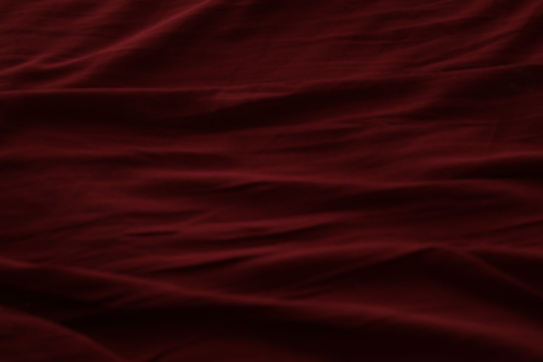
Maroon (around #800000) is a dark red with brown depth and almost no brightness. Because it’s so deep and muted, it pairs best with lighter neutrals and a few jewel-toned or metallic accents. The strongest matches are:
- Blush (#F4C9C2) — a pale, warm pink in the same red family that lightens maroon into an elegant, tonal palette.
- Navy (#1B2A4A) — a deep cool blue that contrasts maroon’s warmth for a formal, confident look.
- Gold (#C9A227) — a warm metallic that makes maroon feel luxurious and celebratory.
- Cream (#F5EFE6) — a soft warm neutral that gives maroon breathing room without going stark.
- Forest green (#2C4A3B) — a deep cool green near maroon’s complement, for a rich, traditional pairing.
- Gray (#8A8D91) — a neutral that keeps maroon modern and understated.
Best color combinations for maroon
Maroon is a dark red, so green sits opposite it on the wheel and acts as its natural complementary color — forest green is the standout deep contrast. Blush is essentially a pale relative of maroon, so it reads analogous and harmonious, while navy and gold add formal richness. If you’re unsure whether your tone is maroon or a neighboring red, compare maroon vs burgundy and wine vs maroon before building your palette.
Maroon + blush + cream (soft and elegant)
The most refined pairing. Blush and cream lighten maroon into a tonal, romantic scheme — ideal for weddings, beauty, and lifestyle.
Maroon + navy + gold (formal and rich)
Deep and authoritative. Navy adds cool contrast and gold supplies warmth and luxury — a classic for heritage and premium brands.
Maroon + forest green + cream (traditional)
A near-complementary scheme with an old-world feel. Cream keeps the two deep tones from going heavy — great for editorial and holiday palettes.
Maroon palettes with hex codes
| Pairing color | Hex | Why it works / mood |
|---|---|---|
| Blush | #F4C9C2 | Analogous tint; soft and elegant |
| Navy | #1B2A4A | Deep cool contrast; formal |
| Gold | #C9A227 | Warm metallic; luxurious accent |
| Cream | #F5EFE6 | Warm neutral; soft and airy |
| Forest green | #2C4A3B | Near-complement; traditional |
| Gray | #8A8D91 | Neutral; modern and understated |
| Brown | #6F4E37 | Warm neutral; earthy depth |
Three ready palettes to copy:
- Soft elegant: Maroon #800000 · Blush #F4C9C2 · Cream #F5EFE6 · Gold #C9A227
- Formal rich: Maroon #800000 · Navy #1B2A4A · Gold #C9A227 · Cream #F5EFE6
- Traditional: Maroon #800000 · Forest green #2C4A3B · Cream #F5EFE6 · Gold #C9A227
How to build a balanced maroon palette
Maroon is dark and saturated, so it works best as a grounding base or a deep accent rather than the whole field. A reliable structure is roughly 30% maroon, 50–60% light neutral (cream, blush, or gray), and 10–20% an accent like gold, navy, or forest green. That keeps maroon feeling luxurious instead of oppressive.
Maroon’s undertone shifts its best partners. A pinker, wine-leaning maroon pairs beautifully with blush and gray for a soft palette, while a browner, more oxblood maroon leans toward gold, brown, and forest green for depth. Hold your tone against both a blush and a brown swatch to see which way it leans. Because maroon, burgundy, and wine are easy to confuse, check wine vs maroon if the exact hue matters.
For digital and brand use, maroon is best as a deep background or header color with cream or white text on top — it has enough contrast against light type to stay readable. Avoid pairing maroon text with dark backgrounds, where it disappears. Knowing whether your scheme leans warm or cool helps you pick the right accent; see warm vs cool colors.
Colors to avoid with maroon
Maroon is deep and warm, so a few combinations undercut it:
- Bright red or orange — too close in hue and far brighter, making maroon look dull and muddy beside them.
- Cool pastel blue or lilac — can feel chilly and disconnected from maroon’s warmth; choose navy or forest green for cool contrast instead.
- Black as the only partner — two very dark tones together read heavy and flat; add cream or gold to lift the scheme.
Maroon in branding vs interiors
In branding, maroon signals heritage, sophistication, confidence, and quality, which suits universities, law, wine, beauty, and premium retail. Pair it with cream and gold for a refined identity, or navy for something more corporate. For the full process, see how to choose brand colors.
In interiors, maroon adds warmth and drama to walls, upholstery, and textiles. It loves cream and blush for softness, gold and brass for richness, and forest green for a traditional, library-like feel. Keep large maroon surfaces balanced with plenty of cream and natural wood so the room stays inviting rather than dim.
Frequently Asked Questions
What is the best color to pair with maroon?
Blush (#F4C9C2) is the best partner for maroon when you want elegance, because it lightens maroon within the same warm family for a soft, tonal look. For contrast instead, navy and gold are the strongest choices, giving maroon a formal, luxurious edge.
Does maroon go with gray?
Yes. Gray is a reliable neutral for maroon because it keeps the deep red modern and understated without competing. Mid and charcoal grays work best; very warm beige-grays can blur slightly against maroon, so a cooler, more neutral gray gives the cleaner, more contemporary contrast.
What colors go with maroon for a wedding?
Blush, cream, gold, and dusty rose create the most popular maroon wedding palette — soft, romantic, and elegant. For a richer, more dramatic look, add navy or deep forest green as an accent. Gold or brass details tie the deep and pale tones together beautifully.
Is maroon a warm or cool color?
Maroon is a warm color because it’s a dark red with brown undertones. That warmth is why cool partners like navy and forest green balance it so well, and why it sits naturally alongside warm neutrals like cream, blush, gold, and brown in rich, traditional palettes.


