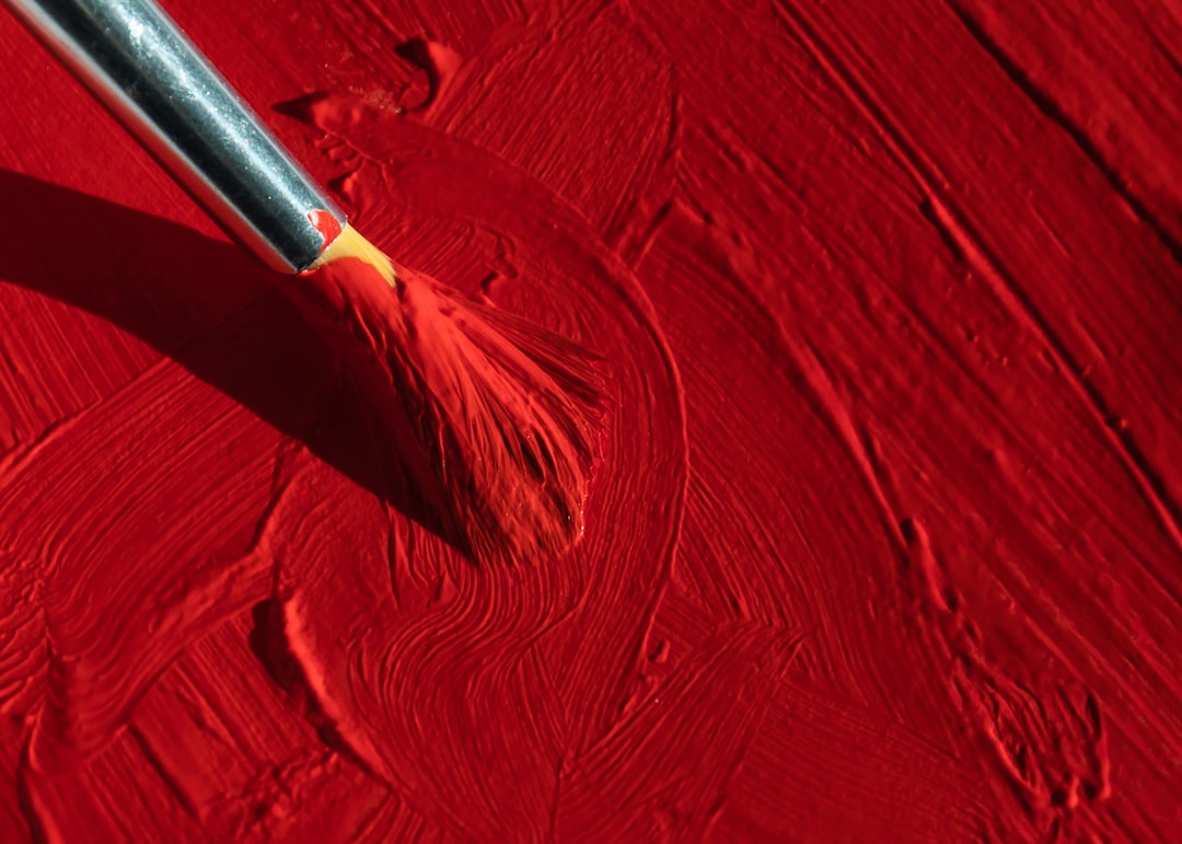
Colors That Go With Red
Red is the most attention-grabbing color in design, which makes pairing it a balancing act — the goal is usually to let red lead without letting it shout. The best colors that go with red are calming neutrals like cream, black, and charcoal that give red room to breathe, plus deep partners like navy and gold for a bolder statement. Below you’ll find exact hex codes, ready palettes, and how to keep red from overwhelming a brand or a room.
What colors go with red?
Red is a warm primary at maximum visual intensity, so most successful red schemes lean on neutrals to balance it. The few colored partners that work either contrast it deeply (navy) or echo its warmth quietly (gold, blush). Here are the strongest matches:
- Navy (#1B2A4A) — a deep cool anchor that balances red’s heat. Navy and red reads bold, classic, and confident.
- Cream (#F5EFE6) — a warm neutral that lets red breathe while staying in the same temperature family.
- Black (#111111) — maximum drama. Black and red is high-contrast, powerful, and timeless.
- Gold (#C9A227) — a warm metallic that makes red feel rich and celebratory rather than aggressive.
- Charcoal (#36454F) — a softer dark anchor than black; grounds red in a modern, restrained way.
- Blush pink (#F4C9C2) — a tint of red itself; softens the scheme into something warm and approachable.
Best color combinations for red
The cardinal rule with red is that two strong colors compete, so most reliable schemes are red plus neutrals. Red’s direct complement is green, but pairing two saturated, equally loud colors creates tension and visual vibration — which is why red works far better with quiet partners. Cream, black, and charcoal let red be the single hero. When you do add a colored partner, choose a deep one like navy that contrasts in value rather than fighting red for attention. For the full logic of opposite-on-the-wheel pairings, see our complementary colors guide.
Red + cream + charcoal (balanced)
The most versatile scheme. Cream softens, charcoal grounds, and red leads without shouting. Reads confident but refined — strong for editorial and modern branding.
Red + navy + white (bold classic)
The timeless high-energy palette. Navy and red both carry weight, while white keeps it legible. A favorite for sports, Americana, and heritage brands.
Red + black + gold (dramatic luxe)
The most opulent option. Black amplifies red’s drama and gold adds celebration — common in luxury, food, and entertainment branding. Use sparingly to avoid feeling heavy.
Red palettes with hex codes
| Pairing color | Hex | Why it works / mood |
|---|---|---|
| Navy | #1B2A4A | Deep cool balance; bold, classic |
| Cream | #F5EFE6 | Warm neutral; lets red breathe |
| Black | #111111 | Max drama; powerful, timeless |
| Gold | #C9A227 | Rich, celebratory warmth |
| Charcoal | #36454F | Soft dark anchor; modern restraint |
| Blush pink | #F4C9C2 | Tonal softener; warm, approachable |
| White | #FFFFFF | Crisp space; keeps red legible |
Three ready palettes to copy:
- Balanced: Red #C0392B · Cream #F5EFE6 · Charcoal #36454F · Camel #C19A6B
- Bold classic: Red #C0392B · Navy #1B2A4A · White #FFFFFF · Gray #B0BEC5
- Dramatic luxe: Red #C0392B · Black #111111 · Gold #C9A227 · Cream #F5EFE6
How to build a balanced red palette
Because red is so loud, restraint is the whole game. The most important rule: use red as the 10% accent, not the dominant field, in most layouts. In the classic 60-30-10 split, let a neutral (cream, white, charcoal) take 60%, a secondary neutral or navy take 30%, and red punctuate at 10%. A little red goes a long way — a small saturated red against a calm base reads more confident than a wall of it.
Match your red’s undertone to its partners. A warm, orange-leaning red (#E74C3C) pairs best with cream, gold, and warm neutrals. A cool, blue-leaning red (#C0392B to crimson #DC143C) pairs best with navy, charcoal, and cool whites. Mixing a warm red with cool partners can look slightly off. For the deep psychology of red — passion, urgency, appetite, power — see our red color meaning guide, and for a quick read on whether your red leans warm or cool, our warm vs cool colors guide.
Red also demands attention to contrast and accessibility. Red text on a dark background often fails legibility checks, and pure red on pure green vibrates painfully. Keep red on neutral backgrounds for body-adjacent uses, and reserve full-saturation red for headlines, buttons, and accents where its energy is an asset rather than a distraction.
Colors to avoid with red
Red is powerful but unforgiving. Watch for:
- Pure saturated green — the textbook complement, but at full strength it vibrates and reads accidentally festive. Mute the green to sage or olive if you must combine them.
- Bright orange or magenta — too close to red and equally loud; they clash and muddy each other. Let red stand alone among warm brights.
- Large fields of two strong colors — red plus another saturated color (cobalt, purple) competes for dominance and feels chaotic. Pick one hero and surround it with neutrals.
Red in branding vs interiors
In branding, red signals energy, urgency, passion, and appetite, which is why food, sports, and clearance-driven retail use it. The risk is aggression and fatigue, so the strongest red brands pair it with generous neutral space and one supporting anchor (navy, black, cream). Our guide on how to choose brand colors covers using a high-energy hero color responsibly.
In interiors, red is a commitment — a full red wall raises the energy of a room and can feel overwhelming, so most designers use it as an accent in textiles, art, or a single piece of furniture. Balance it with cream, charcoal, wood, and plenty of negative space. If you want a calmer, lower-stakes warm color as your base instead, our piece on colors that go with cream shows how a soft warm neutral carries a red accent beautifully.
Frequently Asked Questions
What is the best color to pair with red?
Navy (#1B2A4A) is the best colored partner for red because it balances red’s heat with deep, cool weight, reading bold and classic. For a calmer scheme that lets red shine, neutrals like cream, charcoal, and black are the strongest choices. The best option depends on whether you want energy or restraint.
Does red go with navy?
Yes. Red and navy is a timeless, high-impact pairing — navy’s depth grounds red’s energy, creating a confident, classic look used in sports, Americana, and heritage branding. Add white as a third color to keep the combination crisp and legible. It works because the two contrast strongly in both temperature and value.
Can you pair red with green?
Carefully. Red and green are direct complements, but at full saturation they vibrate uncomfortably and read accidentally festive. To use the pairing intentionally, mute the green to a sage or olive, which preserves the pleasing complementary contrast while removing the harsh, seasonal Christmas effect. Keep one of the two as the clear accent.
What neutral goes best with red?
Cream (#F5EFE6) and charcoal (#36454F) are the two strongest neutrals for red. Cream stays in red’s warm family and lets it breathe softly, while charcoal grounds it with modern restraint. Black amplifies red’s drama, and white keeps it crisp and legible. Use plenty of neutral space so red stays a confident accent.


