Colors That Go With Terracotta
Terracotta is a warm, earthy clay tone — somewhere between burnt orange, brown, and pink — that has become a defining color of modern, organic interiors and brands. The best colors that go with terracotta are cool greens and blues like sage, navy, and teal, balanced by soft cream, blush, and brown. Below are exact hex codes, ready palettes, and notes on using terracotta in branding versus interiors.
What colors go with terracotta?
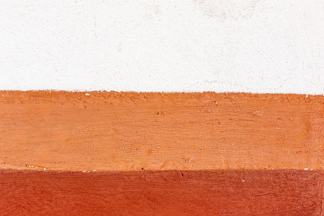
Terracotta (around #E2725B) is a muted orange-red with brown depth. Because it’s warm and earthy, it pairs best with cool greens and blues plus soft neutrals. The strongest matches are:
- Sage green (#9CAF88) — a muted cool green that’s nearly complementary to terracotta, for a balanced, natural look.
- Cream (#F5EFE6) — a warm off-white that softens terracotta and keeps it airy.
- Navy (#1B2A4A) — a deep cool blue that gives terracotta crisp, sophisticated contrast.
- Teal (#008080) — a blue-green that makes terracotta feel vivid and contemporary.
- Blush pink (#F4C9C2) — a lighter warm tint in the same family for a soft, tonal palette.
- Brown (#6F4E37) — a warm neutral that deepens terracotta’s earthy character.
Best color combinations for terracotta
Terracotta is an earthy orange, so green and blue-green sit opposite it on the wheel and act as natural complementary colors. Sage and teal are the standout cool contrasts, while navy adds depth. Cream, brown, and blush keep things warm and tonal — blush is essentially a pale relative of terracotta, so it reads analogous and harmonious. The sage pairing is so popular it works both directions; see our colors that go with sage guide for the reverse.
Terracotta + sage + cream (organic earthy)
The defining modern palette. Complementary warmth and coolness, softened by cream — calm, natural, and inviting.
Terracotta + navy + cream (crisp contrast)
More structured and graphic. Navy sharpens terracotta for branding and confident interiors.
Terracotta + teal + blush (vibrant boho)
The liveliest option. Teal pops against terracotta while blush ties the warm side together — great for eclectic, creative looks.
Terracotta color palettes (with hex codes)
| Pairing color | Hex | Why it works / mood |
|---|---|---|
| Sage green | #9CAF88 | Near-complement; balanced and natural |
| Cream | #F5EFE6 | Warm neutral; soft and airy |
| Navy | #1B2A4A | Deep cool contrast; sophisticated |
| Teal | #008080 | Vivid blue-green; contemporary |
| Blush pink | #F4C9C2 | Analogous tint; soft and tonal |
| Brown | #6F4E37 | Warm neutral; earthy depth |
| Gold | #C9A227 | Warm metallic; rich accent |
Three ready palettes to copy:
- Organic earthy: Terracotta #E2725B · Sage #9CAF88 · Cream #F5EFE6 · Brown #6F4E37
- Crisp contrast: Terracotta #E2725B · Navy #1B2A4A · Cream #F5EFE6 · Gold #C9A227
- Vibrant boho: Terracotta #E2725B · Teal #008080 · Blush #F4C9C2 · Cream #F5EFE6
How to build a balanced terracotta palette
Terracotta is warm and saturated enough to dominate, so balance is everything. A reliable structure is roughly 30% terracotta, 50–60% soft neutral (cream and white), and 10–20% a cool contrast (sage, navy, or teal). That keeps terracotta feeling grounded and organic rather than heavy or relentlessly orange.
Terracotta’s undertone changes its best partners. A pinker, clay-leaning terracotta (closer to #E2725B) pairs beautifully with blush and cream for a soft scheme, while a browner, more burnt terracotta leans toward navy, brown, and gold for depth. Compare your tone against both a blush and a rust swatch to see which way it leans before building out the palette.
Texture and light amplify terracotta. It glows under warm light and in matte, natural materials like clay, plaster, and linen, which is part of why it feels so organic. For digital and brand use, terracotta works as a warm accent or background with dark charcoal or cream text on top; verify contrast, since mid-tone text on terracotta can fail accessibility checks.
Colors to avoid with terracotta
Terracotta is rich and warm, so watch for these:
- Bright orange or true red — too close in hue and brighter, so terracotta looks muddy beside them.
- Cool pastel blue or lilac — can feel chilly and disconnected from terracotta’s earthiness. Choose teal or navy instead.
- Pure black alone — heavy and harsh; brown or charcoal flatter terracotta better. Not sure if your tone is terracotta or rust? Compare terracotta vs rust before committing.
Using terracotta in branding vs interiors
In branding, terracotta signals warmth, craft, nature, and approachability, which suits wellness, ceramics, food, and lifestyle brands. Pair it with cream and a sage or navy for legible contrast, and use brown or gold as a grounding accent. For the full process, see how to choose brand colors.
In interiors, terracotta is a favorite for walls, tile, pottery, and textiles. It loves sage foliage, cream linen, warm wood, and rattan, with teal or navy as a bolder accent. Keep large terracotta fields balanced by plenty of cream and white. For grounding tones, see our neutral color palette guide.
Frequently Asked Questions
What is the best color to pair with terracotta?
Sage green (#9CAF88) is the best partner for terracotta because it sits near terracotta’s complement, creating a balanced, natural contrast of warm and cool. Cream softens the pair, and navy is the best choice when you want crisper, more modern contrast instead.
Does terracotta go with gray?
Yes, especially warm grays and greige. They keep terracotta grounded and contemporary without competing with its warmth. Cool blue-grays work less well, since they can feel chilly against terracotta’s earthiness; charcoal and warm taupe are safer, more flattering neutral choices.
What colors go with terracotta in a living room?
Sage green, cream, warm wood, and rattan create the most popular terracotta living-room palette, soft and organic. For more contrast, add navy or teal accents through cushions or art. Plenty of cream and white keeps the warm tones from feeling heavy in a large space.
Is terracotta a warm or cool color?
Terracotta is a warm color because it’s an earthy orange-red with brown undertones. That warmth is why cool partners like sage, teal, and navy balance it so effectively, and why it blends seamlessly into earthy palettes with cream, brown, and blush.


