Coral vs Pink: What’s the Difference?
The coral vs pink distinction comes down to one ingredient: orange. Coral is a warm blend of pink and orange that takes its name from sea coral, while pink is a light red tint with no meaningful orange in it. Both are warm and friendly, but coral is noticeably more vibrant and sun-warmed where pink stays soft and gentle.
What is coral?
Coral is a warm pink-orange. The widely cited representative value is #FF7F50 — the CSS web color “coral” — which sits roughly halfway between pink and orange with a clear lean toward orange. Because of that orange content, coral reads as lively, tropical, and energetic. It evokes sunsets, reefs, and summer, and it carries far more warmth and intensity than a plain pink. Lighter, dustier versions are often called coral pink, but true coral always keeps that orange undertone.
For how this warmth registers emotionally, our orange color meaning guide covers the energy and approachability that coral inherits from its orange side.
What is pink?
Pink is a light tint of red — red mixed with white. The common CSS web color “pink” is #FFC0CB, a clean, soft light pink. As a category, pink spans hot pinks, bubblegum pinks, and pale baby pinks, but the defining trait is a light reddish hue with little orange. Compared with coral, standard pink is cooler, softer, and gentler. It reads as sweet, romantic, and calm rather than vibrant and energetic.
For the broader cultural associations of the family, see our pink color meaning page on how pink signals warmth, romance, and approachability.
What’s the difference between coral and pink?
The defining difference is orange content. Coral contains a clear measure of orange, which pushes it warmer, brighter, and more energetic; pink is a near-pure light red with little or no orange, so it stays softer and cooler. Here is a side-by-side with representative values — remember that both “coral” and “pink” span ranges, so these are reference points.
| Property | Coral | Pink |
|---|---|---|
| Hex code | #FF7F50 | #FFC0CB |
| RGB | 255, 127, 80 | 255, 192, 203 |
| CMYK | 0, 50, 69, 0 | 0, 25, 20, 0 |
| Undertone | Warm, orange-leaning | Neutral to slightly cool |
| Hue family | Pink-orange (warm) | Light red tint (pink family) |
| Best used for | Summer branding, hospitality, energetic accents | Beauty, romance, soft and playful design |
| Mood/feel | Vibrant, tropical, warm, energetic | Soft, sweet, gentle, romantic |
When should you use each?
Use coral when you want warmth and energy without going to full orange or red. Its sun-warmed vibrancy suits summer campaigns, hospitality and travel brands, food and beverage packaging, and lively accents that need to feel inviting and fresh. Coral pairs beautifully with teal, navy, cream, and gold.
Use pink when you want softness, romance, or playful charm. Cleaner pinks suit beauty and wellness brands, youthful products, and gentle, approachable design. Pink pairs well with white, navy, sage, and gray.
To tell them apart in practice, look for orange: if the color glows warm and reads almost peachy, it is coral; if it stays soft and slightly cool, it is pink. Our guide to warm vs cool colors explains how that undertone shift changes the whole feel.
How are coral and pink used across design?
In branding, coral signals friendliness with a jolt of energy — it appears in lifestyle, food, and travel identities that want to feel warm and contemporary without the aggression of red. Pink signals romance, care, and approachability, dominating beauty, wellness, and youthful consumer brands. The orange in coral is what makes it read more upbeat and less delicate than pink.
In interiors and fashion, coral works as a statement warm accent that flatters skin tones and brightens neutral rooms, while pink ranges from soft, calming backdrops to bold fashion statements depending on saturation. Coral feels seasonal and lively; pink feels timeless and soft.
In web and digital design, coral is a popular call-to-action and highlight color because its warmth draws the eye while staying friendlier than pure orange or red. Soft pink works better as a large background tint, where its low intensity is easy on the eyes. Because coral is more saturated and warm, it is typically reserved for accents rather than big surfaces, where its energy would dominate.
How can you tell coral and pink apart?
The fastest test is to ask whether the color looks like it has been touched by orange or by red. Coral always carries visible orange warmth — held next to a pure pink, it looks almost peachy or sun-kissed, and in bright light it glows rather than softens. Pink, by contrast, holds its ground as a clean light red and never tips toward orange; even a warm pink stays gentler and cooler than coral.
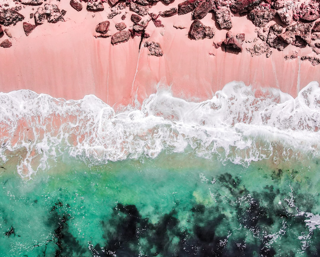
A second reliable check is saturation and energy. Coral is typically more saturated and vivid because it borrows the intensity of orange, so it reads as a lively, attention-getting color even at smaller sizes. Common light pink is paler and softer, so it recedes more and reads as a background-friendly tint. If a swatch feels energetic and tropical, it is coral; if it feels soft and sweet, it is pink. When you are unsure, place the color beside a known reference — a printed pink versus a coral lipstick or a coral reef photo — and the orange in coral becomes obvious immediately.
Do coral and pink go together?
Yes — they sit close on the warm side of the spectrum, so they layer into a natural, tonal palette. A soft pink base with coral accents reads cohesive and sun-warmed, especially with cream and gold added for richness. For closely related warm-color breakdowns in this batch and beyond, see our salmon vs coral and coral vs peach comparisons, browse the full range in our shades of pink guide, and explore color psychology for why warm tints feel inviting.
Frequently Asked Questions
Is coral the same as pink?
No. Coral is a warm pink-orange (around #FF7F50) that contains a clear dose of orange, while pink is a light tint of red (commonly #FFC0CB) with little orange. Coral reads vibrant and sun-warmed; pink reads soft and cooler. The orange content is what separates them.
Is coral warmer than pink?
Yes. Coral is defined by its orange undertone, which makes it noticeably warmer, brighter, and more energetic than standard light pink. Pink can lean neutral or even slightly cool, so coral almost always sits on the warmer side when the two are placed together.
What is the hex code for coral?
The common reference is #FF7F50, the CSS web color “coral,” a warm pink-orange. Because coral describes a pink-orange quality rather than one fixed standard, it spans a range — from brighter, more orange corals to softer, dustier coral pinks closer to the pink family.
What colors go with coral?
Coral pairs beautifully with teal, navy, cream, white, and metallic gold. Its warm, tropical character makes complementary cool tones like teal especially striking, while neutrals let coral act as a lively accent without overwhelming a palette.
Is coral pink a real color?
Yes. Coral pink is a softer, lighter version of coral that pulls slightly back toward the pink family while keeping some orange warmth. It sits between true coral and standard pink, reading gentler than coral but warmer and more sun-kissed than a plain light pink.


