What Font Does Cross Game Use?
If you are searching for the Cross Game font, you have likely fallen for that warm, nostalgic title treatment, the one that feels like summer baseball and quiet heartbreak, which is exactly the Mitsuru Adachi mood. The honest answer: the logo is custom lettering created for the series, so no single retail font reproduces it exactly. But the style is built from recognizable choices, and free fonts can get you close while staying on the right side of licensing.
What font is the Cross Game logo?
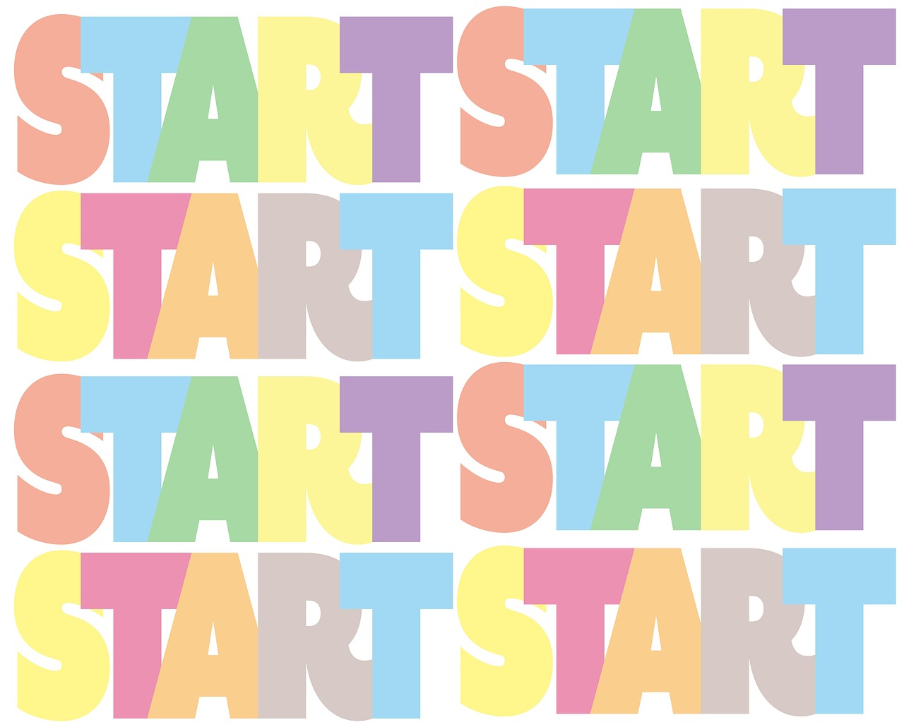
The Cross Game logo is bespoke lettering rather than an off-the-shelf font. Its identity is warm, nostalgic, and gently athletic, evoking the Americana of baseball without shouting. You can read a varsity or collegiate sports influence in the proportions, softened by a friendly, approachable feel that matches Adachi’s restrained, emotionally grounded storytelling. This is not an aggressive sports wordmark; it is a tender one, fitting a series as much about love and loss as about the game.
Treat any exact-font claim you find online as an informed observation, not a confirmed spec. The lettering was designed for the show and the source is not public, so the reliable approach is to describe the style and rebuild it. The traits to match are: warmth, a nostalgic vintage edge, a subtle baseball/varsity cue, and an overall gentleness. Avoid anything cold or harsh, the emotional softness is central to the brand.
The balance is what makes this logo tricky to recreate. Push too far toward varsity block lettering and it starts to feel like a generic sports jersey, all muscle and no heart. Push too far toward a soft serif and you lose the baseball identity. The Cross Game wordmark sits in the sweet spot between the two, athletic enough to read as a sports series, warm enough to promise an emotional, character-driven story. Holding that middle ground is the real design problem, and it is why simply grabbing the loudest varsity font you can find usually overshoots the mood the series is going for.
What typeface is used in the anime?
Two type roles appear across the series. The warm display lettering carries the logo and the nostalgic, baseball-flavored moments that define the show’s tone. Separately, the practical text, on-screen Japanese titles in some cuts and English subtitles in official releases, uses clean, legible fonts so the quiet, dialogue-driven scenes stay readable. Those subtitle fonts are functional and neutral, not part of the nostalgic mood.
Decide which layer you want before recreating anything. A poster or title card quoting the logo needs that warm, nostalgic, varsity-tinged feel. A caption mimicking the show’s subtitles needs a plain, readable sans or serif. Mixing them is the common recreation mistake: the nostalgic logo and the workmanlike subtitle font serve different purposes and should not stand in for one another.
Free fonts that look like the Cross Game font
You cannot download the exact logo, but free, well-licensed fonts can capture its warm, nostalgic, baseball-tinged character. The table maps each part of a Cross Game-style layout to a free alternative.
| Use case | Cross Game uses | Free alternative |
|---|---|---|
| Main logo / title | Custom warm varsity display | Graduate or Freshman |
| Baseball / collegiate feel | Athletic block lettering | Graduate |
| Warm nostalgic headline | Friendly serif tone | Bitter or Arvo |
| Body / caption text | Clean readable type | Source Serif or Inter |
| Numerals / jersey numbers | Sporty figures | Oswald |
For the varsity flavor, Graduate is a free Google Font built on classic American collegiate lettering, making it an ideal starting point for the baseball cue. For the warmer, gentler side of the logo, Bitter and Arvo are friendly slab serifs that carry nostalgia without feeling cold or corporate.
- Graduate – collegiate varsity face; best for the baseball/sports cue.
- Bitter – warm slab serif for nostalgic headlines and body text.
- Arvo – friendly geometric slab with a vintage feel.
- Oswald – condensed sans for jersey numbers and labels.
A good recreation pairs one varsity element with one warm element rather than leaning entirely on either. For instance, set a short word or the team-style accent in Graduate, then carry the longer title or tagline in Bitter so the whole composition stays gentle. Color choices reinforce the mood just as much as the type: muted blues, warm cream, faded reds, and the soft green of a summer field will read as nostalgic, while bright primary colors will tip the design toward modern sports branding. Aim for the feeling of an old photograph or a worn baseball card, and the typography will follow naturally.
Why does Cross Game use this kind of type?
The typography mirrors Adachi’s storytelling. His baseball series are famous for understatement, warmth, and emotional realism, and the title type reflects that, nostalgic and gentle rather than loud and aggressive. The varsity baseball cue grounds the show in its sport and in the wistful Americana of summer ball games, while the softness signals that this is a character drama about growing up, grief, and love as much as it is about pitching and batting.
There is a tonal reason too. A harsh, hyper-modern logo would clash with Adachi’s quiet sincerity. The warm, slightly vintage lettering tells you to slow down and feel something. When you recreate the look, protect that warmth: favor friendly serifs or softened varsity faces, keep the spacing comfortable, and avoid cold sharpness. The brand here is nostalgia and tenderness, far more than any single letter’s exact contour.
Can I use the Cross Game font for my own project?
The Cross Game logo is a trademarked wordmark owned by the series and its rights holders. Do not reproduce the actual logo for commercial products, merchandise, or anything implying an official connection, that is a trademark issue separate from font licensing. For personal fan art, study, and transformative work, recreating the warm nostalgic style with your own type is the safe, normal route.
The free fonts above generally carry open licenses permitting commercial use, but confirm the exact terms for your medium before shipping anything paid. If desktop, webfont, and embedding rights are confusing, read our font licensing guide. For another sports-anime title study, see our Baby Steps font breakdown, and if you love warm, retro lettering, our roundup of vintage fonts is packed with nostalgic display and slab styles.
Frequently Asked Questions
Is the Cross Game font available for download?
No. The logo is custom lettering made for the anime and is not sold as a font. You can approximate it for free with a varsity face like Graduate for the baseball cue, paired with a warm slab serif such as Bitter or Arvo to capture its nostalgic tone.
What font is closest to the Cross Game logo?
Graduate is the closest free font for the collegiate baseball flavor, while Bitter adds the warm, nostalgic serif quality. Together they reproduce the gentle, Americana-tinged feel of the logo for fan posters and thumbnails without crossing into harsh, modern styling.
Can I use these fonts commercially?
The free alternatives generally allow commercial use, but verify each license for your medium. The Cross Game logo itself is trademarked, so do not reproduce the official wordmark on merchandise or in any context that implies endorsement by the series rights holders.
What kind of font is the Cross Game logo?
It is custom warm, nostalgic display lettering with a subtle varsity baseball cue. The tone is gentle and emotionally grounded, matching Mitsuru Adachi’s understated storytelling, rather than an aggressive, cold, or hyper-modern sports wordmark built purely for impact.


