What Font Does Dashing Diva Use?
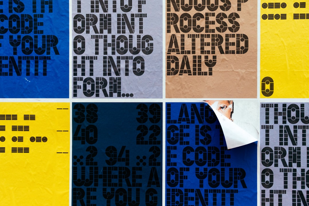
If you are searching for the dashing diva font to recreate the brand’s fun, friendly look for a mood board, a mockup, or a styled flatlay, the honest answer is that there is no single off-the-shelf typeface that matches it exactly. To be clear up front, this is Dashing Diva, the press-on, gel, and nail-strip brand known for salon-style sets you apply at home. The wordmark is custom-drawn brand lettering with a playful, modern character — rounded, approachable, and a little bit fun — not a released font, so there is no public file called “Dashing Diva” to install. This guide breaks down what the wordmark actually is, why it leans playful, and which free fonts get you closest without touching the trademark.
What font is the Dashing Diva logo?
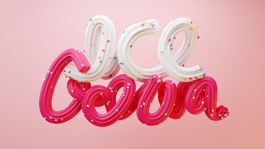
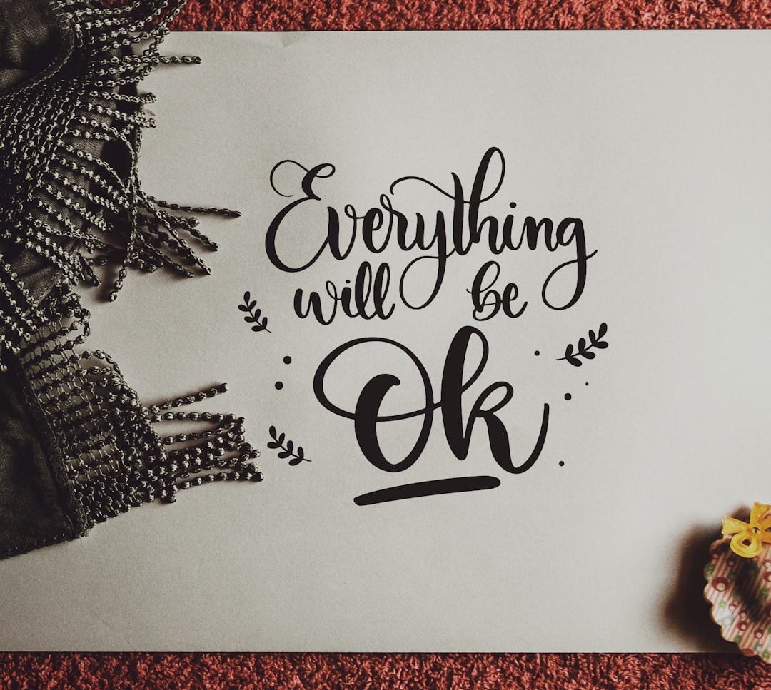
The Dashing Diva logo is best read as a playful, custom wordmark rather than a single installed font. The letters lean friendly and approachable — softer shapes, a touch of personality, and a modern feel that signals fun rather than formality. There is no austere serif and no corporate stiffness; the styling feels upbeat and accessible, which fits a brand built around easy, expressive at-home manicures. That playfulness is deliberate: it tells customers the product is approachable and enjoyable, not intimidating.
Because this is bespoke artwork tied to the brand’s identity, no major foundry sells it as a retail typeface, and the company has not published a public type spec for general download. Anyone claiming a precise source font should be read skeptically. The honest framing: treat the Dashing Diva wordmark as custom playful lettering, not a confirmed commercial font. Any file labeled “Dashing Diva font” online is a fan recreation or a look-alike, and any specific match is an informed observation, not a confirmed spec.
What typeface does Dashing Diva use in branding?
Beyond the playful wordmark, Dashing Diva leans on clean, legible sans-serifs across packaging, the website, and campaigns for product names, length and shape details, and supporting copy. The logo carries the fun personality; the functional text is set in quieter, readable faces so everything stays clear on a compact box or a screen.
- Primary wordmark: playful, modern custom lettering anchoring the logo and packaging.
- Supporting type: clean rounded or geometric sans-serifs for product names and body copy.
- Tone: playful, friendly, and modern — the typography signals easy, expressive at-home manicures.
This split between a characterful playful wordmark and neutral supporting type is standard across modern beauty branding. For more brand-by-brand breakdowns, see our roundup of famous brand fonts.
Free fonts that look like the Dashing Diva font
No free font will be an exact match, but several capture the playful, friendly spirit well enough for a poster, a mockup, or a fan project. The bold names below are alternatives you can search for and license accordingly.
| Use case | Dashing Diva uses | Free alternative |
|---|---|---|
| Logo / wordmark feel | Playful rounded lettering | Baloo 2 or Quicksand |
| Headline / display | Friendly modern sans | Poppins or Fredoka |
| Body / supporting | Readable clean sans | Nunito or Work Sans |
Quicksand is a strong starting point because its rounded, friendly geometry shares the Dashing Diva sense of approachable, playful lettering; set it at a comfortable weight with even spacing for the closest feel. Baloo 2 brings a chunkier, rounder personality if you want extra warmth, while Poppins gives clean, modern headlines with a soft geometric tone. Pair any of these with the friendly Nunito or the versatile Work Sans for body copy and small print. The playful, rounded character is what makes the look feel like Dashing Diva, so lean into softness and even spacing.
Why does Dashing Diva use this kind of type?
A playful, friendly style does real branding work. Dashing Diva sells easy, expressive at-home manicures, so its logo needs to feel approachable and fun rather than formal or intimidating. Rounded, upbeat letters read as welcoming and enjoyable, exactly the mood a brand wants when it asks customers to try press-ons and gels themselves. A stiff corporate face would feel cold, while the playful treatment keeps the brand inviting and memorable.
There is also a practical argument. A friendly wordmark stays legible at any size, from a small box panel to a large campaign banner, and survives print, web, app, and packaging contexts. The personality of the lettering pairs naturally with bright color and lively product photography, while the logo stays steady and recognizable. Compare this with the clean styling of the Static Nails logo or the bold wordmark of Glamnetic — both useful contrasts to the playful Dashing Diva look.
Can I use the Dashing Diva font for my own project?
For the actual logo: no. The Dashing Diva name and wordmark are part of a registered trademark and the brand’s protected identity. Copying the mark, or using a near-identical recreation in a way that suggests affiliation, can create legal exposure — this is about trademark, not just fonts. Even if someone posts a “Dashing Diva font” file online, that file is at best an unofficial recreation and is not licensed for commercial use.
What you can do is use a legitimately licensed free font (like the options above) to build your own original wordmark with a similar playful, friendly mood. That keeps you on solid ground. Before you ship anything commercial, confirm the license on whatever font you pick — our font licensing guide walks through desktop, web, and embedding rights so you do not get caught out.
Frequently Asked Questions
Is the Dashing Diva font free to download?
No. The Dashing Diva wordmark is custom playful brand lettering, not a released font, so there is no official free download. Any file labeled “Dashing Diva font” online is an unofficial recreation. Use a free font like Quicksand or Poppins to get a similar playful look legally, and check its license first.
What font is closest to the Dashing Diva logo?
A friendly, rounded sans comes closest. Quicksand and Baloo 2, both free, capture the playful, approachable feel of the wordmark. Set them at a comfortable weight with even spacing for the nearest match — without copying the trademarked press-on nail wordmark in commercial work.
Is the Dashing Diva logo a real typeface?
Treat it as custom lettering, not a commercial typeface. The company has never published a public type specification for download, so the exact origin is unconfirmed — an informed observation, not a documented fact. The safest description is bespoke playful, modern brand lettering built for the Dashing Diva wordmark.
Can I use a Dashing Diva-style font commercially?
You can use a free look-alike font commercially if its license allows it, but you cannot reproduce the trademarked Dashing Diva logo or wordmark on products or services you sell. Style your own text in a free playful sans instead of copying the brand mark, and check both the font license and trademark rules first.