Disney Font: The Typeface Behind the Magic
The Disney font is one of the most searched-for typefaces on the internet, yet it does not technically exist as a single downloadable file. The wordmark that appears on everything from theme park gates to movie title cards is not a font at all — it is a hand-lettered logotype rooted in Walt Disney’s own signature. That distinction matters for designers, because it shapes what you can actually use in your own projects and what you cannot.
Still, the demand for a Disney-style typeface has produced several faithful recreations, most notably Waltograph by Justin Callaghan. These fonts capture the spirit of the logo’s flowing cursive letterforms and make them available for personal projects, fan art, and themed events. Understanding the history behind the Disney logotype, knowing which recreations are available, and grasping the legal boundaries around their use is essential for anyone working in typography or brand-inspired design.
This guide traces the Disney logo from Walt Disney’s handwriting to its current form, identifies the best font recreations by name, explains where to download them, covers the corporate typefaces Disney actually uses across its properties, and addresses the trademark and copyright issues that govern how you can use Disney-style fonts in your own work.
History of the Disney Logo Font
The story of the Disney logotype begins not in a type foundry but at a drawing desk. Walt Disney’s signature — or rather, a stylized version of it — became the foundation for one of the most recognized wordmarks in history. Understanding that origin explains why the Disney logo feels so different from conventional famous logos built from off-the-shelf typefaces.
Walt Disney’s Signature as the Foundation
Walt Disney’s actual handwritten signature was relatively modest. It evolved over the decades, becoming more stylized as the company grew, but it was always a personal autograph rather than a designed logotype. The version that became the basis for the company wordmark was not a direct trace of his handwriting. Instead, Disney’s in-house artists took the general character of his signature — the flowing D, the upward sweep of the y, the overall cursive rhythm — and refined it into a consistent, reproducible mark.
This refinement process is common in logo design. A hand-lettered mark inspired by someone’s handwriting carries personal warmth and authenticity that a geometric typeface cannot replicate. It also makes the mark nearly impossible to reproduce with any existing font, which is precisely the point from a branding perspective.
Evolution from 1937 to Today
The earliest Disney logos appeared on theatrical releases in the 1930s. The 1937 premiere of Snow White and the Seven Dwarfs featured a version of the Walt Disney name in a flowing script, though it differed from the modern logo in several details. The letterforms were less uniform, the spacing was tighter, and the overall feel was closer to actual handwriting than to a polished wordmark.
Through the 1940s and 1950s, the logo was gradually refined. The characteristic dotted i was introduced, though some versions used a standard dot while others featured the small circle or flourish that became iconic. The sweeping tail of the capital D grew more pronounced, and the letterforms became more consistent in weight and angle.
By the 1970s and 1980s, the logo had settled into something close to its current form. The version used today — the one most people picture when they think of the Disney wordmark — was standardized in the mid-1980s and has remained largely unchanged since. It features a prominent capital D with a backward-looping tail, a dotted i with a distinctive small circle, and a flowing y with an extended descender. The overall impression is of elegant, slightly whimsical cursive that feels both timeless and approachable.
The Cinderella Castle silhouette was added above the wordmark in 2006 as part of the Walt Disney Pictures logo, but the letterforms themselves remained consistent. That stability is deliberate: the Disney wordmark is one of the most valuable pieces of intellectual property in the world, and any alteration would risk diluting its recognition.
The Stylized Cursive Wordmark
Several specific characteristics define the Disney logotype and distinguish it from generic cursive scripts. The capital D is the most distinctive element — its bowl curves backward and downward in a way that no standard script font replicates. The letters are connected in a flowing baseline but maintain individual character, unlike many script fonts where connections feel mechanical. The dot over the i resembles a small filled circle rather than a conventional dot. And the overall slant is moderate, giving the wordmark a sense of forward motion without the aggressive lean of italic typefaces.
These details are why simple script fonts never quite look like the Disney logo, even when they share a similar cursive structure. The logotype was hand-crafted, and its idiosyncrasies are part of its identity.
The Actual Font Name: Waltograph
If you have ever searched for the Disney font name, you have almost certainly encountered Waltograph. Created by Justin Callaghan, Waltograph is a free font that recreates the look and feel of the Disney wordmark. It is not an official Disney product, and Disney has no involvement in its creation or distribution. It is a fan-made typeface, and it remains the most widely recognized answer to the question “what font does Disney use?”
How Waltograph Was Created
Justin Callaghan developed Waltograph by studying the Disney logotype and drawing letterforms that match its visual characteristics. The font includes a full alphabet in both uppercase and lowercase, numerals, and basic punctuation. A second version, Waltograph UI, was later released with adjustments for user interface applications and improved screen rendering.
Waltograph captures the most recognizable features of the Disney wordmark: the looping D, the circular dot on the i, the flowing connections between letters, and the overall cursive rhythm. It is remarkably close to the real logo for a free, fan-made font, though side-by-side comparisons reveal differences in letter spacing, stroke weight, and the specific curves of individual characters.
How Close Is Waltograph to the Real Logo?
Waltograph is the closest widely available approximation, but it is not a perfect match. The Disney logotype was hand-lettered, meaning each letter was drawn as part of a specific composition. When you type a word in Waltograph, the letters are assembled from a standard character set with uniform spacing rules. The real logo has contextual adjustments — subtle shifts in letter position and connection that respond to the specific sequence of letters in “Walt Disney” and “Disney.”
The capital D in Waltograph is a strong match. The lowercase letters are generally accurate in structure, though the connections between them can feel slightly more mechanical than the hand-lettered original. The overall impression from a distance is convincing; the differences become apparent mainly at large sizes or when placed directly beside the authentic logotype.
For most practical purposes — birthday party invitations, fan art, themed school projects — the distinction is negligible. For professional design work or anything that might be confused with official Disney branding, the differences matter for both aesthetic and legal reasons.
Waltograph and Similar Disney-Inspired Fonts
Waltograph is the most popular option, but it is not the only font that attempts to capture the Disney aesthetic. Several alternatives exist, each with different strengths and limitations. Here is a breakdown of the most notable options.
Waltograph (Free, Most Accurate)
Waltograph remains the gold standard for Disney font recreations. It is free for personal use, widely available on font distribution sites like dafont.com and fontspace.com, and includes two variants: Waltograph 42 (the standard version) and Waltograph UI (optimized for digital interfaces). The font supports basic Latin characters and includes some decorative alternates.
Strengths: Most accurate recreation of the Disney wordmark. Free. Widely supported across design applications.
Limitations: Personal use only — the license does not cover commercial projects. Limited character set compared to professional fonts. No bold or italic variants.
Download: Available on dafont.com and most free font directories.
Walt Disney Script (Variations)
Several fonts circulate under the name “Walt Disney Script” or close variations. These are not a single unified typeface but rather different designers’ interpretations of the Disney wordmark. Quality varies significantly. Some are crude traces with awkward spacing, while others are polished recreations that rival Waltograph in accuracy.
Strengths: Multiple versions mean you can find slight stylistic differences to suit your specific project. Some versions include extended character sets.
Limitations: Inconsistent quality. Naming confusion makes it difficult to verify which version you are downloading. Licensing terms vary by creator.
Download: Various free font sites; verify the specific version and license before use.
Mickey Font (Decorative)
Mickey is a decorative font inspired by Disney’s visual style but less tied to the specific logotype. It takes a more playful, rounded approach to the Disney aesthetic, with letterforms that evoke the cheerful, cartoon-friendly side of Disney rather than the elegant cursive of the wordmark. Some versions incorporate mouse-ear motifs or other Disney-associated decorative elements into the letterforms.
Strengths: More playful and immediately recognizable as Disney-themed, even to casual viewers. Works well for children’s party materials and casual designs.
Limitations: Less versatile than Waltograph. The decorative elements can reduce legibility at smaller sizes. Not suitable for projects requiring a close match to the actual Disney logo.
Download: Available on various free font sites under names like “Mickey” or “Mickey Mouse Font.”
Other Disney-Inspired Options
Beyond these primary options, a constellation of Disney-inspired fonts exists for specific properties and aesthetics. Fonts like “Mouseketeer” offer a vintage Disney feel. “New Waltograph” provides an updated take on the classic recreation. Some designers have created fonts inspired by specific Disney properties — the Frozen movie title, the Moana logotype, or the retro styling of vintage Disneyland signage. Many of these fall into the broader category of trending fonts that surge in popularity alongside film releases.
When downloading any Disney-inspired font, verify three things: the quality of the letterforms (test them in your actual design, not just the font preview), the completeness of the character set (many free Disney fonts lack accented characters, numerals, or punctuation), and the license terms (most are restricted to personal use).
Official Disney Typography
The hand-lettered logotype is the most visible piece of Disney’s typographic identity, but it is far from the only font the company uses. The Walt Disney Company employs a range of typefaces across its corporate communications, theme parks, film marketing, and digital platforms. These are professional, licensed typefaces — not the free recreations available online.
Corporate and Print Typography
For corporate documents, annual reports, and investor communications, Disney uses clean, professional typefaces that have nothing to do with the whimsical logotype. These include standard corporate serif and sans-serif fonts chosen for clarity and professionalism. The company’s corporate identity guidelines specify typefaces for different communication contexts, ensuring consistency across a global organization with hundreds of thousands of employees.
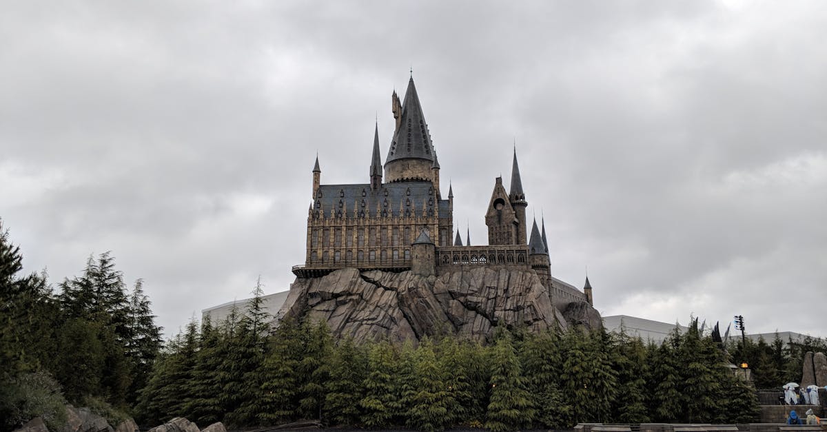
Disney Parks use a mix of custom and licensed typefaces for wayfinding signage, menus, maps, and informational materials. The typography in the parks is carefully chosen to match the theme of each area. Main Street, U.S.A. uses period-appropriate Victorian and Edwardian typefaces. Tomorrowland features geometric sans-serifs that suggest futurism. Adventureland employs weathered, hand-crafted letterforms that evoke exploration. This environmental typography is a critical part of the immersive experience Disney parks are famous for.
Movie and Property-Specific Fonts
Each major Disney property has its own typographic identity, often developed from scratch for the specific franchise.
Marvel. The Marvel logo uses a custom condensed sans-serif in bold red and white. Film titles within the Marvel Cinematic Universe each have bespoke typographic treatments — the industrial lettering of Iron Man differs entirely from the regal serif of Black Panther or the cosmic styling of Guardians of the Galaxy.
Star Wars. The Star Wars logo uses a modified version of Helvetica Black, with customized letterforms that give it a distinct identity. The title crawl text uses News Gothic. These choices, made in the 1970s, have become so iconic that any deviation would feel wrong to audiences.
Pixar. Pixar’s logo features a custom geometric treatment where the I is replaced by the Luxo Jr. lamp character. The studio’s film titles each receive unique typographic designs — the retro signage of Cars, the childlike scrawl of Monsters, Inc., the elegant script of Ratatouille.
Disney Animation. Walt Disney Animation Studios films typically feature the Disney wordmark above or near a film-specific title treatment. Frozen used a custom geometric sans-serif with ice-crystal detailing. Moana employed a hand-crafted display face inspired by Polynesian visual traditions. Encanto featured warm, organic letterforms reflecting Colombian folk art.
These property-specific typefaces are custom-designed assets, not commercially available fonts. Each represents a distinct approach to logo design tailored to the emotional register of its franchise. Fan recreations of some exist (particularly for popular franchises like Star Wars and Frozen), but the originals are proprietary.
Disney Font in Design: Legal Considerations
Using a Disney-style font in your own design work raises important legal questions. Disney is one of the most aggressive intellectual property enforcers in the world, and the line between fan appreciation and infringement can be blurry. Understanding the distinction between logo types and typeface usage is critical here.
Trademark vs. Copyright in Fonts
Two separate legal frameworks apply. First, trademark law protects the Disney wordmark as a brand identifier. You cannot use the Disney name, logo, or a confusingly similar mark in a way that suggests your product or service is affiliated with, endorsed by, or produced by The Walt Disney Company. This applies regardless of which font you use — even typing “Disney” in Times New Roman on a product you sell could constitute trademark infringement if it implies a false association.
Second, copyright law governs the fonts themselves. In the United States, typeface designs are generally not copyrightable, though font software (the digital files) is. This means the visual appearance of Waltograph is legal — it does not infringe Disney’s copyright by looking similar to the Disney wordmark. However, the font files themselves are copyrighted by their respective creators, and their licenses dictate how you can use them.
What You Can and Cannot Do
Personal use is generally safe. Using Waltograph or a similar Disney-inspired font for a birthday party invitation, a personal scrapbook page, or a school project is unlikely to create legal problems. You are not selling a product, not implying Disney endorsement, and not competing with Disney in any market.
Fan projects occupy a gray area. Creating Disney fan art, blog graphics, or social media content using Disney-style fonts is technically a trademark use if you are using the Disney name. Disney generally tolerates non-commercial fan activity but reserves the right to act against it. The further your work is from anything that could be mistaken for official Disney content, the safer you are.
Commercial use is where risk increases. Selling products that use Disney-style fonts — T-shirts, mugs, greeting cards, digital downloads — is the most legally precarious territory. Even if the font itself is legally free, using it in combination with Disney character names, imagery, or themes on a product you sell could constitute trademark infringement. The font license may also prohibit commercial use, creating a separate legal issue.
Creating confusion with official Disney branding is clearly infringement. Designing a logo, product, or marketing material that could be mistaken for an official Disney product is the clearest violation. This includes recreating the Disney wordmark on merchandise, using Disney-style fonts alongside Disney character names on products for sale, or creating a brand identity that mimics Disney’s visual language closely enough to suggest affiliation.
Practical Guidelines for Designers
If you are a professional designer, the safest approach is to avoid using Disney-style fonts in any commercial context. For client projects that need a Disney-inspired aesthetic — themed events, fan communities, tribute designs — consider using the font as a starting point and then customizing the letterforms enough to create visual distance from the Disney wordmark. Alternatively, use one of the many script and handwritten fonts that share a similar cursive elegance without specifically mimicking the Disney logotype.
Fonts for Disney-Themed Projects
Not every project that wants to feel magical needs to use an explicit Disney font recreation. A range of script fonts and decorative typefaces can evoke the warmth, elegance, and whimsy associated with Disney without triggering any legal concerns. These alternatives work well for themed invitations, party decorations, fan art, and any design that needs a fairy-tale quality.
Invitations and Party Decorations
Great Vibes. A free Google Font with flowing calligraphic letterforms, Great Vibes captures the elegance of the Disney wordmark’s cursive style without mimicking its specific letter shapes. It works beautifully for princess-themed party invitations and formal Disney-inspired events.
Alex Brush. Another free calligraphic script, Alex Brush has a slightly more casual feel than Great Vibes. Its single weight and smooth connections make it ideal for “Once Upon a Time” headers and fairy-tale themed stationery.
Parisienne. A refined script with moderate contrast and elegant curves, Parisienne evokes the sophistication of classic Disney animation title cards. It is free on Google Fonts and pairs well with clean serif body text for invitation suites.
Cinzel. For projects that need a regal, castle-inspired feel rather than a cursive script, Cinzel is a display serif based on classical Roman inscriptions. Its uppercase letterforms suggest royalty and grandeur — fitting for Cinderella or Beauty and the Beast-themed designs.
Fan Art and Creative Projects
Sacramento. A semi-connected script with a vintage California feel, Sacramento captures some of the nostalgic warmth associated with Disneyland-era Disney. It is free, legible at moderate sizes, and feels handwritten without being childish.
Euphoria Script. An upright calligraphic font with clear letterforms and moderate flourishes, Euphoria Script works for Disney-inspired designs that need to balance elegance with readability. Available free on Google Fonts.
Lobster. For projects that need a bold, eye-catching display font with a retro feel — similar to other popular calligraphy fonts — Lobster offers thick, connected script letterforms that echo the playful side of Disney’s visual identity. It is better suited to headlines and short phrases than to body text.
Dancing Script. A lively, casual script that captures some of the same hand-lettered warmth as the Disney wordmark without imitating it directly. Available on Google Fonts, Dancing Script works well for informal Disney-themed party signage and social media graphics.
Mixing Fonts for a Complete Design
A Disney-themed project rarely works with a single font. The most effective approach combines a decorative or script font for headlines and feature text with a clean, readable font for body content. For example, pairing Great Vibes headers with a handwritten font for personal notes and a simple sans-serif like Lato for informational text creates a layered design that feels magical without relying on a single gimmick. This approach to font pairing is a fundamental skill in any design project, whether Disney-themed or not.
Frequently Asked Questions About Disney Font
What is the official Disney font called?
There is no official Disney font available to the public. The Disney logo is a hand-lettered wordmark based on a stylized version of Walt Disney’s signature. The closest publicly available recreation is Waltograph, a free font created by Justin Callaghan. While Waltograph closely approximates the Disney logotype, it is a fan-made project and not an official Disney product.
Can I use the Disney font for commercial projects?
Using a Disney-style font like Waltograph for commercial projects carries legal risk on two fronts. First, most Disney font recreations are licensed for personal use only, so commercial use may violate the font license. Second, using the Disney name or a confusingly similar visual style on products you sell could constitute trademark infringement, regardless of which font you use. For commercial work, consider original script fonts that evoke a similar elegance without mimicking the Disney wordmark specifically.
Where can I download Waltograph for free?
Waltograph is available for free download on dafont.com, fontspace.com, and several other free font directories. Search for “Waltograph” and look for the version by Justin Callaghan. The font is available for personal, non-commercial use. Make sure you download from a reputable site to avoid bundled software or modified files.
Is the Disney logo based on Walt Disney’s actual signature?
The Disney logo is inspired by Walt Disney’s signature but is not a direct reproduction of it. Disney’s in-house designers took the general character of his handwriting — the flowing D, the cursive rhythm, the upward energy — and refined it into a consistent, reproducible wordmark. Walt Disney’s actual autograph varied over the years and looks noticeably different from the polished logotype used by the company today.
What font does Star Wars use?
The Star Wars logo uses a modified version of Helvetica Black with customized letterforms. The opening crawl text is set in News Gothic. Several fan-made recreations exist, including “Star Jedi” and “SF Distant Galaxy,” which approximate the Star Wars title treatment for personal use. Like the Disney wordmark, the Star Wars logo is a trademarked design, and using close imitations commercially carries legal risk.


