Earth Tone Color Palette: Natural Design Palettes
An earth tone color palette draws directly from the natural world, using the warm browns, muted greens, dusty oranges, and soft tans found in soil, stone, clay, and foliage. Earth tones have surged in popularity across design disciplines because they communicate authenticity, sustainability, and timeless warmth in an era when consumers increasingly value these qualities. Building an effective earth tone palette requires understanding how these naturally low-saturation colors interact through color harmony and where their source hues sit on the color wheel before being softened by nature’s own processes of oxidation, weathering, and mixing.
What Defines the Earth Tone Color Family
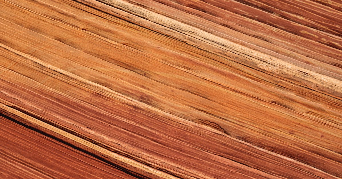
Earth tones are characterized by warmth, low to moderate saturation, and a grounded quality that comes from their connection to physical materials. Unlike synthetic or digital color families, earth tones reference tangible substances: terra cotta clay, sandstone, dried leaves, mossy bark, iron oxide, and sun-baked mud. This material connection gives earth tones an inherent tactility that viewers respond to instinctively.
The psychological impact of earth tones centers on comfort, stability, and trustworthiness. These colors communicate reliability because they reference the literal ground beneath our feet. They suggest permanence because they represent materials that have been used by humans for thousands of years. Earth tones feel honest because they do not attempt the visual excitement of saturated colors; instead, they offer quiet confidence.
The earth tone family spans a wider hue range than many people initially assume. It includes warm browns from tan to chocolate, muted oranges from peach to burnt sienna, dusty yellows from sand to ochre, subdued greens from sage to olive, and even deep, warm reds like terracotta and rust. What unites these diverse hues is their shared quality of appearing sun-warmed, naturally aged, and grounded in the physical world.
Culturally, earth tones carry associations with craft, heritage, and the outdoors. Indigenous art traditions worldwide use earth pigments. Mediterranean, Southwest American, and African design traditions all center on earth tones. In contemporary design, earth tones signal sustainability, organic production, and a return to natural values that resist the disposable culture of fast fashion and digital excess.
Building a Palette with Earth Tones
Earth tone palettes build differently than saturated palettes because the color relationships are subtler. Start with a dominant earth tone that establishes the palette’s temperature. Warm terracotta (#CC6744) leans toward the red-orange family and creates a desert-inspired foundation. Cool sage (#9CAD87) draws from the green family and creates a woodland mood. Neutral tan (#D2B48C) sits in the yellow-brown middle ground and works as a versatile, temperate base.
Because earth tones are already low in saturation, complementary contrasts work differently. Instead of placing saturated complements opposite each other, earth tone palettes create interest through temperature contrast. Warm terra cotta against cool sage, dusty gold against muted slate blue, or rust against deep olive: these pairings create visual interest through warm-cool tension rather than hue opposition.
Layering earth tones of varying value creates depth without introducing new hues. A palette of cream, warm tan, sienna, and dark chocolate moves from light to dark within the brown family, creating a rich monochromatic scheme that feels both simple and sophisticated. Adding a single accent, such as a muted teal or dusty blue, breaks the warmth without disrupting the natural mood.
Texture is an essential companion to earth tone palettes. Because the colors reference natural materials, pairing them with textured surfaces amplifies their impact. In print, earth tones on uncoated, textured paper stocks feel authentic and crafted. In digital, combining earth tones with photography of natural materials, linen textures, or paper grain overlays enhances the organic quality these colors promise.
Earth Tones in Graphic Design
In editorial design, earth tones create a warm, literary atmosphere. Book covers, especially in literary fiction, memoir, and nature writing, use earth tones to suggest substance and contemplation. Magazine layouts that use earth-toned color blocking feel premium and curated, as if the publication itself is a crafted object rather than a mass-produced product.
Packaging design is where earth tones arguably have their greatest impact. Organic food brands, artisan coffee roasters, craft breweries, and natural skincare companies use earth tone packaging to communicate authenticity and quality ingredients. The unspoken message is: this product comes from the earth, and its packaging reflects that origin. Explore our graphic design examples for more applications of earth tone aesthetics in packaging and print.
In poster and promotional design, earth tones offer a counterpoint to the saturated maximalism that dominates social media. An earth-toned poster in an urban environment stands out through contrast with its surroundings. The quiet confidence of earth tone design creates a premium signal: this brand does not need to shout because its quality speaks for itself.
Map design, environmental graphics, and wayfinding systems benefit from earth tones because they connect visual communication to physical place. National parks, hiking trails, cultural heritage sites, and eco-tourism brands use earth tone palettes to reinforce the connection between their visual identity and the landscapes they represent.
Earth Tones in Branding
Earth tone branding has moved from a niche associated with health food stores and outdoor gear into mainstream design. Today, earth tones appear in technology branding, financial services, hospitality, fashion, and real estate. The connecting value is authenticity: earth tone brands signal that they are genuine, trustworthy, and built on real substance rather than hype.
Building a brand strategy around earth tones requires selecting a tonal direction. Warm earth tones centered on terracotta, sienna, and ochre position a brand as passionate, artisanal, and culturally rich. These work for food and beverage, hospitality, and fashion brands with Mediterranean, Latin American, or Southwest American influences. Cool earth tones built on sage, slate, and driftwood gray position a brand as calm, Scandinavian-influenced, and environmentally conscious. These suit architecture, wellness, and sustainable fashion brands.
Industries where earth tone branding excels include specialty food and beverage, sustainable fashion and textiles, architecture and interior design, wellness and natural beauty, outdoor recreation and travel, real estate and property development, and artisan craft brands. Earth tones are less effective for technology companies seeking to communicate innovation, entertainment brands pursuing excitement, and youth-oriented brands targeting Gen Z consumers who often prefer bolder colors.
An emerging trend is the combination of earth tones with a single vivid accent color. Earth tone palettes with a pop of electric blue, bright coral, or rich violet create a contemporary tension between natural and digital, organic and designed. This hybrid approach allows brands to communicate both authenticity and modernity simultaneously.
Earth Tones in Web and UI Design
Earth tones in web design create warm, distinctive digital experiences that contrast with the cool blues and grays dominating most of the internet. An earth-toned website immediately signals a different set of values: craft, nature, warmth, and human touch. This differentiation is particularly effective for brands in crowded markets where most competitors default to safe, cool-toned digital palettes.
For contrast and readability, earth tones offer natural pairings. Dark brown or espresso text on cream backgrounds provides comfortable reading contrast with warmth that pure black on white cannot match. Terracotta headings on light backgrounds create hierarchy without harshness. For dark mode or evening-oriented interfaces, deep chocolate or charcoal-brown backgrounds with warm cream text create an inviting reading environment.
Earth tone interfaces work particularly well for content-focused websites: blogs, publications, portfolio sites, and e-commerce stores where products are photographed against natural backgrounds. The warm, neutral quality of earth tones allows product photography to feel naturally integrated rather than pasted onto a digital surface.
Accessibility with earth tones is generally favorable for darker shades. Dark browns provide sufficient contrast against light backgrounds, and warm cream provides adequate contrast against dark backgrounds. Mid-range earth tones like tan and sage can fall below contrast thresholds, so test these carefully. The warmth of earth tone palettes can slightly reduce perceived contrast compared to cool-toned designs, so err on the side of stronger contrast ratios than you might use with blue or gray text.
Sample Earth Tone Color Palettes
Warm Desert Palette
This palette draws from arid landscapes and baked clay. The primary shade is Terracotta (#CC6744), a warm, red-orange earth tone that feels both ancient and contemporary. It pairs with Sand (#C2B280) for warm neutrality, Cream (#FFFDD0) for light backgrounds, and Dark Umber (#483C32) for rich contrast. This combination suits artisan pottery brands, Southwest-inspired restaurants, and boutique hotels in warm climates.
Cool Woodland Palette
Drawing from forest floors and overcast landscapes, this palette feels grounded and contemplative. The anchor is Moss (#8A9A5B), a cool, muted green-brown that suggests damp stone and lichen. It combines with Driftwood (#AF8F6F) for textural warmth, Pale Stone (#E8E0D5) for airy lightness, and Peat (#3B3C36) for deep, earthy contrast. This scheme works for environmental organizations, architectural firms, and Scandinavian-influenced brands seeking quiet sophistication.
Muted Clay Palette
For versatile warmth without strong hue direction, this palette centers on Warm Taupe (#8B7D6B), a balanced brown-gray that sits between warm and cool. It pairs with Blush Beige (#D5B9A1) for gentle warmth, Oat (#F3EDE0) for soft backgrounds, and Cocoa (#3E2723) for anchoring depth. Lifestyle brands, premium stationery companies, and interior design studios will find this palette endlessly adaptable and timelessly elegant.
Bold Ochre Palette
When earth tones need to command attention, this high-contrast palette leads with Golden Ochre (#CC7722), a saturated, mustard-gold earth tone with visual punch. Paired with Deep Teal (#006D6F) for striking temperature contrast, Off-White (#F8F4E8) for brightness, and Dark Walnut (#544034) for depth, this scheme is designed for craft breweries, adventure travel brands, and cultural institutions that want earth tone warmth with confident energy.
Frequently Asked Questions
What is the difference between earth tones and neutrals?
Earth tones and neutrals overlap but are not identical. Neutrals include pure grays, blacks, and whites, which have no hue. Earth tones always carry warm hue content, drawing from browns, muted oranges, olive greens, and warm tans. Beige and taupe sit in both categories. The key distinction is that earth tones reference natural materials and carry warmth, while neutrals are broader and include achromatic colors with no material association.
How do I keep an earth tone palette from looking dull?
Introduce contrast through value range, pairing very light creams with very dark browns. Add one accent color outside the earth tone family, such as a muted teal, dusty blue, or soft plum. Use texture in your designs to add visual interest that color alone does not provide. Vary warm and cool earth tones within the palette to create temperature tension. Ensure generous white space to let each color breathe and register distinctly.
Are earth tones trending in current design?
Earth tones have been in a sustained upswing driven by consumer interest in sustainability, authenticity, and natural materials. The trend extends across branding, interior design, fashion, and digital design. Unlike fleeting trends, earth tones connect to enduring values, suggesting they will remain relevant well beyond the current cycle. Their versatility and broad appeal across demographics and cultures reinforce their longevity.
Can earth tones work in technology and digital branding?
Earth tones can differentiate technology brands in a sector dominated by blue, white, and gradient aesthetics. They work best for technology companies emphasizing sustainability, human-centered design, or artisan craftsmanship, such as sustainable tech, productivity tools, and platforms connecting people to physical experiences. Pure earth tone palettes may feel too traditional for cutting-edge tech brands, but combining earth tones with modern typography and a single vivid accent creates a bridge between natural warmth and digital innovation. For a deeper dive, see our bronze vs copper vs brass comparison guide.


