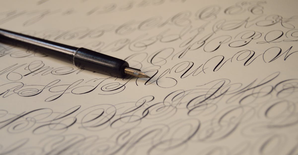
Easy Calligraphy Letters A to Z: A Beginner’s Printable Guide
You do not need years of training to write beautiful calligraphy letters. Modern brush calligraphy is one of the most accessible entry points into the world of decorative lettering, and with a methodical approach you can learn all 26 letters — both uppercase and lowercase — in a matter of weeks rather than months.
This guide breaks the entire calligraphy alphabet into logical groups based on shared strokes. Instead of tackling letters one by one from A to Z, you will learn the handful of fundamental strokes that make up every letter, then apply them in clusters. By the time you finish the lowercase “i” group, for example, you will already know the building blocks for half a dozen other letters. That compounding effect is what makes this approach faster and more confidence-building than random practice.
Whether you want to address envelopes, create wall art, start a journal, or simply develop a new creative skill, this guide gives you everything you need. We have included stroke-by-stroke descriptions, common mistakes to watch for, tips for consistency, and a structured practice routine you can follow in just 15 minutes a day. If you are completely new to what calligraphy is and how it differs from regular handwriting, start there for the broader context, then come back here for the hands-on work.
What You Need to Get Started
One of the best things about modern brush calligraphy is that the startup cost is minimal. You do not need a dip pen, an inkwell, or specialty paper to begin. Here is what you actually need:
A Brush Pen
A brush pen is the single most important tool. For beginners, a small-tip brush pen like the Tombow Fudenosuke (hard tip) is ideal. It produces thin upstrokes and thick downstrokes with moderate pressure, but its firm tip gives you more control than a soft brush pen. Avoid starting with large brush pens — they amplify every wobble and make it harder to build confidence early on.
Smooth Paper
Regular printer paper or copy paper works surprisingly well for practice. What you want to avoid is textured or fibrous paper like standard notebook paper, which catches the brush tip and frays it over time. Laser printer paper, Rhodia pads, or HP Premium32 are all good choices. Save the fancy cardstock for finished pieces once your letterforms are consistent.
Printed Guidelines
Guidelines are non-negotiable for beginners. You need a baseline (where letters sit), a waistline (the top of lowercase letters like “a” and “o”), an ascender line (the top of tall letters like “h” and “l”), and a descender line (the bottom of letters like “g” and “y”). You can print guideline sheets from dozens of free sources online, or simply place a ruled guide sheet beneath your smooth practice paper so the lines show through.
Optional but Helpful
- A pencil for sketching letterforms before inking.
- A ruler or T-square for drawing your own guidelines if you prefer custom spacing.
- A light pad for tracing guidelines through thicker paper.
That is genuinely all you need. Resist the urge to buy a full calligraphy kit before you have spent a few sessions with a single brush pen. Constraints help you focus on technique rather than tools.
The Six Basic Strokes: The Foundation of Every Letter
Before you write a single letter, spend time with the six fundamental strokes of modern brush calligraphy. Every letter in the alphabet — uppercase and lowercase — is built from combinations of these strokes. Master them and the letters almost teach themselves. Rush past them and you will struggle with every letter that follows.
1. The Upstroke (Thin Line)
Pull the pen upward from the baseline toward the waistline with light pressure. The result should be a thin, hairline stroke. This is the thinnest line you will make. The key is to barely touch the paper — let the pen glide rather than press. Practice making these strokes parallel and evenly spaced.
2. The Downstroke (Thick Line)
Push the pen downward from the waistline toward the baseline with firm, steady pressure. This produces the thick stroke that gives calligraphy its characteristic contrast. Keep the pressure consistent throughout the stroke so the line width stays even from top to bottom. A common beginner error is applying more pressure at the start than the end, creating a tapered look where you want uniformity.
3. The Overturn
Start with a thin upstroke, then curve over the top and transition into a thick downstroke — all in one continuous motion. The transition from thin to thick happens at the very top of the curve. Think of it as drawing an upside-down “U” shape. This stroke forms the basis of letters like n, m, and h.
4. The Underturn
The reverse of the overturn. Start with a thick downstroke, curve at the bottom, and transition into a thin upstroke. The pressure change happens at the base of the curve. This stroke appears in letters like u, a, and i.
5. The Oval
A full oval shape that starts just below the waistline, curves up and to the left with a thin upstroke, rounds over the top, comes down the left side with a thick downstroke, and curves back to the starting point. The oval is the engine behind letters like o, a, d, g, and q. Consistency in your ovals is one of the biggest factors in making your calligraphy look polished.
6. The Compound Curve
This stroke combines an underturn and an overturn into a single S-shaped motion: thick downstroke, thin curve at the bottom, thin upstroke, and thin curve at the top transitioning into the next downstroke. It appears in letters like s and is a building block for connecting letters in cursive calligraphy.
Spend at least two or three practice sessions on these strokes alone before moving to letters. Fill entire rows with each stroke. Your goal is to make each repetition look nearly identical to the last. When your strokes are consistent, your letters will be consistent.
The Lowercase Calligraphy Alphabet: Grouped by Stroke
Now for the letters themselves. Rather than working through the alphabet in order, we group easy calligraphy letters by the base strokes they share. This way, the muscle memory you build on one letter directly transfers to the next.
Group 1: The Underturn Letters — i, t, l, u
Start here because these letters use the simplest strokes. The letter i is just an underturn with a dot. The l is an underturn that begins at the ascender line instead of the waistline, giving it a longer entry stroke. The t is similar to the l but slightly shorter, with a horizontal crossbar added. The u is two underturns connected together.
Stroke sequence for i: Begin at the waistline with a thick downstroke, curve at the baseline into a thin upstroke (the underturn), then add a dot above. Stroke sequence for u: Underturn, lift, underturn — two identical motions side by side.
Common mistake: Making the entry strokes inconsistent heights. Your l and t should always reach their respective heights — the ascender line for l, about three-quarters of the way for t. If they are the same height, they become hard to distinguish.
Group 2: The Overturn Letters — n, m, h, r
These letters are built on the overturn stroke. The n is an underturn followed by an overturn. The m adds a second overturn — underturn, overturn, overturn. The h is like an n but with a tall entry stroke from the ascender line. The r is a shortened overturn that stops partway down instead of completing the full downstroke.
Stroke sequence for n: Thick downstroke from waistline to baseline (underturn curve up), then overturn back down to baseline with an exit stroke. Stroke sequence for m: Same as n but repeat the overturn one more time.
Common mistake: Spacing the humps unevenly in m. The two arches should be the same width. If the first is wider than the second (or vice versa), the letter looks lopsided. Use your guideline grid to check spacing.
Group 3: The Oval Letters — o, c, e, a, d, g, q
This is the largest group because the oval is such a versatile building block. The o is simply a complete oval. The c is an oval that does not fully close — it stops about two-thirds of the way around. The e is like a c with a small loop at the center where the stroke begins.
The a is an oval followed by an underturn on its right side. The d is an oval followed by an ascender stroke on the right. The g is an oval followed by a descender loop dropping below the baseline. The q is similar to g but with a straight descender instead of a loop.
Stroke sequence for a: Begin with the full oval (starting just below the waistline, going counterclockwise), then without lifting the pen, continue into an underturn on the right side. Stroke sequence for d: Oval first, then a stroke that rises to the ascender line and comes back down alongside the oval’s right edge.
Common mistake: Rushing the oval and creating a pointed shape rather than a smooth curve. Slow down at the top and bottom of the oval. Another common issue is not closing the oval before starting the next element, which makes the letter look open and wobbly. If you are struggling with ovals, go back to the basic oval stroke drill and do two full rows before returning to letters.
Group 4: The Ascending Loop Letters — b, f, k
These letters feature a loop that rises to the ascender line. The b starts with an ascending loop (thin upstroke to the ascender line, looping over and down with a thick downstroke) and finishes with a partial oval at the baseline. The f has an ascending loop at the top and a descending loop below the baseline, making it one of the taller letters in the alphabet. The k begins like b with an ascending loop, then adds two angled strokes at the waistline.
Common mistake: Making ascending loops too wide or too narrow. The loop should be roughly one-third the width of the letter body. If you cannot see a clear opening inside the loop, it is too tight. If the loop extends as wide as the letter itself, it is too loose.
Group 5: The Descending Loop Letters — j, y, p, g, f
These letters drop below the baseline. You have already encountered g and f above, but they belong here too. The j is an underturn that continues below the baseline into a descender loop, plus a dot. The y is like a u whose second downstroke extends below the baseline into a descender loop. The p starts with a downstroke that drops below the baseline, then adds an overturn or partial oval at the waistline.
Common mistake: Descender loops that are too long, crashing into the line of text below. Keep your descenders to about the same length as your ascenders for visual balance. Also watch that your descender loops curve smoothly back to the baseline rather than making a sharp angular return.
Group 6: The Special Letters — s, v, w, x, z
These letters do not fit neatly into the other groups. The s is essentially a compound curve — thick at the top, thin in the middle, thick at the bottom. The v and w use angled strokes with thin-to-thick transitions at each change of direction. The x is two diagonal strokes crossing at the center. The z combines horizontal strokes with a diagonal.
Take extra time with these. Because they do not share as much DNA with other letters, your muscle memory from the earlier groups will not carry you as far. Dedicate separate practice rows to each one.
Common mistake: Forgetting thick-thin contrast on these letters. It is tempting to write s, v, w, x, and z with uniform line weight because their stroke paths feel unfamiliar. Remember the rule: downward or rightward motion gets thick pressure, upward or leftward motion stays thin.
The Uppercase Calligraphy Alphabet: Grouped by Stroke
Uppercase calligraphy letters for beginners are more varied and ornamental than lowercase, but they still follow groupable patterns. The key difference is that uppercase letters are larger, often feature flourished entry strokes, and do not connect to the next letter in a word the way lowercase letters do.
Oval-Based Capitals: O, C, G, Q, D
These uppercase letters are built around a large oval. O is a large oval, often with a slight flourish at the entry point. C is an open oval. G adds a horizontal crossbar at the midline. Q is an oval with a decorative tail extending from the base. D combines a vertical downstroke on the left with a large curved stroke on the right that creates the oval shape.
Tip: Make your uppercase ovals noticeably larger than your lowercase ovals. They should span from the baseline to the ascender line. Keeping them proportionally larger than the lowercase is what makes them read as capitals.
Downstroke Capitals: B, P, R, F, E, L, D
These letters begin with a strong vertical downstroke, then add curves or horizontal strokes. B is a downstroke with two bumps on the right. P is a downstroke with a single bump at the top. R is like P with a leg extending from the bump. F and E are downstrokes with horizontal branches. L is a downstroke with a baseline flourish.
Common mistake: Starting the downstroke without a lead-in. Uppercase calligraphy letters almost always benefit from a thin, curved entry stroke before the main downstroke. This small flourish transforms a stiff letter into an elegant one.
Branching Capitals: H, K, N, M, V, W, X, Y, Z
These letters feature two or more major strokes that branch or cross. H has two downstrokes connected by a crossbar. K has a downstroke with two angled strokes meeting at the midpoint. N and M use multiple downstrokes connected by diagonal or curved transitions. V, W, and X use angled strokes. Y combines two angled strokes above with a descender below. Z uses two horizontal strokes connected by a diagonal.
Tip: For multi-stroke capitals, plan before you write. Lightly pencil in the skeleton of the letter so you know where each stroke will land. This prevents the common problem of running out of space on the second half of the letter.
Curved Entry Capitals: A, I, J, S, T, U
These capitals are defined by sweeping curved entry strokes. A often begins with a large curved stroke rising from the baseline, looping at the top, and descending into a thick downstroke. I and J feature a curved lead-in stroke before the main vertical. S is an enlarged compound curve. T has a broad, sweeping crossbar. U is a large underturn with decorative entry and exit strokes.
Common mistake: Over-flourishing. Beginners sometimes add so many loops and swirls to uppercase letters that the letter becomes unreadable. Start with simple, clean versions of each capital. Add ornamentation only after the basic form is solid and consistent.
Tips for Consistent Lettering
Beautiful individual letters are only half the equation. Your calligraphy will not look polished until the letters are consistent — same slant, same spacing, same pressure, same proportions, letter after letter. Here is how to get there.
Maintain a Consistent Slant
Choose a slant angle and stick with it. Most modern brush calligraphy uses a slant of about 55 to 65 degrees from the baseline. Print or draw slant guidelines on your practice sheet (diagonal lines at your chosen angle, spaced evenly). Every downstroke you make should be parallel to these slant lines. Inconsistent slant is the single most visible flaw in beginner calligraphy — more noticeable than wobbly strokes or uneven pressure.
Even Out Your Spacing
The space between letters (and between strokes within a letter) should appear optically even. This does not mean mathematically equal — round letters like o need to sit slightly closer to their neighbors than straight letters like l to look evenly spaced. Train your eye by writing common words repeatedly and comparing the spacing across each word. If one gap looks wider or tighter than the rest, adjust.
Control Your Pressure
The contrast between thin upstrokes and thick downstrokes is what gives calligraphy its beauty. But the thick strokes should all be the same thickness, and the thin strokes should all be the same thinness. Practice pressing with consistent force on every downstroke. If your downstrokes vary in width within a single word, it reads as inconsistency rather than style. A good drill is to write a row of downstrokes and check if they are all the same width.
Slow Down
Speed is the enemy of good calligraphy at the beginner stage. Every time you feel your hand rushing, deliberately slow your stroke speed by half. Precision comes before fluidity. Fluidity comes from repeating precise motions so many times that they become second nature. You will get faster naturally over weeks — there is no need to force it.
Your 15-Minute Daily Practice Routine
Consistency in practice matters more than marathon sessions. Fifteen minutes a day, six days a week, will take you further than a two-hour session once a week. Here is a structured routine you can follow.
Minutes 1 to 3: Warm-Up Strokes
Fill one row each of upstrokes, downstrokes, and overturns. Focus on evenness. This wakes up your hand muscles and reestablishes the pressure habits from your last session.
Minutes 4 to 9: Letter Group Practice
Pick one letter group from this guide. Write each letter in the group at least eight to ten times. Between repetitions, pause and compare. Circle your best version of each letter — this trains your eye to recognize quality, which is just as important as training your hand to produce it.
Minutes 10 to 13: Word Practice
Write three to five short words that use the letters you have been practicing. This shifts your focus from isolated letters to spacing, connections, and rhythm. Common words like “minimal,” “hello,” “thank,” and “quilting” cover a wide range of letter combinations.
Minutes 14 to 15: Review and Reflect
Look at everything you wrote in the session. Identify one specific thing that improved and one specific thing to focus on tomorrow. Write it down at the top of your next blank practice page so you see it first thing in your next session.
Follow this routine for four to six weeks and you will have worked through every letter group multiple times. By that point, you should have a consistent calligraphy letters style that you can deploy with confidence for real projects.
Where to Go After the Basics
Once your printable calligraphy alphabet practice sheets start looking consistent, you are ready to expand. Consider exploring different calligraphy styles — hand lettering offers more creative freedom with mixed styles and illustrated elements. Copperplate and Spencerian scripts offer more formal, traditional paths. Brush lettering at larger scales with soft-tip pens creates a different feel entirely.
You can also start learning letter connections and full-word flow, which transforms isolated beautiful letters into fluid, connected script. Our beginner calligraphy alphabet guide covers these connections and transitions in more detail.
Frequently Asked Questions
How long does it take to learn calligraphy letters A to Z?
With consistent daily practice of 15 minutes, most beginners can write all 26 lowercase letters with reasonable consistency in three to four weeks. Uppercase letters typically take an additional two to three weeks because they are more varied. Full confidence — where you can write any letter without hesitating or referencing a model — usually develops around the two- to three-month mark. The timeline depends on how consistently you practice, not how much time you put in per session.
What is the easiest calligraphy style for beginners?
Modern brush calligraphy is widely considered the most beginner-friendly style. It is more forgiving than traditional pointed-pen scripts like Copperplate, because brush pens handle the thick-thin transitions through pressure rather than nib angle. Modern calligraphy also has looser rules around letterforms, so slight variations look intentional rather than wrong. Start here, build your muscle memory, and then branch into more structured styles if they interest you.
Can I learn calligraphy with regular pens?
You can practice letterforms and spacing with any pen, but you will not get the thick-thin contrast that defines calligraphy without a tool that responds to pressure. A brush pen is the most affordable and accessible option. If you want to practice the shapes without a brush pen, use a pencil held at an angle — this mimics some of the thick-thin variation and helps you internalize the letterforms before committing to ink.
Why do my calligraphy letters look shaky?
Shaky strokes almost always come from one of three causes. First, moving too slowly — counterintuitively, extremely slow strokes amplify hand tremor. Try a slightly faster, more confident stroke speed. Second, gripping the pen too tightly — a death grip creates tension in your hand and forearm. Hold the pen firmly enough that it does not slip, but loosely enough that someone could pull it from your fingers without much resistance. Third, drawing from the fingers instead of the arm — calligraphy strokes should be driven by forearm movement, not finger movement. Rest your forearm on the table and move the entire arm for longer strokes. Finger movement is only for small details and curves.


