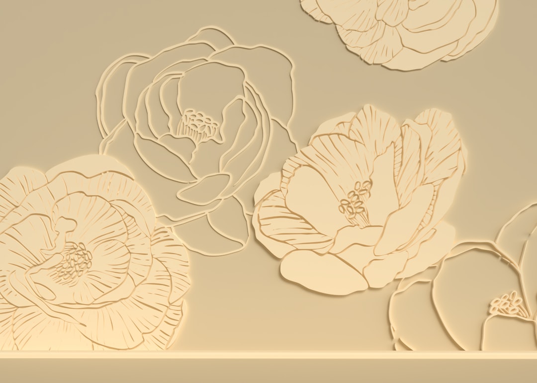
Embossing and Debossing Explained
Embossing raises a design out of the paper toward the viewer; debossing pushes it into the surface to create a recessed impression. Both rely on matched metal dies that squeeze the stock under heat and pressure, and both add a tactile dimension that flat printing simply cannot. This guide explains the difference, the main variations, and how to set up artwork so the relief forms cleanly.
Embossing is one of the core treatments in our complete guide to print finishing. Read that pillar for the big picture; here we focus on relief effects and how to specify them.
Embossing vs debossing: the core difference
The distinction is purely directional. Embossing creates a raised relief — run your finger over it and the design stands proud of the surface. Debossing creates a recessed impression — the design sinks below the surrounding paper. Same tooling concept, opposite direction.
Both use a matched pair of dies: a male die with the raised image and a female die with the corresponding recess. The paper is pressed between them so the fibers permanently take the shape. Because the stock is physically deformed, you can usually see a faint “ghost” of the design on the reverse side — something to account for on double-sided pieces.
| Aspect | Embossing | Debossing |
|---|---|---|
| Direction | Raised toward viewer | Recessed into surface |
| Best for | Logos, monograms, hero type | Backgrounds, patterns, subtle marks |
| Reverse side | Shows a recess (visible) | Shows a bump (visible) |
| Feel | Prominent, premium accent | Understated, tactile texture |
Blind, registered, and combination effects
There are three common ways to use relief, and choosing one is your main creative decision:
- Blind emboss/deboss — relief only, with no ink or foil. The effect is purely tactile and tonal, created by light and shadow on the raised or recessed shape. Elegant and subtle; great for monograms and stationery.
- Registered emboss — the relief is aligned to a printed element so the raised shape sits exactly on top of printed color. Demands tight registration between the print and the die.
- Combination (foil + emboss) — foil is applied and embossed in register so the lettering is both metallic and raised. This is one of the most premium results in print. See foil stamping for how the foil side is set up.
What embosses well — and what does not
Relief loves bold, simple shapes and clean type. Thin hairlines, tiny serifs, and intricate fine detail tend to flatten out or crack the paper because the fibers cannot form a sharp edge at small scale. Sculpted (multi-level) dies can hold more nuance, but they cost more. As a rule:
- Favor solid letterforms and logos with reasonable weight over delicate scripts.
- Keep spacing generous — adjacent raised elements that are too close can merge.
- Choose stock that has give. Heavier uncoated and cotton stocks form crisp, durable relief; very thin or heavily coated stocks crack.
The best stock for relief
Embossing and debossing reward thicker, softer stocks. Cotton and uncoated cover weights in the 300–400gsm range form deep, clean relief and feel substantial. Coated gloss stocks can crack along the relief edge and the coating may show stress marks. If your design needs both crisp CMYK and a strong emboss, talk to your printer about the stock trade-off early. For a full breakdown of coated versus uncoated and weight ranges, see our guide to paper types for printing.
How to set up artwork for embossing
File prep mirrors other die-based finishes — isolate the relief shape so the die maker gets exactly what it needs.
- Create a dedicated layer or spot color for the emboss, named clearly (e.g. “Emboss” or “Deboss”).
- Draw the shape as a solid, flat vector — no gradients or screens. The die is cut from this outline.
- Outline all type so the engraver reproduces the exact letterforms.
- For registered or combo effects, keep the emboss layer in precise registration with the print or foil layer, and allow slight tolerance.
- Set the layer to overprint and supply a mockup noting which areas are raised vs recessed and whether it is blind or combined with foil.
- Note the depth/level if you want a sculpted die; flag it so the printer quotes the right tooling.
Single-level vs sculpted dies
Not all relief is created equal. A single-level die raises or recesses the design to one uniform depth — the most common and affordable option, perfect for logos, type, and simple shapes. A sculpted (multi-level) die is hand-tooled with varying depths and bevels to render gradients of relief, so an illustration or seal can have genuine three-dimensional modeling rather than a flat raised plateau. Sculpted dies cost considerably more and take longer to produce, but they are the only way to emboss detailed crests, portraits, or layered logos with depth.
Edge styles matter too. A beveled edge gives a clean angled transition, a rounded edge a softer rise, and a chiseled edge a sharp, faceted look. Discuss the edge profile with your printer, because it changes how light plays across the relief and how crisp the result feels in hand. For most brand work, a single-level die with a beveled edge is the dependable, cost-effective choice.
Cost and production considerations
Like foil, embossing requires custom tooling, so each design carries a die cost that is spread across the run — short runs feel the tooling charge most. Sculpted dies and combination foil-emboss setups raise both cost and lead time because of the extra engraving and registration work. Embossing also adds a separate press pass, so allow additional days in the schedule. Because the relief shows through to the reverse, plan double-sided layouts around the ghost impression, or keep the back simple where the relief lands.
When to use embossing
Reach for relief when touch matters: business cards and letterheads, book and report covers, certificates, premium packaging, and any brand mark you want people to feel as well as see. A blind deboss is a quiet, sophisticated choice for backgrounds and patterns; a foil-and-emboss combo is the showpiece for a logo. If you want shine without raised texture, compare it against spot UV coating, which adds gloss contrast without deforming the stock.
Frequently Asked Questions
What is the difference between embossing and debossing?
Embossing raises a design so it stands proud of the paper surface, while debossing presses the design down into the paper to create a recessed impression. Both use matched male and female metal dies under heat and pressure; the only difference is the direction of the relief.
What is a blind emboss?
A blind emboss is relief applied with no ink or foil — just the raised or recessed shape itself. The effect comes from light and shadow falling across the relief, producing a subtle, tactile result that is popular for monograms, stationery, and understated logos on premium stock.
How do I set up a file for embossing?
Place the emboss shape on a dedicated layer or spot color drawn as a solid flat vector with no gradients, outline any type, and set it to overprint. For registered or foil-combination effects, keep the emboss in precise registration with the print or foil layer and supply a clear mockup.
Can you emboss and foil at the same time?
Yes. A combination finish applies foil and embosses it in register, producing raised metallic lettering — one of the most premium effects available. It requires tight registration between the foil die and the matched embossing dies, so allow a little tolerance and confirm the setup with your printer.
What paper is best for embossing?
Thicker, softer stocks emboss best. Cotton and uncoated cover weights around 300–400gsm form deep, crisp relief and resist cracking. Heavily coated gloss stocks can crack or show stress marks along the relief edge, so choose stock with some give for the cleanest result.


