Emphasis in Graphic Design: How to Direct the Viewer’s Eye
Emphasis in graphic design is the principle of making one element stand out from the rest of a composition. It is what creates a focal point, an entry point that tells the viewer exactly where to look first. Without emphasis, a design is a collection of equally weighted parts competing for attention. With it, the designer takes control of how information is received, guiding the viewer through the composition in a deliberate sequence.
Every effective design, whether it is a billboard, a business card, a website landing page, or a magazine spread, has at least one clear point of emphasis. It is not optional. A design without emphasis is like a sentence without a subject: technically present but functionally incomplete. This guide explains what emphasis is, why it matters, the specific techniques designers use to create it, how to build an emphasis hierarchy with multiple focal points, and the common mistakes that undermine it. [LINK: /graphic-design-principles/]
What Is Emphasis in Graphic Design?
Emphasis is the design principle concerned with creating a dominant element or area within a composition. It answers the most basic question a viewer asks, whether consciously or not, when encountering any visual: where should I look?
The element that receives emphasis becomes the focal point. It is the visual anchor that the eye lands on first before moving to secondary elements. In a movie poster, it might be the lead actor’s face. In an e-commerce product page, it might be the product image or the price. In a typographic poster, it might be a single word rendered at massive scale. The focal point does not have to be the largest element in the composition, though size is one of the most direct ways to create it. What matters is that it is clearly differentiated from everything else.
Emphasis in graphic design works because of how human visual perception operates. The eye is naturally drawn to elements that break a pattern, stand apart from their surroundings, or exhibit a quality that differs from the norm. Designers exploit these perceptual tendencies by manipulating visual properties such as size, color, value, weight, position, and spacing to elevate certain elements above others.
It is worth distinguishing emphasis from contrast, though the two are closely related. Contrast is the degree of difference between elements. Emphasis is the result of applying contrast strategically so that one element dominates. You can have contrast without emphasis, as in a checkerboard pattern where black and white alternate equally, but you cannot have emphasis without contrast. Contrast is the tool; emphasis is the outcome. [LINK: /contrast-in-graphic-design/]
Why Every Design Needs a Clear Visual Entry Point
Designers sometimes underestimate how quickly a viewer decides whether to engage with a composition. Research on visual attention consistently shows that people form initial impressions of a design in less than a second. In that fraction of time, the viewer’s eye needs somewhere to land. If the design does not provide a clear entry point, the viewer’s gaze will wander aimlessly, and the likelihood of engagement drops sharply.
A clear focal point serves several critical functions in any design.
It organizes information. In a composition containing a headline, subheading, body text, images, icons, and a call-to-action button, emphasis tells the viewer which of these elements is most important. Without that signal, all elements compete equally, and the viewer must work to determine the hierarchy on their own. Most will not bother.
It communicates purpose. The focal point reveals what a design is about. A charity poster that emphasizes a statistic communicates differently from one that emphasizes a human face, even if both contain the same information. Where you place emphasis defines the message.
It creates visual flow. The focal point is not the end of the viewing experience but the beginning. Once the eye lands on the dominant element, it moves naturally to secondary elements, then tertiary ones. This sequential movement is what designers call visual flow, and it begins with emphasis. Without a strong starting point, the flow never develops.
It reduces cognitive load. A design with clear emphasis is easier to process than one without it. The viewer does not need to evaluate every element simultaneously because the hierarchy has already been established. This makes the overall experience more pleasant and the content more memorable.
Techniques for Creating Emphasis in Graphic Design
There is no single way to create emphasis. Designers draw on a range of techniques, often combining several in a single composition to reinforce the focal point. Here are the primary methods for creating emphasis in design.
Size Contrast
Making an element significantly larger than everything around it is the most straightforward way to create emphasis. The eye gravitates toward the biggest object in a visual field. This is why headlines are larger than body text, why hero images dominate web pages, and why a single oversized letter can anchor an entire poster.
The key word is significantly. A slight size difference, say a headline at 20 pixels and body text at 16 pixels, reads as inconsistency rather than intentional hierarchy. Effective size emphasis requires a meaningful ratio. A headline at 48 pixels or larger against 16-pixel body text creates unmistakable emphasis. The greater the size difference, the stronger the focal point.
Size emphasis works for any visual element: type, images, icons, shapes, or graphic devices. An oversized product photograph on a packaging design, a massive numeral on an infographic, or a full-bleed image on a magazine spread all use size to command attention.
Color Contrast
A single element in a contrasting color will attract the eye even if it is smaller than the surrounding elements. This is the von Restorff effect, sometimes called the isolation effect: items that are distinctly different from their context are more likely to be remembered and noticed.
The most effective color emphasis places a warm, saturated color against a field of cool or neutral tones. A red call-to-action button on a predominantly blue-gray website. A gold accent on a monochrome business card. A yellow highlight on a black-and-white photograph. In each case, the color difference creates an immediate focal point.
Color emphasis does not require bright or saturated colors to work. A muted element in a sea of vibrant ones will also draw attention, because the principle is difference, not loudness. A desaturated, faded photograph in a layout of vivid illustrations will stand out precisely because it breaks the established pattern.
Value Contrast
Value, the lightness or darkness of an element, is one of the most powerful emphasis tools because it operates at a fundamental perceptual level. The human eye detects value differences before it processes color, shape, or detail. A dark element against a light background, or a light element against a dark background, creates immediate emphasis through value contrast.
This principle is why white text on a dark overlay instantly becomes the focal point of a hero image, and why a dark logotype on a light background reads as the dominant element. Value contrast is also the reason the squint test works: when you squint at a design, color and detail disappear, and only value relationships remain visible. Whatever stands out in value is what has emphasis. [LINK: /contrast-in-graphic-design/]
Isolation and White Space
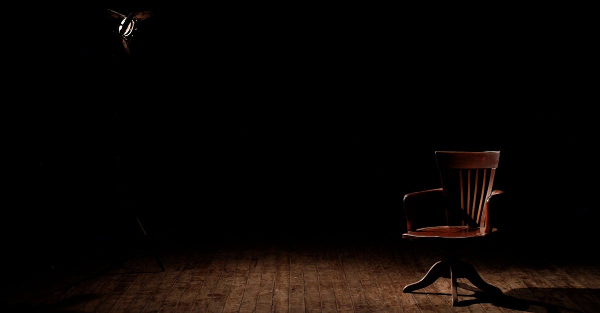
An element surrounded by generous empty space naturally draws the eye, even if the element itself is small or subdued. This is isolation emphasis, and it works because the white space acts as a frame that directs attention inward. There is nowhere else for the eye to go.
Luxury branding relies heavily on this technique. A small logotype centered on a vast white page communicates confidence and exclusivity precisely because of the surrounding emptiness. Apple’s product photography, with a single device floating in clean white space, is a textbook example. The product does not need to be large to command attention when nothing else competes for the viewer’s gaze.
Isolation emphasis is also practical in information-dense layouts. Pulling a key statistic, quote, or call-to-action out of a crowded text block and surrounding it with white space instantly elevates its importance. It is one of the simplest emphasis techniques available, and one of the most underused. [LINK: /balance-in-graphic-design/]
Typography Weight and Style
Within a block of text, typographic emphasis is created through differences in weight, style, size, and case. A bold word in a regular-weight paragraph draws the eye. An italic phrase within roman text signals emphasis. An uppercase word among lowercase words stands apart. A different typeface or color applied to a single word or phrase creates a typographic focal point.
Typographic emphasis operates at multiple scales. At the page level, the headline is the focal point because of its size and weight relative to body text. At the paragraph level, bold or colored text highlights key terms. At the word level, italics or underlines signal emphasis within a sentence. Each scale requires appropriate contrast: a bold weight that is only marginally heavier than the regular weight does not create sufficient emphasis. [LINK: /what-is-typography/]
The best typographic emphasis uses the weight and style options available within a single type family. A well-designed font family includes light, regular, medium, semibold, bold, and black weights, each offering a different level of typographic emphasis. Using these options systematically, rather than mixing unrelated typefaces, produces emphasis that is clear and cohesive. [LINK: /font-pairing/]
Position and Placement
Where an element sits within a composition affects how much emphasis it receives. Elements placed in certain positions naturally attract more attention than others. Research on visual scanning patterns shows that viewers tend to look at the top-left area of a composition first (in left-to-right reading cultures), then move across and down. Elements placed in this prime position benefit from positional emphasis.
The center of a composition is another high-emphasis position, particularly in symmetrical layouts. A centered element on a symmetrical background becomes the unavoidable focal point. This is why centered logos, centered headlines, and centered hero images are so common in web design: the center position inherently carries emphasis.
Breaking an established grid is another form of positional emphasis. In a layout where all elements are aligned to a strict grid, a single element that breaks the grid, whether by overlapping a column, extending beyond a margin, or sitting at an unexpected angle, will draw immediate attention. The disruption itself creates emphasis. [LINK: /alignment-in-graphic-design/]
Unusual Shapes and Forms
An element with an unexpected or unconventional shape will stand out from a field of regular forms. A circular element in a composition of rectangles. A jagged, irregular shape among smooth, geometric ones. A diagonal element in an otherwise horizontal-vertical layout. These shape anomalies exploit the perceptual tendency to notice what is different.
This technique is particularly useful in layouts that contain many similar elements, such as a grid of product cards or a directory of profile photos. Making one element a different shape, perhaps a circular image among square ones or a card with a colored border among borderless cards, instantly elevates it to focal point status.
In logo and icon design, unusual shapes serve as built-in emphasis. A mark that uses an unexpected form is more memorable precisely because it does not conform to expectations. The irregularity is the emphasis.
Emphasis Hierarchy: Primary, Secondary, and Tertiary Focal Points
Most real-world designs need more than one point of emphasis. A website landing page might need a headline, a hero image, and a call-to-action button to each receive some degree of emphasis. A magazine spread might require a main headline, a pull quote, and a photograph to coexist as focal points. The solution is emphasis hierarchy: a structured system of primary, secondary, and tertiary focal points.
The Primary Focal Point
The primary focal point is the single most dominant element in the composition. It is where the viewer’s eye lands first. Only one element should hold this position. If two elements compete equally for primary emphasis, the viewer’s attention splits and the design loses its anchor. The primary focal point typically uses the strongest combination of emphasis techniques: the largest size, the highest contrast, the most saturated color, the most isolated position, or some combination of these.
The Secondary Focal Point
The secondary focal point is the element the eye moves to after the primary. It is clearly less dominant than the primary but still distinct from the background elements. In a poster, the primary focal point might be the event name, and the secondary might be the date and venue. In a web page, the primary might be the headline, and the secondary might be the call-to-action button. The secondary focal point uses emphasis techniques at a reduced intensity: a smaller size, a less saturated color, or a lighter typographic weight.
The Tertiary Focal Point and Beyond
Tertiary focal points include supporting information that the viewer encounters after engaging with the primary and secondary elements. Body text, supporting images, secondary navigation, and footer information typically fall into this tier. These elements do not compete for initial attention but remain accessible and readable.
The key to a successful emphasis hierarchy is clear separation between levels. Each step down in the hierarchy should involve a noticeable reduction in visual weight. If the primary and secondary focal points are too similar in emphasis, the hierarchy collapses and the viewer cannot determine the intended sequence. A useful test: can you identify the primary, secondary, and tertiary elements within two seconds of looking at the design? If not, the hierarchy needs more contrast between levels.
Common Mistakes with Emphasis in Graphic Design
Even experienced designers make emphasis errors. Understanding the most common mistakes helps you identify and correct them in your own work.
Competing Focal Points
The most frequent emphasis mistake is giving two or more elements equal visual weight at the top of the hierarchy. A poster with a headline and an image that are both large, bold, and saturated creates two competing focal points. The viewer’s eye bounces between them, unable to settle. The result is confusion rather than communication.
The fix is decisive. Choose one element to dominate and subordinate the other. If the headline is the primary focal point, reduce the image’s contrast, size, or saturation. If the image is the primary focal point, make the headline smaller or lighter. Someone has to win.
No Clear Emphasis at All
Some designs distribute visual weight so evenly that nothing stands out. Every element is the same size. Every color is equally saturated. Every text block is the same weight and length. The result is a composition that feels flat and directionless, offering the viewer no guidance on where to begin.
This mistake often stems from a desire to treat all content as equally important. In reality, giving everything equal emphasis is the same as giving nothing emphasis. Hierarchy requires inequality. Some elements must be louder so that others can be quieter, and the overall composition benefits from the contrast.
Overusing Emphasis
The opposite of no emphasis is too much emphasis, and it produces a similar result. When every word in a paragraph is bold, nothing reads as bold. When every element is oversized, brightly colored, and surrounded by white space, the cumulative effect is visual noise rather than clarity.
Emphasis works through scarcity. A single bold word in a paragraph is emphatic. Three bold words are noticeable. An entire bold paragraph is just dense. The same principle applies at the composition level: one dominant focal point is clear, three competing focal points are confusing, and a composition where everything is maximized is exhausting.
Emphasis That Contradicts the Message
Sometimes the element receiving the most emphasis is not the element that matters most to the viewer or the communication goal. A restaurant menu that emphasizes the restaurant name over the food items. An event poster that emphasizes the venue address over the event name. A product page that emphasizes the company logo over the product image. In each case, the emphasis is technically successful (the eye goes to the intended element) but strategically misguided (the intended element is not what the audience cares about).
Before applying emphasis techniques, ask: what does the viewer need to see first? The answer should determine the primary focal point, not the designer’s personal preference or the client’s ego.
Real-World Examples of Emphasis in Design
Examining how emphasis works in professional design contexts illustrates the principle in action across different media and purposes.
Film Posters
Film posters are masterclasses in emphasis. The primary focal point is almost always the lead actor’s face or a central dramatic image, rendered at large scale with high contrast. The film title serves as the secondary focal point, typically in bold, distinctive typography positioned below or above the image. Tertiary elements, such as the cast list, director credit, and release date, occupy the margins in smaller, lighter type. The hierarchy is unmistakable, even in a two-second glance.
News Website Homepages
Major news websites use emphasis to signal the top story of the day. The lead story receives a large image, a bold headline, and a prominent position at the top of the page. Secondary stories appear below with smaller images and lighter headlines. Tertiary stories are listed as text links with no images. This emphasis hierarchy allows readers to immediately identify the most important news, scan secondary stories, and drill into specific topics as needed.
Product Packaging
On a crowded store shelf, packaging must create emphasis within a small surface area. The brand name or product name typically serves as the primary focal point, rendered in the largest, boldest type. A product image or key visual serves as secondary emphasis. Supporting details, such as ingredients, weight, and legal information, are tertiary. The most effective packaging designs use color contrast to differentiate themselves from competitors on the shelf, applying emphasis not just within the package design but relative to the entire visual environment.
Presentation Slides
Effective presentation slides apply emphasis by limiting each slide to one focal point. A single headline, a single statistic, or a single image dominates the slide. Supporting text is minimal and clearly subordinate. The worst presentation slides violate emphasis by cramming multiple paragraphs, charts, and images onto a single slide with no hierarchy. The audience cannot determine what to focus on, and the slide fails to communicate.
How to Test Emphasis in Your Designs
Several practical tests can reveal whether your emphasis is working as intended.
The blur test. Apply a Gaussian blur to your design in Photoshop or Figma. With the details removed, only the large-scale contrast relationships remain visible. Whatever is still clearly identifiable has strong emphasis. Whatever disappears has weak emphasis. If the wrong element dominates in the blurred version, your emphasis hierarchy needs adjustment.
The five-second test. Show your design to someone for five seconds, then take it away and ask them what they remember. The elements they recall are the ones with the most emphasis. If they do not mention the element you intended as the primary focal point, your emphasis is not working.
The distance test. View your design from across the room or at a reduced zoom level on screen. At a distance, only the most emphasized elements remain legible. This test is especially useful for posters, signage, and any design that needs to communicate at a distance.
The grayscale test. Convert your design to grayscale. If your emphasis depends entirely on color differences that disappear in grayscale, it is not robust enough. The strongest emphasis is supported by value contrast, size contrast, and spatial contrast in addition to color.
Frequently Asked Questions
What is the difference between emphasis and contrast in graphic design?
Contrast is the degree of visual difference between elements in a composition. Emphasis is the result of using contrast to make one element dominant. Contrast is a tool; emphasis is what the tool achieves. You can have contrast without emphasis, as in a pattern where two colors alternate equally, but you cannot have emphasis without some form of contrast. When designers talk about emphasis in graphic design, they are describing the strategic application of contrast to direct the viewer’s attention to a specific focal point. [LINK: /contrast-in-graphic-design/]
How many focal points should a design have?
A design should have one primary focal point and can support two to three secondary and tertiary focal points. The exact number depends on the complexity of the content. A simple poster might need only a primary and secondary focal point. A complex web page might have a primary focal point, two secondary focal points, and several tertiary elements. The critical rule is that there must be one clear winner at the top of the hierarchy. Two elements competing for primary emphasis will confuse the viewer. When in doubt, reduce the number of focal points rather than adding more.
Can white space alone create emphasis?
Yes. White space, or negative space, is one of the most effective emphasis techniques available. An element surrounded by generous empty space becomes a focal point even if it is small, subdued, or otherwise unremarkable in isolation. The white space eliminates competing visual information and directs the eye toward the only available target. This technique is especially common in luxury branding and minimalist design, where restraint communicates confidence. However, white space works best when combined with at least one other emphasis technique, such as position or contrast, to reinforce the focal point. [LINK: /balance-in-graphic-design/]
How do I create emphasis without making a design look cluttered?
The secret is selectivity. Apply strong emphasis to one element and let everything else recede. Clutter occurs when multiple elements compete for attention simultaneously, so the solution is to limit the number of elements that receive any emphasis technique. Use one large element, not three. Use one accent color, not four. Use one bold phrase per paragraph, not five. Emphasis works through exception, not accumulation. The fewer elements you emphasize, the more powerful each emphasized element becomes. A composition where one element speaks loudly and everything else speaks softly will always feel cleaner than one where every element is at medium volume. [LINK: /alignment-in-graphic-design/]


