Fuchsia vs Pink: What’s the Difference?
People use “pink” as a catch-all, but fuchsia is a specific, high-voltage member of that family. The fuchsia vs pink distinction is mostly about intensity and undertone: fuchsia is a bold purplish-pink at full saturation, while pink is a soft, light tint. One commands attention; the other soothes.
What is Fuchsia?
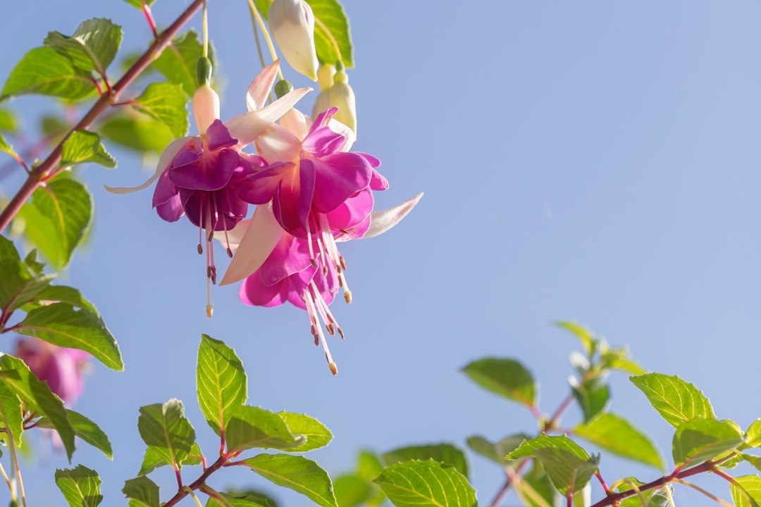
Fuchsia is a vivid reddish-purple named after the bright blooms of the fuchsia plant. A representative hex is #FF00FF, which in the RGB color model is identical to magenta: full red, no green, full blue. That equal mix of red and blue is what gives fuchsia its unmistakable purple lean. It reads as energetic, confident, and a little theatrical, and at maximum saturation it’s one of the most attention-grabbing colors a screen can display.
What is Pink?
Pink is, in its classic form, a pale tint of red created by adding white. A representative hex is #FFC0CB, the soft “rose” pink most people picture. Because it’s desaturated and light, pink reads as gentle, sweet, and calming rather than bold. Its undertone can drift warm (coral, salmon) or cool (rose, blush), but the canonical pink stays soft and approachable, a color associated with tenderness, romance, and youth.
What’s the difference between Fuchsia and Pink?
Saturation and lightness do most of the work here. Fuchsia is fully saturated and medium-bright, pulling toward purple, while pink is heavily lightened and low in saturation, sitting firmly on the red side. Fuchsia is what pink looks like with the volume turned all the way up and a splash of blue added. The table below sums it up.
| Property | Fuchsia | Pink |
|---|---|---|
| Hex code | #FF00FF | #FFC0CB |
| RGB | 255, 0, 255 | 255, 192, 203 |
| Undertone | Purple / blue-leaning | Warm to neutral red |
| Hue family | Magenta / purplish-pink | Light red (tint) |
| Best used for | Bold branding, CTAs, statement fashion | Soft design, baby goods, gentle accents |
| Mood/feel | Energetic, confident, dramatic | Gentle, sweet, calming |
When should you use each?
Use fuchsia when you need maximum impact: a call-to-action button, a bold fashion statement, packaging that has to pop on a crowded shelf, or branding that wants to feel daring and modern. Use pink when you want warmth and approachability without intensity, such as soft UI accents, wellness or beauty branding, or romantic and youthful themes. The emotional gap between the two is large, which is why color psychology treats vivid and pastel members of the same hue so differently.
How to tell Fuchsia and Pink apart
Compare saturation first. Fuchsia is electric and almost glowing, while pink looks soft and washed with white. Next, check the undertone: fuchsia leans purple because its blue channel is maxed out, whereas classic pink leans warm-red. Numerically, fuchsia’s green channel sits at zero while pink’s hovers near 192, a gap that explains why fuchsia feels so much more intense even though both share a full red channel.
Do Fuchsia and Pink go together?
They pair wonderfully as a tonal duo. Because pink is essentially a quieter relative of fuchsia, layering the two builds a monochromatic pink scheme with built-in contrast: fuchsia as the bold focal point, soft pink as the supporting field. This light-and-loud pairing reads as playful and contemporary. For extra balance you can introduce fuchsia’s near-opposite, a green, an approach grounded in the logic of complementary colors.
Frequently Asked Questions
Is fuchsia the same as magenta?
In the RGB color model, yes: both render as #FF00FF. The names differ by origin, with magenta tied to printing and fuchsia to the flower, but on a screen they’re effectively identical. In paint and fashion, fuchsia sometimes reads slightly pinker or more reddish than printer’s magenta.
Is fuchsia just a bright pink?
Sort of. Fuchsia belongs to the pink family but sits at full saturation with a strong purple lean, making it far more intense than everyday pink. Calling it a bright pink is fair shorthand, though purists note the blue undertone is what truly separates fuchsia from a simple vivid pink.
Which is warmer, fuchsia or pink?
Classic pink is usually warmer because it leans toward red, while fuchsia’s maxed-out blue channel pulls it cooler and toward purple. So despite fuchsia’s high energy, it reads as the cooler-toned of the two when compared directly under neutral light.
Can you mix fuchsia and pink in one design?
Yes, and it’s a popular combination. Using a pale pink alongside vivid fuchsia creates a monochromatic palette with clear hierarchy: fuchsia draws the eye while pink softens and supports. Keep fuchsia as the accent to avoid overwhelming the composition.
Is fuchsia a good color for branding?
It can be very effective for brands wanting to feel bold, youthful, and unconventional, since fuchsia is hard to ignore. The key is restraint: a little goes a long way, so many brands pair small fuchsia accents with neutral or soft-pink supporting tones.


