What Font Does Games Workshop Use?
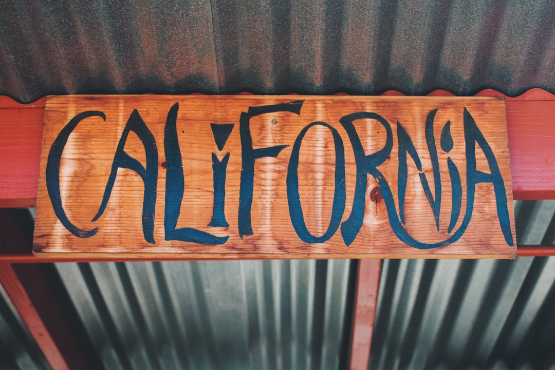
If you are searching for the games workshop font, you want the bold wordmark from Games Workshop, the British miniatures and tabletop wargame company behind Warhammer Age of Sigmar and Warhammer 40,000. To be clear up front, this is the Games Workshop corporate brand and its logo lettering, not the many gothic display faces used on individual game boxes. The honest answer: the logo is custom, heavy display lettering, not a single released typeface you can install. The letters are strong, condensed, and assertive, signaling a company built on epic battles and grim-dark worlds. Below we break down what the lettering actually is, why a bold style suits the brand, and which free fonts get you closest without lifting the trademark.
What font is the Games Workshop logo?
The Games Workshop logo is best understood as a custom, bold display treatment rather than a font you can grab off a shelf. The letters are heavy, even, and condensed, drawn with the steady weight of a brand that wants to look established and powerful. That strong, no-nonsense character is the whole point: the wordmark reads as authoritative and serious rather than playful, the kind of mark that belongs on a flagship store and a hobby empire spanning miniatures, paints, and rulebooks.
Because Games Workshop has refined its identity over decades, treat the precise construction as an informed observation, not a confirmed spec. What we can say confidently is that it is not a famous commercial font dropped in unedited — the weight, the spacing, and the condensed proportions were tuned for impact. The look is reminiscent of bold, grotesque-style display sans faces rather than any one downloadable file. If it were a stock typeface, designers would have named it long ago, so the safest description is custom bold lettering built specifically for the brand.
What typeface does Games Workshop use in its branding?
Across boxes, the White Dwarf magazine, codices, and store signage, Games Workshop pairs its bold corporate wordmark with a wide cast of supporting type. Individual ranges lean on dramatic, gothic, and blackletter-flavored display faces to set mood, while rules and stat lines are set in clean, legible sans and serif faces so dense army lists stay readable. The corporate logo gets the bold treatment; functional text stays quiet and clear.
So if you want to mirror the whole identity, make two decisions: one heavy display face for the logo-style headline, and one calm, well-spaced face for the paragraphs and rules. Setting your rules text in a heavy gothic display face is the most common mistake when chasing this epic aesthetic, because it quickly becomes unreadable across long passages of stats and lore.
Free fonts that look like the Games Workshop font
No free font is an exact match, but several capture the bold, confident spirit well enough for a poster, a mockup, or a fan project. Bold names below are free alternatives you can search for and license accordingly.
| Use case | Games Workshop uses | Free alternative |
|---|---|---|
| Main wordmark / headline | Custom bold condensed display | Archivo Black or Anton |
| Subheads / labels | Strong condensed sans | Oswald or Barlow Condensed |
| Body / rules text | Clean legible type | Roboto or Source Serif Pro |
Archivo Black is a strong starting point for the wordmark because its heavy, even character shares the logo’s solid, commanding feel; scale it up and tighten the spacing to match. Anton pushes toward a more condensed, poster-like punch, while Oswald works well for subheads and labels with sturdy, tall letterforms. For readable supporting copy, Roboto stays neutral and clear. The bold weight and tight spacing matter as much as the font itself. For another miniatures-brand breakdown, see our Reaper Miniatures font guide.
Why does Games Workshop use this kind of type?
The bold lettering is doing real branding work. Games Workshop is built on epic, large-scale conflict and immersive grim-dark worlds, so its corporate mark needs to feel strong, established, and serious rather than light or whimsical. Heavy, condensed letterforms read as powerful and authoritative, the right tone for a company that has dominated tabletop wargaming for decades. A thin, elegant face would feel wrong here, undercutting the scale and grit the hobby is known for.
The choice also helps the brand command attention on a shelf or a storefront. A bold, confident wordmark reads as a serious institution rather than a passing fad, reassuring hobbyists investing real money and time. That steady authority is hard to achieve with a careless stock font, because a generic sans can read as ordinary rather than commanding. A bespoke treatment lets the designers pitch the mood precisely. For more logo breakdowns, browse our famous brand fonts hub.
Can I use the Games Workshop font for my own project?
You can recreate the style, but you cannot use the actual logo. The Games Workshop name, wordmark, and brand design — along with Warhammer and its sub-brands — are trademarked branding owned by Games Workshop Group, so copying them for merchandise, a business, or anything implying affiliation is off-limits. Using a free bold look-alike for a personal, fan, or unrelated creative project is fine as long as you respect each font’s individual license. Our font licensing guide explains personal-versus-commercial use, and for a dice-maker’s mark, see our Chessex font guide.
Frequently Asked Questions
Is the Games Workshop font free to download?
No. The Games Workshop logo is custom bold lettering, not a released font, so there is no official file to download. Any “Games Workshop font” you find is a fan recreation or look-alike. For the style, use free fonts like Archivo Black or Anton, keep them heavy and condensed, and check each license before commercial use.
What font is most similar to the Games Workshop logo?
Archivo Black and Anton are among the closest free matches for the bold, condensed letterforms, with Oswald a sturdy choice for labels. None is identical, since the logo is custom-styled and relies on its weight and spacing, but with tight tracking they get convincingly close for mockups and fan projects.
What font does Warhammer 40,000 use on its boxes?
Individual Warhammer ranges use dramatic, gothic, and blackletter-flavored display lettering tuned for atmosphere rather than the corporate logo font. These are custom or licensed display treatments chosen per product, which is why a box wordmark often looks different from the Games Workshop corporate mark above the door.
Can I use a Games Workshop-style font commercially?
You can use a free look-alike font commercially if its license permits, but you cannot reproduce the trademarked Games Workshop wordmark or any Warhammer logo on products you sell. Set your own text in a free bold font instead of copying the official mark, and verify both the font license and trademark rules first.