What Font Does Goodfellas Use?
If you’re hunting for the goodfellas font, you almost certainly want to recreate that blunt, no-nonsense mob-movie title — the kind of lettering that hits like a fist and signals organized-crime grit before you read a word. The honest answer is that no public, downloadable typeface has been confirmed as the official Goodfellas title font. Like most major studio films, Martin Scorsese’s 1990 classic relies on custom or heavily customized title art rather than a font you can simply install. Below we break down what’s actually happening with the logo, what type appears in the film, and which free fonts get you closest without copying a trademarked wordmark.
What font is the Goodfellas logo?
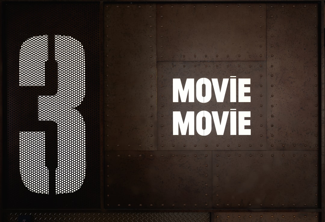
The Goodfellas title treatment is a heavy, bold display logotype with a tough, grounded character — thick strokes, tight spacing, and a flat, unglamorous attitude that matches the movie’s working-class mob world. That lettering reads as a custom display logotype rather than a stock font you can download.
It’s worth being precise about the distinction. The official film wordmark is a protected brand asset owned by the studio. Even if you found a typeface that closely matched the curves of the poster lettering, the title as designed — the specific letterforms, spacing, and arrangement — is intellectual property. So when people ask “what font is the logo,” the most accurate response is that it’s hand-built or heavily customized lettering, and you should treat any single-font claim as an informed observation, not a confirmed spec.
What typeface is used in the film?
Inside the movie, the typography is deliberately understated. The famous freeze-frame title cards and on-screen text lean on clean, no-frills lettering that stays out of the way of the storytelling. Scorsese’s films tend to use type as a tool, not a spectacle:
- Main title: the bold, gritty wordmark seen on the poster and opening, built as custom art.
- Freeze-frame cards: simple, legible text that punctuates the narration without competing with it.
- Credits: straightforward supporting type chosen for readability over personality.
Because title sequences and key art are produced by specialist designers, there’s no single font threading through every frame. The consistent thread is tone — heavy, grounded, unpretentious — more than one specific typeface. If you like that era of crime-movie branding, our roundup of classic vintage fonts is a good place to browse adjacent moods.
Free fonts that look like the Goodfellas font
You can’t legally download the official wordmark, but you can capture the same heavy, gritty feeling with free display fonts. Match the use case rather than trying to clone the title exactly:
| Use case | Goodfellas uses | Free alternative |
|---|---|---|
| Main title / wordmark | Custom heavy bold display | A thick condensed bold display (e.g. Anton or Oswald Heavy) |
| Gritty crime feel | Customized rugged lettering | A rough or worn free display face |
| Poster headline | Bold all-caps art | A heavy grotesque like Archivo Black |
| Credits / supporting text | Clean readable type | A neutral grotesque such as Roboto or Inter |
For maximum mob-movie energy, pair a heavy condensed headline with tight letter spacing and a slightly weathered texture — that grit does as much work as the letterforms themselves.
A practical workflow: set your headline word large in a free heavyweight, kill most of the letter spacing so the characters nearly touch, then drop the whole thing into a muted, almost monochrome palette. Avoid bright colors and avoid anything rounded or friendly — the Goodfellas mood is built on weight, restraint, and a faint sense of menace, so the texture and color grade you choose matter as much as the typeface. Test it small, the way it would read on a spine or thumbnail, and if it still feels tough and legible at that size, you’ve matched the spirit of the original.
Why does Goodfellas use this kind of type?
Heavy, blunt lettering is functional for a crime drama. It reads instantly on a poster, projects toughness and inevitability, and signals genre at a glance. Scorsese’s branding favors a strong, ownable mark over a generic font because a memorable title treatment carries across posters, home video, and decades of re-release.
This is the same logic behind a lot of film and company branding — a distinctive, ownable visual mark beats a stock font every time. If you want the broader picture of how studios and brands build recognizable type identities, see our guide to famous brand fonts. The approach also rhymes with Scorsese’s other crime pictures; you can compare directly with our breakdown of the Casino movie font and the stark The Departed font.
Can I use the Goodfellas font for my own project?
For personal, non-commercial fun — fan art, a mock poster, practice lettering — you have plenty of latitude, especially if you use a free look-alike rather than the actual title art. The line you should not cross is reproducing the film’s actual wordmark or anything that implies official endorsement on products you sell. That’s trademark territory, not just font licensing.
If you’re building something commercial, choose a properly licensed font for your look-alike and design your own original mark. Always confirm each font’s terms before you ship — our font licensing guide walks through desktop vs. web vs. commercial use so you don’t get caught out. Bottom line: borrow the vibe, build your own logo.
Frequently Asked Questions
Is there an official downloadable Goodfellas font?
No verified, downloadable typeface has been released as the official Goodfellas font. The title appears as custom or heavily customized display lettering built for the poster and titles. Any “exact font” claim should be treated as an informed guess rather than confirmed fact.
What free font is closest to the Goodfellas logo?
For the bold wordmark, free heavyweights like Anton, Archivo Black, or a heavy Oswald get you close, especially with tight spacing and a worn texture. None will match perfectly, since the original is custom, but they capture the thick, gritty mob-movie energy well enough for fan projects.
What kind of font is the Goodfellas title?
It’s best described as a heavy, bold display logotype with a gritty, grounded character — thick strokes and tight spacing rather than a delicate or decorative face. Think rugged condensed display rather than a clean corporate sans, which suits the film’s working-class crime world.
Can I sell merch using the Goodfellas font?
Not safely if you reproduce the actual title art or wordmark — those are trademarked studio assets. You can sell original designs made with a properly licensed look-alike font, as long as they don’t imply official endorsement. Check both font licensing and trademark rules before selling anything.