Graphic Design Trends 2026: What’s Shaping Visual Culture Right Now
Graphic design trends do not emerge in isolation. They are shaped by technology, culture, economics, and the inevitable reaction cycle: whatever dominated last year becomes the thing designers collectively reject this year. The trends defining 2026 reflect all of these forces at once. Artificial intelligence has moved from novelty to daily workflow tool, prompting both excitement and backlash. Minimalism’s long reign is fracturing under the weight of maximalist energy. Nostalgia keeps cycling through decades at accelerating speed. And the line between static and motion design has effectively dissolved.
This article maps the ten graphic design trends shaping visual culture right now. For each, we will examine why it is happening, who is leading it, what it looks like in practice, and how you can apply it to your own work without becoming a trend-chaser. Because the goal is never to follow trends blindly — it is to understand the visual currents well enough to swim with them, against them, or around them as the project demands. We update this guide annually to reflect the shifting landscape. If you are looking for a broader historical perspective on visual movements, our guide to graphic design styles provides the long view.
A note before we begin: trends are descriptive, not prescriptive. They tell you what is happening across the industry at a given moment. They do not tell you what you should do. The best designers use trend awareness as context, not as a creative brief.
1. AI as Design Tool, Not Designer
The conversation around artificial intelligence in design has matured considerably since the initial wave of AI image generators in 2022 and 2023. In 2026, the industry has largely settled into a pragmatic middle ground: AI is a powerful tool within the design process, but it is not a replacement for the designer. The most effective studios are using AI for ideation, moodboarding, texture generation, copy drafting, image upscaling, and rapid prototyping — tasks that accelerate the early and middle stages of a project. The strategic thinking, art direction, cultural sensitivity, and craft refinement that define professional design work remain firmly human.
Midjourney and its competitors have become standard moodboarding tools at agencies like Sagmeister & Walsh and Pentagram. Designers generate dozens of visual directions in minutes, then use those outputs as conversation starters with clients rather than as finished deliverables. ChatGPT and similar language models assist with copy exploration, naming exercises, and content structuring. AI upscaling tools like Topaz and Magnific have made it possible to work with archival and low-resolution imagery that would have been unusable five years ago.
At the same time, there has been a significant backlash against purely AI-generated design. Clients and audiences have developed an eye for the telltale signs of unedited AI output — the uncanny smoothness, the generic compositions, the lack of conceptual depth. Brands that leaned too heavily on AI-generated visuals in 2024 and 2025 have faced public criticism and quietly returned to human-led creative processes. The market is signaling clearly: AI-assisted is welcome; AI-replaced is not.
How to Apply This Trend
Integrate AI into your workflow where it genuinely saves time without compromising quality. Use image generators for early exploration, not for final assets. Use language models to break through writer’s block on project briefs, not to write your portfolio copy. Always refine, edit, and art-direct AI output — treat it as raw material, never as finished work. And be transparent with clients about where AI fits into your process. The studios earning the most trust right now are the ones that use AI openly and honestly, positioning it as one tool among many in their design software stack.
2. Maximalism’s Return
After nearly a decade of minimalist dominance — clean grids, restrained palettes, generous whitespace, and sans-serif everything — the pendulum has swung. Maximalism is back, and it is arriving with force. Bold color, layered compositions, pattern mixing, decorative typography, and unapologetic visual excess are defining some of the most talked-about design work of 2026.
The drivers are cultural as much as aesthetic. Gen Z’s visual language, shaped by TikTok, Instagram, and the collision of global subcultures, favors density and sensory richness over restraint. The fashion industry, always a leading indicator for graphic design trends, has been pushing maximalism through houses like Versace, Dolce & Gabbana, and emerging streetwear labels that treat more-is-more as a philosophy. Music visuals — album covers, tour posters, lyric videos — are embracing layered, chaotic compositions that reject the clean-grid aesthetic of the streaming era’s early years.
This does not mean minimalist graphic design is dead. It means it is no longer the default. Maximalism offers an alternative that feels energetic, personal, and culturally engaged in ways that minimalism’s austerity cannot always achieve. Studios like Sagmeister & Walsh, Morag Myerscough’s practice, and the Brooklyn-based studio Order have been producing maximalist work that demonstrates how visual abundance can be controlled without being restrained.
How to Apply This Trend
Maximalism works best when it is structured underneath the apparent chaos. Start with a clear grid, then layer elements deliberately. Mix patterns and textures, but maintain a consistent color logic. Combine typefaces, but ensure each one serves a distinct hierarchical role. The difference between effective maximalism and visual noise is intentionality — every element should earn its place, even when the goal is abundance.
3. Nostalgic Decade Revivals
Nostalgia has always been a force in design, but in 2026 the cycle is spinning faster than ever. Three decades are simultaneously feeding the visual culture: the chrome-and-bubble optimism of Y2K design, the raw grit of 90s graphic design, and the warm earthiness of 70s graphic design. Each revival serves a different emotional register, and designers are mixing and matching elements across eras rather than committing to a single decade’s aesthetic wholesale.
Y2K nostalgia has been the most commercially potent. Chrome textures, translucent plastics, metallic gradients, and bubbly 3D forms have appeared in branding for beauty companies (Glossier’s limited editions, Rhode Skin), tech startups (particularly in the Web3 and gaming spaces), and fashion labels targeting the 18-to-25 demographic. The style’s optimism — its faith in a shiny, digital future — resonates with a generation that grew up hearing about the early internet’s utopian promise.
The 90s grunge revival leans harder into texture: torn paper, photocopied type, distressed imagery, and the DIY aesthetic of zine culture. It appears in music industry work, independent publishing, and streetwear branding. The 70s revival, meanwhile, favors rounded serifs, sunset gradients, warm mustard-and-rust palettes, and organic forms. It has found a natural home in food and beverage branding, wellness companies, and lifestyle media.
How to Apply This Trend
The most effective nostalgic design references an era without cosplaying it. Pull specific visual elements — a color palette, a texture treatment, a typographic convention — and place them in a contemporary context. Avoid recreating a decade’s aesthetic wholesale, which reads as pastiche rather than design. The goal is resonance, not reproduction.
4. Dimensional and 3D Typography
Typography has broken free of the flat plane. Inflatable, chrome-plated, clay-rendered, frosted-glass, and otherwise three-dimensional type treatments have become one of the most visible graphic design trends of 2026. What began as an experimental technique in motion graphics and social media content has migrated into brand identities, packaging, editorial design, and advertising.
The technical barrier to entry has dropped significantly. Tools like Cinema 4D, Blender (free and open-source), and Adobe’s Substance 3D suite have matured to the point where producing high-quality 3D type no longer requires a specialist background. Plugin ecosystems and template libraries have made dimensional text accessible to graphic designers who would never call themselves 3D artists. AI-assisted 3D generation tools are further accelerating adoption.
The trend feeds on social media’s appetite for scroll-stopping visuals. A chrome headline that catches and distorts its environment, or an inflatable letterform that appears to bulge off the screen, creates immediate visual impact in feeds dominated by flat imagery. Brands like Apple, Nike, and Spotify have all incorporated dimensional type into campaign work. Boutique studios like DIA and Mucho are producing some of the most refined examples, proving that 3D type can be sophisticated rather than merely eye-catching.
How to Apply This Trend
Start with strong typographic fundamentals. A poorly chosen typeface does not improve by becoming three-dimensional — it just becomes a poorly chosen typeface with a shadow. Select faces with enough structural character to hold up as sculptural objects. Use 3D effects to reinforce a concept or brand personality, not as decoration. And consider how dimensional type will work across different contexts: a chrome headline that looks stunning on Instagram may need a flat fallback for email headers or print collateral.
5. Serif Confidence in Tech
For the better part of a decade, the tech industry’s typographic palette was remarkably narrow. Geometric sans-serifs — Circular, Product Sans, SF Pro, and their many imitators — created a visual monoculture where every app, platform, and startup looked essentially the same. The result was a sea of rounded, friendly, interchangeable wordmarks that communicated approachability but sacrificed distinctiveness.
In 2026, the correction is well underway. Tech companies are reaching for serif typefaces to differentiate themselves, project maturity, and signal a shift from Silicon Valley’s perennial youthfulness toward something more grounded. The move echoes a broader cultural moment in which tech companies are trying to present themselves as established, trustworthy institutions rather than disruptive startups.
Mailchimp’s adoption of a custom serif, Spotify’s increasing use of editorial serif typography in campaign work, and numerous fintech and SaaS rebrandings have made serifs in tech feel not just acceptable but forward-looking. The typefaces being chosen are not dusty Garamonds — they are contemporary serifs with personality: faces like GT Super, Reckless Neue, and Noe Display that feel modern while carrying the structural authority that serifs inherently provide.
How to Apply This Trend
If you work in tech branding, consider whether a serif — or a serif-sans pairing — could give your project the differentiation it needs. The key is selecting a serif that matches the brand’s specific personality rather than defaulting to “any serif.” A high-contrast editorial serif communicates something very different from a sturdy slab serif fonts or a delicate transitional face. Test your serif choices at small sizes and on screens to ensure they maintain legibility in digital contexts. Explore our trending fonts guide for specific typeface recommendations.
6. Sustainable and Eco-Conscious Design Language
Sustainability has moved from a niche concern to a mainstream design consideration, and it is generating its own visual language. Earth tones — terracotta, sage, sand, clay, and muted ochre — have become shorthand for environmental consciousness in branding and packaging. Recycled paper textures, unbleached cardboard, visible fiber, and imperfect material surfaces communicate honesty and reduced environmental impact. Reduced-ink approaches, where designers deliberately minimize ink coverage to lower printing’s environmental footprint, are producing a stripped-back aesthetic that feels both ethical and visually distinctive.
The trend extends beyond materials into design philosophy. Brands committed to sustainability are favoring transparency in their visual communication: clear ingredient lists, honest photography of production processes, supply chain diagrams, and information-dense packaging that treats the consumer as an intelligent adult. The aesthetic rejects the glossy, idealized product imagery of traditional consumer goods marketing in favor of something more grounded and real.
Studios like Pentagram (particularly Natasha Jen’s team), Stockholm Design Lab, and the London-based agency &Walsh have produced notable work in this space. Patagonia’s ongoing design evolution remains the benchmark — a brand whose visual identity has always communicated environmental seriousness without ever feeling preachy or self-righteous.
How to Apply This Trend
Start with materials, not just aesthetics. If you are designing for print, research recycled and FSC-certified paper stocks, soy-based inks, and reduced-coverage printing techniques. If you are designing for screen, consider the energy implications of your color choices (darker interfaces consume less power on OLED screens). Avoid greenwashing — using earth-tone palettes and leaf motifs on products that are not genuinely sustainable will backfire with an increasingly informed audience. The most credible eco-conscious design communicates substance, not just style.
7. Variable Fonts and Fluid Typography
Variable font technology has existed since 2016, but 2026 is the year it has become genuinely mainstream. Browser support is now universal. Design tools — Figma, Adobe Illustrator, and the broader creative software ecosystem — handle variable fonts natively. And a critical mass of high-quality variable typefaces are available, from open-source options on Google Fonts to premium releases from foundries like Dinamo, Grilli Type, and Typotheque.
The practical impact is significant. A single variable font file can replace an entire family of static weights and widths, reducing page load times while giving designers unprecedented control over typographic expression. On the web, fluid typography — type that scales smoothly relative to viewport size rather than jumping between fixed breakpoints — creates a more refined reading experience across devices. Kinetic typography, where letterforms animate along their variation axes, has moved from experimental CodePen demos to production websites and brand campaigns.
The creative possibilities are equally compelling. Designers can now create typographic systems that respond to user interaction, data inputs, time of day, or any other variable. Heading text that subtly shifts weight as you scroll. Body copy that adjusts its optical size based on reading distance (using device sensors). Animated wordmarks that breathe and pulse. These are no longer speculative concepts — they are shipping features on live websites.
How to Apply This Trend
If you are not already using variable fonts, start with well-supported options like Inter, Roboto Flex, or Source Sans 3. Implement fluid typography using CSS clamp() functions to create smooth scaling between minimum and maximum sizes. For kinetic type, begin with subtle animations — weight shifts on hover, gentle width transitions during scroll — before attempting more dramatic effects. The goal is to enhance the reading experience, not to distract from it. Variable fonts are a tool for refinement, not spectacle.
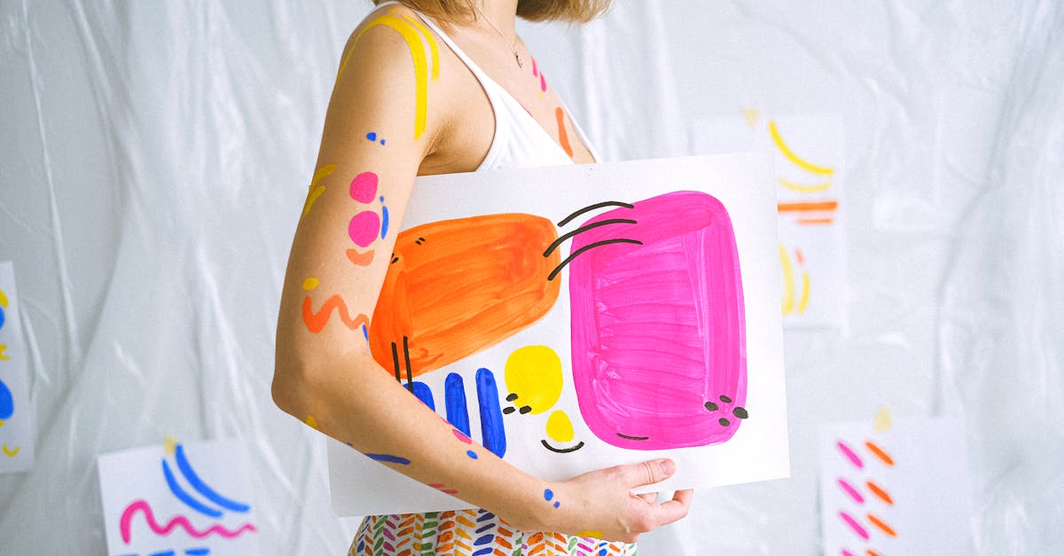
8. Hand-Drawn and Imperfect Elements
As AI-generated imagery has become ubiquitous, a counter-movement has emerged that prizes the unmistakably human. Hand-drawn illustrations, imperfect lettering, rough textures, visible brushstrokes, and organic irregularities are appearing with increasing frequency in branding, editorial design, and packaging. The appeal is straightforward: in a visual landscape saturated with algorithmic smoothness, the wobble of a hand-drawn line communicates authenticity, warmth, and care in a way that pixel-perfect rendering cannot.
This is not a new impulse — the tension between mechanical precision and human imperfection has run through design history since the Arts & Crafts movement of the 1880s. But AI has given it fresh urgency. When a machine can produce a technically flawless illustration in seconds, the value proposition of human craft shifts from skill to soul. Clients are paying a premium for work that could not have been generated by a prompt, and audiences respond to the tactile quality of hand-made elements with a warmth that polished digital work rarely elicits.
Studios like Helme Studio, OMSE, and illustrator-led practices like those of Olimpia Zagnoli and Jean Jullien are thriving in this environment. The trend also connects to a broader preference for illustration over stock photography — original drawn and painted imagery that gives brands a unique visual voice rather than the generic sameness of stock libraries (or AI image generators, which often produce a similar kind of generic sameness at higher resolution).
How to Apply This Trend
Introduce hand-drawn elements strategically rather than uniformly. A hand-lettered headline paired with clean body type creates contrast. A set of custom illustrations used as brand icons differentiates a system without requiring every element to be hand-crafted. If your own drawing skills are limited, collaborate with illustrators — the investment in original artwork pays dividends in brand distinctiveness. Resist the temptation to over-refine hand-drawn work digitally. The imperfections are the point.
9. Bold Color Blocking
Color is being used with increasing boldness and simplicity in 2026. Large fields of saturated, unapologetic color — used structurally to divide compositions, create hierarchy, and establish brand recognition — have become a defining characteristic of contemporary graphic design. The approach draws on a long lineage, from De Stijl’s primary-color planes to Swiss Style’s color-coded information systems, but the current iteration favors palettes that are simultaneously limited and punchy.
Duotone imagery — photographs reduced to two colors — remains popular for its ability to create visual unity across diverse image content. A brand can apply a consistent duotone treatment to any photograph and achieve instant cohesion, making it a practical tool for design systems that need to accommodate user-generated or editorially diverse imagery. Spotify popularized the technique in the mid-2010s, and it has since become a staple of tech, media, and cultural institution branding.
The palette preferences of 2026 lean toward combinations that feel energetic without being aggressive: deep indigo with warm coral, forest green with butter yellow, rich burgundy with blush pink. These pairings balance warmth with sophistication, avoiding both the cold sterility of monochrome tech palettes and the overwhelming intensity of neon. Studios like Collins, Wolff Olins, and Porto Rocha have been producing exemplary color-forward work that demonstrates how a confident palette can carry an entire brand identity.
How to Apply This Trend
Limit your palette deliberately. Two or three colors used with conviction will always outperform seven colors used tentatively. Test your color combinations for accessibility — ensure sufficient contrast ratios for text over colored backgrounds. Use color structurally, not decoratively: let large color fields organize your layout and guide the viewer’s eye. And invest time in finding unexpected combinations rather than defaulting to safe, predictable pairings. The most memorable brand palettes of this moment are the ones that feel simultaneously surprising and inevitable.
10. Motion as Default
The distinction between “graphic designer” and “motion designer” continues to blur. In 2026, motion is no longer a specialized add-on — it is an expected component of most design deliverables. Brand identities are incomplete without animated logo specifications. Social media content is motion-first by default. Websites incorporate micro-animations, scroll-triggered transitions, and kinetic typography as standard practice. Even print-focused work increasingly considers how a design will translate to animated formats.
The shift has been driven by platforms and technology. Instagram Reels, TikTok, and YouTube Shorts have made short-form video the dominant content format. CSS and JavaScript animation capabilities have matured to the point where sophisticated motion is achievable without dedicated animation software. Tools like Rive, LottieFiles, and After Effects bridge the gap between design and animation workflows, making it easier for traditionally static designers to add motion to their skill set.
The brands leading this trend understand that motion is not about making things move for the sake of movement. It is about using animation to communicate more effectively. A logo that subtly breathes conveys a sense of life. A loading animation that reflects a brand’s personality turns a moment of friction into a moment of engagement. A kinetic social post that reveals information sequentially controls the viewer’s attention in a way that a static image cannot. Google’s Material Design system, Stripe’s website interactions, and Apple’s product launch animations remain benchmarks for purposeful motion design.
How to Apply This Trend
If you are a designer who has not yet incorporated motion into your practice, start small. Animate a logo you have already designed. Create a simple scroll-triggered reveal for a web project. Turn a static social media graphic into a short animated sequence. You do not need to become a motion graphics specialist — you need to understand the principles well enough to design with motion in mind from the start. Think of every static composition as a keyframe in a potential animation, and your work will naturally become more motion-ready.
How to Use Trends Without Being Derivative
Awareness of graphic design trends is valuable. Blind adherence to them is not. The difference between a designer who uses trends effectively and one who merely follows them comes down to a few principles.
Understand the why before you adopt the what. Every trend on this list exists for a reason — a cultural shift, a technological capability, a reaction against a previous dominant aesthetic. When you understand the underlying cause, you can apply the trend in ways that are genuine to your project rather than superficially fashionable. A sustainable design language makes sense for an eco-conscious brand. It makes no sense slapped onto a fast-fashion label’s packaging as greenwashing.
Mix and filter. The most distinctive work in any year combines elements from multiple trends, filtered through the designer’s own sensibility and the project’s specific needs. A brand identity that pairs hand-drawn illustration with bold color blocking and a confident serif creates something that feels current without being reducible to any single trend. The goal is synthesis, not replication.
Know when to resist. Sometimes the most powerful design choice is to go against the prevailing current. If every competitor in a category has adopted maximalist aesthetics, a clean minimalist approach will stand out more than following the trend would. Trends describe the center of gravity — and sometimes the opportunity lives at the edges.
Play the long game. Trends cycle. What feels fresh in 2026 will feel dated by 2028 and nostalgic by 2032. Design work that ages well tends to be rooted in strong conceptual thinking, solid craft, and clear communication rather than in the aesthetic flavor of the moment. Use trends as seasoning, not as the main ingredient. The history of graphic design styles makes one thing clear: movements come and go, but good thinking endures.
The designers and studios producing the best work right now — Pentagram, Collins, &Walsh, Sagmeister, DIA, Porto Rocha — are not trend followers. They are trend-aware practitioners who draw on current visual culture while maintaining a point of view that transcends any single year’s aesthetic. That is the standard worth aspiring to.
If you are looking to deepen your understanding of the foundations beneath these trends, our guides to what graphic design is, major design styles, and essential design software provide the broader context. For typographic trends specifically, see our annually updated trending fonts guide. And for deep dives into the decade-specific aesthetics referenced throughout this article, explore our coverage of Y2K design, 90s design, 70s design, brutalist design, and minimalist design.
Frequently Asked Questions
What are the biggest graphic design trends in 2026?
The defining graphic design trends of 2026 include AI-assisted design workflows (with human creativity remaining central), the return of maximalism after years of minimalist dominance, nostalgic decade revivals drawing on Y2K, 90s, and 70s aesthetics, dimensional and 3D typography, serif typefaces in tech branding, sustainable design language, variable fonts and fluid typography, hand-drawn and imperfect elements as a reaction to AI polish, bold color blocking, and motion as a default component of design deliverables. These trends reflect broader shifts in technology, culture, and the ongoing reaction cycle where designers move away from whatever dominated the previous era.
How do I keep up with graphic design trends without losing my own style?
The key is to treat trends as context rather than instructions. Stay informed by following design publications, award platforms, and the work of leading studios, but filter every trend through two questions: does this serve the specific project I am working on, and does this align with my creative point of view? The most respected designers are trend-aware but not trend-dependent. They draw selectively on current visual culture while maintaining a consistent voice. Developing a strong personal style rooted in solid fundamentals — typography, composition, color theory, conceptual thinking — gives you a stable foundation that can absorb and adapt to trends without being overwhelmed by them.
Is AI going to replace graphic designers?
Based on the current trajectory, no. AI is becoming an increasingly powerful tool within the design process — useful for ideation, moodboarding, asset generation, and workflow acceleration — but it has not replaced the strategic thinking, cultural judgment, client collaboration, and craft refinement that define professional design work. The market in 2026 is signaling clearly that AI-assisted design is valued while purely AI-generated design faces skepticism and backlash. Designers who learn to use AI tools effectively while maintaining strong creative and conceptual skills are the ones positioned for long-term success. The threat is not to designers broadly, but specifically to designers whose work was already generic and undifferentiated.
Are minimalist design trends over?
Minimalism is not over, but it is no longer the unquestioned default. For the past decade, minimalist aesthetics dominated branding, web design, and product design to the point where a minimalist approach had become the safe choice rather than a bold one. The rise of maximalism, nostalgic revivals, and expressive typography in 2026 represents a correction — a broadening of the acceptable visual range rather than a wholesale rejection of restraint. Minimalism remains effective when it is a deliberate choice that serves a project’s goals. What has changed is that it now exists as one option among many rather than as the presumed starting point. Good design has always been about choosing the right approach for the context, and sometimes that approach is still minimal.


