What Font Does Grease Use?
If you are looking for the grease font, you mean that unmistakable pink script logo from the 1978 musical, the loopy, energetic lettering that captures everything fun about 1950s greaser culture. The honest answer is that the famous wordmark is custom lettering, but a well-known free fan recreation exists and is reasonably citable, and the bold retro-script style is easy to echo with the right free font. Below we cover what the logo actually is, what runs in the film, and which free scripts get you closest legally.
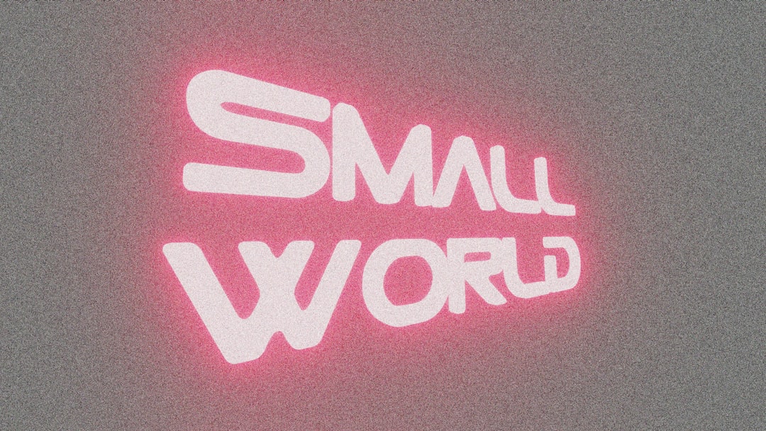
What font is the Grease logo?
The Grease wordmark is a bold, flowing brush-style script with serious 1950s personality, thick connected strokes, a lively bounce along the baseline, and the kind of casual, hand-lettered energy you would see on a diner sign or a hot-rod. It is rock-n-roll made visible: confident, playful, and dripping with mid-century nostalgia. The hot pink color is practically part of the typeface in people’s memories.
Because it is custom lettering, treat any “this is the exact font” claim online as an informed observation, not a confirmed spec. The closest honest description is a bold retro connected script. If you held it next to vintage signage scripts, you would see the family resemblance in the thick brush strokes and the upbeat, swinging rhythm of the letters.
What typeface is used in the film?
On the poster, titles, and merchandise, the pink script logo is the whole identity, it is doing the same job a brand logo does. Around it, the supporting type tends toward clean mid-century sans and the occasional retro display face, so nothing fights the star wordmark. The script carries the era; the rest stays out of its way.
That single-hero-logo approach is why the mark is so instantly recognizable: it behaves like a brand, not just a movie title. It is pure costume design for type, every loop says “1950s.” For another era-specific lettering style at the opposite, sleeker end of the spectrum, compare our breakdown of the Scarface font.
Free fonts that look like the Grease font
You have two routes. The first is the dedicated free fan font simply called Grease, which recreates the original wordmark and is reasonably citable, search DaFont for it. The second, and often safer route for commercial work, is to rebuild the look from a free bold retro script. Here are practical pairings by use case:
| Use case | Grease uses | Free alternative |
|---|---|---|
| Exact wordmark recreation | Custom 1950s brush script | Grease fan font (DaFont) |
| Bold rock-n-roll script | Thick connected script | Pacifico |
| Bouncy retro headline | Lively brush script | Yellowtail |
| Supporting / body text | Clean mid-century sans | Work Sans |
Pacifico, Yellowtail, and Work Sans are open-licensed (SIL Open Font License) and free for commercial work. To sell the resemblance, set the title in the script at a generous size, give it that hot-pink fill, add a slight bounce or italic lean, and keep supporting type minimal. For more period-correct lettering, browse our collection of vintage fonts.
Why does Grease use this kind of type?
The bold script is doing nostalgic, emotional work. The musical is a celebration of 1950s teen culture, and a loopy hand-lettered script in candy pink instantly transports you there, jukeboxes, diners, leather jackets, and first love. The type sets the tone before you have heard a single song.
It also functions like a logo. A distinctive script wordmark is endlessly merchandisable and recognizable on a poster, a soundtrack sleeve, or a T-shirt at a glance. The personality is the point: where a neutral font would feel cold, the bouncy script feels warm, fun, and unmistakably Grease. There is a subtle craft lesson here too: hand-lettered scripts let the designer control every join, swash, and bounce, so the word reads as a single energetic gesture rather than a string of separate letters. That is hard to fake with a default font, which is why even the best free scripts benefit from a little manual spacing and a custom flourish on the final stroke if you want to get truly close.
Can I use the Grease font for my own project?
Two separate questions here. First, the Grease logo, name, and artwork are protected studio property. You cannot use the actual pink wordmark or the film’s name to brand your own products, merch, or marketing, or imply association, regardless of which font you set it in.
Second, the fonts: the free rebuild scripts (Pacifico, Yellowtail, Work Sans) are yours to use commercially under their open licenses. The dedicated Grease fan font is typically free for personal use only, so check its readme before any commercial work, fan logo recreations usually restrict that. Setting your own title in a similar bold retro script is fine; copying the official wordmark to look licensed is not. See our font licensing guide for how trademark and font licensing differ. If you enjoy this retro-pop direction, the contrasting bold action style of the Die Hard font is worth a look.
Frequently Asked Questions
Is there an official Grease font I can download?
No. The pink logo is custom lettering, not a retail typeface, so there is no official file. A free fan font named Grease recreates the wordmark on DaFont, but treat it as a fan interpretation rather than the genuine, studio-confirmed mark, and check its personal-use restrictions.
What font is closest to the Grease logo?
A bold connected retro script gets closest. Free options like Pacifico or Yellowtail capture the thick brush strokes and bouncy 1950s feel. Set them large, fill them hot pink, and add a slight lean to push the resemblance toward the original rock-n-roll wordmark.
Can I use the Grease fan font commercially?
Usually not without checking. Movie logo fan fonts are typically licensed free for personal use only, and recreating a trademarked wordmark for sale carries extra legal risk. Read the included license file, and lean on open-licensed scripts like Pacifico for anything you plan to sell.
What style is the Grease lettering?
It is a bold, bouncy 1950s brush-style script with thick connected strokes and lots of personality, classic rock-n-roll signage energy. Paired with its signature hot-pink color, the lettering instantly signals mid-century teen nostalgia, which is why the logo is so iconic.


