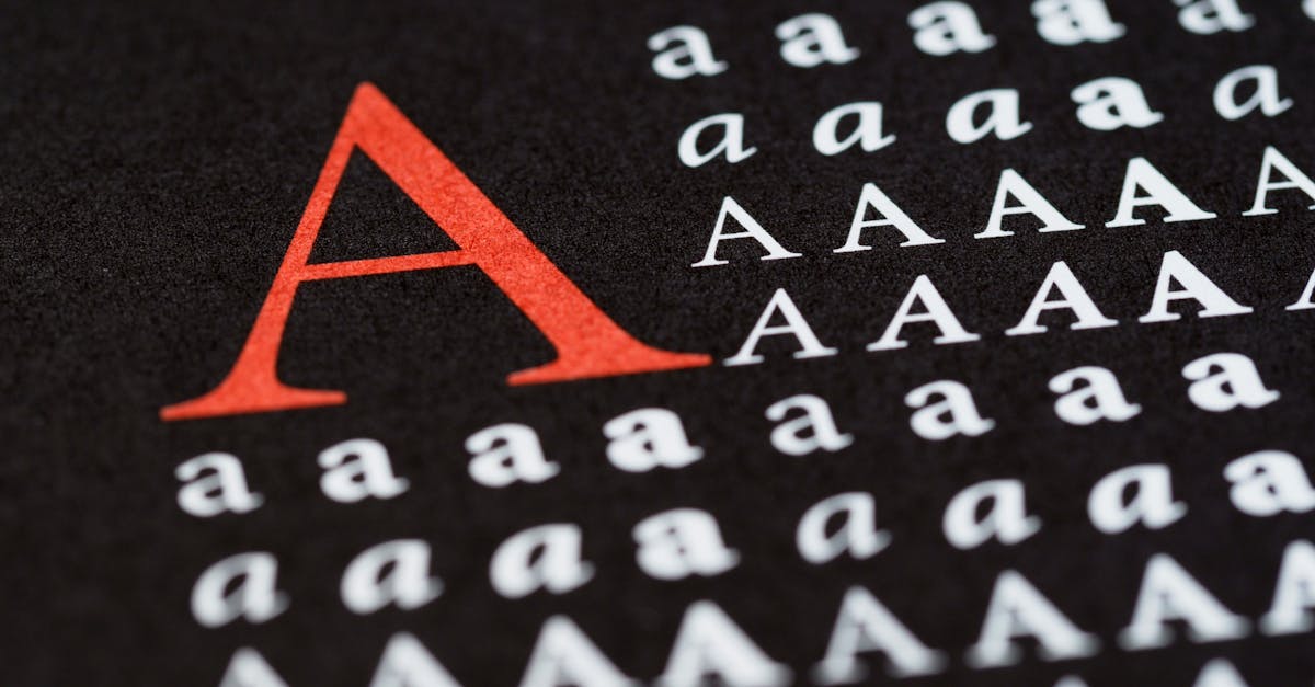
GT America Font: The Swiss-American Grotesque by Grilli Type
The GT America font is one of the most ambitious grotesque typefaces released in the past decade. Designed by Noel Leu at Grilli Type and published in 2017, GT America sets out to reconcile two of the most important lineages in sans-serif type design: the American gothic tradition of Franklin Gothic and News Gothic, and the Swiss neo-grotesque precision of Helvetica and Univers. The result is a typeface family of extraordinary breadth — 84 styles spanning six widths and a monospaced variant — that manages to feel both historically grounded and unmistakably contemporary.
Where most grotesque typefaces align with one tradition or the other, GT America occupies the territory between them. It has the warmth, openness, and slightly rough-hewn character of American gothics, tempered by the discipline, consistency, and refinement of Swiss modernism. This dual heritage is not merely a marketing conceit; it is visible in every letterform and is the key to understanding why GT America has become a staple of editorial design, corporate identity, web typography, and user interface work.
Quick Facts About the GT America Font
| Designer | Noel Leu |
| Foundry | Grilli Type |
| Release Year | 2017 |
| Classification | Grotesque sans-serif |
| Weights | Thin to Black across 6 widths (Compressed, Condensed, Standard, Extended, Expanded, Mono) — 84 styles total |
| Best For | Editorial, corporate identity, web, UI |
| Price | Commercial license via Grilli Type |
| Notable Users | Design studios, editorial publications, tech companies |
The History and Concept Behind GT America
The story of the GT America typeface begins with a historical observation. In the early twentieth century, American and European type designers pursued grotesque sans-serif design along diverging paths. In the United States, typefaces like Franklin Gothic (1902) and News Gothic (1908) — both designed by Morris Fuller Benton for American Type Founders — established a tradition of grotesque type that was robust, slightly irregular, and full of character. These typefaces were workhorses of American newspapers, signage, and advertising. Their letterforms carried the marks of their industrial origins: slightly uneven stroke widths, generous proportions, and a directness that prized impact over geometric purity.
In Switzerland, the mid-century drive toward rationalism and order produced a radically different approach. Max Miedinger’s Helvetica (1957) and Adrian Frutiger’s Univers (1957) sought to strip the grotesque of its idiosyncrasies, producing typefaces of near-mechanical consistency and studied neutrality. The Swiss neo-grotesque became synonymous with modernism itself — clean, universal, and rigorously systematic. [LINK: /helvetica-font/]
Noel Leu’s insight was that these two traditions, while different in temperament, share deep structural DNA. Both descend from the same nineteenth-century grotesque roots. Both prioritize functionality. Both are designed for heavy, sustained use across diverse applications. What separates them is not so much their fundamental architecture as their attitude — the Americans embraced warmth and personality, while the Swiss pursued precision and neutrality.
GT America was designed to bridge that divide. Leu, working at Grilli Type — a foundry whose catalog is known for conceptually rich, historically informed designs — spent years studying both traditions and developing a typeface that could hold them in productive tension. The “GT” prefix, standard for Grilli Type releases, takes on a quietly appropriate resonance here: the typeface truly is a transatlantic design, drawing equally from both sides.
Design Characteristics of the GT America Font
Understanding what makes GT America distinctive requires looking at how it synthesizes its source traditions. The typeface does not simply average the characteristics of Franklin Gothic and Helvetica. Instead, it selectively inherits qualities from each, creating a design language that is more nuanced than either parent tradition alone.
The Width System: GT America’s Defining Feature
The most immediately striking aspect of the GT America font is its width system. The family spans six proportional widths — Compressed, Condensed, Standard, Extended, Expanded — plus a Mono variant. Each width is available in a full range of weights from Thin to Black, with corresponding italics. The total count reaches 84 styles, making GT America one of the most comprehensive grotesque families in existence.
This width range is not merely a commercial proposition designed to maximize style counts. It is a deliberate design strategy rooted in the typographic traditions GT America references. Both the American gothic and Swiss neo-grotesque traditions produced extensive width families — Univers was famously conceived as a systematic grid of weights and widths, and Franklin Gothic spawned numerous condensed and extra-condensed variants over its long history. GT America’s width system is a contemporary expression of that same ambition.
Crucially, each width maintains its own proportional logic rather than being a simple mechanical compression or expansion of the Standard width. GT America Compressed has the vertical energy and space efficiency of a true condensed design, while GT America Expanded has the confident, billboard-scale presence of a genuine extended face. Designers can move across the width spectrum while maintaining a unified visual identity — a capability that proves invaluable in editorial layouts, responsive web design, and complex brand systems.
Subtle Ink Traps
At the detail level, GT America incorporates subtle ink traps — small notches at the junctions where strokes meet. This is a functional feature inherited from the letterpress era, where ink would pool at tight intersections and cause blotting. In GT America, the ink traps are refined enough to be nearly invisible at text sizes but become visible and characterful at large display sizes. They give the typeface a slight technical edge, a hint of its industrial heritage that rewards close inspection without distracting from the overall reading experience.
Slightly Squared Curves
The curves in GT America are not purely circular. They carry a subtle squareness — a slight flattening at the extremes that gives the letterforms a structured, architectural quality. This characteristic places GT America between the rounder curves of Helvetica and the more angular construction of some American gothics. The result is a typeface that feels precise without being cold, organic without being soft. Letters like “o,” “c,” and “e” reveal this quality most clearly: they are round enough to read naturally but squared enough to suggest discipline and intention.
Industrial Refinement
GT America occupies a carefully calibrated position on the spectrum between raw and polished. It is more refined than Franklin Gothic, which retains a roughness that reflects its early-twentieth-century origins. But it is less clinically smooth than Helvetica, which can sometimes feel as though every trace of human production has been engineered away. GT America’s refinement is that of a well-made tool — precise and reliable, but with enough texture to remind you that it was made by human hands for human use.
GT America Mono
The Mono variant deserves particular attention. Where many type families treat their monospaced companion as an afterthought, GT America Mono is a fully realized design in its own right. It maintains the grotesque character of the proportional family while meeting the strict requirements of fixed-width composition. For design teams building products that require both proportional and monospaced type — particularly in technology, finance, and data-intensive applications — GT America Mono ensures visual consistency between prose and code, between narrative content and tabular data.
GT America vs Helvetica vs Akzidenz-Grotesk
To fully appreciate the GT America font’s position in the grotesque landscape, it helps to compare it directly with two of its most important reference points: Helvetica and Akzidenz-Grotesk.
GT America vs Helvetica
Helvetica is the definitive Swiss neo-grotesque: tight apertures, uniform stroke widths, minimal contrast, and a studied neutrality that aims to disappear behind the content it sets. GT America borrows Helvetica’s discipline and systematization but rejects its commitment to total neutrality. Where Helvetica closes its apertures to maintain geometric consistency, GT America opens them slightly for improved legibility and a touch of warmth. Where Helvetica’s curves are smooth and continuous, GT America introduces subtle squared tensions. The difference is perhaps best described as tonal: Helvetica is formal and restrained; GT America is professional but approachable. [LINK: /helvetica-font/]
GT America vs Akzidenz-Grotesk
Akzidenz-Grotesk, the great-grandfather of the grotesque genre, predates both the American gothic and Swiss neo-grotesque traditions. It has a rawness and irregularity that reflects its nineteenth-century origins — slightly uneven stroke widths, idiosyncratic letter proportions, and a character that feels hand-cut rather than systematically engineered. GT America shares some of Akzidenz-Grotesk’s warmth and personality but brings a level of systematic refinement that the older typeface was never designed to offer. If Akzidenz-Grotesk is the hand-forged original, GT America is the precision-milled contemporary interpretation that honors the original’s spirit while meeting modern standards of consistency and versatility.
The Distinctive Middle Ground
What emerges from these comparisons is a clear picture of GT America’s positioning. It is warmer than Helvetica, more systematic than Akzidenz-Grotesk, more refined than Franklin Gothic, and more characterful than Univers. It occupies a middle ground that, before its release, was largely unpopulated — a grotesque that is simultaneously precise and personable, historical and contemporary, European and American. This positioning is not a compromise; it is a synthesis, and it explains the typeface’s broad appeal across diverse design contexts.
Best GT America Font Pairings
GT America’s versatile grotesque character makes it an excellent pairing partner. Its balanced personality — neither too neutral nor too expressive — allows it to work alongside a wide range of companion typefaces. The following pairings represent some of the most effective combinations for different design contexts. [LINK: /font-pairing/]
GT America + GT Sectra
The most natural pairing within Grilli Type’s own catalog. GT Sectra is a contemporary serif with sharp, triangular serifs and a distinctive character that bridges old-style and contemporary aesthetics. Combined with GT America, it creates a system where the sans handles headlines, navigation, and interface elements while the serif takes on long-form body text. The pairing is especially effective for editorial design and publishing platforms.
GT America + Canela
Commercial Type’s Canela is a soft, rounded serif with an organic warmth that provides a gentle contrast to GT America’s structured grotesque forms. This combination works well for lifestyle brands, cultural publications, and any context that needs to balance professionalism with approachability.
GT America + Freight Text
Joshua Darden’s Freight Text is a sturdy, readable serif designed for sustained reading at text sizes. Paired with GT America, it creates a workhorse combination suited to publishing, corporate communications, and content-heavy websites. GT America handles the structural elements — headlines, captions, navigation — while Freight Text carries the body copy with clarity and comfort.
GT America + Tiempos
Klim Type Foundry’s Tiempos is a contemporary reinterpretation of the Times tradition. Its sharp, authoritative serifs pair effectively with GT America’s industrial grotesque character, creating a combination that reads as journalistic, credible, and modern. This pairing is a strong choice for news outlets, magazines, and editorial platforms.
GT America + Signifier
For high-end editorial or luxury brand applications, pairing GT America with Klim’s Signifier introduces dramatic contrast. Signifier’s high-contrast strokes and refined details provide visual richness, while GT America grounds the composition with functional clarity. The result is sophisticated without being ornate.
GT America + Neue Haas Grotesk
This is an unconventional pairing that works in specific contexts. Using GT America for display sizes and Neue Haas Grotesk for body text — or vice versa — creates a subtle dialogue between two grotesque traditions. The differences are quiet but perceptible, producing a layered typographic experience suited to design-literate audiences. This combination is best reserved for projects where the audience will appreciate the nuance. [LINK: /neue-haas-grotesk/]
GT America + Plantin
Plantin is a classic old-style serif with a robust, readable character. Its slightly heavy strokes and compact proportions complement GT America’s industrial sensibility, creating a combination that feels grounded and trustworthy. This pairing suits institutional communications, academic publishing, and brands that want to project substance and reliability.
GT America + Atlas Grotesk
Schick Toikka’s Atlas Grotesk is a geometric-leaning sans serif that provides enough stylistic contrast to work alongside GT America in multi-font systems. Using GT America for primary text and Atlas Grotesk for secondary or supporting elements creates a nuanced hierarchy within the sans-serif category. This approach works well for design-forward brands and technology companies.
Alternatives to the GT America Font
For designers seeking similar qualities at different price points or with different licensing terms, several alternatives to the GT America font are worth evaluating. [LINK: /best-sans-serif-fonts/]
Aktiv Grotesk
Dalton Maag’s Aktiv Grotesk is a pragmatic neo-grotesque designed for broad utility. It offers a wide weight and width range, strong language support, and competitive pricing. While it lacks GT America’s conceptual depth and its distinctive bridging of American and Swiss traditions, it is a dependable workhorse for projects that need a solid grotesque at a more accessible price point. Aktiv Grotesk is especially strong for UI and web applications where extensive language coverage is a priority.
Neue Haas Grotesk
Christian Schwartz’s meticulous revival of the original Helvetica — before it was modified and homogenized by Linotype — is the closest thing to a historically pure Swiss neo-grotesque available today. Where GT America synthesizes traditions, Neue Haas Grotesk restores one. It is the right choice when you want the purity of the Swiss neo-grotesque tradition without compromise, and its quality of drawing is exceptional. [LINK: /neue-haas-grotesk/]
Inter
Rasmus Andersson’s Inter is a free, open-source sans serif designed primarily for screen use. It incorporates many features that GT America also handles well — open apertures, careful spacing, a comprehensive weight range — and adds the significant advantage of being freely available. Inter lacks GT America’s width variants and its depth of character, but for projects where budget constraints rule out commercial licensing, it is one of the best free alternatives in the grotesque space. [LINK: /inter-font/]
Barlow
Jeremy Tribby’s Barlow is a free, open-source grotesk family inspired by the geometry of California’s highway signage. It offers a range of widths — Normal, Condensed, and Semi Condensed — that echo GT America’s width system at a smaller scale. Barlow’s character is slightly more geometric and less historically referential than GT America’s, but it is a capable and freely available alternative for web projects and brand systems operating within tight budgets.
Trade Gothic
Jackson Burke’s Trade Gothic (1948) is one of the American gothic typefaces that GT America draws inspiration from. If you are drawn to GT America’s warmer, more characterful qualities — the American side of its dual heritage — Trade Gothic provides those qualities in their original, undiluted form. Its irregularities and idiosyncrasies, which GT America smooths and refines, are Trade Gothic’s defining charm. It is the right choice when you want the raw energy of the American gothic tradition without Swiss mediation. [LINK: /trade-gothic-font/]
Where to Use the GT America Font
GT America’s breadth of styles and balanced character make it appropriate for an unusually wide range of applications. Here is where it excels most:
- Editorial design. The width system is a gift for editorial designers. Compressed and Condensed widths handle tight headline situations, the Standard width serves body text and captions, and the Extended and Expanded widths provide display options for covers, openers, and pull quotes. A single typeface family can power an entire publication. [LINK: /what-is-typography/]
- Corporate identity. GT America’s professionalism and versatility make it a strong foundation for corporate brand systems. The width range ensures that the brand typeface can adapt to any layout requirement — from a narrow mobile navigation to a wide desktop hero banner — without breaking visual identity.
- Web and UI design. The Standard and Condensed widths, combined with GT America Mono, provide everything a digital product needs: readable body text, clear interface labels, and a monospaced variant for code and data. The typeface’s screen legibility, supported by its open apertures and carefully managed spacing, ensures reliable rendering across devices.
- Signage and environmental design. The bolder weights in the Extended and Expanded widths have the presence and legibility required for physical signage, wayfinding systems, and environmental graphics.
What Makes GT America Worth the Investment
GT America is a commercial typeface available through Grilli Type, and its pricing reflects both the quality of the design and the sheer scale of the family. Purchasing the full system — all six widths plus Mono across all weights — represents a significant investment. However, the value proposition is clear: few other typeface families can serve as the sole typographic resource for a complex, multi-platform brand system. The cost of licensing GT America is often less than the cost of licensing three or four separate typefaces to cover the same range of use cases.
For smaller projects or budget-conscious teams, Grilli Type offers individual widths for separate purchase. Starting with the Standard width and adding Condensed or Mono as needed is a practical approach that allows teams to build their GT America library incrementally.
Trial fonts are available through Grilli Type’s website, allowing designers to test the typeface in context before committing to a purchase. This is always recommended — no amount of reading about a typeface substitutes for setting your own content in it and seeing how it performs in your specific design context.
Frequently Asked Questions
What is the GT America font?
GT America is a grotesque sans-serif typeface designed by Noel Leu and published by Grilli Type in 2017. Its defining concept is the bridging of two major type traditions: the American gothic style of typefaces like Franklin Gothic and News Gothic, and the Swiss neo-grotesque precision of Helvetica and Univers. The family comprises 84 styles across six widths (Compressed, Condensed, Standard, Extended, Expanded) plus a Mono variant, each available in weights from Thin to Black with corresponding italics. This makes it one of the most comprehensive grotesque typeface systems available today.
Is GT America free to use?
No. GT America is a commercial typeface that requires a paid license from Grilli Type. Licensing options cover desktop use, web embedding, app embedding, and other contexts. Pricing varies depending on the specific widths and license types needed. Grilli Type does offer trial fonts for testing purposes, which allows designers to evaluate the typeface before purchasing. For free alternatives with a similar grotesque character, consider Inter or Barlow, both of which are open-source and available at no cost.
How many styles does GT America have?
GT America includes 84 styles in total. The family spans six proportional widths — Compressed, Condensed, Standard, Extended, and Expanded — plus a Mono (monospaced) variant. Each width is available in a range of weights from Thin to Black, with italics for each weight. This comprehensive system allows designers to build entire typographic identities using a single family, moving between widths and weights to create hierarchy, emphasis, and variety without introducing a second typeface.
What pairs well with the GT America font?
GT America pairs effectively with a wide range of serif typefaces. Within the Grilli Type catalog, GT Sectra is the most natural companion, offering a contemporary serif with sharp details that contrast well with GT America’s grotesque forms. Other strong pairings include Canela for lifestyle and editorial contexts, Freight Text for publishing and long-form content, Tiempos for journalistic applications, and Signifier for luxury or high-end editorial work. GT America’s balanced character — neither too neutral nor too expressive — gives it unusual flexibility as a pairing partner. For a detailed guide to combining typefaces, see our resource on font pairing. [LINK: /font-pairing/]


