What Font Does Hajime no Ippo Use?
Boxing manga lives and dies on impact, and the title art for Hajime no Ippo delivers it before you read a single panel. The hajime no ippo font in the official logo is custom lettering drawn for the franchise rather than a typeface you can install, but its heavy, punchy character is easy to approximate with free fonts. Below we look at the logo, the type used inside the anime, the closest free substitutes, and whether you can use the look in your own project. For more famous logo breakdowns, see our famous brand fonts hub.
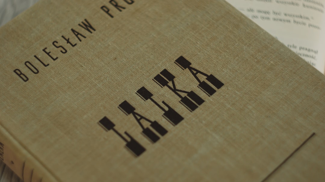
What font is the Hajime no Ippo logo?
The Hajime no Ippo logo leads with its Japanese title, and the Latin “Hajime no Ippo” rendering sits in bold, weighty, all-caps-feeling letterforms with thick stems and very little open space inside the characters. The construction is dense and grounded, with squared-off terminals and a tight, compressed rhythm that makes the words feel like they land with force. There is an intentional roughness in places, a slightly hand-finished edge that keeps the mark from feeling corporate. Because this is trademarked artwork drawn specifically for the series, no foundry sells the exact face, and any file labelled “Hajime no Ippo font” online is a fan recreation rather than the genuine lettering. Treat any single named match as an informed observation, not a confirmed spec.
What typeface is used in the anime?
Inside the anime, the production pairs the punchy title art with cleaner supporting type for credits, episode titles and on-screen Latin text. The supporting faces tend to be straightforward bold sans-serifs chosen for legibility at broadcast resolution rather than for personality, letting the logo carry the brand weight. Japanese productions rarely publish their type specifications, so the specific names used for subtitles or eyecatch cards are not documented and should be treated as unconfirmed. The consistent intent across the anime is a contrast between a heavy, characterful logo and clean, readable secondary text, a pattern shared with many other sports titles, including the boxing-adjacent Megalobox title lettering.
Free fonts that look like the Hajime no Ippo font
You cannot license the real wordmark, but the heavy, impactful boxing look is straightforward to rebuild with free type. Map the pieces by use case to assemble a full sports-poster system.
| Use case | Hajime no Ippo uses | Free alternative |
|---|---|---|
| Logo / title | Custom heavy punchy display | Anton or Bebas Neue (for the impact) |
| Headlines | Bold compressed display feel | Fjalla One or Oswald (Bold) |
| Body / captions | Clean readable sans | Work Sans or Inter |
For the closest single match to that dense, heavyweight punch, start with Anton, which gives you the thick stems and minimal internal space that make the logo feel like a body blow. Bebas Neue is taller and more condensed if you want the lettering to read like a vertical fight poster.
Why does Hajime no Ippo use this kind of type?
Hajime no Ippo is a story about raw power, discipline and the physical reality of boxing, and its typography is tuned to broadcast all three. Heavy, dense letterforms read as strong and immovable, mirroring the sport and the protagonist’s signature punching power. The slightly rough, hand-finished edges keep the mark feeling gritty and grounded rather than polished, which suits a series rooted in sweat and repetition. All-caps weight also reads instantly at small sizes on volume spines and thumbnails, where the title competes for attention. The result is a logo that feels like impact itself, a deliberate match of form to subject that many combat-sports titles chase but few land as cleanly.
Can I use the Hajime no Ippo font for my own project?
Not the real one. The logo lettering is protected trademarked artwork created for the franchise, and using a clone to imply an official Hajime no Ippo connection can create legal exposure even when the font file is labelled “free.” Fan recreations of the title are usually unlicensed for commercial use as well. The safe approach is to capture the style, a heavy, punchy, slightly rough display look, with properly licensed fonts like Anton, Bebas Neue or Fjalla One, then make the design clearly your own. Our font licensing guide explains what is and is not allowed when you are working from a famous logo.
How do designers recreate the Hajime no Ippo look?
If you are building a fan poster, a YouTube thumbnail or a training-themed graphic and you want that combat-sports impact without copying the protected mark, the process is mostly about layering weight and texture rather than finding one perfect font. Start by setting your title in a heavy face such as Anton at a large size, then tighten the letter spacing until the words feel dense and immovable. The original logo’s force comes from how little air sits inside and between the characters, so resist the temptation to let it breathe. From there you can build out the rest of the system.
- Add controlled roughness. Apply a subtle grain, rough-edge or torn-paper texture over the title so it feels hand-finished and gritty rather than clean and corporate, echoing the worn quality of the original lettering.
- Push contrast. Set the heavy title in white or a hot accent color against a dark, high-contrast background so it reads instantly at thumbnail size, the way the volume covers do on a shelf.
- Keep secondary text calm. Use a clean sans like Work Sans or Inter for taglines, names and captions so the heavyweight title stays the clear focal point and the layout does not feel noisy.
- Imply motion sparingly. A single speed line, impact burst or slight tilt can suggest a punch landing, but overdoing it undercuts the grounded, planted strength that defines the look.
This layered approach gives you the punchy, gritty feel of the franchise while keeping every element you ship properly licensed and clearly your own work, which is exactly the balance the licensing rules below are meant to protect.
Frequently Asked Questions
Is the Hajime no Ippo font available to download?
No. The logo lettering is custom, trademarked artwork made for the series, not a commercial typeface. Files labelled “Hajime no Ippo font” online are fan recreations. To get the look legally, use a heavy impact sans such as Anton or Bebas Neue and set it bold and tight for that punchy, boxing feel.
What font is closest to the Hajime no Ippo logo?
Among free options, Anton comes closest for the dense, heavyweight punch of the title, while Bebas Neue captures a taller, more condensed poster feel. Neither is exact, since the original is hand-drawn with rough finishing, but they reproduce the impactful, grounded look convincingly.
Why does the logo look so heavy and rough?
The weight and rough edges are deliberate. Boxing is a sport of force and grit, so thick stems and a slightly hand-finished surface make the title feel physical and unpolished. It reads as strength rather than refinement, matching the protagonist’s punching power and the series’ gritty, training-heavy tone.
What font pairs well for a Hajime no Ippo-style poster?
Pair a heavy Anton or Bebas Neue title with Work Sans or Inter for body and captions. This mirrors the series’ approach of a punchy, characterful headline over clean, legible secondary text, giving your layout a combat-sports feel that still reads well at small sizes and on screen.


