Hand Lettering for Beginners: The Complete Guide
Hand lettering is the art of drawing letters — not writing them, not typing them, but deliberately constructing each character as a visual element. Unlike typing a font or even writing in cursive, hand lettering treats every letter as an individual illustration. The result is custom letter art that carries personality, warmth, and craftsmanship no typeface can replicate. Whether you want to letter inspirational quotes, design custom logos, address wedding envelopes, or simply develop a meditative creative practice, this guide covers everything you need to start hand lettering from scratch.
We will walk through the essential tools, the major lettering styles, step-by-step techniques for each style, practice exercises that build real skill, how to digitize your finished work, and projects to try as you develop your abilities. No prior experience required — just a pencil and the willingness to practice.
Hand Lettering vs. Calligraphy vs. Typography
Before diving into technique, it helps to clarify the differences between three related but distinct disciplines. These terms are often used interchangeably, but they mean different things.
Hand Lettering
Hand lettering is the art of drawing letters. Each letter is constructed, often starting with a pencil sketch, then refined and inked. The process is closer to illustration than to writing. A hand letterer might spend an hour perfecting a single word, adjusting curves, thickening strokes, adding serifs or flourishes. The result is a custom piece of letter art — unique and unrepeatable. Hand lettering is about the final visual, not the process of writing.
Calligraphy
Calligraphy is the art of beautiful writing. It is created in real time, with a specific tool (dip pen, brush, reed) in a single continuous motion per stroke. Calligraphy follows established scripts and traditions — Copperplate, Italic, Spencerian, Chinese regular script, Arabic Naskh. The beauty comes from the controlled movement of the tool, producing natural thick-and-thin stroke variation. For a deep dive, see our guide on [LINK: /what-is-calligraphy/].
Typography
Typography is the art of arranging type — selecting and combining typefaces, setting sizes, adjusting spacing, building layouts. A typographer works with pre-designed letterforms (fonts), while a hand letterer creates the letterforms themselves. Typography is a core skill of [LINK: /what-is-graphic-design/], and understanding type categories like [LINK: /serif-fonts/] and [LINK: /sans-serif-fonts/] will make your hand lettering stronger.
In practice, these disciplines overlap. A hand letterer borrows calligraphic stroke techniques. A calligrapher might sketch layouts typographically. A typographer studies hand lettering to understand letterform construction. But understanding the distinctions helps you focus your practice and communicate clearly about your work.
Essential Hand Lettering Tools
One of the best things about hand lettering is the low barrier to entry. You can start with a pencil and paper. As you progress, targeted tool investments will expand your capabilities.
Pencils
Every lettering piece starts with a pencil sketch. A standard HB pencil works fine to begin. As you advance, you might prefer softer pencils (2B–4B) for sketching because the darker marks are easier to see and erase cleanly. Mechanical pencils (0.5mm or 0.7mm) are excellent for precise construction lines and guidelines. A good quality eraser — Staedtler Mars Plastic or Tombow Mono — is equally important.
Brush Pens
Brush pens are the most popular hand lettering tool for beginners because they produce natural thick-and-thin strokes based on pressure. Key recommendations:
- Tombow Dual Brush Pens: The most recommended brush pen for hand lettering beginners. The large, flexible brush tip produces dramatic strokes, and the fine tip on the other end is useful for small details. Available in 108 colors. They are water-based, so they blend beautifully but can bleed on thin paper.
- Pentel Fude Touch Sign Pens: A smaller, firmer brush tip that is easier to control than the Tombow. Excellent for medium-scale lettering and everyday practice. The limited color range (12 colors) is sufficient for learning.
- Kuretake Zig Clean Color Real Brush: True brush tips that behave like tiny paintbrushes. More advanced, but produce beautiful, organic strokes. Great for loose, expressive lettering.
- Tombow Fudenosuke (hard and soft tips): Small brush pens perfect for small-scale lettering, envelope addressing, and developing pressure control. The hard tip is ideal for beginners because it is easier to control.
Fine Liners and Markers
Fine liners are essential for outlining, adding details, and creating faux calligraphy (more on that technique below).
- Sakura Pigma Micron: The industry standard for fine-line work. Available in sizes from 005 (0.2mm) to 08 (0.5mm). Waterproof, archival, and consistent. Every hand letterer should have a set.
- Staedtler Pigment Liner: A solid alternative to the Micron with a slightly different feel. Some letterers prefer the barrel shape.
- Crayola Broad Line Markers: Do not overlook these. Their firm, chisel-ish tip is surprisingly effective for practicing large-scale brush lettering at a fraction of the cost of professional markers.
Paper
Paper matters more than you might expect. Brush pens in particular perform poorly on rough, absorbent paper — the tips fray, the ink bleeds, and the strokes look fuzzy.
- Rhodia Dot Pad: Smooth, high-quality paper with a dot grid that helps with letter height and spacing without the visual clutter of lined paper. The standard recommendation for brush pen lettering.
- HP Premium32 Laser Paper: Extremely smooth, inexpensive printer paper that is excellent for brush pen practice. A ream costs a few dollars and lasts months.
- Canson Marker Paper: Designed for markers, so it resists bleeding and feathering. Good for final pieces.
- Tracing Paper: Invaluable for iterating on compositions. Letter a first draft, place tracing paper over it, and refine. Repeat as many times as needed.
Other Useful Supplies
- Ruler and T-square: For drawing consistent guidelines.
- Light pad: An LED light pad (available cheaply online) lets you trace and iterate without tracing paper. Essential if you do a lot of lettering.
- iPad and Apple Pencil with Procreate: For digital hand lettering. Procreate’s brush engine can simulate brush pens, pencils, and markers convincingly. Many professional letterers now work primarily on iPad.
Basic Hand Lettering Styles
Every lettering style has its own character, construction logic, and appropriate applications. Master these four foundational styles and you will have a versatile hand lettering vocabulary.
Style 1: Sans-Serif Block Letters
Sans-serif block letters are the simplest starting point and an excellent way to develop letterform awareness. These are uppercase letters with uniform stroke width and no serifs — think Helvetica or Futura drawn by hand.
Step-by-step technique:
- Draw guidelines. Using a ruler, draw a baseline (where letters sit), a cap height line (the top of uppercase letters), and optionally a midline (halfway, for reference). A height of 1–2 centimeters is good for practice.
- Sketch lightly in pencil. Draw each letter as a simple skeleton — single strokes that capture the basic shape. Focus on consistent widths. Most sans-serif capitals are roughly 60–80% as wide as they are tall, though M and W are wider and I is narrower.
- Build up stroke weight. Go back over each letter, thickening the skeleton into a uniform stroke. Aim for strokes that are about 15–20% of the cap height in width. Keep all strokes the same weight.
- Refine and ink. Clean up your pencil outlines, then ink with a fine liner (Micron 05 or similar). Fill in the letter bodies with a marker or thicker pen. Erase pencil lines when the ink is dry.
Tips: Pay special attention to optical adjustments. Round letters (O, C, G, Q) should extend very slightly above the cap height and below the baseline — otherwise they will look smaller than the straight letters. The crossbar of H and E should sit slightly above the mathematical center — otherwise it looks like it is drooping.
Style 2: Serif Letters
Serif letters add small terminal strokes (serifs) to the ends of each stroke. They look more traditional, elegant, and formal. The serif category is vast — from chunky slab serifs to delicate hairline serifs — but start with a classic, medium-weight bracketed serif inspired by typefaces like Garamond or Times.
Step-by-step technique:
- Draw guidelines as before — baseline, cap height, and optionally a midline.
- Sketch the skeleton. Letter construction is the same as block letters, but plan for stroke contrast: vertical strokes will be thicker than horizontal strokes. This follows the logic of a broad-nibbed pen held at a consistent angle.
- Add stroke contrast. Thicken the vertical (downward) strokes to about 15–20% of cap height. Keep the horizontal strokes and thin parts at roughly one-third that width.
- Add serifs. At the end of each main stroke, add a small perpendicular or slightly flared stroke. Connect the serif to the main stroke with a smooth curve (the “bracket”). Serifs should be consistent in size throughout the piece.
- Refine and ink. Clean up curves, check consistency, then ink with fine liners. Erase pencil marks after the ink is fully dry.
Tips: The transition from thick to thin strokes is where serif lettering gets its elegance. Practice making smooth, gradual transitions rather than abrupt changes. Study typefaces like Baskerville and Garamond closely to see how professionals handle these transitions.
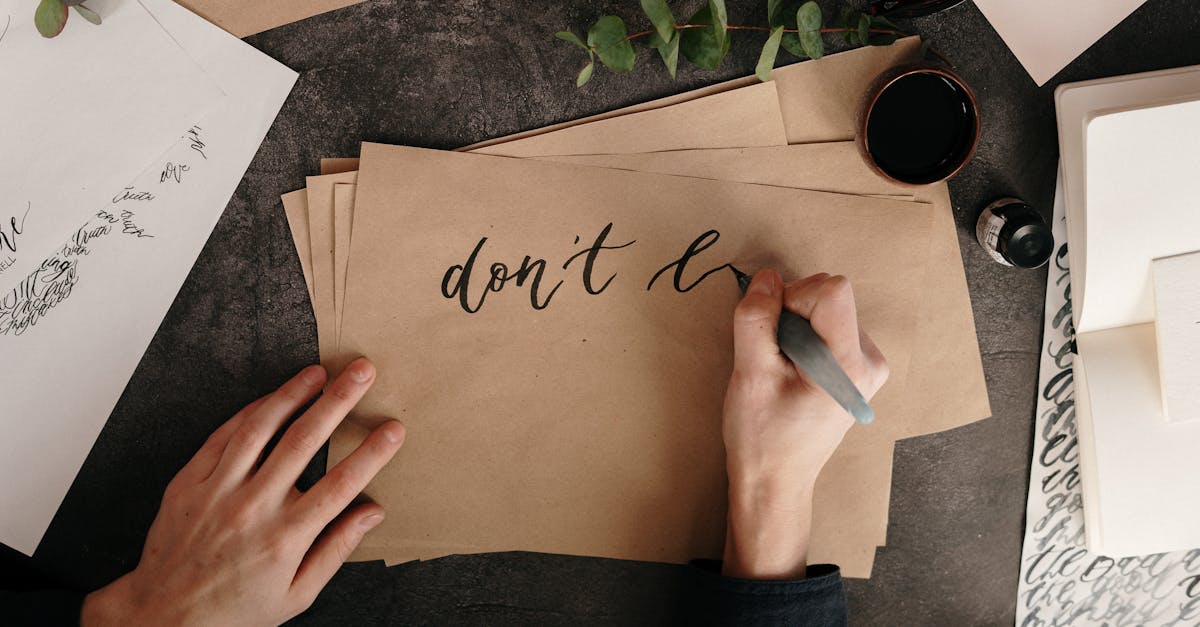
Style 3: Script and Brush Lettering
Script lettering mimics connected handwriting but with deliberate, controlled strokes. When done with a brush pen, the thick-thin variation comes from pressure: press hard on downstrokes (thick), release pressure on upstrokes (thin). This is the most popular hand lettering style on social media and the one most beginners want to learn.
Step-by-step technique:
- Master the basic stroke first. Before lettering any words, practice the fundamental stroke: a thin upstroke transitioning into a thick downstroke and back to a thin upstroke. This is the building block of all brush script. Practice this single stroke until the pressure transition is smooth.
- Practice basic shapes. All script letters are built from a small set of strokes: the overturn (up, over, down), the underturn (down, under, up), the oval (a full curved stroke), and the ascending and descending loops. Practice each in isolation before combining them into letters.
- Draw guidelines. For script lettering, you need: a baseline, an x-height line (the top of lowercase letters, typically about half the cap height), a cap height or ascender line, and a descender line below the baseline.
- Letter slowly. Work through each word letter by letter, lifting the pen between strokes. Beginners often try to write in one continuous motion — resist this. Each stroke is separate. The connections between letters are thin upstrokes that you add deliberately.
- Check consistency. Are your thick strokes consistent in width? Are your thin strokes consistently thin? Is your slant angle uniform? Inconsistency is the most common beginner issue.
Tips: If brush pens are too challenging at first, try “faux calligraphy” — write in cursive with a regular pen, then go back and thicken all the downstrokes by drawing a parallel line and filling in the space. This produces a similar thick-thin effect and helps you internalize which strokes should be thick and which should be thin.
Style 4: Decorative and Display Lettering
Decorative lettering is where hand lettering becomes fully illustrative letter art. This category includes dimensional lettering (3D effects), inline lettering, shadow lettering, lettering with textures and patterns, ornamental lettering with flourishes and swashes, and mixed-style compositions that combine multiple approaches.
Step-by-step technique (3D block letters as an example):
- Letter the base. Start with clean sans-serif or serif block letters in pencil.
- Choose a shadow direction. Decide where the light source is. If light comes from the upper left, shadows fall to the lower right. Consistency is essential — the shadow direction must be the same for every letter.
- Draw the extrusion. From each corner and end point of each letter, draw a line at a 45-degree angle (or whatever angle you chose) to a consistent depth. Connect the endpoints of these lines to form the sides of the 3D extrusion.
- Shade the sides. The extruded sides are either a solid darker color or filled with hatching. The front face can remain flat, get a gradient, or receive additional decoration (inline, patterns, textures).
- Add details. Drop shadows, highlights (a thin white line along the edge closest to the “light source”), hatching, stippling, or decorative fills add depth and interest.
Tips: Decorative lettering rewards patience. The more time you invest in precise construction and careful detailing, the more impressive the result. Use a light pad or tracing paper to iterate — rarely does a decorative piece come together in a single pass.
Hand Lettering Practice Exercises
Talent matters less than practice in hand lettering. Here are structured exercises to build your skills systematically.
Warm-Up Drills (5–10 Minutes)
Start every practice session with these warm-ups. They loosen your hand, build muscle memory, and improve brush pen control.
- Pressure lines: Draw rows of thin upstrokes and thick downstrokes with your brush pen. Focus on smooth, gradual transitions between thin and thick. Fill an entire page.
- Ovals: Draw rows of connected ovals — these build the muscle memory for letters like a, o, d, g, and q. Maintain consistent size and slant.
- Zigzags: Draw zigzag lines with thick downstrokes and thin upstrokes. This practices the overturn and underturn movements.
- Spirals: Draw spirals from small to large and back again, maintaining consistent stroke width. This builds control for flourishes and curved letters.
Alphabet Practice
After warming up, work through the full alphabet in the style you are practicing. Write each letter three to five times, comparing them and noting inconsistencies. Then write common letter combinations: “th,” “sh,” “ing,” “tion,” “and,” “the.” These combinations force you to practice connections and spacing in context.
Word Repetition
Choose a single word and letter it 10–20 times. With each repetition, try to improve one specific aspect: consistency of slant, smoothness of curves, evenness of spacing, uniformity of stroke weight. Repetition with intention is the fastest path to improvement in hand lettering.
Spacing Exercises
Letter the word “minimum” in lowercase script. This word is notoriously difficult because it contains only vertical strokes, making spacing errors glaringly obvious. If you can letter “minimum” with even, consistent spacing, your spacing skills are strong. Other good test words: “lullaby,” “rhythm,” “illumination.”
Composition Practice
Choose a short quote (3–8 words) and create a lettered composition. This exercises multiple skills simultaneously: hierarchy (which word is largest?), style mixing (script for one word, block for another?), layout (centered, asymmetrical, shaped?), and spacing (how do the elements relate?). Start with a pencil thumbnail sketch at small scale before committing to a full-size version.
How to Digitize Hand Lettering
Many hand lettering projects — logos, social media graphics, prints for sale — need to be digitized. Here are the standard workflows.
Method 1: Scan and Vector Trace
- Letter your piece in black ink on white paper. High contrast produces the best scan results.
- Scan at 600 DPI in grayscale or black-and-white mode. If you do not have a scanner, photograph with a phone camera in good, even lighting (avoid shadows).
- Adjust levels in Photoshop or a free alternative like GIMP. Push the whites whiter and the blacks blacker until the background is pure white and the lettering is solid black.
- Auto-trace in Illustrator. Use Image Trace (set to Black and White, with high detail) to convert the raster image to vector paths. Expand the trace and clean up any stray points or rough edges with the Direct Selection tool.
- Manually refine. Auto-trace rarely produces perfect results. Use the Pen tool and Smooth tool to clean up curves, fix bumpy edges, and ensure smooth paths.
Method 2: Manual Vector Tracing
For maximum control, place your scanned lettering as a background layer in Illustrator, reduce the opacity, and trace every letter manually with the Pen tool. This is slower but produces cleaner, more controlled vectors. Professional lettering artists who create logos and brand marks almost always use this method for final deliverables.
Method 3: iPad Direct-to-Digital
If you work on an iPad with Procreate, your lettering is already digital. Export as a high-resolution PNG or PSD, then vector-trace in Illustrator if you need scalable vector files. Procreate also exports to SVG with certain workflows, though the results are less refined than Illustrator vectors.
Method 4: Photograph and Composite
For social media and personal projects, a high-quality photograph of your lettering can be more appealing than a perfectly clean vector. Shoot from directly above with even lighting, correct perspective in your photo editor, and adjust levels for a clean white background. The slight imperfections of a photographed piece can add warmth and authenticity that vector art lacks.
Hand Lettering Projects to Try
Applied projects are more motivating than abstract exercises. Here are hand lettering projects organized from simple to complex.
Beginner Projects
- Daily word practice: Letter one word per day in a different style. After 30 days, you will have a visual journal of your progress and 30 different styled words.
- Quote art: Choose a favorite quote and create a finished, framed piece. This is the classic hand lettering project and an excellent way to practice composition.
- Envelope addressing: Address envelopes (real or practice) in brush script. This is one of the most commercially viable lettering skills — wedding calligraphers are always in demand.
- Gift tags and cards: Hand-lettered gift tags and greeting cards are personal, appreciated, and relatively low-stakes. Perfect for building confidence.
Intermediate Projects
- Alphabet poster: Letter the full alphabet in a single style, arranged as a poster. This forces consistency across 26 characters and teaches you to design a cohesive system.
- Song lyrics or poem: Letter a full song or poem, mixing multiple styles for hierarchy and emphasis. This is a longer composition that exercises layout skills.
- Chalkboard sign: Real or faux chalkboard lettering uses different techniques — chalk pencils, wet-erase markers on chalkboard-painted surfaces. Restaurant and cafe chalkboard signs are a common commercial application.
- Digitized social media templates: Create a set of hand-lettered templates for Instagram Stories or posts. Digitize them and use them regularly to build a distinctive visual brand.
Advanced Projects
- Logo sketching: Design a hand-lettered logotype for a real or fictional brand. This combines lettering skill with design thinking — the letterforms must communicate the brand’s personality. Study examples in our [LINK: /graphic-design-examples/] roundup for inspiration.
- Mural lettering: Scale your lettering up to a wall-sized mural. This requires projecting or gridding your design, working with paint and large brushes, and managing a scale that is far more physically demanding than paper-based work.
- Typeface design: Create a complete typeface based on your hand lettering style. This is a major undertaking — a full character set includes hundreds of glyphs — but tools like Glyphs, FontForge, or Fontself make it more accessible than ever. See our guides on [LINK: /display-fonts/] for context on decorative type design.
Resources for Continued Learning
Hand lettering has a generous, active community. Here are the best resources for ongoing development.
Books: “The ABC of Custom Lettering” by Ivan Castro is the most comprehensive technical guide. “In Progress” by Jessica Hische documents her process in detail. “Creative Lettering and Beyond” (Walter Foster series) is a solid beginner workbook.
Online courses: Skillshare offers courses from letterers like Mary Kate McDevitt, Jon Contino, and Martina Flor. Domestika has excellent lettering courses with high production quality. YouTube channels like The Happy Ever Crafter, Lettering Daily, and AmandaRachLee offer free tutorials.
Instagram accounts: Follow working letterers for daily inspiration: @jessicahische, @sfrfrancisco (Ken Barber), @martinaflor, @nfrfrancisco (Niels Shoe Meulman), @homsweethom, and @ianbarnard.
Practice sheets: Downloadable practice sheets with guidelines and letter exemplars are available from most lettering educators. They provide structure for self-directed practice and help you develop consistent letter heights, spacing, and angles.
Frequently Asked Questions
How long does it take to learn hand lettering?
With consistent daily practice of 20–30 minutes, most people can produce attractive basic lettering within four to six weeks. Developing a refined personal style and professional-level consistency typically takes six months to a year. Like any craft, hand lettering rewards patience — the letterers you admire online have usually been practicing for years. The key is consistent, focused practice rather than occasional marathon sessions.
What is the best brush pen for hand lettering beginners?
The Tombow Fudenosuke Hard Tip is the best brush pen for absolute beginners because its firm tip is easier to control than flexible brush pens. Once you are comfortable with pressure control, move to the Pentel Fude Touch Sign Pen (medium flexibility) and then the Tombow Dual Brush Pen (full flexibility). Starting with a very flexible pen is frustrating because it amplifies every inconsistency in your hand.
Can I learn hand lettering if I have bad handwriting?
Absolutely. Hand lettering and handwriting are fundamentally different skills. Handwriting is fast, habitual, and unconscious. Hand lettering is slow, deliberate, and constructed. Many excellent letterers have terrible everyday handwriting. The muscle memory is completely different. If you can hold a pen and draw a straight-ish line, you can learn hand lettering.
What is the difference between hand lettering and calligraphy?
Hand lettering is drawing letters — constructing them through sketching, outlining, and refining. Calligraphy is writing letters — producing them in real-time strokes with a specific tool. Calligraphy follows established scripts and emphasizes the beauty of the writing process itself. Hand lettering is focused on the finished visual result regardless of how it was produced. In practice, many artists blend both approaches. Our guide on [LINK: /what-is-calligraphy/] covers calligraphy in depth.
Do I need an iPad for hand lettering?
No. An iPad with Procreate is a wonderful tool for hand lettering — it offers infinite undo, layers, easy color changes, and no need for scanning. But it is not required. Many professional letterers still work primarily on paper with traditional tools. If you are just starting out, invest in good paper and a few brush pens before considering an iPad. The fundamentals of letterform construction, spacing, and composition are the same regardless of whether you work analog or digital.


