Hue vs Color: What’s the Difference?
The terms hue and color are often used interchangeably in everyday language, but they mean different things. Hue refers to the pure spectral wavelength of light, the quality that makes red look red, blue look blue, and green look green. Color is the broader term that encompasses hue along with saturation and lightness or value. In other words, hue is one ingredient of color, not the whole recipe.
Understanding the difference between hue and color is more than academic. It directly affects how you use design tools, build palettes, and communicate with clients. Every color picker, from Photoshop to Figma to CSS, is organized around this distinction.
What Is Hue?
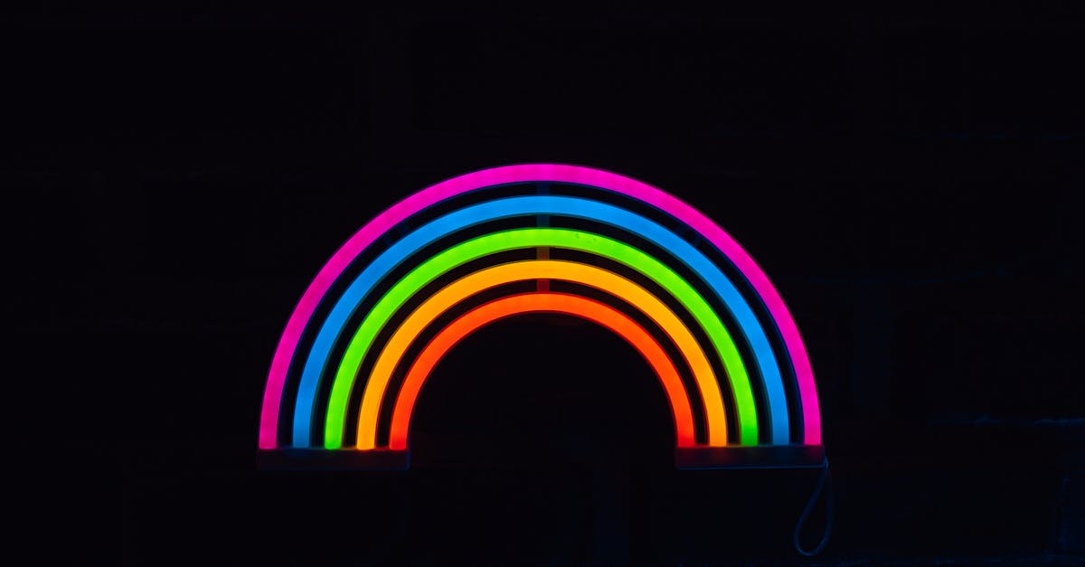
Hue is the attribute of color that places it on the visible spectrum. It is the name we give to a color family: red, orange, yellow, green, blue, or violet. On a standard color wheel, hue is represented as a position along the 360-degree circle, with red at 0 degrees, green at 120 degrees, and blue at 240 degrees.
Critically, hue contains no information about how light, dark, vivid, or muted a color is. Pure red and pale pink share the same hue. Navy blue and powder blue share the same hue. The hue only tells you which part of the spectrum the color belongs to.
Hue on the Color Wheel
The color wheel arranges hues in a continuous loop based on their spectral relationships. Adjacent hues blend naturally, which is the basis of analogous color schemes. Hues on opposite sides of the wheel create visual tension, the foundation of complementary color pairings.
When designers say “shift the hue,” they mean move the color around this wheel without necessarily changing its brightness or intensity. A hue shift from red toward orange warms the color. A shift from red toward violet cools it. This concept ties directly into the relationship between warm and cool colors.
What Is Color?
Color is the complete visual experience. It is what you actually perceive when you look at an object or a screen pixel. While hue tells you the spectral family, color includes three dimensions: hue, saturation, and lightness (or value). Change any one of those three properties and you get a different color, even if the hue stays the same.
Consider the word “blue.” That single hue can produce hundreds of distinct colors: sky blue, navy, cobalt, cerulean, baby blue, royal blue, teal-blue, and steel blue. Each one shares the blue hue but differs in saturation, lightness, or both. This is why the hue vs color distinction matters: calling something “blue” only tells part of the story.
The Three Dimensions of Color
- Hue is the spectral identity, the position on the color wheel.
- Saturation (also called chroma) is the intensity or purity of the hue. Full saturation gives you a vivid, electric color. Low saturation pushes the color toward gray.
- Lightness or Value is how light or dark the color is. High lightness moves toward white. Low lightness moves toward black.
These three properties are independent. You can have a highly saturated, dark blue (like navy) or a desaturated, light blue (like powder blue). Both share a hue, but they look and feel completely different as colors.
The HSL and HSV Framework
The HSL (Hue, Saturation, Lightness) and HSV (Hue, Saturation, Value) color models were designed specifically to separate hue from the other properties of color. Unlike RGB, which defines color by mixing red, green, and blue light, HSL and HSV map color in a way that matches how humans actually think about it.
HSL: Hue, Saturation, Lightness
In HSL, hue is measured in degrees from 0 to 360. Saturation is a percentage from 0 percent (gray) to 100 percent (fully vivid). Lightness is a percentage from 0 percent (black) to 100 percent (white), with 50 percent being the pure, mid-tone color.
CSS uses HSL natively. The declaration hsl(210, 80%, 50%) defines a vivid medium blue. Change only the first number and you shift the hue. Change the second and you adjust intensity. Change the third and you make it lighter or darker. The framework makes the hue-versus-color distinction tangible and practical.
HSV: Hue, Saturation, Value
HSV works similarly but replaces lightness with value. Value runs from 0 percent (black) to 100 percent (the brightest version of the hue). At full value and full saturation, you see the purest, most intense version of a hue. Photoshop’s color picker uses HSV by default, which is why the vertical axis controls brightness and the horizontal axis controls saturation, with the hue slider running along the side.
Why These Models Matter
RGB and hex codes are efficient for screens, but they obscure the relationship between hue, saturation, and lightness. If someone hands you the hex code #4A90D9, you cannot instantly tell how to make it more muted or shift its hue. But in HSL, hsl(213, 60%, 57%), the path is obvious: lower the saturation to mute it, raise the lightness to soften it, or rotate the hue to push it toward purple or green.
Key Differences Between Hue and Color
Here is a direct comparison to make the hue vs color difference clear.
- Scope: Hue is one property. Color is the sum of hue, saturation, and lightness.
- What it describes: Hue identifies the spectral family (red, blue, green). Color describes the specific shade, tone, or tint you see.
- Number of dimensions: Hue is one-dimensional, a single value on a 360-degree scale. Color is three-dimensional.
- Examples: “Red” is a hue. “Crimson,” “salmon,” and “maroon” are colors that all share the red hue.
- In design tools: The hue slider moves you around the color wheel. The full color picker adjusts all three dimensions simultaneously.
Why the Distinction Matters for Designers
Knowing that hue is just one component of color changes how you approach palette building, accessibility, and client communication.
Building Better Palettes
A monochromatic color scheme holds the hue constant and varies only saturation and lightness. If you do not understand that distinction, monochromatic palettes feel like a mystery. Once you separate hue from the equation, they become intuitive: pick one hue, then generate lighter, darker, more vivid, and more muted variations of it.
Communicating About Color
When a client says “I want blue but not that blue,” they are usually talking about saturation or lightness, not hue. Understanding the hue vs color framework lets you ask better questions: “Do you want a lighter blue, a more muted blue, or a different hue altogether, like teal?” This saves rounds of revision.
Accessibility and Contrast
Color accessibility depends on lightness differences, not hue differences. Two colors with different hues but similar lightness values can be nearly indistinguishable for colorblind users. The color harmony of a design must account for contrast in the lightness dimension, not just variety in hue.
Using Design Tool Color Pickers
Every major design application organizes its color picker around the hue-saturation-lightness model. The rainbow strip or ring selects the hue. The square or triangle area selects saturation and lightness within that hue. Once you see the picker through this lens, choosing and adjusting colors becomes faster and more deliberate. Understanding how color psychology maps to specific hues also helps you make intentional choices rather than intuitive guesses.
Frequently Asked Questions
Is hue the same as tint?
No. Hue is the base spectral color, like red or blue. A tint is what you get when you add white to a hue, increasing its lightness while keeping the hue the same. Pink is a tint of the red hue. Similarly, a shade is what you get when you add black to a hue, and a tone is what you get when you add gray.
How many hues are there?
In theory, hue is a continuous spectrum, so there are infinite hues. In practice, most color models use a 360-degree wheel with each degree representing a distinct hue. The traditional color wheel identifies 12 named hues: three primaries, three secondaries, and six tertiaries. Digital systems can reference any of the 360 degree positions or even fractional degrees for finer precision.
Can two colors share the same hue but look completely different?
Absolutely. Burgundy and blush pink share a red hue but differ dramatically in saturation and lightness. Navy and baby blue share a blue hue but sit at opposite ends of the lightness scale. This is exactly why “color” and “hue” are not synonyms. The hue is constant, but the saturation and lightness create entirely different visual experiences.
Should I use HSL or RGB for web design?
Both are valid in CSS, but HSL is more intuitive for making adjustments. If you need to lighten a button color on hover, HSL lets you simply increase the lightness value. In RGB, you would need to adjust all three channel values. Many designers define their base colors in hex or RGB and then use HSL when they need to create systematic variations, like lighter backgrounds or muted borders.


