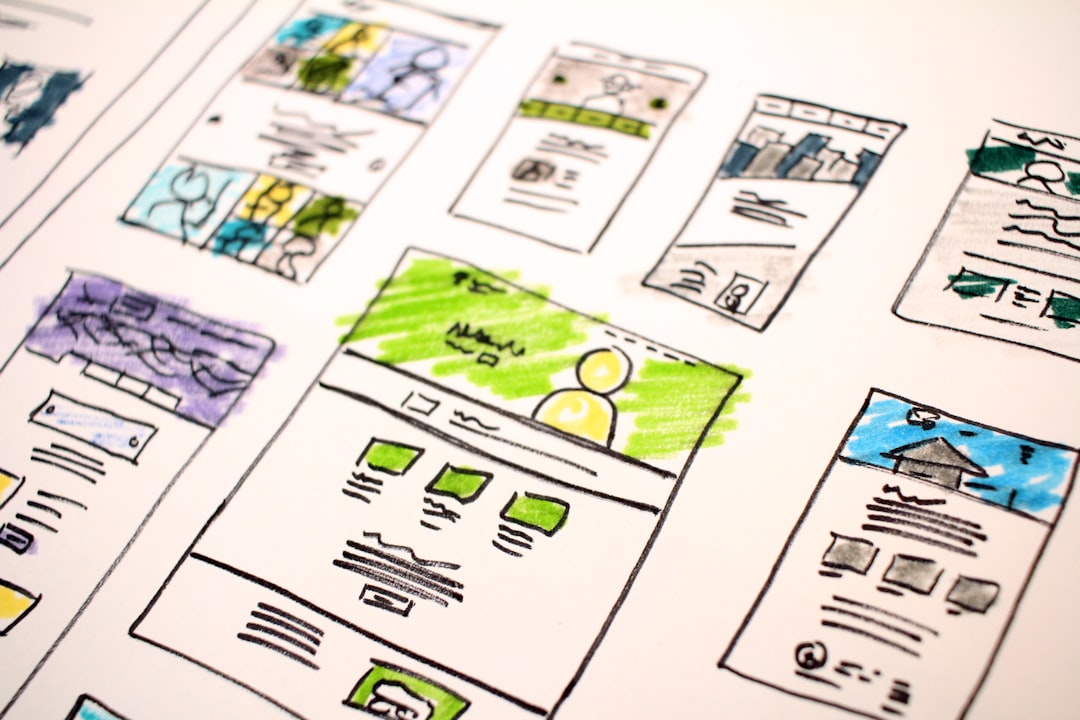
Infographic Design Principles That Work
An infographic earns its keep when a reader understands a dataset faster than they could from a paragraph or a raw table. Good infographic design principles turn numbers into a story with a beginning, middle, and end. They fail when charts misrepresent the data, when decoration buries the point, or when there’s no obvious order to follow. They succeed when the eye glides from one insight to the next and every visual choice serves comprehension.
The key principles of infographic design
The seven principles below move from structuring the story to choosing honest visuals and making the final graphic shareable.
| Principle | Why it matters |
|---|---|
| Tell one clear story | A single narrative keeps the reader oriented from top to bottom. |
| Match the chart to the data | Accurate chart types prevent misleading comparisons. |
| Maximize the data-ink ratio | Removing decoration lets the data itself carry the message. |
| Guide with visual hierarchy | Size and color signal what to read first and what’s supporting. |
| Limit the palette | A few purposeful colors aid scanning and look cohesive. |
| Keep icons consistent | One icon style reads as a unified system, not a clip-art jumble. |
| Cite sources and design for sharing | Credibility plus a vertical format drives reuse and reach. |
1. Tell one clear story — give the data a single flow
Before opening a design tool, decide the one thing the infographic must say. Every section should advance that argument, and the layout should establish an unmistakable reading order, typically top to bottom or left to right. Number the steps, use connecting arrows, or stack sections so the eye knows where to go next. If a viewer has to wonder where to start, the structure has failed before the visuals even matter.
2. Match the chart to the data — choose honest visuals
Each chart type answers a specific question. Use bars to compare categories, lines for change over time, and pie charts only for a few parts of a clear whole. Never truncate a bar chart’s axis to exaggerate a difference, and avoid 3D effects that distort proportions. The fastest way to lose a reader’s trust is a chart that technically shows the data but visually lies about it.
3. Maximize the data-ink ratio — cut the decoration
The data-ink ratio, a concept popularized by Edward Tufte, asks how much of your graphic’s ink actually conveys information. Remove heavy gridlines, redundant labels, drop shadows, and background textures that compete with the numbers. Lean charts read faster and feel more authoritative. A useful test: if erasing an element doesn’t reduce understanding, erase it. This restraint applies to text too, so trim long captions to the few words that add genuine context and let the data carry the rest.
4. Guide with visual hierarchy — show what matters most
Not every figure deserves equal weight. Make the headline statistic large and bold, set supporting numbers smaller, and reserve your strongest color for the single point you most want remembered. Clear visual hierarchy lets a reader skim the big takeaways in seconds and drill into detail only if they choose. Pairing hierarchy with deliberate white space keeps dense data from feeling overwhelming.
5. Limit the palette — fewer colors, more meaning
Two or three core colors plus neutrals are usually enough. Assign colors with intent so that a single hue consistently means the same category throughout, which lets readers decode charts without constant trips to the legend. A restrained palette also looks more professional than a rainbow. Thoughtful color theory additionally ensures sufficient contrast for accessibility and readability.
6. Keep icons consistent — one visual language
Icons help readers parse sections at a glance, but only when they share a single style. Mixing flat, outlined, and detailed illustrative icons makes the graphic feel assembled from scraps. Pick one stroke weight, one corner radius, and one level of detail, then apply it everywhere. Consistent icons act like a typeface for imagery, holding the whole composition together. Keep them functional rather than decorative, too: an icon should reinforce the meaning of its section, not just fill space, and it should remain recognizable even at the small sizes a dense layout demands.
7. Cite sources and design for sharing
An infographic makes claims, so back them up. Add a small, legible source line near each chart or a credits block at the foot of the graphic. This builds trust and protects you if a figure is questioned. For reach, favor a tall vertical format that suits scrolling feeds and embeds, and keep text readable when the image is scaled down in a thumbnail.
Common infographic design mistakes to avoid
- Packing in unrelated facts with no single narrative thread.
- Using misleading axes, 3D charts, or the wrong chart type for the data.
- Drowning the data in gridlines, shadows, and busy backgrounds.
- Omitting sources, which undermines credibility and reuse.
Frequently Asked Questions
What are the most important infographic design principles?
The core principles are telling one clear story with a defined reading flow, matching each chart type to the data honestly, maximizing the data-ink ratio by stripping decoration, using a limited palette, and citing sources. Together they make an infographic both accurate and easy to scan in seconds.
What format and dimensions work best for an infographic?
A tall vertical format, often around 800 pixels wide by 2000-5000 pixels long, suits social feeds, blog embeds, and scrolling on phones. Keep file sizes reasonable and ensure text stays legible when the image is shown as a smaller thumbnail. Export at sufficient resolution so charts remain crisp.
How do I choose the right chart type?
Match the chart to the question. Use bar charts to compare categories, line charts for trends over time, scatter plots for correlation, and pie charts only for a few parts of a single whole. Avoid 3D effects and truncated axes, which distort how the data is perceived.
How much text should an infographic contain?
As little as possible while staying clear. The visuals should carry the message, with short labels, brief captions, and a concise headline doing the talking. If you find yourself writing full paragraphs, that content probably belongs in the accompanying article rather than crowding the graphic.
Why is the data-ink ratio important?
The data-ink ratio measures how much of your graphic actually conveys information versus decoration. A high ratio means lean, fast-reading charts that look authoritative. Removing gridlines, shadows, and textures lets the numbers speak. For more foundational guidance, see our overview of core design principles.


