Live: try it with the mouse and the keyboard (Tab, arrows, Escape).
Screenshot
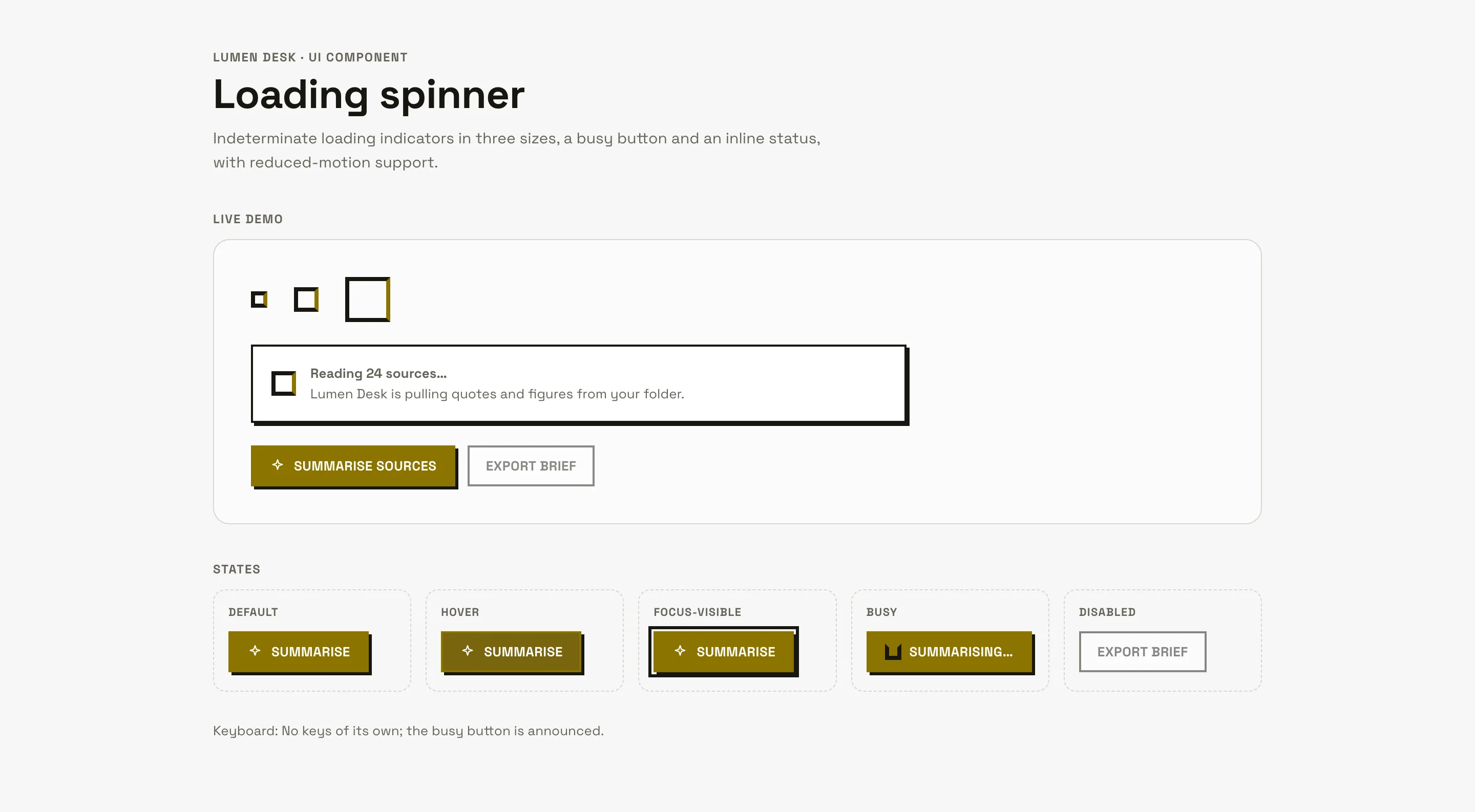
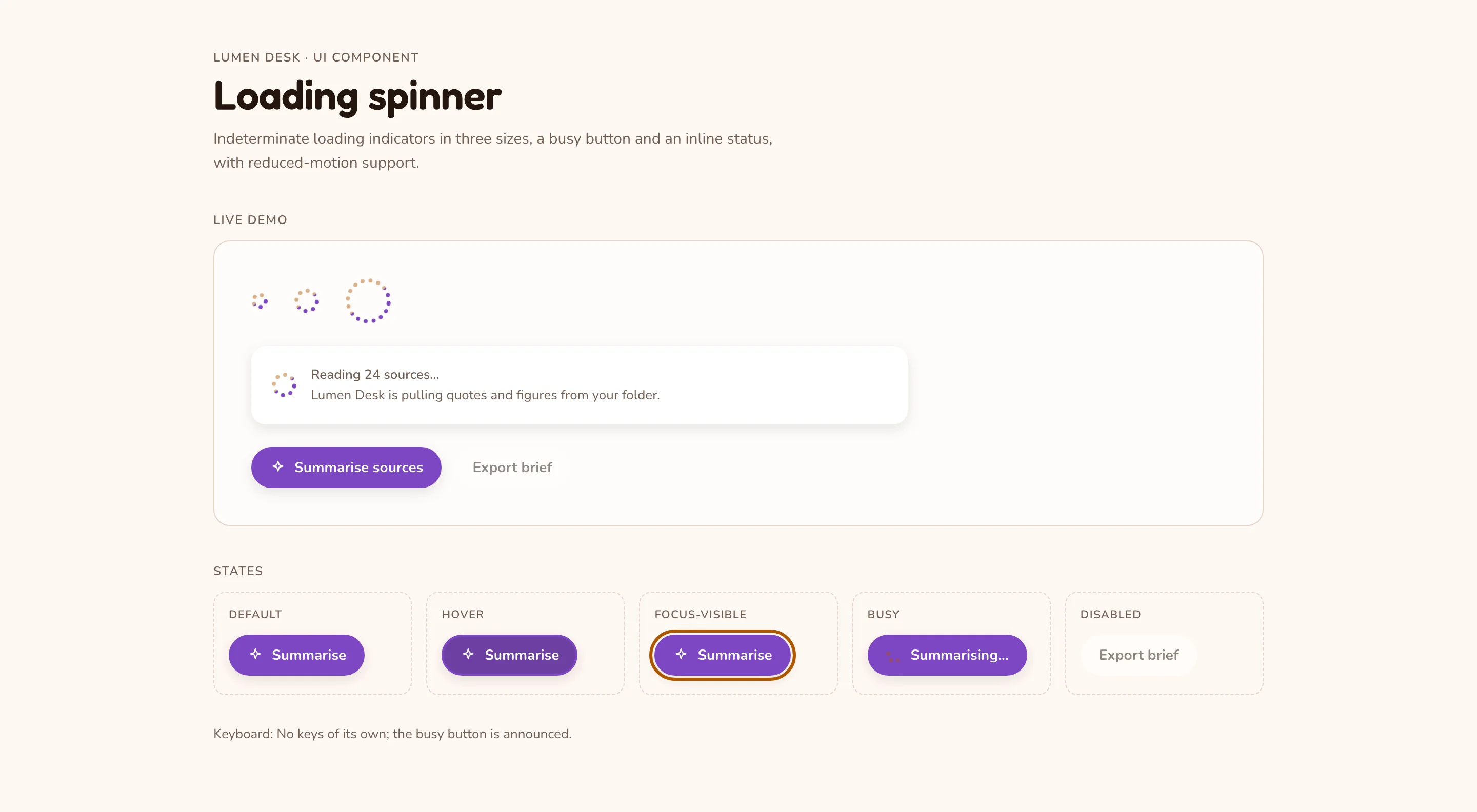
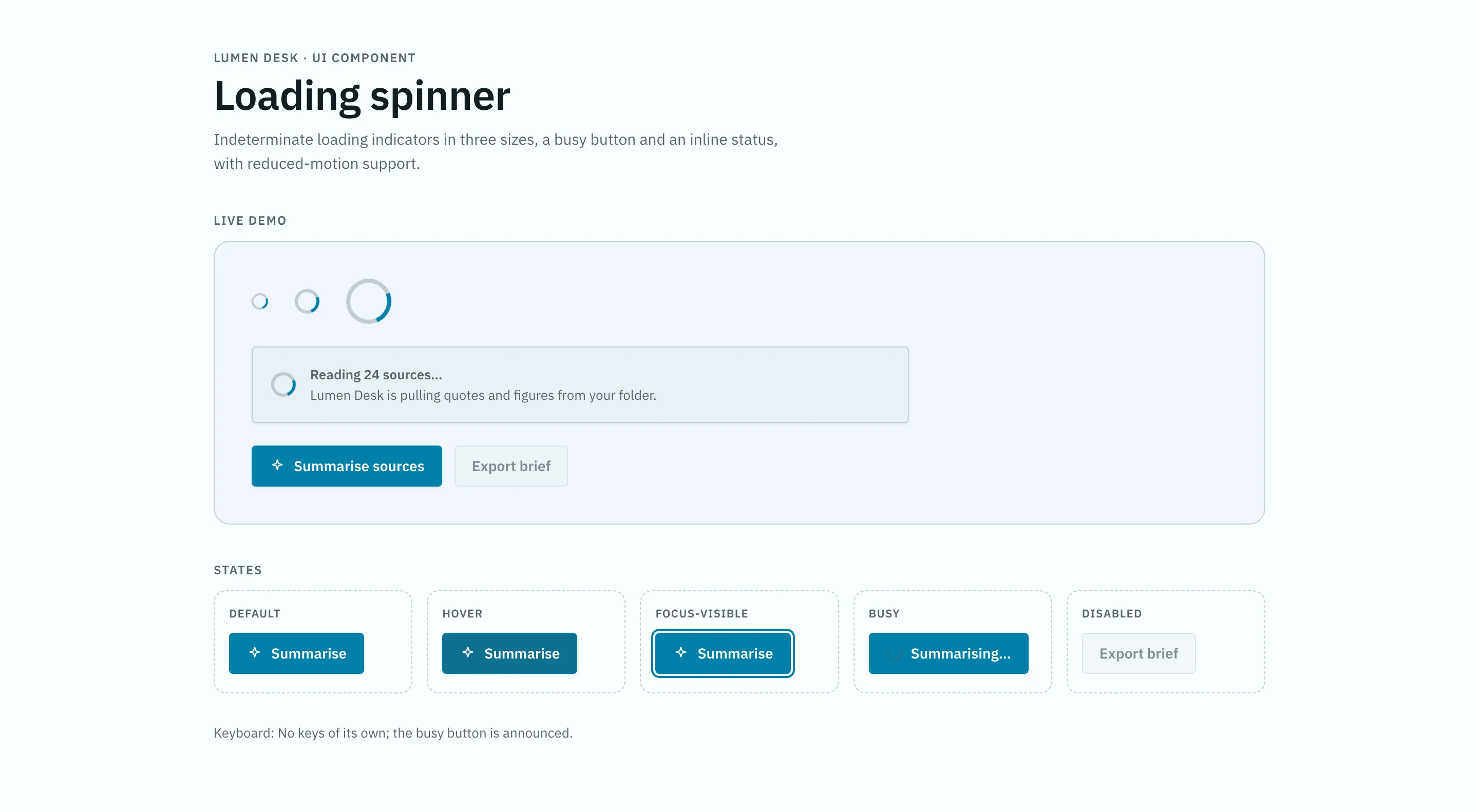
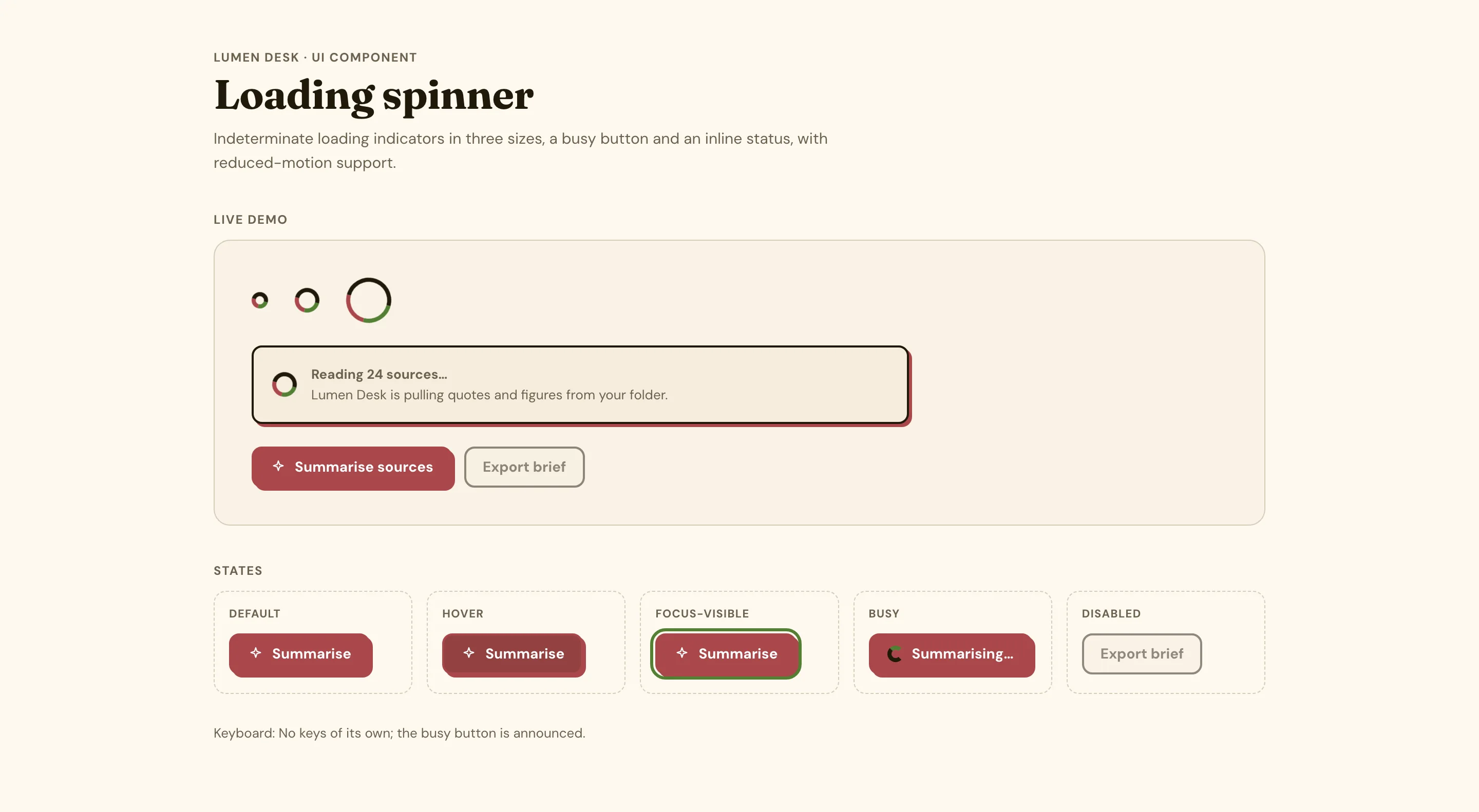
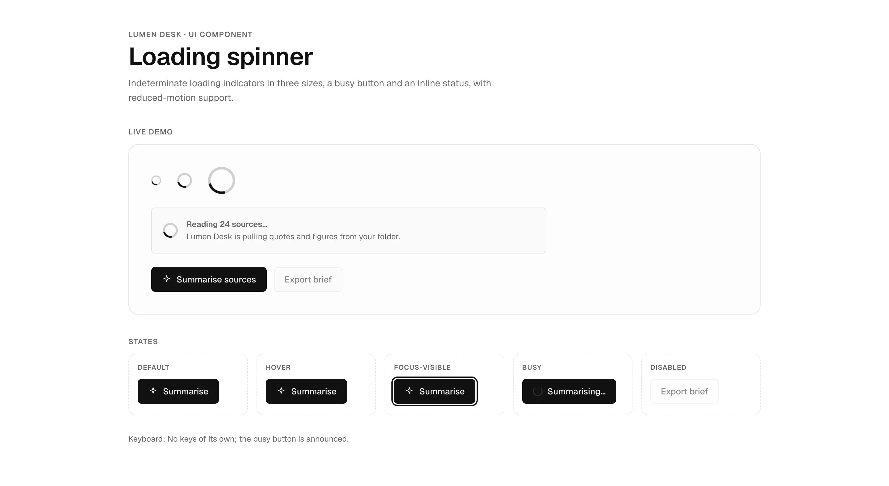
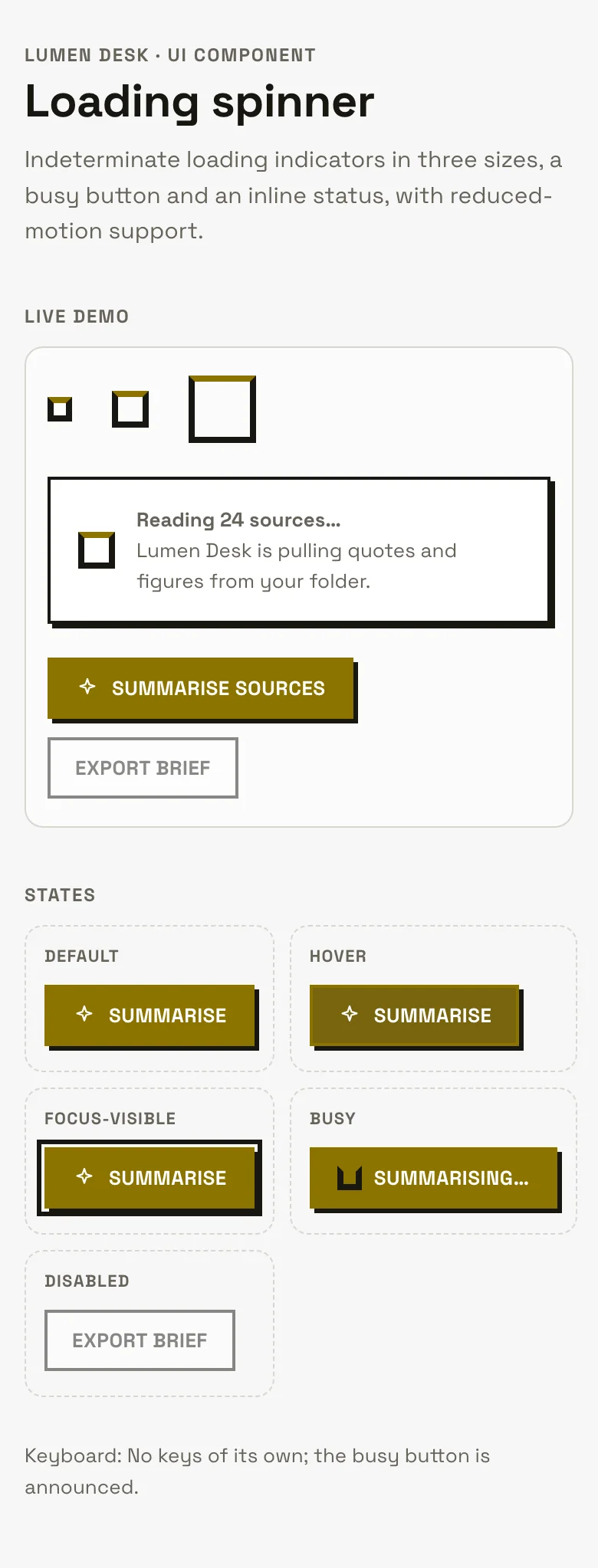
Loading spinner component — web, brutalist style
Loading spinner UI component for websites and web apps, shown in Lumen Desk, a fictional ai product. Shows loading spinners in three sizes, a button that shows a busy state, an inline loading status with screen-reader text, and every state (default, hover, focus-visible, busy, disabled). Brutalist style: high contrast, Space Grotesk, uppercase headings, thick black borders and hard offset shadows. Comes with copyable HTML, CSS and a few lines of plain JavaScript (keyboard support and ARIA per the WAI-ARIA Authoring Practices), a live demo, and a DESIGN.md with light and dark colour tokens.
- Pattern
- Loading spinner
- Device
- Web
- Style
- Brutalist
- Product (fictional)
- Lumen Desk
- Category
- AI
Spec
- Colours (light)
- background
#f7f7f7· surface#ffffff· text#181710· muted#666359· primary#8c7400· accent#435bd5 - Colours (dark)
- background
#0d0d09· surface#1c1b15· text#ecebeb· muted#b3b1aa· primary#d6b300· accent#9cb4ff - Fonts
- Space Grotesk (headings and body), JetBrains Mono (code) · Google Fonts, under their own licences
- Light and dark
- Both included; follows the system setting
- ARIA pattern
- Semantic HTML, no widget role needed
- Keyboard
- No keys of its own; the busy button is announced
- States
- default, hover, focus-visible, busy, disabled
Code
Paste the HTML where the component goes, the CSS into your stylesheet and the script before </body>. The tokens block holds the light and dark colours; swap in your own.
<div class="mgd-load">
  <div class="mgd-load__sizes" aria-hidden="true"><span class="mgd-spin mgd-spin--sm"></span><span class="mgd-spin"></span><span class="mgd-spin mgd-spin--lg"></span></div>
  <div class="mgd-load__card" role="status"><span class="mgd-spin"></span><span><b>Reading 24 sources…</b><span>Lumen Desk is pulling quotes and figures from your folder.</span></span></div>
  <div class="mgd-load__row">
    <button class="mgd-btn mgd-btn--primary" type="button" data-busy-label="Summarising…"><svg class="i" width="16" height="16" viewBox="0 0 24 24" fill="none" stroke="currentColor" stroke-width="1.7" stroke-linecap="round" stroke-linejoin="round" aria-hidden="true"><path d="M12 3l1.8 5.4L19 10l-5.2 1.6L12 17l-1.8-5.4L5 10l5.2-1.6z"/></svg><span>Summarise sources</span></button>
    <button class="mgd-btn" type="button" disabled>Export brief</button>
    <span class="mgd-load__msg" role="status"></span>
  </div>
</div>/* Tokens (light + dark) */
:root{--bg:#f7f7f7;--surface:#ffffff;--border:#d8d6cf;--text:#181710;--muted:#666359;--primary:#8c7400;--on-primary:#ffffff;--accent:#435bd5;--font-h:"Space Grotesk",Georgia,serif;--font-b:"Space Grotesk",system-ui,sans-serif;--hw:700;
--c-bw:2px;--c-line:var(--text);--c-r:0;--c-pill:0;--c-sh:3px 3px 0 var(--text);--c-pop:6px 6px 0 var(--text);--c-tt:uppercase;--c-ls:.02em;--c-fw:700;--c-fs:13px;--c-ring:3px solid var(--text);--c-ind:4px;color-scheme:light}
@media (prefers-color-scheme:dark){:root:not([data-theme="light"]){--bg:#0d0d09;--surface:#1c1b15;--border:#32312b;--text:#ecebeb;--muted:#b3b1aa;--primary:#d6b300;--on-primary:#111111;--accent:#9cb4ff;color-scheme:dark}
}
:root[data-theme="dark"]{--bg:#0d0d09;--surface:#1c1b15;--border:#32312b;--text:#ecebeb;--muted:#b3b1aa;--primary:#d6b300;--on-primary:#111111;--accent:#9cb4ff;color-scheme:dark}
/* Component */
.mgd-sr{position:absolute!important;width:1px;height:1px;padding:0;margin:-1px;overflow:hidden;clip:rect(0 0 0 0);white-space:nowrap;border:0}
.mgd-btn{display:inline-flex;align-items:center;justify-content:center;gap:8px;min-height:40px;padding:0 16px;border:var(--c-bw) solid var(--c-line);border-radius:var(--c-pill);background:var(--surface);color:var(--text);font:var(--c-fw) var(--c-fs)/1 var(--font-b);text-transform:var(--c-tt);letter-spacing:var(--c-ls);box-shadow:var(--c-sh);cursor:pointer;white-space:nowrap;transition:background-color .12s,border-color .12s}
.mgd-btn:hover,.mgd-btn.is-hover{background:color-mix(in oklab,var(--primary) 9%,var(--surface))}
.mgd-btn:focus-visible,.mgd-btn.is-focus{outline:var(--c-ring);outline-offset:2px}
.mgd-btn[aria-expanded="true"],.mgd-btn.is-open{background:color-mix(in oklab,var(--primary) 15%,var(--surface))}
.mgd-btn--primary{background:var(--primary);border-color:var(--primary);color:var(--on-primary)}
.mgd-btn--primary:hover,.mgd-btn--primary.is-hover{background:color-mix(in oklab,var(--primary) 84%,var(--text))}
.mgd-btn:disabled,.mgd-btn[aria-disabled="true"],.mgd-btn.is-disabled{opacity:.5;cursor:not-allowed;box-shadow:none}
.mgd-btn svg{flex:none}
.mgd-spin{display:inline-block;flex:none;width:var(--size,24px);height:var(--size,24px);border:3px solid color-mix(in oklab,var(--muted) 30%,transparent);border-top-color:var(--primary);border-radius:50%;animation:mgd-spin .8s linear infinite;vertical-align:middle}
.mgd-spin--sm{--size:16px;border-width:2px}
.mgd-spin--lg{--size:44px;border-width:4px}
.mgd-spin{border-radius:0;border-width:4px;border-color:var(--text);border-top-color:var(--primary);animation-timing-function:steps(4)}
@keyframes mgd-spin{to{transform:rotate(360deg)}}
@keyframes mgd-pulse{50%{opacity:.35}}
@media (prefers-reduced-motion:reduce){.mgd-spin{animation:mgd-spin 2.4s linear infinite,mgd-pulse 1.6s ease-in-out infinite}}
.mgd-btn[aria-busy="true"]{cursor:progress}
.mgd-load{display:grid;gap:22px;max-width:640px}
.mgd-load__sizes{display:flex;align-items:center;gap:26px}
.mgd-load__card{display:flex;align-items:center;gap:14px;padding:16px 18px;background:var(--surface);border:var(--c-bw) solid var(--c-line);border-radius:var(--c-r);box-shadow:var(--c-sh)}
.mgd-load__card b{display:block;font-weight:600}
.mgd-load__card span{color:var(--muted);font-size:13px}
.mgd-load__row{display:flex;flex-wrap:wrap;align-items:center;gap:12px}
.mgd-load__msg{color:var(--muted);font-size:14px}document.querySelectorAll("[data-busy-label]").forEach(function (btn) {
var label = btn.querySelector("span"), idle = label.textContent, icon = btn.querySelector("svg"), msg = btn.parentNode.querySelector("[role=status]");
btn.addEventListener("click", function () {
if (btn.getAttribute("aria-busy") === "true") return;
btn.setAttribute("aria-busy", "true"); btn.setAttribute("aria-disabled", "true");
var spin = document.createElement("span"); spin.className = "mgd-spin mgd-spin--sm"; spin.setAttribute("aria-hidden", "true");
if (icon) icon.replaceWith(spin); else btn.prepend(spin);
label.textContent = btn.dataset.busyLabel; if (msg) msg.textContent = "Summarising your sources…";
setTimeout(function () {
btn.removeAttribute("aria-busy"); btn.removeAttribute("aria-disabled");
spin.replaceWith(icon || document.createTextNode("")); label.textContent = idle; if (msg) msg.textContent = "Summary ready.";
}, 2500);
});
});DESIGN.md
Component section (states, ARIA, keyboard)
## Component: Loading spinner

Indeterminate loading indicators in three sizes, a busy button and an inline status, with reduced-motion support.

- **Pattern:** Semantic HTML (no ARIA widget role needed)
- **Roles and attributes:** A spinner sits inside role="status" with visually hidden text ("Loading…"), so the message is announced once; a busy button is disabled with aria-busy="true" while it works. With prefers-reduced-motion the spin slows to a gentle pulse.
- **States drawn:** default, hover, focus-visible, busy, disabled
- **Focus:** a visible `:focus-visible` outline (3px solid text), never removed
- **Style knobs (brutalist):** border 2px, corners 0, shadow `3px 3px 0 var(--text)`, labels uppercase, tracked .02em
- **Motion:** transitions are short (≤160ms) and switched off under `prefers-reduced-motion: reduce`
- **Code:** HTML + CSS + a few lines of plain JavaScript (no libraries); colours come only from the tokens above, so light and dark both work

### Keyboard
- **Tab:** reach the Save button
- **Enter / Space:** start the busy state

### Licence
Original Made Good Designs code: free to use and adapt in any project, including commercial ones, with no credit needed. Fonts are Google Fonts under their own licences.Build this with your AI
Add the Made Good Designs library to your assistant once. Then ask for UI references, brand palettes, font pairings and design tokens in any chat.
https://madegooddesigns.com/inspiration/mcp?ref=ui-loading-spinnerSettings → Connectors → Add custom connector → paste the URL.
Settings → Apps & Connectors → Advanced → Developer mode → Create → paste the URL.
One click, then confirm in Cursor.
One click, then confirm in VS Code (Copilot agent mode).
claude mcp add --transport http made-good-designs https://madegooddesigns.com/inspiration/mcp?ref=ui-loading-spinner
gemini mcp add --transport http made-good-designs https://madegooddesigns.com/inspiration/mcp?ref=ui-loading-spinner
Add this to the app's MCP config (Windsurf: mcp_config.json).
Fonts: Space Grotesk (Google Fonts)
Prompt copied: paste it into the chat that just opened.
Writing about this component?
More loading spinner components
search_ui_screens (e.g. “billing settings, editorial style”), get_ui_flow for a whole journey, and get_ui_screen_code to pull the HTML and DESIGN.md straight into your project.